


guest23
-
Posts
3,600 -
Joined
-
Last visited
Posts posted by guest23
-
-
1 hour ago, DCarp1231 said:
After the curtain has been pulled back over the last several years as to how the league manages itself I would never use the nfl and the word intellectual in the same statement. The nfl should just stick to their core competency which is intellectually dishonest property like military cosplay merchandise and corporatized empty phrases like inspire change. Leave the numerals to the professional archeologists and stick to sprots.
-
1 hour ago, aawagner011 said:
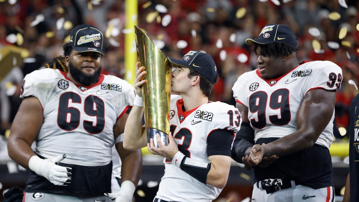
There appears to be heavy smoke around Georgia updating its font and dropping Bulldog Bold.

The rumors are that Georgia will be going back to a more traditional block font, which is not surprising. In the 2020 season, Georgia wore a 1980 throwback with a block font as well as an all-new black alternate with the same font.
The font was heavily disliked among the older fan base but as far as custom fonts go, I liked it. It was easily legible and clean. It was also identifiably Georgia. Nonetheless, I’ll like a block font, too as it’s what they wore when I was a student.
It’s interesting to me that we’d do this immediately after our most significant moment in four decades. The title was won in Bulldog Bold. Maybe we’ll see throwbacks in the future with the font!
I don’t have further details but am trying to get more info. I hope we retain a black jersey and I’d love red pants as a permanent part of the set. We should wear black jerseys as well as red pants on the road as least once or twice per season. Both are traditional Georgia uniforms.When are nike and these schools gonna learn that adding proprietary elements to classic uniforms rarely results in long term adoption. The only exception I can think of is the steelers. I am honestly surprised it lasted this long.
-
 1
1
-
-
8 minutes ago, tron1013 said:
It is a tale
Told by an idiot, full of sound and fury,
Signifying nothing.Not to mention that they sloppily copied the burgundy sleeve color rather than going with white, I think you are giving them way too much credit. The white jersey is incongruous and black for black's sake.
The Tale of the Terrible Little Man Who Refused to Sell the Team
-
1
-
 1
1
-
-
1 hour ago, Volt said:
This also perfectly illustrates why they used an older Schutt Air XP helmet to show off the Black lid; imagine how bad that decal will look (and last) on a SpeedFlex or F7?
It'll be above the first section on both. Good god, do these people even think?Well that is also the same helmet model and mask of one of their top players wears, who just happened to be part of the unveiling. Could just be a coincidence that they chose to outfit him in the black set or it's all staged to protect the w.
-
1
-
-
Bengals are sooooo close to having their best and most classic uniform combo but the clownfish patterned pants just ruin it for me.
-
6
-
-
1 hour ago, DCarp1231 said:
A desert mountain range on the Cardinals sleeves would be a better design choice than anything state flag related
utes already went that route and went back to stripes for a reason...
-
3 hours ago, Blast_Brothers said:
The flag keeps showing up in Cardinals redesigns because it's the only unique design element they've ever had. Even the piping they use now isn't all that special.
Take the flag out of the equation, and you're left with uniforms any team could wear. Their uniform history is extremely uninteresting, and it's not even consistent enough to be iconic like the Raiders, Colts, or Packers' uniforms are. Recoloring the Jags' uniforms in red and white produces a pleasing result, but it also shows how much Jacksonville's unique color scheme covered for their plainness. Unless the Cardinals feel like radically reinventing their brand, leaning on the flag imagery is probably the best way forward.
I think to some of the old timers (including me) there's an overall aesthetic where after ww2 as the league matured into the tv era the nfl really differentiated its uniforms from college which may have evoked the image of the sunday uniform as professional business attire as opposed to other amateur outfits that did not have such clean aesthetic. I'm off on a bit of a tangent here but the cardinals are one of the oldest franchises in the league and what I am saying is that they do not have to do the over the top storytelling and have every single element embellished like the abomination the rams have put on the field. A nice clean and classic uniform for the cards would be very effective.
-
6
-
 1
1
-
-
1 hour ago, DCarp1231 said:
How exactly would they cram the numbers, cardinal, and state flag onto the sleeves? With today’s uniform trends, they’d likely only pick one of those elements.
That's why I said basis. The best thing on this uniform is the white primary, striping patterns, and incorporation of black trim that enhances the overall uniform. No need for the bird if it's on the helmet. Also could try get creative with the flag or scrap it. TV numbers are now optional so I challenge someone on this board to use this uniform as inspiration for a modernized concept.
-
2
-
-
10 minutes ago, Volt said:
I don't like it either, but it was on the original Away uniform I'm referencing, and with Arizona's horrendous color palette, it's an element that has existed in the team's history that allows for another design detail, and one that provides color.Best cards uniform that they should use as a basis for a redesign.
-
3
-
-
12 minutes ago, dont care said:
It’s blue, it’s also in reverse order. They are nothing alike.
I had the exact same thought so it's pretty much confirmed that this is a german flag-inspired uniform.
-
1
-
-
1 hour ago, panthers_2012 said:
Oh Lord. I hate these even more.
They can't get anything right. I get the point for the years, but I like subtle references, like in the Islanders logo. It's just too many elements going on in this logo.
Judging by those graphics WTF used an in house designer (ie someone's kid) and an online uniform builder. It all makes sense now.
-
11 hours ago, Cujo said:
BEFORE
 AFTER
AFTER
There was a game about a decade ago where demarcus ware wore the alt silver pants with the white jersey while the rest of the team wore silver green...also you can go back to the '94 double stars where they wore white over silver which looked ok but much more like a road uniform. Obviously the compromise would be go back to the mid/late 70's where the helmet had more blue tint in the silver and the pants had less blue/green.
-
2 hours ago, the_grateful_ted said:
What a silly thing to say
Statistically speaking he was the best offensive football player of his generation, one of the few that deserve the goat title.
-
2 minutes ago, LA Fakers+ LA Snippers said:
Yes, actually. He became the GM in 2012, the year the Broncos made the switch (coincidentally, also the year the League switched to Nike, the original creator of Denver’s set).
They’re stale-er than Subway bread at this point, though, and the need to change as soon as possible.
Unpopular opinion alert: The current helmet logo is a superior helmet logo to the D and uniforms are modern classics because they are the 1st and the best of that late 90's paneled design.
Are they dated? Probably. Was the orange crush/robin blue dated in the mid 90's? Yes.
-
9
-
-
I have to disagree about your statement regarding the reebok era as reebok's manufacturer, ripon produced a wide swath of templates/cuts that often looked very non-uniform within the same team. As a matter of fact the titans (and bengals) were one of the most egregious offenders of wide ranging variations of jerseys on field. Nike came in and really streamlined things to achieve a more consistent on field aesthetic.
-
4
-
-
52 minutes ago, LA Fakers+ LA Snippers said:
The 49ers are doing this exact thing this season.
I am still quite surprised that this throwback red was not used with matching red pants as a dark color rush as opposed to those hideous black sets they wore. While not as good as the throwback it would have looked interesting (think tosu all red) for one game a season.
-
1
-
-
15 hours ago, MCM0313 said:
That would be an overreaction. They’re still a very historic franchise with a lot of memorable moments: Turk Edwards’ bizarre career-ending injury, 73-0, the career of Sammy Baugh, the end of Vince Lombardi’s career (and life), the Over-the-Hill Gang, Mike Bass’ touchdown on Garo Yepremian’s ill-advised throw, Riggins’ Super Bowl run, Doug Williams and Timmy Smith setting the world on fire in Super Bowl 22, and the 1991 team - arguably the best NFL team of the Super Bowl era, right up there with the ‘72 Dolphins, ‘84 49ers, ‘85 Bears, and (LOLOLOLOL) ‘07 Patriots.
I do believe the league could find a reason, if HQ really wanted to, to force Dan Snyder to sell the team. That plus the new name could work wonders in the rehabilitation of the franchise.
I don't think so. Given the history of bigotry in ownership and the horrendous track of the current regime the entire franchise has no belonging in the modern nfl. Send them to the history books where they can live alongside the Pottsville Maroons and Dayton Triangles.
-
1 hour ago, MCM0313 said:
Yeah. They have some sordid history, and it’s not just the old name. In fact, I would argue that the actions of George Preston Marshall with regard to integration were a good bit worse than any team name. Then you have the harassment allegations from the past few years, and the mostly unspoken fact that their current owner is a toxic dickweed and to some extent their work environment will *always* be toxic while he is in charge.
Missed opportunity to dissolve the franchise imho.
-
56 minutes ago, gosioux76 said:
Maybe I'm remembering this wrong, but didn't the Texans initially unveil a white helmet when they were awarded the franchise? I remember playing Madden back then, and they initially included the Texans with a white helmet and generic uniform design. Of course, that's because they had yet to unveil their inaugural uniforms by the time the game was released.
It was just a placeholder helmet for the press photo. I think a fair amount of people conflate the jax/car expansion round where all the bidding cities had logos and prototype uniforms to be the norm when new franchises are awarded/announced and that was really the exception.
-
1 hour ago, MJWalker45 said:
The home white pants are the only downside because the stripes should be colored in on the pant stripe instead of outlined.
Agreed. The failure on having white pants directly tie into the orange or black jerseys is a huge and obvious miss and downgrade this from a smashing success to a solid improvement.
-
2
-
-
1 hour ago, the admiral said:
Based on what. Based on what. What have you seen from either party here that would make you think that. Their interim logo is the work of a graphic design intern who had The Bends open in Spotify and knocked it out before the end of "Fake Plastic Trees." On the Nike side, the Rams' concept is "off-white hypebeasts," the Titans' is "pointy armpits," and the Dolphins think a toothpaste glob makes them a Veblen good. The Snyder organization is going to cost the league millions in settlements. Where is this faith coming from?
You would be amazed how the opportunity to do something new drives perpetual optimism among the masses despite overwhelming past evidence to the contrary that bad faith actors and poor decision makers never change.
-
4
-
-
3 hours ago, fouhy12 said:
Ja'Whaun Bentley for the Pats has been wearing black leggings as his socks recently. Never seen a guy wear a non-team color before. They've really abandoned enforcing any kind of sock rules.
#36 for the 9ers was wearing black sleeves, socks, and cleats last night. While black is a trim color with the throwback alt, I think that's the most egregious deviation from the standard uniform rules that I've seen in quite some time.
-
2
-
-
1 hour ago, ramsjetsthunder said:
I never realized how bad the previous bolt was until this came out.
I think the previous primary bolt logo might have been adopted off a merch specific interpretation of the helmet bolt. For quite some time I only remember seeing that bolt forced into an arc on hats and car stickers (which may explain the horrible curvature) but somehow kept creeping into other applications. The new one is much more representative of the helmet bolt being presented as a primary logo.
-
3
-
-
On 10/13/2021 at 6:30 AM, BBTV said:
that is better. I wonder how gray socks or silver tights would look, especially with the home set.I would like to see more of that but I think you need a darker color at the bottom of the sock to give a bit of a natural break/contrast against the white bottom. The dolphins did something like that when they launched the cruise ship redesign. The lions attempted gray/silver socks with their blue road pants and it just looked a bit off with gray touching white.


Washington Commanders to debut new NFL identity
in Sports Logo News
Posted
You see the problem here is that this design is only gets you to 9.5 when they want to TURN IT UP TO 11.