


guest23
-
Posts
3,600 -
Joined
-
Last visited
Posts posted by guest23
-
-
1 hour ago, oldschoolvikings said:
I’m here at the Hall of Fame Game waiting out the lightning delay (for some reason). I saw the new authentic Commanders helmet on display here. It’s actually amazing how nice that helmet is in person. The finish is beautiful and they showed real restraint with the two color scheme and the single stripe.
Makes it all the more unbelievable how badly they bungled literally every other part of the new uniforms. You could base a pretty nice identity off of that helmet. And I mean pretty much any of us could. Except them, apparently.
it's a fine looking helmet but in reality it needs some white in it to give it better balance with any uniform...to me it feels more like a minnesota gophers helmet than anything else.
-
 1
1
-
-
Nike makes college hockey uniforms to secure overall athletic contracts to sell licensed merch for the entire school and can sell national team merch for the big competitions which are marketed around big events. Do they need to outfit and create licensed product for an entire league that has a much lower ceiling of potential merch sales compared to the other pro leagues they contract with? Is there enough upside in such a deal to make it worthwhile?
-
4 hours ago, goDEVILS said:

Had not seen this posted yet, but apologize if it already was. ASU showing off a new helmet combo earlier in the week, and I’m sure as always will be one of many different looks we see from them this year. As far back as I know, they have never worn a gold facemask with the maroon helmet. Glad they’re keeping the color-shift maroon/gold shell from last year, but I’m pretty sure this has the asymmetrical look with the number on the other side.
That is hideous and very appropriate for the state of arizona.
-
12 minutes ago, Carolingian Steamroller said:
So a lot of this is largely based on tradition, and by tradition I mean "What I grew up watching on TV or reading in the paper as a kid."
There generally are fairly banal explanations as to why baseball wears white at home football (at least in the era of TV) generally does not.
Baseball players in the 19th century wore a myriad of colors and frequently had only one uniform. However, since all games were played during the day, white became the preferred default for a variety of reasons: it's cooler than darker colors under the sun, manufacturing became more standardized and thus teams began using similar templates (doesn't that sound familiar), white doesn't show sweat as much, it's easier to identify players in the field against the deep browns and greens and made them stand out from fans, and a little bit of copying since the most well know clubs like the Cubs and Reds wore white at home. Grey only became the standard because it was a color similar to white but that would not show as much dirt from travelling teams unable to find reliable laundry.
By contrast, football never has an issue with cleaning since games are played weekly rather than daily. But Football is a contact sport played in not the best field quality so mud and dirty during the game meaning a white uniform shows dirt, grass, and blood more readily. With fall weather being significantly cooler, the necessity to limit the sun's harshness was minimal. A lot of teams were also significantly short of cash, leading many to have only one jersey. White jerseys only emerged consistently in the 30's and 40's as a "change" to ensure you could always tell the two apart.
The white jersey in gridiron football at the time served the same purpose as it did for football across the atlantic. It was the club's choice to pick a primary jersey color and some would choose white like the bears of the 1930s. White as an de facto and mandated away color was a result to optimize contrast on black and white television screens.
-
6 minutes ago, fouhy12 said:
A minor story I'm following ahead of New England's first preseason game next week: NOBs. The Pats currently have four Joneses on the roster, and three of them are defensive backs. Should all four need to differentiate their jerseys, we end up with Ja. Jones, Jo. Jones, Mar. Jones, and Mac Jones all as names on the back of jerseys. I don't think that'll happen, especially with Mac, but I don't know the requirements around this. Having three guys with the same last name at the same position will likely require at least the Jo. Jones, Ja. Jones, and M. Jones names.
I think the league stopped doing that over a decade ago. You are just going to see a bunch of joneses running around.
-
1
-
-
2 hours ago, ManillaToad said:
Miami "updating" their look to make it as sleek and soulless as possible really went under the radar as one of the worst rebrands the league's ever seen. It's akin to if the Celtics decided their logo needed mOdErNiZiNg. Dunno who the owner is but he clearly has a huge ego if he thought he was fixing a well-loved look represented by the likes of Dan Marino, Don Shula, and the only perfect team in history
Hey now I'm pretty sure ownership spent into the high six, if not seven figures on this rebrand to not just freshen up their logo and uniforms but to position themselves as a premium lifestyle brand along the lines of louis vuitton, rolls royce etc. Reverting back to throwbacks would seriously downgrade their premium brand status to that of a franchise owner of a mid century upstart pro football league. I honestly don't understand how you could possibly drive brand activation and engagement with such a positioning. Seems like a big mistake to me.
-
 1
1
-
 6
6
-
-
8 minutes ago, justen said:
Nike already trashed the NHL before... started Adidas and Reebok down the Swift jersey trend and boring templates like the olympics.... might as well ruin them completely.
Hate to break it to nhl fans but it's a tier 1.5-2 league in terms of tv and merchandising. The fan bases are extremely loyal but the overall popularity of the sport does not qualify as top tier which is why they have such a hard time getting a national tv deal and also why nike likely won't bother with making anything but a lowball effort. This deal has fanatics written all over it. There may be a smaller outsider that decides to take a shot at the nhl but we will see.
Also it's pretty evident adidas has difficulty profiting off merch deals in north america.
-
1
-
-
58 minutes ago, Cujo said:
Right!
It looks like the space shuttle is melting as it tragically meets its demise descending into the heliosphere.
-
13 hours ago, Volt said:
This is one simple comparison that shows how messed up this was. The Black/Orange stripe panel from the Black pants in the top photo, along with the Black/Orange shoulder cap on the Black jersey in the bottom photo, should've been used on their "new" White/Away uniform, since they insisted on 2-color numbers. Would be perfect with the Orange helmet.
Then, they could've kept the Color Rush with 1-color block numbers and White/Black stripe pattern for the Alternate, to go with the new White/Black helmet.They got the stripe patterns right but failed to implement them properly. Here's what should have been the final release:
Jerseys
- black - no change
- orange - no change
- white - keep striping, copy orange sleeve cap from orange jersey
- white color rush - current new white
Pants
- black - no change
- white - use pant stripe from black pants
- white color rush - current white with black only striping
Had they done this they would have suitable set of white pants that fit the traditional bengals striped pants and had a new white/black color rush perfectly set up for a future white helmet. Talk about lack of foresight.
-
2
-
1 hour ago, Volt said:
This is what the Bengals should've built their new uniform set around, so this is just a correction. The block numbers, black cap sleeves, and black collar details make this the superior away look.
I'm thrilled they'll be wearing these again.The problem is now that you have 2 disparate tiger stripe patterns which is a total bush league move to me. The latest set did a great job of cleaning up the stripe patterns on the jersey shoulders. Sure the casual fan won't know the difference but they are using an inferior set just so they can have an alt helmet. They need to make a new color rush the current white and remove the orange outline to align the aesthetics and ultimately become the most unnecessary jersey in the history of the nfl.
-
2
-
-
43 minutes ago, VDizzle12 said:
The Bengals bringing back an outdated jersey just so they can wear the Zebra helmets is pointless and unnecessary. The worst part is that neither of the white uniforms are anything special. At least when other teams have two jerseys of the same color, one is usually different enough or at least an improvement over the other. Other teams' Color Rush jerseys added a pop of color to the numbers and throwbacks go back to prominent eras. The Bengals old color rush uniforms do neither.
this reminds me of a mid-major that only has enough funds for a new set or two but still really wants to wear that alt from the old set even though it completely clashes with the new set(s)
-
1
-
-
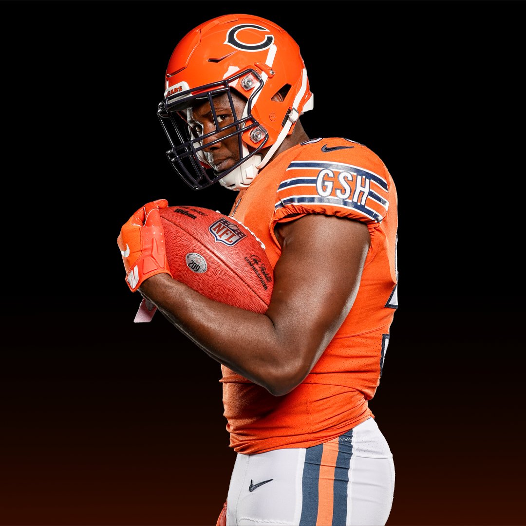
1 minute ago, IceCap said:
as a long suffering bears fan I went to bed hoping that the orange helmet might suffer a similar fate as the infamous 9ers one day helmet once fan reaction came out on a weekday, but as the sun sets on this long summer day I've come to the sad realization that the days of reflection, humility, and restraint have passed us long, long ago and we will never get those times back.
-
2
-
-
28 minutes ago, IceCap said:
No, the Eagles have to wait on kelly green because Nike can't get the colour right.
I'm not kidding.
Nike! Cutting edge fabrics and templates! Can't do green!
Pretty sure the eagles historical kelly green was manufacturer stock color back in the day. I don't see why nike's stock kelly green could not fit the bill. The only issue I could see if they are trying to match current nike kelly fabric to 40 year old russell kelly green where the fabrics are completely different.
-
30 minutes ago, Cujo said:
At least be decent and remove the 'GHS'. Papa Bear would absolutely hate this sh1t
hideous
-
1
-
-
On 7/20/2022 at 8:46 PM, Red Wolf said:
Nevada's shade of silver that they use on their helmets is gorgeous and works perfectly with navy blue. Going to symmetrical helmets is a welcome change.
My only complaint is that I wish they'd go back to saving helmet stripes for the seniors on senior day like during the Chris Ault days. That was such a cool thing, but also barely registers as an actual complaint.
I think the stripe was a mid/late season award for on field performance. I may have been used for senior day as well.
-
5 hours ago, NYCdog said:
Here’s the Liberty White helmet they also tested out last year in the lobby. Interestingly enough, with a white face mask (personally I would’ve chose a navy face mask like the original concept helmet)Battle Red helmet was the right choice.
WTF is liberty white??? more like surrender white...texans lead the americas in spectacularly failed independence bids.
-
2
-
-
2 hours ago, DCarp1231 said:
The Oilers-Titans-Texans discourse around here never fails
• “tHe OiLeRs BeLoNg iN hOuStOn”
• ”iF oNLy tHe TiTaNs jUsT LeT tHe TeXaNs uSe ThE nAmE”
• “tHe LeGaL sTuFf dOeSn’t MaTtER wHeN it’S tHe OiLeRs”
Since we are talking football and Hank Scorpio...
-
4
-
-
5 hours ago, GhostOfNormMacdonald said:
All the inserts and piping gives it an early 2000s feel, which based on when they were founded wouldn't be the worst thing in the world
What if we took a texas tech design from '04 and gave it to the texans

-
1
-
1
-
-
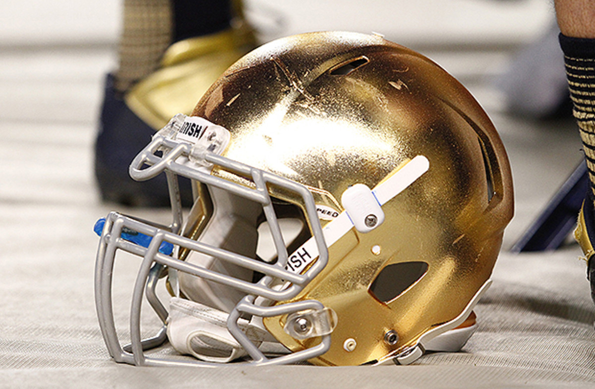
9 hours ago, Old School Fool said:
The 49ers should have a Notre Dame style gold helmet. Kinda like a saxaphone or something. I mean what they have now is fine but I think leaning into the Gold Rush aspect would be cool.
No to the 9ers and this is the superior nd helmet...there is no reason the helmet needs to be a literal representation of the dome.
-
3
-
 1
1
-
 5
5
-
-
28 minutes ago, kimball said:
And, I'm sure that's why everyone loves it.
well rec league chic is all the rage in pro sports these days
-
2
-
1
-
-
3 hours ago, the admiral said:
I shouldn't like that San Antonio wordmark, but I really do. Feels appropriately no-nonsense for the Spurs.
I appreciate the spirit of the jersey and know it's a throwback but the nob font on front for city name gives off a early 80's t-shirt shop heat pressing letters on a blank tank top vibe.
-
2 hours ago, Volt said:
This is how it always should have been.
Silver/White/Silver is just outstanding. These pants, as someone else said, instantly make them a top NFL uni. The Navy pants were never the right call.
Also, I wouldn't be opposed to a White pant for the White jersey.pats unis will never be top tier in the league...they are a mish/mash of eras combining a very dated early 90's logo with a classic ucla design...additionally the repeating of logos on the sleeve ar boring. The best they can hope for is inoffensive.
-
2
-
-
3 hours ago, cajunaggie08 said:
Even if the only change is the removal of the Longhorn chest logo, it's already a huge improvement. The chest has been overcrowded for years now on the Texas uniform.
they should just remove the XII while they are at it
-
3
-
-
On 7/6/2022 at 2:22 PM, aawagner011 said:
Bayern away kit has been unveiled. There’s a sublimated pattern down the middle but I can’t tell what it is.
This kit appears to be the spiritual successor to last year’s away kit. For reference:
Last year’s and this year’s both use gold detailing and include the Münchner Kindl on the socks and the upper back. Munich’s city colors are black and yellow (while the state of Bavaria is blue and white) so this is a natural fit.real munchen???


Adidas, NHL to split after 23-24 season
in Sports Logo News
Posted
Hasn't the wnba supplier deal been in tandem with the nba? That's why I did not consider it as an outlier. I would agree that nike supplier and merch deals are better performers in north america but I stand by my position that the nhl contract is likely not a priority for them to tie up capital and resources on when there are other investments that they can make via colleges, endorsements, or other sports leagues that have better demographic indicators that favor investment.