


guest23
-
Posts
3,600 -
Joined
-
Last visited
Posts posted by guest23
-
-
1 hour ago, Echo said:
Does that mean NFL captains can legally marry people?
Correct. Much like international waters and sea captains, their jurisdiction to officiate is limited to within the confines of nfl stadia where the nfl rulebook is the law of the land.
-
 5
5
-
-
14 hours ago, Meshmaster101 said:
guys only the military is allowed to have team captains sorry yall try again next time !

Everyone is ignoring that civilian ship captains go back many centuries. In my opinion nfl captaincy better reflects maritime law than that of military rank.

-
1
-
 1
1
-
-
2 hours ago, IceCap said:
Nike: unable to replicate a colour Wilson Athletics managed in 1997.
The solution is simple. Go back to the original fabric that the cowboys and raiders still use.
-
8
-
-
Watched a bit of the th night kickoff game and really appreciated brady going with the unbranded white cleats since ua is too cash poor to re-up for an nfl on field license. Definitely gave off a '94 costco court classics vibe.
-
1
-
-
2 hours ago, packerfan21396 said:
That is also the 1953 team photo, where these style of jerseys have been renumbered and maintained for 4 seasons. They wore alts in the the 1950 team photo, but in 1951, only a couple jerseys had been renumbered making it clear what the intended number font is:
Clearly they intended the numbers to be blockish , yellow, and legible. Don't think they had a style/branding guide other than close enough.
-
1
-
-
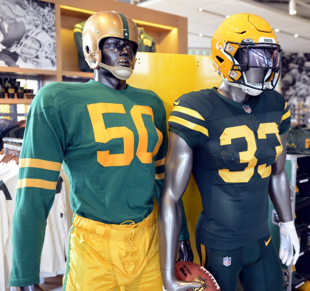
31 minutes ago, Gothamite said:
So this is how the Packers are promoting the new alt in the Pro Shop, alongside a reproduction of the 1955 uniform.
I’m guessing the Hall of Fame didn’t have a mannequin in the 1950 uniform this actually recreates.
just noticed the mannequin's helmet has the green mask...since this is more a color rush than throwback they should have kept the green.
-
2
-
-
14 minutes ago, MJWalker45 said:
The problem with the numbers are there are three different 4's and at least two different 5's, 7's, 6's and 1's in the original uniforms.
Yeah 1950's nfl uniform and equipment management would be considered at the level of an under-funded high school of today. Based on the graphic above, that font looks like russell's standard varsity block.
-
2
-
-
32 minutes ago, DNAsports said:
It's a fine fauxback/color rush but it is neither fresh nor clean imho.
-
4
-
-
57 minutes ago, nuordr said:
It is the lighting or does the green pants have a shine to them? We seen UA bring back the dazzle for the Fighting Irish a few weeks ago, is Nike jumping on that bandwagon? I sure hope so as I am sick of the matte pants.
Yes I noticed that but given that the packers are still wearing ripon uniforms the pants are likely the old fashioned dazzle nylon material that the raiders and cowboys still use and not some newfangled shiny material.
-
5
-
-
1 hour ago, elliott said:
Yes.
Why are they not wearing that?The basically tried that with gray pants. Story goes hen they did the redesign in 2000 the white/road was much more uniform, they used red numbers and socks but there was blue trim to tie the set together. They even went blue socks in 02 but apparently one of the mara elders was strong armed into that and wanted the traditional throwback look and they finally acquiesced back to the white/red with northwestern stripes. Now here we are repeating the late 60's/early 70's all over again.
-
3
-
-
2 hours ago, MJWalker45 said:
The only thing that's changing is a number. They still have to tackle, block and catch. The worst part about the NFL today is the guys with their undershirts hanging out, not the LB wearing number 11. I don't think picking a number they've worn for most of their time makes them any dumber than the guys that played in the 1920's-1990's and led with their heads when tackling. That was pretty friggin dumb.
I'm going to echo what bbtv said. Purely from an aesthetic standpoint, the extra formality with the number system, socks etc gave an air of professionalism to the sport that was distinctive at 1st glance. That distinct aesthetic line between pro and amateur no longer exists.
-
8
-
-
The pattern that goes from the crown to the bill is one of the worst elements I've ever seen from new era. On some of the hat models it doesn't even line up correctly. Not sure what look they were going for here...looks like the embroidery machine got jammed.
-
9
-
-
2 hours ago, insert name said:
If Under Armour can figure it out with UCLA, I'm sure Nike can too. I think it's absurd after all these years and they haven't produced a uniform that can properly display looping shoulder stipes.
They did try for a hot minute with the college equivalent of the elite 51 template with lsu and miss but once they moved to the vapor series nike regressed to the hard cutoff at the chest. It's evident that the short shoulder inserts are deemed good enough in the eyes of nike where replicating what ua did for ucla as a niche/edge case that's not worth their time to design and produce.
-
1 hour ago, PaleVermilion81 said:
I'm explaining why I think this font works well for a football uniform by comparing it to other football uniform numbers that have flaws that this font does not have. From an aesthetic standpoint, I think
this fontvarsity block is a perfect fit for an NFL uniform.-
2
-
-
1 hour ago, PaleVermilion81 said:
I guess I completely disagree. I think this font works well. It's a legible, gothic font that doesn't have some of the stupid treatments with serifs and mix of angled/round edges that other teams have (Browns, Vikings, Dolphins).
Edit to add: by Gothic I meant "century gothic". https://en.wikipedia.org/wiki/Century_Gothic
Where in my statement did I mention legibility? I'm speaking from an aesthetic standpoint that the font is not a good fit for the sports uniform for which it is being applied.
-
1
-
-
7 hours ago, PaleVermilion81 said:
The font is good, though. The shiny parts has nothing to do with the font itself. Remove the shine and make it just a single color and we're good.
There are few round number fonts that work well in gridiron football. I think the bears get a pass simply due to longevity. The rams font does not belong in the nfl but if you removed the textured /swirl treatment, it would look good on the pitch or basketball court.
-
1
-
-
41 minutes ago, WSU151 said:
Snyder was dead set on keeping the name until he got the call from FedEx and other corporations.
Sounds like he lacks the foresight to be a competent franchise owner/operator.
-
6
-
-
2 hours ago, WSU151 said:
Washington's bland placeholder name was due specifically to a lack of time in creating a good brand between June 2020 and September 2020.
They've been on notice and fighting the inevitable change for about two decades. To claim "lack of time" is disingenuous.
-
3
-
-
1 hour ago, SFGiants58 said:
"Stormtrooper" is too popular an aesthetic at the moment to do that.
but the players love the bone pants so you can book it now
-
16 hours ago, Bruhammydude said:
Lets hope the new Rams jersey stay with yellow pants. It would not surprise me if they paired that up with the bone pants
I heard on reddit they will exclusively go white over bone.
-
the lack of continuity between the pants and the tops is really amateurish
-
9
-
-
15 minutes ago, DNAsports said:
I highly doubt a team as traditional as the Bears would be dumb enough to pull something like that. A faux leather helmet? Absolutely should be in the cards. A ridiculous orange helmet for the sake of an orange helmet? Not a chance in hell.
Going back to through the archives they even had navy leather helmets so any other color should be a no go.
-
5
-
-
3 hours ago, Typhoon said:
Any rumours regarding new uniforms for the Edmonton Elks?
The official team shop only shows the “Third Jersey” for sale
I did some sleuthing on the internets and here's what came up for elks uniforms...can't say for 100% certainty but I'm guessing this is a sign of what's to come.
-
2
-
-
53 minutes ago, BBTV said:
Actually, I didn't realize how average his record was - it's 117-117. Also, his Pro Football Reference HOF Monitor score has him pretty much tied with...
Don't get me started...
-
5
-


NFL Changes 2021
in Sports Logo News
Posted
We have a winner. They could use a sleeve cap or the crescent insert that the chargers use to achieve this effect.