
guest23
-
Posts
3,600 -
Joined
-
Last visited
Posts posted by guest23
-
-
15 hours ago, Hat Boy said:
This definitely needs to happen at least once this century. The sheer audacity of these uniforms make them an all time great.
-
 3
3
-
-
-
16 hours ago, insert name said:
Local users in sports logo forum says married couple can't be goofy at own wedding.
yep they know better than to let their geek flag fly in public...
-
 2
2
-
-
1 hour ago, oldschoolvikings said:
Yeah, having the same logo on both the helmet and jersey is absolutely redundant. That’s kind of the literal definition of redundant. You can say that you don’t mind, or you like it anyway, or you enjoy a good redundancy now and then… that’s cool.
I would say it's visually repetitive as the logos occupy adjacent space and could often be viewed at the same time. To me, redundant would be to place one helmet decal on top of another.
-
11 minutes ago, MJD7 said:
Honestly, on its own aesthetically, I actually like the Saints helmet, as unpopular as that seems to be. I can see the Louis Vuitton comparison with the helmet stripe, but something about it captures an “elegance” that feels very “New Orleans” and very “Saints” at the same time, if that makes any sense at all.
However, pairing it with the Color Rush jersey is an absolute travesty. I didn’t think it could possibly get worse than the vegas gold helmet that didn’t match. An old gold helmet would have been so much better, even a white helmet would have been nice. The only combo I think this helmet would look good with is all black, although I understand that’s impossible under the current rules.
As for the Eagles’ wordmark, I similarly like it on its own, it’s a nice refresh that feels fitting for the team. However, in keeping the old eagle logo & presumably the old number font, I imagine the wordmark will look quite out of place. It feels like a half-measure when I would have preferred them to try a complete refresh.
seahawks did it first so I guess it's more apt to call it a louis vuitton knock off...
-
 4
4
-
-
3 hours ago, infrared41 said:
Of all the good alternate helmet options available to them, the Saints didn't choose any of them.
Old gold to match the throwbacks/color rush would have been ideal.
-
 8
8
-
-
-
27 minutes ago, CaliforniaGlowin said:
 wow. We can barely afford gas and they puttin out this :censored:?
off-white is a fashion brand for the if you have to ask how much it is you can't afford it crowd who like to pay luxury prices for garments that either look like they were too soiled to be resold at goodwill or a 4th graders sewing project.
The people who can afford this don't care how much it costs to fill up their g wagons to run to the grocery store or salon.
-
1 hour ago, Haz_Matt said:
5 years in New Orleans... 42-43 in Utah, one could say that the name, while geographically not significant to Utah, has more historical significance with Utah.
Where are the Lakes in Los Angeles? They're an established brand/identity, should they also give up their name because it originated and existed somewhere else for a shorter period than it's current form and location?

How many chips have the lakers won with essentially the same forum blue and gold identity??? Utah hasn't won anything ever and doesn't even want to use the identity as intended. Time to give it back and become 'rockzz.
-
 4
4
-
-
1 hour ago, CaliforniaGlowin said:
enough of this already the jazz have destroyed whatever brand equity they had built during the sloan/malone/stockton era with all of these color changes and pivoting to the outdoor themes...time to give the name back to the city where it rightfully belongs!
-
 1
1
-
-
-
1 hour ago, LA Fakers+ LA Snippers said:
I think this needs to be repeated and/or pinned to the top of the boards or something, because this poster does this often, and as @gosioux76 pointed out, you guys always fall for it. If you know it’s fake, you don’t have to tell them that it’s fake, because that person likely already knows. If you’ve proven his information to be false before, just ignore him.

-
 10
10
-
-
1 hour ago, willforgetmylogin said:
I have news. Believe me don't whatever but I am just sharing so don't shoot the messenger.
TB has received special approval to have the creamsicles this year.
The Falcons are going red helmets (already announced) for four games this year. You will see them with the Gradient uniforms and with different striping and logos than the throwbacks as well.
The Cowboys white helmet and classic Thanksgiving uniforms are returning.
The Rams will debut a black helmet with an all black set.
The Saints will have a white helmet this year they will pair with the CR. It is stupid clean.
Arizona will get a red helmet they have dedicated for use with the CR.
The Bears are getting an orange helmet to match with an unannounced as of yet new alt. Really looking forward to seeing reactions to that.
The Bills are bringing back red helmets to match their CR.
Carolina is getting a black helmet. I was told they'll be worn with the black jerseys and pants so I'm not sure if they are designating teal as their primaries or if they got an exception.
Cinci is getting black helmets with white stripes. Sounds weird but it looks so much cooler than white with black stripes, especially with black socks.
New England is bringing back Pat Patriot and the old red uni.
Philly has a black helmet to go with their all black alts.
Denver has a new/old orange helmet they will pair with the CR. I said before they'd be switching to all navy primaries. Officially orange will be the primary but they will wear all navy more times than the classic orange because of CR games. So technically I was wrong, but you will see them more than the designated primaries.
I've heard rumblings about the Packers doing something but good luck getting leaks out of that organization.
This is the


 post that I needed to get my week started right!! Can't wait to see them all come to fruition!
-
 1
1
-
 7
7
-
-
33 minutes ago, insert name said:
except when the majority Angels fanbase is against it
this has nothing to do with the fan base and everything to do with advertisers
-
1 hour ago, gosioux76 said:
I agree with this. Some of this may purely be for nostalgic reasons. They may not have won anything under that name, but those early to mid-'80s Angels had some impressive lineups.
The initial shift away from California, I presume, was intended partly to remove some of the vagueness from its brand and apply it to a specific locale. Then the shift to Los Angeles was an attempt to attach itself more directly to the lucrative L.A. market. But it doesn't really seem as if any of those moves led to any meaningful gain, so at this point, why not go back to California?
I believe they dropped california and took the anaheim designator as part of the agreement for the city to renovate the stadium. This was also during the disney era when they had a branding initiative to expand their footprint in the city and effectively rebrand the entire city as "disney anaheim resort". I believe there was also talks at some point to create train line between the stadium and the park to create a resort corridor. Obviously that never materialized. moreno inherited the agreement but leveraged the fact that anaheim only had to be in the team name, not a specific name hence the of anaheim.
This whole nonsense comes down to tv and advertisers. moreno made his money in the ad business and technically he's right in terms of how the area is officially defined as the Greater Los Angeles CSA aka Los Angeles - Long Beach - Anaheim.
-
1 hour ago, Silent Wind of Doom said:
Wow. It wasn't until reading this that I realized just how much the Angels AGAIN refused to take any side in their identity and connect to no city as they went with a vague local idea that covers the entire region but avoids any specific reference to one municipality. They're the Angels Angels of Angels.
This design is not tasteful. Does that make it more or less accurate representation of the city?
-
1 hour ago, Kg54mvp said:
I’ve probably said this before, but city connect uniforms are just an annoying cash grab.
Teams represent the cities enough already. When I think of Boston, I think of the Red Sox, I think about Fenway. Teams already connect the community.
+1 on this. Just off the top of my head you can go back to the early 80's and magnum pi where mlb hats have been worn as the de facto fashion statement to align one's connection to a particular city/metro. How do you show a connection to a city more than the classic navy red sox cap already does???
-
 7
7
-
-
21 minutes ago, plobrien said:
Let's hope so, the bone is so bad.
The white jerseys with yellow pants are gorgeous and the blue jersey has really grown on me, even the gradient numbers! I prefer the yellow pants with the blue jerseys but even the blue pants look good too.
Let's hope not! Using Bone in lieu of plain old white jerseys was the best design innovation to happen to nfl uniforms in the super bowl era.
-
 2
2
-
 1
1
-
 1
1
-
 8
8
-
 4
4
-
 3
3
-
-
2 hours ago, monkeypower said:
I think you two just verbalized my issues with the jerseys when they were leak. They are nice jerseys, but they don't really feel like City Connects (for better or worse) because they aren't connecting to a city. It does just look like a fauxback or if the PCL Angels decided to get wild.
They had two cities to pick from, went the safe route by picking neither and going with a general area theme which both the Anaheim teams already have "claimed", but yet still picked the one city that fits the City Connect concept/the "meaning" of the jersey the least (see my post at the top of this page).
I'm not saying they needed to have an anthropomorphic orange surfing while wearing Disneyland Mickey ears, but I think there's a certain level of connection to the city/area missing (mostly because they don't have a city to connect to).
Missed opportunity...should have used this as inspiration and turn it up to 11

-
 1
1
-
 2
2
-
-
29 minutes ago, sitboaf said:
Exactly right. One of the better looking CC uniforms, but after reading the presser pointing out all the surf culture elements, I thought, great idea. But, uhhh… that’s it? This is just a mid-century PCL team.
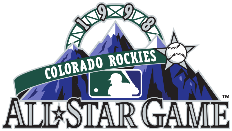
Well we have the rockies and their state connect uniform now we get the laa unveiling a
countystatistical MSA connect uniform. -
2 hours ago, Anubis2051 said:
The PED derby
 ...every guy in that photo was juicing.
-
 1
1
-
-
55 minutes ago, tohasbo said:
And with a few from the 2021 season now retired, it's nice to see some of the unneeded alternates taken out of circulation.
Now it'd be nice if the Dodgers retired their "Dodgers" gray alternate as I feel it is not even needed for themI would be fine if there were more protocols associated with alternates. The starting pitcher's choice is a horrible concept that needs to die but I think some consistent criteria such as interleague, day/night, inter/intra division. For example the dodgers script could be worn for divisional road games etc.
-
21 minutes ago, DouglasQuaid said:
Huge miss on the pants, looks like a sea shell neckless. They also should've went with a white facemask.
Hey these guys are hella-stoked about the pant stripe...

I don't mind it but it clashes with the helmet stripe...they need to pick one or the other.
-
 1
1
-
-
15 minutes ago, MJWalker45 said:
D3? Not so much but I'm sure we'll see more FCS teams getting a payday as a result of these schools kicking their bigger matchups down the road. Tennessee State and Jackson State are already getting a boost from Ohio State is playing a team 10 years from now that they should have played I believe five years ago when they first made the contract. It's insane. And they moved a game vs a FBS team next year to play . . . Youngstown State. I'm pretty sure Mount Union on their best day could give them a better game though.
Scrimmages masquerading as games. Crazy that alumni would put up with such garbage as part of their season ticket/donation package but I guess cfb is the end justifies the means...









/cdn.vox-cdn.com/uploads/chorus_asset/file/22424745/51638215.jpg)


/cdn.vox-cdn.com/uploads/chorus_asset/file/22706585/96802827.jpg)

NFL 2022 Changes
in Sports Logo News
Posted
Yep this should be their logo...it's timeless and harkens back to the jim brown era. Also I typically hate white masks but they are the superior choice for the browns.