


CreamSoda
-
Posts
2,741 -
Joined
-
Last visited
-
Days Won
9
Posts posted by CreamSoda
-
-
9 hours ago, Cujo said:
You don't have to throw out the "it would make a good alt" stuff.
The logo looks better than what they currently use. Period.
lol. Wrong. Way wrong.
-
 2
2
-
-
On 6/11/2023 at 1:32 PM, Cujo said:
Things the Canucks desperately need to get away from:

and
I love that logo.
agency font can go though
-
9
-
 1
1
-
 1
1
-
-
1 hour ago, TenaciousG said:
Can we all just agree that ads are out of control and need to be scaled back?
The teams have enough money, and Covid is mostly over so it’s no longer a valid excuse.
It's never going the other way, only more and more ads.
-
 1
1
-
-
Jets going back to their old school look? Replacing home with alternate sweater next year?
-
2 hours ago, Krudler said:
It's a travesty what've they've done to those sweaters. Such seemingly small changes causing such a major downgrade.
Yup.... just for no reason either...
-
6
-
-
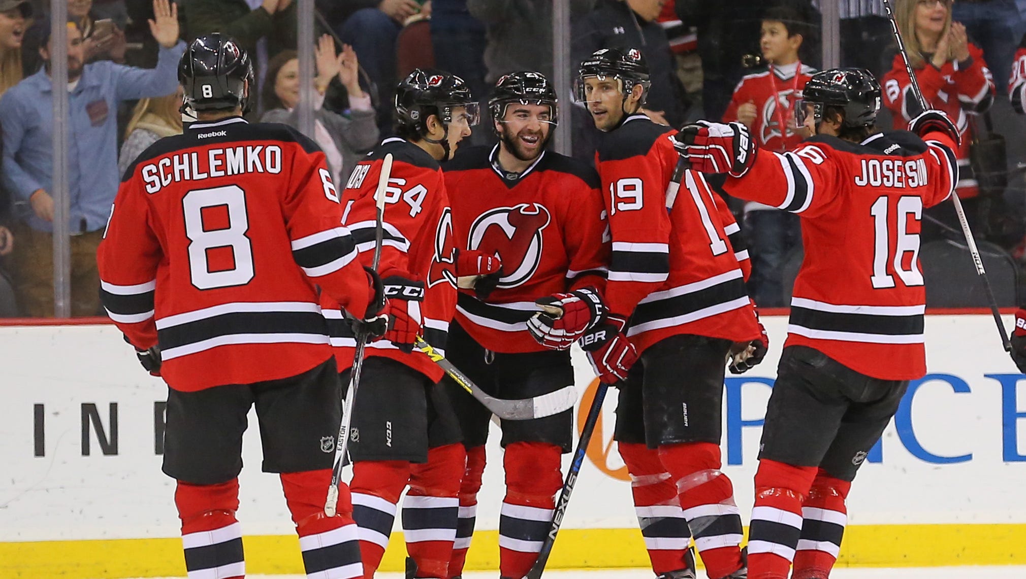
One of the biggest misses of late has been the Devils new sweaters.
it just looks so bad without the hem stripes and the super huge arm stripes.
what a downgrade from their classic uniform.
-
11
-
 1
1
-
-
Colorado was only favorited based off pedigree. They were too banged up to make a long run.
Edmonton and Toronto final is gonna be amazing.
-
1
-
 1
1
-
-
13 hours ago, Cujo said:
I'm sure this has been said 100000000 times, but would it hurt the Lightning to mix in some black? They're dressed as the Maple Leafs vs the actual Maple Leafs
It’s terrible watching the Leafs/Lightning series for this reason.
way too similar!!
-
4
-
-
I like em.
the away and black are the best.
-
1
-
-
Red Wings away whites vs Maple Leafs home blues may just be the best matchup in sports.
Two classic logos. Two classic uniforms with unique striping patterns. Perfect color balance and contrast.
-
1
-
-
6 minutes ago, WSU151 said:
According to our benevolent overlord on the mothership, the Flyers sweaters will look like 80s/90s with a lot of black stripped off and they're keeping the ridiculous contrasting nameplates....
Sounds dumb. Why get rid of the stripes , and keep the contrasting nameplate.
-
5
-
-
I am not a FAN of this news....
I guess I can just hope they don't muck with the actual designs too much....
-
6 hours ago, M4One said:
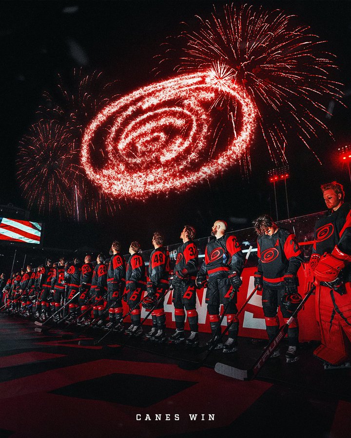
The sleeve numbers on the Hurricanes Stadium jersey were slanted because why not.
I would guess as a reference to NASCAR which is huge in NC-
3
-
-
Love it! The Merc just looks so much better in black. Even if it’s carbon…
the yellow looks better than the green accents/numbers.
-
2 minutes ago, See Red said:
I hope they stay silver since the grid is way too dark as-is and they're called the silver arrows. Although stripping their car and just having exposed carbon fiber would be appropriate too.
Already tired of exposed carbon fiber but the Ferrari looks very good. Love the Ferrari on the rear wing.
lol true. In a vaccuum the black livery was better. But this grid is really dark with the carbon fiber everywhere.
and agreed, the Ferrari word mark looks so good on the wing. Makes you wonder why it wasn’t there last year.
-
Looks like Merc is our last chance to do something different. I hope they go back to the black livery. At the very least hope they drop the highlighter yellow and bright blue accents for each driver.
-
You can add Aston Martin into the "same" as last year camp:
-
1
-
-
So far it's been pretty much the same liveries as last year. No one has really done anything dramatic.
Same:
Red Bull, McLaren, Williams, Aston Martin
Slight tweaks:
Alfa Romeo, Alpha Tauri
Changed:Haas
-
The logos are about twice as big as they need to be.
-
Something about the Alpha Tauri just doesn’t feel right. I can’t tell what it is either. I think it’s the front. I really like it from the profile view.
-
1
-
-
On 2/7/2023 at 9:59 AM, MJWalker45 said:
I was watching the AHL All Star Games on NHL Network last night. I like that each division had their own colors and I don't know why the NHL stopped doing that, especially with all of the colors that were available from the 1994 All Star game and the Florida Panther color schemes over the years.
I would hate to play a game where the colors are light gray and white...
-
1
-
-
5 hours ago, dont care said:
The black is still painted. The only black on there that isn’t painted are all the carbon fiber bits that wouldn’t be painted anyways
On the actual cars, I bet the black is just unpainted carbon fiber. Just look at the hi-res photos of the Alfa that See Red posted.
And the Haas is just a show car, there is no way they paint black carbon fiber with black paint on the actual car. It's black to reduce the car's weight.
-
The Alfa looks ok but it was much better with white instead to offer more contrast with the red.
Im pretty sure all the black liveries so far are just to cut down on the weight of additional paint.
-
Pretty disappointing releases so far. The RedBull is the same as always, and the Williams is just slightly tweaked. Although both are solid liveries so I guess no need to change it up too much.
-
1
-


/cdn.vox-cdn.com/uploads/chorus_asset/file/19744526/1084016366.jpg.jpg)


2023-24 NHL Jersey Changes
in Sports Logo News
Posted
Lol what’s the point here Philly