


CreamSoda
-
Posts
2,741 -
Joined
-
Last visited
-
Days Won
9
Posts posted by CreamSoda
-
-
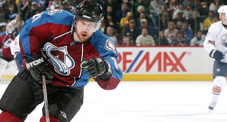
Oh god, its so so ugly. No way to treat the best forward in team history.
-
 2
2
-
-
On 7/9/2016 at 4:50 PM, daniel75 said:


This could be the new Chargers logo!
-
1
-
-
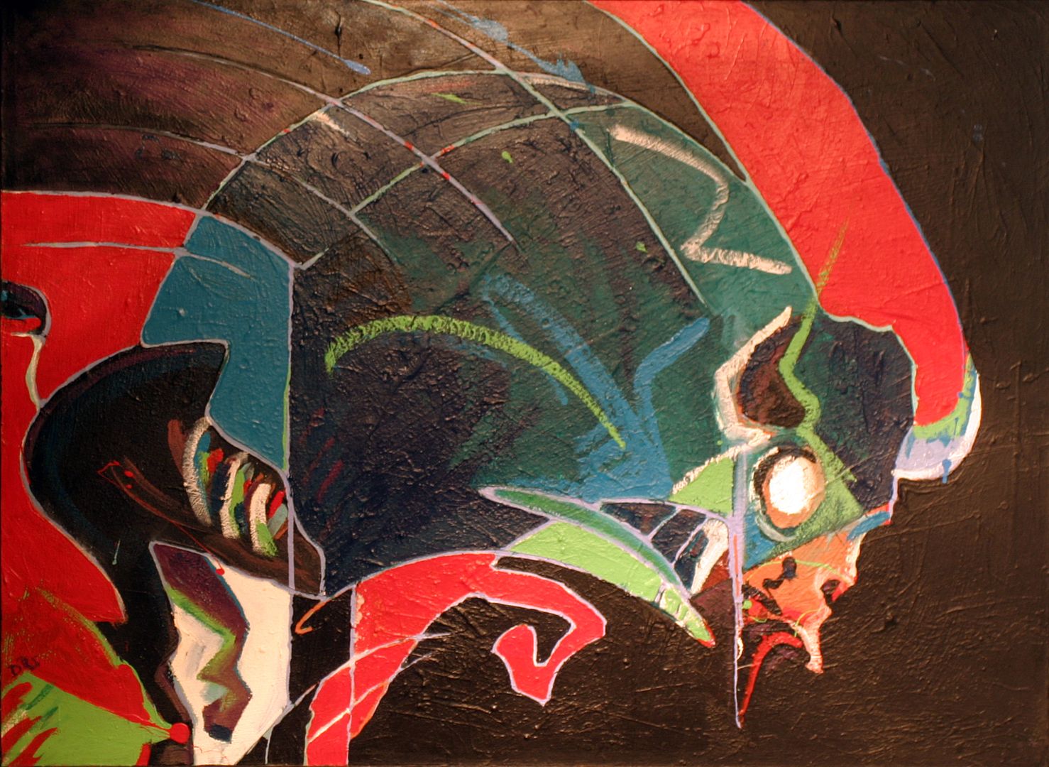
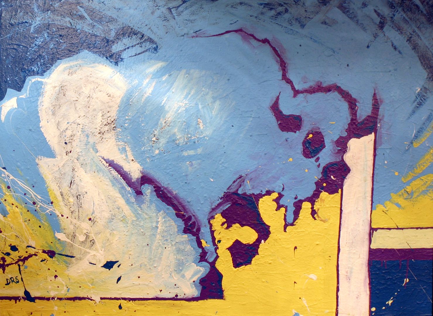
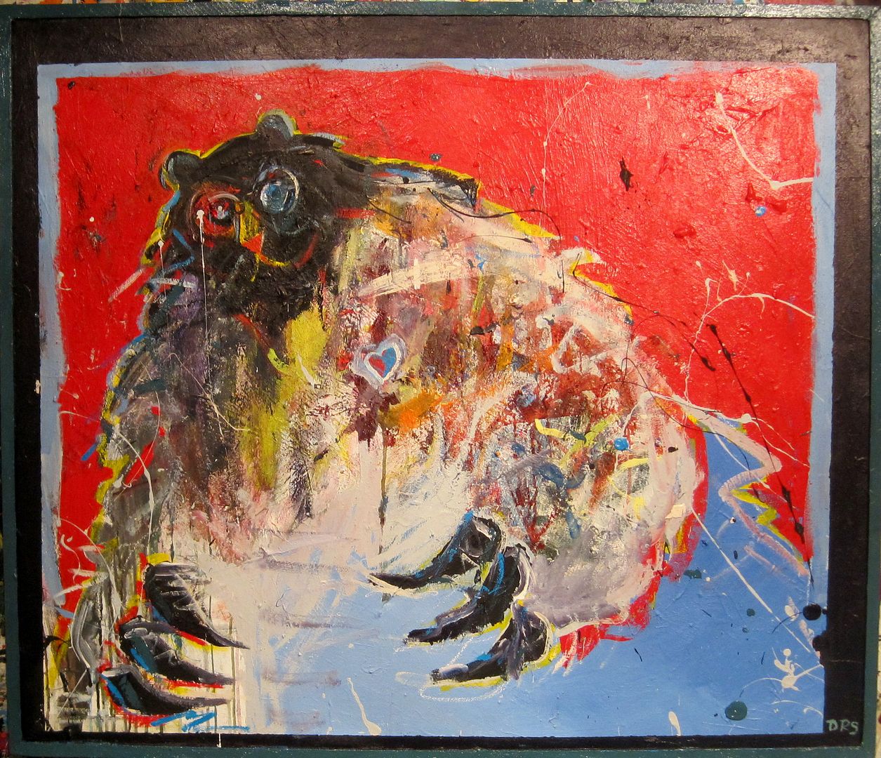
10 minutes ago, Mings said:
It's been a while, here's my latest. Based off a project my firm worked on, but pretty abstracted.

Are the blue square on the same plane as the rest? If so, very good job with the shading. The look to be lower than the green squares.
-
On 7/8/2016 at 9:16 AM, oldschoolvikings said:
Well, OK then...
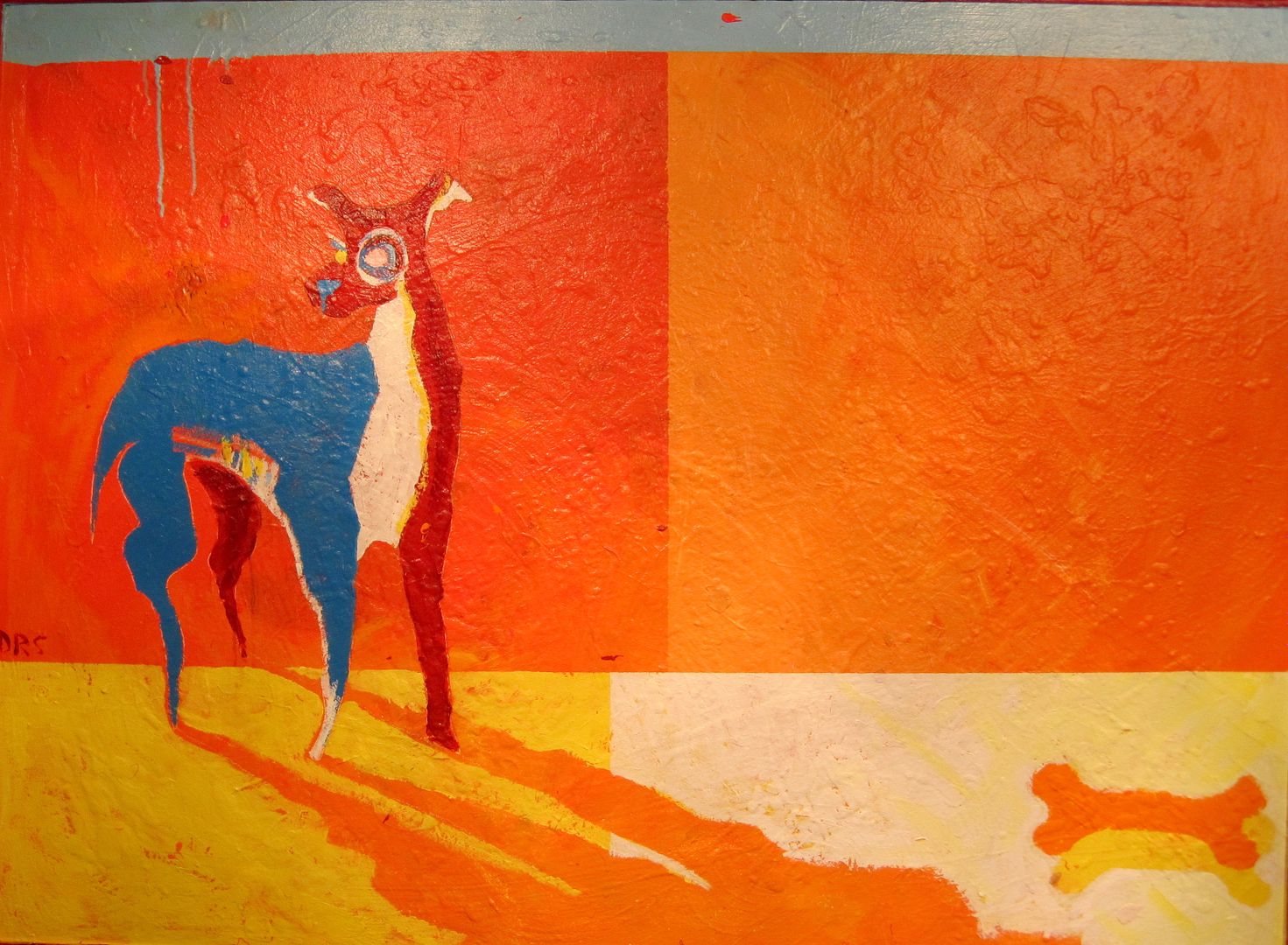
THOSE ARE AWESOME
Love that style, excellent work man. I would seriously hang that dog one up right now in my house.
-
2
-
-
Thought of an idea for an alt so I added it.
And, yes, I'm aware it looks like a Christmas sweater. Who doesn't love Christmas sweaters?
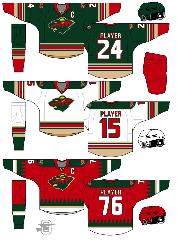
The alt is easily the best! I like it.
The home and away need about half as many stripes...
-
I like the iverson era 76ers uniforms better then their current ones.
I like the Gold wizards jersey.
I like the oilers pre edge jerseys the best, including the meteor alternate.
I think some NHL teams should incorporate brown into their uniforms more often (gloves, pants, helmets)
I think the mid 90's cavs template is the best.
It was an oil drop, not a meteor:

i stand corrected.
still a great look though.
As a fan of traditional jerseys, I thought these were actually pretty cool - as an alternate jersey. Something completely outside-the-box that's worn sparingly. What makes it super-awesome is the five rivets on the gear, symbolizing the Oilers' five Stanley Cup championships. Nicely done.
Those jerseys were what third jerseys were supposed to be. Completely different takes on a teams identity that utilized new concepts/colors/logos.
I was definitely a fan when they came out with those.
-
I HATE colored pants for ANY NFL team.
The away team should be in all white or very light grey/silver.
This:
is much nicer than this:

-
Dallas' home uniforms have the same striping pattern as the Rangers', not the Hawks'.
I think its a combo of both the Hawks and Rangers.
The arm striping, shoulders and pants are similar to the Hawks.
The hemline stripes are similar to the Rangers.
-
You couldn't even get the number font right. Just go away.
You need to get outside more often...
-
I bought a Fabregas #4 Arsenal Kit last year from China. Was it a counterfit? Probably. It has all the Nike Tags and EPL licenses, but for 20 bucks I assumed there was something not quite official about it.
It arrived quickly, looked great and had no mistakes. The correct font was used and the patches were accurate for both Arsenal and the Barclays side patch.
-
does anybody have the template that dgnmrwrw has been using in his NHL redesign?
I asked him but he never responded.
Thanks.
-
I have a printer asking me to put a 1/8" bleed all around on a poster I did for an organization that they are getting printed. The poster size is 11x17. Would it suffice to just to make the image size 11.125x17.125? I'm working in Illustrator by the way.
The odd thing is they want it as a PDF so it's not like they can see the bleed marks or anything since it isn't a AI or EPS file they are getting.
It seems in this case that increasing the image size proportionally by 1/8" of an inch on each side would make the most sense?
depends on the printer, and if they want the image to show to the end.
Some will still print a bleed no matter the image size.
-
that pen tool takes awhile to learn but makes illustrator so much easier!


Players on the "RIGHT" Team, but "WRONG" Uniform
in Sports Logo General Discussion
Posted
His GM days have ruined him! RUINED HIM!