


CreamSoda
-
Posts
2,741 -
Joined
-
Last visited
-
Days Won
9
Posts posted by CreamSoda
-
-
Just now, ebod39 said:
Yes, you can see the hem tag in the Flames/Kraken pic. Also, the Kraken don't have an older set of jersey to fall back on so, yes they kinda had to.
Thanks! That's what I figured but just thought I'd ask with the October 12th "release date"
-
 1
1
-
-
Are teams using the new plastic adidas sweaters in the preseason games? The press release said starting October 12th but that is likely just to call out the regular season.
-
Ok the Seattle aways look great under the Edmonton lights.
Such a cool, unique color combo.
-
5
-
-
The new crests, and shoulder patches, are awesome. Gives just a slight effect and really makes the jersey feel more valuable.
-
8
-
-
1 minute ago, NYRFan said:
here's how the first ever Kraken goal looked.
what color are the numbers supposed to be? From the tweeted photos of the scrimmage game they appeared to be the brightest blue, the largest/upper stripe.But the video you posted and on tv they look more like the bottom stripe.
-
1
-
-
5 minutes ago, WSU151 said:
They’re really easy to read for me.
White numbers on navy would have looked really bland.
you are 100% right. Watching on TV there is no issue whatsoever. They made the right call with the blue.
-
4
-
-
Probably the old arena and lightning but the Kraken sweaters look pretty dull in this game.
-
1
-
-
38 minutes ago, Ridleylash said:
Light-on-light numbers cause terrible readability issues like dark-on-dark numbers do.
yeah if anything I think the home numbers are gonna be hard to read. Would have liked those to be white -
Could be a cool look for Ottawa and they could own this color combo. Set themselves apart from New Jersey, Chicago, Carolina:

-
3
-
-
6 hours ago, habsfan1 said:
This a concept on Icethetics from an artist. Had they gone with something like this revised crest, it would have been amazing.
Yeah Ottawa really missed the mark by not having the black cuffs and black hem stripe on the white sweater. This just feels incomplete and the color balance is off compared to the above:
-
8
-
-
10 minutes ago, LMU said:
One thing has bugged me ever since they brought the Kachina look back as a throwback.
Would it have killed them to put "ARIZONA" on the moon patch? The Coyotes script is specifically shaped to accommodate text and the void there really sticks out.
Leaving it out in case they move and want to keep the sweaters and branding!
-
4
-
-
33 minutes ago, gosioux76 said:
I've been reading through this entire debate, and I keep going back to this concept. I'm sure I'm in the minority about this, but I really like it. It takes a minute, because I think embracing it requires reimagining the AVs as a burgundy-first brand, which they've never been, but certainly could be. I'm really coming around to the idea.
As @the admiral said, really fixing this issue would require blowing the whole thing up and starting over. I see this as meeting-halfway kind of response to that idea.
if they ever do another reverse retro program this would be an interesting look for Colorado.
-
1
-
-
11 minutes ago, monkeypower said:
so much better than their old away. Great move Arizona.-
3
-
-
-
18 minutes ago, Morgan33 said:
Just bring this back with the original shade of burgundy and the Foot. They got it right the first time.
The black gear looks so bad now. It made the whole uniform look cheap.
look at the white uniform above, there’s no black on it. Just some random black equipment that they found at a used hockey shop.
-
9
-
-
8 hours ago, the admiral said:
None of these attempts to fix the '96 Avs design are really working for me. It's really easy for me to accept all the flaws as products of their time. They're load-bearing flaws. If you want to fix them, you have to start over altogether.
An idea I have had is to combine the mountain hem stripes with the sock stripes replacing the sleeve mountain stripes. I think it helps add blue to the away sweater and keeps a good balance of the burgundy blue and gray throughout both home and away:
Or with burgundy gear and mountains:
-
5
-
-
16 minutes ago, dont care said:
What about the away uniform then, they would go from a primary blue team at home to primary burgundy team with no blue on the road
I know. Their current design is kinda mess. The blue gear works the best -
4 minutes ago, the admiral said:
None of these attempts to fix the '96 Avs design are really working for me. It's really easy for me to accept all the flaws as products of their time. They're load-bearing flaws. If you want to fix them, you have to start over altogether.
I agree. I think the blue equipment is better than the black at home but ideally they would have made widespread changes to the full set. -
11 hours ago, Ridleylash said:
By the "they're mountains" logic, white would make more sense than burgundy as the sleeve color on the home, since the Avs generally use snow-capped mountains as their iconography.
Also, burgundy sleeves on the dark jersey would've been pretty bland since then the only breaking of the burgundy would be on the hem;
This keeps the mountains burgundy, like it is in the logo itself. In addition it creates more contrast between the logo and the torso background.
Although I don't like the full uniform, the blue gear looks better to me:
-
5
-
-
1 hour ago, Ridleylash said:
By the "they're mountains" logic, white would make more sense than burgundy as the sleeve color on the home, since the Avs generally use snow-capped mountains as their iconography.
Also, burgundy sleeves on the dark jersey would've been pretty bland since then the only breaking of the burgundy would be on the hem;
the torso should have been blue with burgundy sleeves and hem-
1
-
-
no idea why Colorado just didn’t use burgundy sleeves on both the home and away. Would have made matching gear so much easier.
And you know, they are mountains. So why wouldn’t they be burgundy the whole time.
-
2
-
-
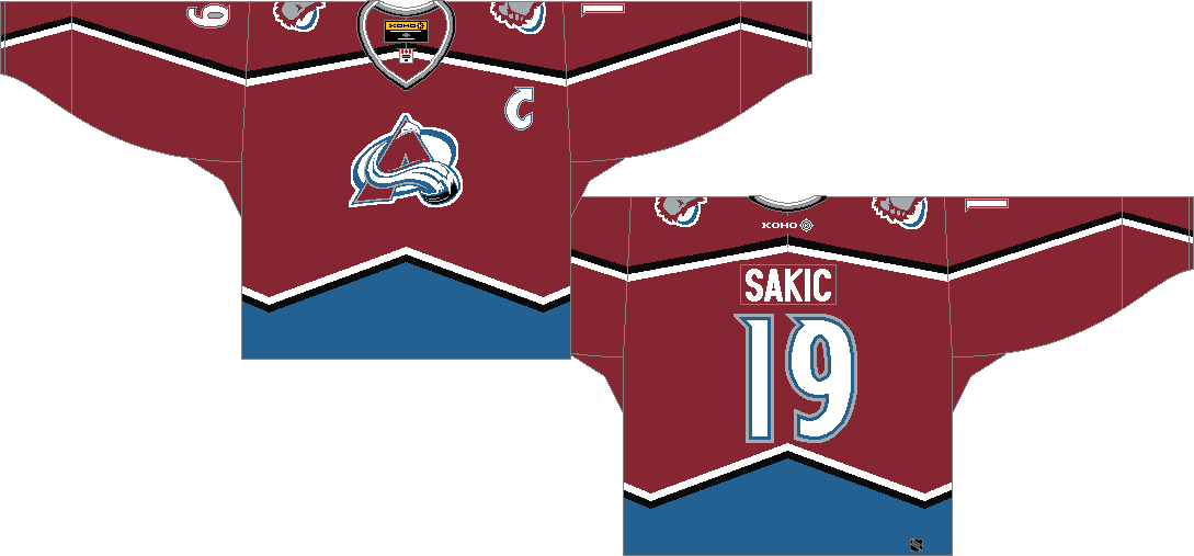
Hopefully the Avs just used cheap materials for the rookie camp games and we see numbers that better match for the regular uniform. This looks so much better:
So much better than the baby blue we saw during the Rookie Camp games. GIF to show the differences:
-
5
-
-
1 hour ago, Sport said:
Yeah I was going to say. When the Blue Jackets introduced the blue pants for the stupid red jerseys it opened the door for this. Prior to that it was always just a thought, but once the pants became real then I think we were all hoping they'd try it with the road uniforms. They waited until the last road game of the season, but I thought it looked pretty good and definitely better than the red pants with the white jerseys.
I would love to be the team that wears red pants at home and blue on the road. It solves two problems: 1. The red pants don't really feel like they belong with the white jerseys and socks and 2. Having home and road pants gives them a unique uniform quirk, which helps further set them apart from the other blue/red teams.
The BlueJackets can get away with this because their away sweater actually has blue as the dominate color with red accents. It works well to change to blue pants on the away uniform.
Colorado has almost NO BLUE on their away sweater. If they were to go with burgundy pants, it would be a burgundy and white uniform with a random blue stripe on the socks.
-
3
-
-
47 minutes ago, DTConcepts said:
This is the correct take. I'm not sure why everyone is so dead-set on only having one set of gear -- it's not an unusual or novel idea to have different home/away gear.
Tell that to the equipment managers and team staff.
-
2
-


2021-2022 NHL Jersey Changes
in Sports Logo News
Posted
Kinda like the TNT graphics.