


CreamSoda
-
Posts
2,741 -
Joined
-
Last visited
-
Days Won
9
Posts posted by CreamSoda
-
-
1 hour ago, andrewharrington said:
I came to a similar conclusion once their alternate uniform came out; pairing it down to burgundy, navy, and white is my favorite path. There’s something so fresh, crisp, and cold about this color scheme, and I totally think it would translate well to the home/road and logos. It evokes the concept of high altitude and snow much better than the medium blue and silver, in my opinion.
that uniform is too dark for me. I personally think it looks better with the slate blue.
-
 5
5
-
-
3 minutes ago, dont care said:
Wtf is that suppose to be?
its their recycled plastic material.
-
1
-
-
1 minute ago, WSU151 said:
Altitude Authentics is only showing the adidas authentics on sale. The replicas are still full price.
ahh my bad, I thought it was replicas too. The fact its just authentics probably just means a fabric change.
-
2
-
-
25 minutes ago, DiePerske said:
So, take this with all necessary grains of salt you wish.
I dont know if it's a new template, but what i've been told is that it's a new material coming out. Could it be just like the switch from Reebok 1.0 to 2.0? Quite possibly, but who knows.
Only source I can provide for the above is conversations with companies and people in the R/HJ sub and discord that I trust their info. So take what I say with that salt.
Hopefully they remove the waffle pattern on the shoulders.
-
3
-
-
1 hour ago, logo-maker said:
The Av's had a similar sale. My guess is that the teams are switching to a new Adidas jersey template (fixes to the collar, different material/cut).
Yup, 25% off every jersey. Authentic/replica, player or blank, home/away/third all of them are on sale.
-
I really do not like this new NBC score bug. The numbers are gigantic and the logos are weirdly faded.
Not to mention the weird diamond shape
-
1
-
-
4 hours ago, AFirestormToPurify said:
Looks alright on the home jerseys but it's really just a lateral move at best imo. On the away jersey the blue pants and glove look objectively awful, though lol
And we all know they're not gonna do any of that and the blue gear will keep looking out of place on the away jerseys. More than the black gear ever did
Strongly disagree. The aways are helped with the blue equipment-
2
-
-
I forgot how much I love that Seattle sweater and their overall branding. Just so good. Can't wait to watch them next season.
-
9
-
-
15 minutes ago, Nordiks_19 said:
Nope, they finally made the right move. The only thing they need to do now is add a blue line on the road jersey, and make the numbers blue
Exactly. They need to add more blue, not take it away.
-
6
-
-
12 hours ago, Cujo said:
Need the Avs to abort the blue helmets and jorts, go back to BFBSish
Nope, no way. The blue looks so much better.
-
6
-
-
Not a fan of the bug on the bottom. Find it very distracting for hockey
yikes. And the delayed penalty is just generically placed and doesn’t indicate which team got the penalty.
-
2
-
-
13 minutes ago, ColeJ said:
I made a big long post about that before.
My favorite is that the NFL added the Panthers and Jaguars in the same season, considering they are literally the same animal. A black panther is just a jaguar that is essentially only spots.
leopard-
1
-
-
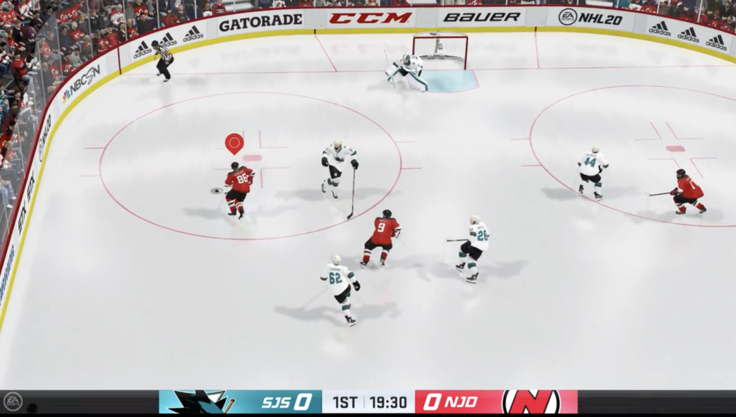
On 10/8/2019 at 1:29 PM, hannajon34 said:
Whats everyones opinion on this? NHL 20's score graphic is now at the bottom of the screen.
I am not a fan of this design.
- It's way too big with the black bar tacking up the whole screen.
- The information is not displayed consistently between the two teams. The Sharks go "SJS 0" and then the Devils go "0 NJD" but the slant on both is the same. Its very confusing visually.
- Not a fan of the period clock in the middle either.
-
1
-
-
I wish they would just use the premier leagues own package. Love that one.
Although this new NBC graphic is quite an improvement over last seasons!
-
I swear NBC has like 5 different version of the commercial break score bug... Last nights looked pretty solid.
-
10 hours ago, Mr. Krabs said:
I've been asking this question all season. It should come in October.
Its different from the Conference Semis.
-
NBCSN has different graphics for the score on commercial exits. Wonder when they update the whole package.
-
1
-
-
Is this new?
-
46 minutes ago, kroywen said:
Good lord, these MNF graphics on ESPN are hideous. Way too bright, reads very blurry from a distance, and commands way too much attention.
Whoever designed this didn't get the "flat graphics" memo from like, 8 years ago, did they?
It seriously made me think it was an XFL game. So bad.
-
1
-
-
ESPNs MNF graphics are awful. They look way too “extreme!!”
-
That light blue bg with white text has to be hard to read from a distance.... Not a great decision there.
-
1 hour ago, CitizenTino said:
THAT'S what that notch was? I thought it was just some sort of asymmetrical design, and it drove me nuts. Never noticed that it switched teams based on possession.
That was one of the first things I noticed, funny how that works.
-
I really like the Fox bug for baseball. Very clean, necessary info is large, and good secondary info.
-
14 hours ago, Walter Sobchak said:

Last time I saw the new Fox bug, they were keeping track of shots for both teams the whole game. In a large grey box beneath the score. Way too big and completely unnecessary.


2021-2022 NHL Jersey Changes
in Sports Logo News
Posted
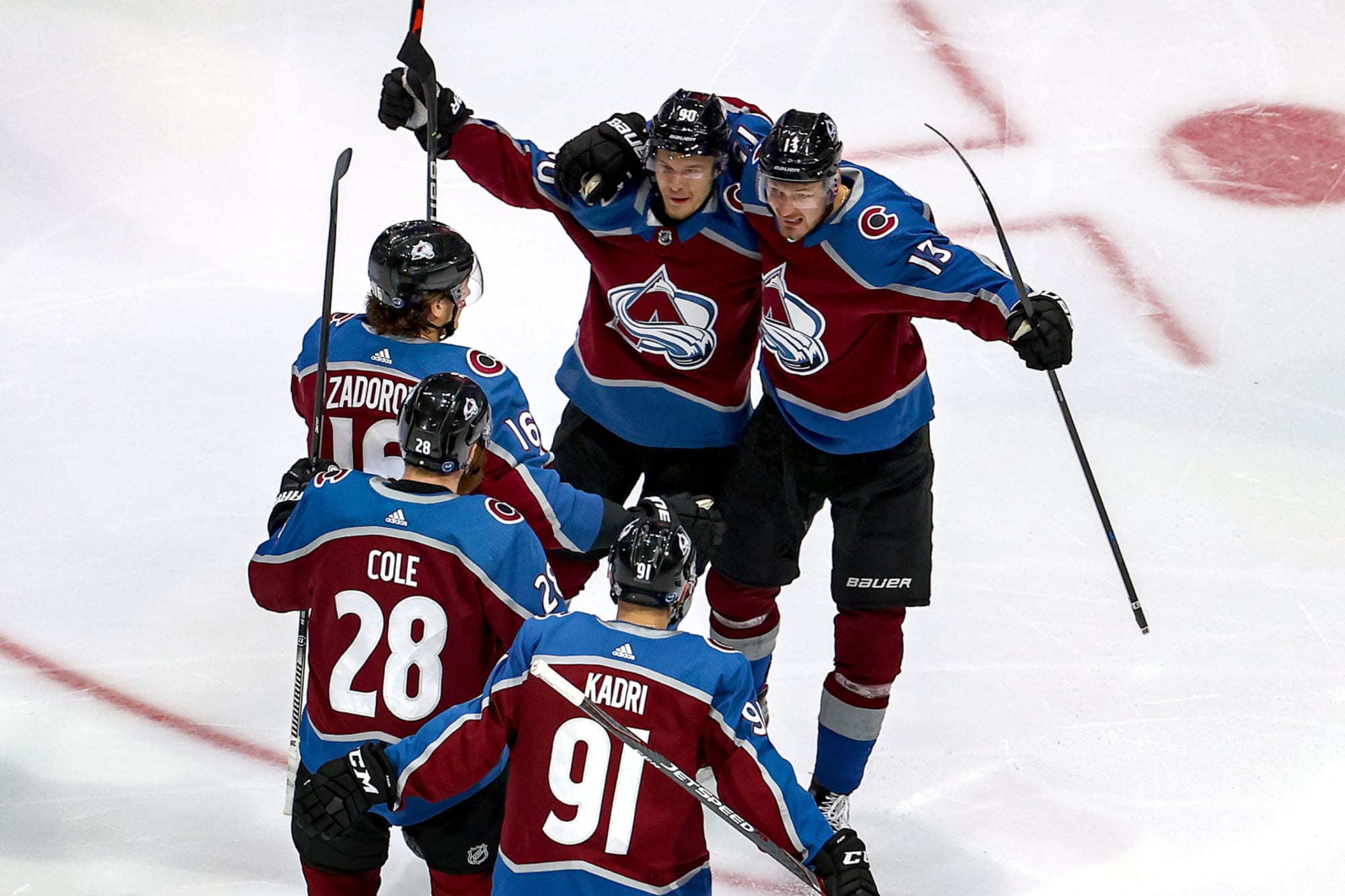
I always hated how dark Colorado looked with the black equipment. On the road they just had no color.
The lighter blue equipment really livens the whole look up. The Navy is just too dark and would have the same colorless feel as black did on TV.