


CreamSoda
-
Posts
2,741 -
Joined
-
Last visited
-
Days Won
9
Posts posted by CreamSoda
-
-
1 hour ago, SFGiants58 said:
I’d brighten the blue.
personally I’d darken the blue to navy and lighten the burgundy-
 2
2
-
-
Blue numbers confirmed for the Avs!
-
13
-
-
The Avs appear to have switched the helmet numbers to blue:
-
3
-
-
Appears to be a mainly green sweater.
-
5
-
-
1 hour ago, chcarlson23 said:
My best guess for this is that the darker cream section is part of the logo. I guess the other opinion is that it’s the numbers. Considering Michael Russo said that it’s a green jersey, I’m going to say this is part of a chest stripe. Maybe one that would go, Cream-Red-Cream-Red-Cream with the center stripe being the thickest.
Looks like a wheat roundel over the stripes to me.
-
1
-
-
I think the white outline helps Chicago but its also not as drastic as I first imagined. I think both sets looks good:

-
1
-
-
Chicago would look a lot better with a white outline between the red and black on their numbers.
-
1
-
-
6 minutes ago, spartacat_12 said:
The numbers have nothing to do with the template. You said the red & blue look like purple when they touch, so why isn't it a concern on the home numbers?
The Blackhawks jerseys avoid having black & red touch on the striping, but I wouldn't want to see a white inner outline on the away numbers.
Probably because the home numbers are white with a small blue outline. There isn't enough red and blue to really mix to create that purple illusion.
-
1
-
-
3 minutes ago, HopewellJones said:
And the French flag.
and the hem stripe
-
3
-
-
7 minutes ago, AFirestormToPurify said:
I think without the white between the blue numbers and red outline, the numbers look ugly and messy and the one element from older Habs jerseys that has aged poorly. It almost makes them look purple from a distance cause the red bleeds into the blue. It just stand outs in a bad way. Red and blue don't touch anywhere else on the jersey, why should they on the numbers? I personally think the current version of the Habs jersey is absolutely flawless. Including the rounded nameplate font, shade of red, laces on the neck and double outline on the numbers on the away jerseys. I wouldn't touch anything. I don't think it's the darker shade of red and double outline on the away jerseys that's the cause of our Cup drought lol
Messy:
Clean:
Yup! They need those white outlines. It also matches the logo with the white outline before the blue.
-
1
-
-
Thanks to @B-mer for the graphic. This is how the Avs should do their numbers. Blue and burgundy never touch and helps get rid of that bubble look on the home sweaters.
Away = white bg and blue numbers on back. Burgundy bg and white numbers on sleeves.Home = burgundy bg and white numbers on back. Blue bg and white numbers on sleeves.
-
15
-
-
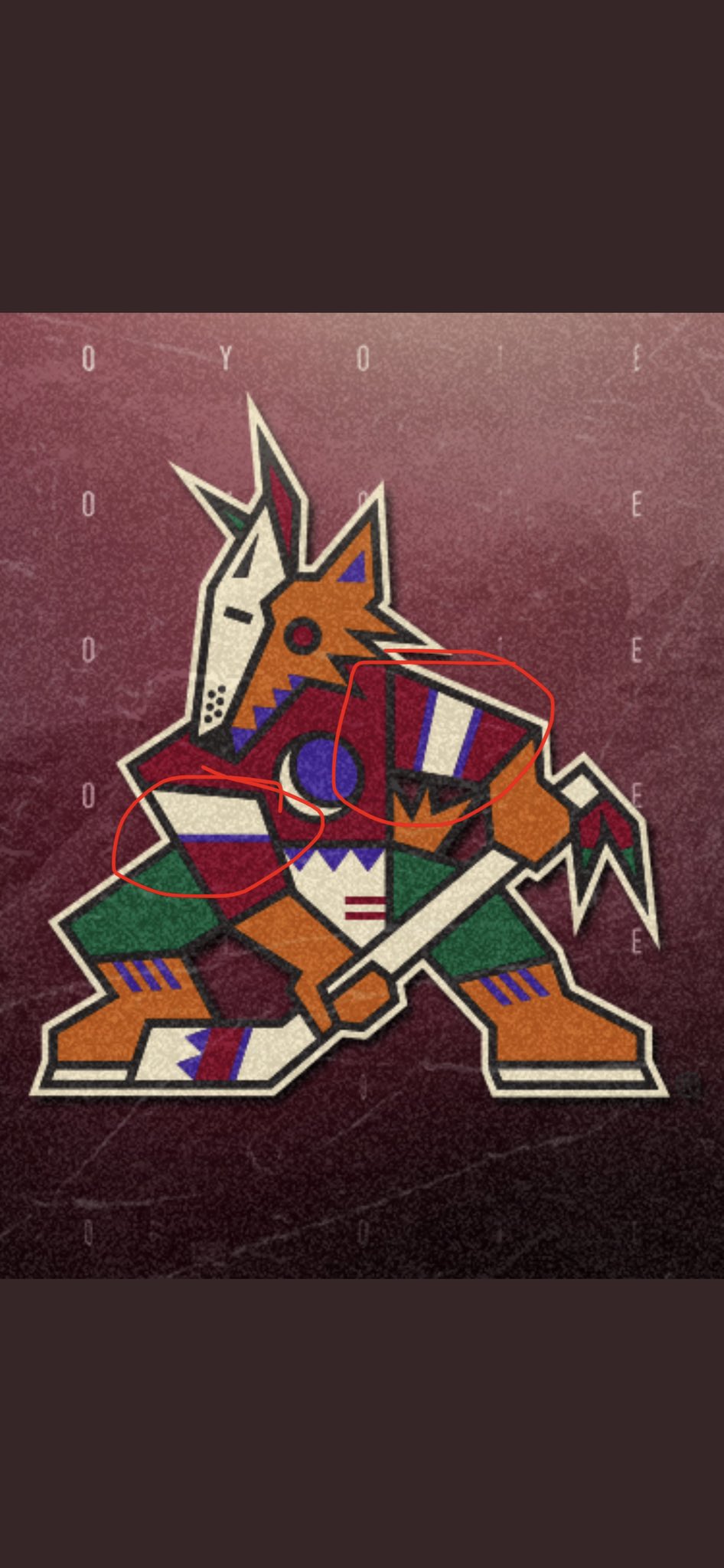
5 hours ago, TheRealPepman said:
What bothers me is the Coyotes are actually using the wrong logo. Check the second picture on the tweet above, the pattern of the right arm goes Black/Beige/Purple when really it should be Purple/Beige/Purple as seen on the other arm. Like this:
And the Yotes are using the wrong logo on their Twitter icon and banner as well. I'm surprised nobody on the team notices that. Talk about inconsistency on the arm stripes SMH.
One more thing: The logo isn't outlined well too as the tail and right leg don't have the Beige outline.
Its also missing the green top on the moon ear side. Only one of the ear parts has that green tip when they both should.-
1
-
-
14 hours ago, B-mer said:
I wanted to ask this question of the board regarding the Avs numbers. With the updated look they've been called cleaner, but also seen some complain about the blue touching the burgundy on the sleeves. I had a couple thoughts but wasn't sure if this is a backwards move.
Here is the new font, with double stroke like the old (still with black for this discussion).
Also, here is the new font with points added back to the 0, 6, 8, and 9 to be similar to the original font.
Would any of this have helped move away from a 90's look? Lateral or no difference? Just toying with ideas. I guess part of my question is what part of the original numbers makes them dated? The design or the double stroke?
Top row without the notches. But make the numbers blue with a gray and then burgundy outline.
-
1
-
-
Ugh, so dumb. So sick of ads everywhere, but I thought the sweaters were safe....
-
5
-
-
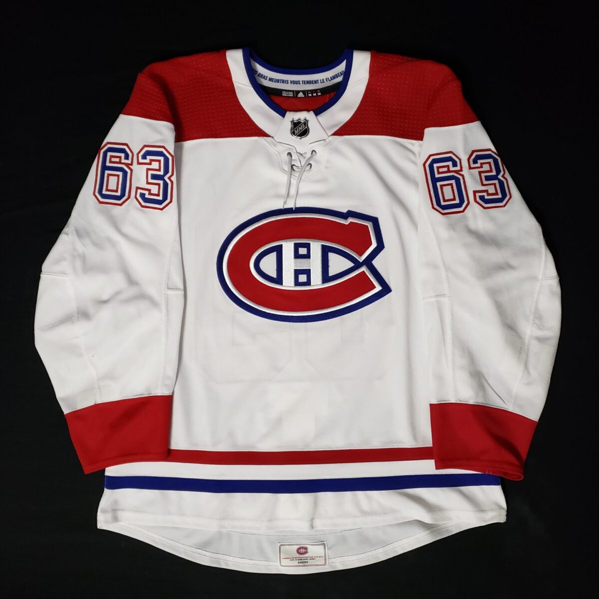
Colorado is switching to blue numbers on the aways. And changing the name to burgundy. Finally ditched the unnecessary black on the uniform!
-
16
-
-
36 minutes ago, Ridleylash said:
My guess is that the Devils and LA are just replacing their current alts with their Reverse Retros. Maybe the Pens are doing the same. Jets...maybe a 90's throwback?
We have word that its just a retail line of jerseys, not an on ice sweater.
-
Why does Italy have to be in all white versus an all red Belgium...
Blue would look so much better for Italy in this match
-
1
-
-
The Avs store is now selling their replica home jerseys for 50% off.
No idea if this is normal or trying to clear inventory.
-
1
-
-
France looked exactly like they played today.... all blue
-
Croatia in black and Spain in all white looks wrong and bad.
-
2
-
-
The owners don't want to give up a revenue stream? Theres a shocker....
Have I gotten used to helmet ads? Yes. Do I like them? Hell no.
Will this alter my viewing of the NHL product? nope.
-
15
-
-
3 hours ago, ManillaToad said:
We will never see the Kraken's uniforms without corporate advertising
Maybe Kraken Rum will step up and deliver for us. -
10 minutes ago, logo-maker said:
Add a hem strip and take away the black 'pit stains' and I would easily add this to my collection of Av's jerseys (FWIW that jersey was nicknames the 'blueberries' by Avs fans).
it was so much better than the unipron look.
-
2
-
-
7 hours ago, nash61 said:
Not sure if this is in agreement or sarcasm, but I personally loved that uniform.
-
1
-


2021-2022 NHL Jersey Changes
in Sports Logo News
Posted
Not sure why the gloves have a white trim. They should have made that gray to help balance that color out more: