


Ted Cunningham
-
Posts
1,286 -
Joined
-
Last visited
Posts posted by Ted Cunningham
-
-
No pic just yet, but Modano is said to have accepted an offer for a one year deal with the Red Wings. I just can't imagine him not wearing Green and yellow/gold
Correct me if I'm wrong, but Modano hasn't worn a green or gold jersey in ages.
He didn't say the jersey was green or gold. Nitpick fail.
How silly of me to assume he meant Dallas' undetectable green and gold trim. Nitpick fail nitpicker.
You didn't think maybe he was referring to the main team colors he's worn for 20 years?
Are these green? With yellow/gold on them? I can't tell.

They look red to me. Also, and unrelated, I didn't know Joel McHale was a hockey fan (over his shoulder).
-
This is what I have. I'm not convinced this is 100% accurate but it should be a good starting point.
Ah! Tres bon; merci!
Does it have a name?
-
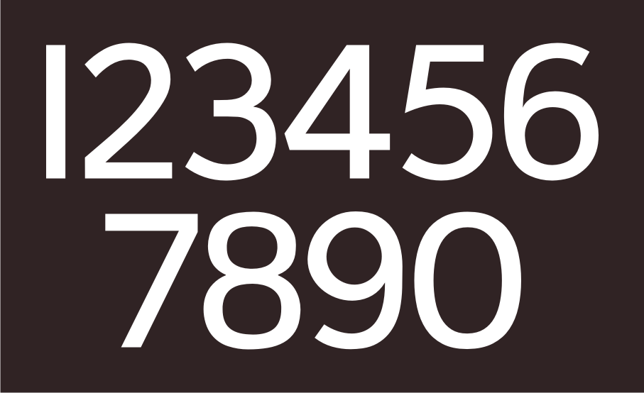
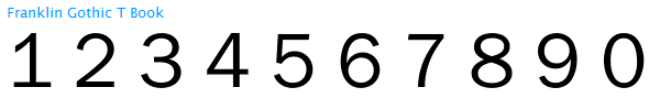
What is the font name of the numerals the Broncos used on their helmets this afternoon?
I'd venture it's something in the Franklin Gothic family, with the capital I used in place of the 1.
I'm going to disagree with you there, unless it's a very specific modification of a Franklin Gothic face. Seeing the Broncos playing the Chargers on Monday night renewed my interest in this specific font.
Franklin Gothic Book appears to be the closest version (in weight) to what the helmet font looks like. However there are several differences.
Franklin Gothic Book:
The Helmet Font (1, 2, 3, 5):
(8):
(7):
Besides the difference you pointed out (the 1), the 3 and 5 are noticeably different, and the 8 appears to be two overlapping circles (one on the other) as opposed to a firgure-8 like Franklin Gothic's. Also, on the helmets, the stroke weight for the numbers appears to be even throughout the whole of each character, whereas with Franklin, the weights differ here and there (6 and 9 for instance.) Plus, not pictured is (found a picture) the number 7 which is also a fairly striking difference: the helmet 7 is two straight lines. The larger portion of the Franklin 7 is curved like Helvetica.
I've been keeping an eye out for this typeface for a long time. Does anyone have it or a lead as to where I could get it? (Or even rasters of each of the numbers so that I could trace them in Illustrator?)
-
-
Does anyone have or know of a typeface that's similar to this one? I've always liked the look of an extremely wide, serifed font like that. It's quite 60's.
Looks alot like 58 Rodeo ($24): http://new.myfonts.com/fonts/baselinefonts/58-rodeo/
Mucho gracias!
-

Does anyone have or know of a typeface that's similar to this one? I've always liked the look of an extremely wide, serifed font like that. It's quite 60's.
-
Does anyone have the SOD template?

Going off of that, does anyone have a copy of that set of numbers in vector? (It's a variation of NCAA Gothic, right?)
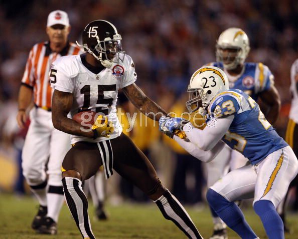
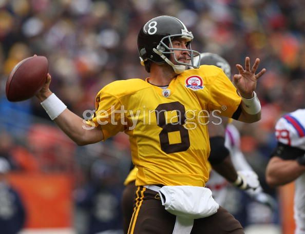
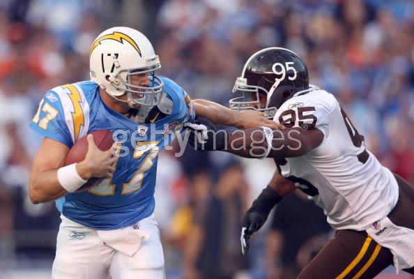
Players in the "wrong" uniforms
in Sports Logo General Discussion
Posted
What I liked even better was that, though I have no specific recollection of him being in one, Keyshawn Johnson in a Panthers uniform wasn't surprising to me.