


Ted Cunningham
-
Posts
1,286 -
Joined
-
Last visited
Posts posted by Ted Cunningham
-
-
4 hours ago, HOOVER said:
I would be shouting from the rooftops how good the Renegades looked if they were just wearing their XFL 2.0 helmets.
We need someone to photoshop the old helmet onto the new uniform.
It's rough, but it conveys the idea.
-
 2
2
-
 3
3
-
-
13 minutes ago, oldschoolvikings said:
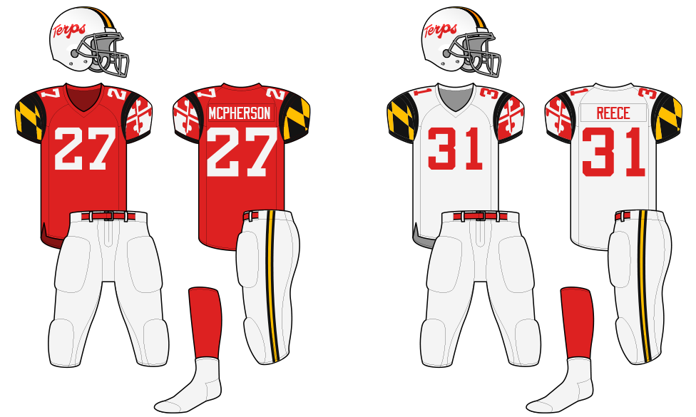
But, check out this beaut from 1970...
I applaud Maryland for going through so many iterations of their uniforms combining red, white, black, and gold. And I am generally on the side of using the flag motif, as they are the flagship state university (so why not) and Maryland's flag is memorable and popular. But the helmet design shown above highlights something that I think Maryland has done fairly well when they've employed it: using two pairs of colors somewhat separately and in parallel.
This is the ideal example of this concept: black and gold elements on the helmet and pants, red and white on the jersey (and if they had socks, red and white could carry to the socks as well). I really like this tandem approach. It employs all four colors without becoming overly busy (e.g. multiple outlines on the numbers just to fit three of the four colors in, etc.).
My ideal Maryland uniform would employ the state flag imagery, the general idea of running these color pairs in tandem, and the Terps script. (Typing all that makes me realize how dumb the idea sounds, but I think execution works):
-
5
-
1
-
-
On 3/1/2023 at 9:42 AM, Volt said:
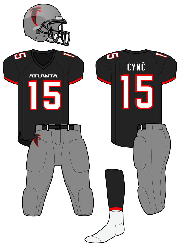
Speaking of Colorado...their Dark Steel Grey helmets over Black jersey & Grey pants are just a beautiful, beautiful combination. I still can't believe the Falcons didn't do this:
Imagine the Falcons logo on that helmet. Red accents on the uniform. Red outlines on the numbers. Uniform would be too similar to the better football team in Georgia, I guess:
Interestingly enough, this exact thought was posited back before the Falcons' latest rebrand was revealed, and I mocked it up in that discussion:
-
2
-
 1
1
-
-
I've watched significant parts of (if not all of) all five games so far. While the viewership numbers and lack of vision don't seem great for the league's long-term viability, the games have been entertaining. I'm not sure what the metrics are for sustained success as far as return on investment, viewership, and so on, but if the parity remains the same and the games stay close, this is fairly easy football to watch.
-
1 hour ago, GFB said:
I just realized that the nostril(?) of the skull is a spade
Same. I've seen that logo several times, and the first time I saw it was when I responded to Cujo an hour or two ago.
-
2
-
-
While I'm sure there isn't hard data to back up any claims of which identities were most memorable, I think @Cujo makes a great point at least based on anecdotes and memory: The Las Vegas Outlaws identity is likely the most recognizable identity from the first iteration of the XFL if for no other reason than Rod Smart's HE HATE ME jersey. When I think XFL1, that's what I think of: that name and the colors black, red, and gold.
-
3
-
1
-
-
On 1/30/2023 at 4:30 PM, CaliforniaGlowin said:
New mono powder blues for USCB
These posts are excellent examples of the differences between using script typefaces (Beaufort and Wright State) and an intentionally designed script (Nebraska). Those Nebraska jerseys are class.
Also, why is Wright State's no. 6 wearing different socks than everyone else?
-
22 hours ago, mafiaman said:
Dolphins full-time throwbacks? I’d even settle for the current set with darker teal and more-orange orange. Oh, and block numbers.
Interesting how these opinions fall: I agree that the throwback look is better than the current one. But if a blend would be on the table, I'd take the throwback set in the current colors. That shade of aqua, especially in the sun, is unbeatable.
-
2
-
-
23 hours ago, walkerws said:
Probably because they're the fan replicas.
Ohhhhhh. Details are important. (Haha.)
Even with that, though, I think I stand by what I said: Kind of generic/out of the catalog style.
-
1
-
-
All of those jerseys just look kind of like knock-offs, somehow. I don't even really hate the designs. But they just look off-brand, somehow; like uniforms for a semi-pro league or something, made by a local manufacturer.
-
2
-
-
4 minutes ago, radchad said:
Wow. Basically everything Nike did with Cal was bad and/or a garish example of the trends of the times. (Though I was reading through various tweets and saw that someone said the Denver/WVU/swooshy design in 03 was actually Nike's take on Adidas's version from 02? So perhaps characterizing at least the first part of Nike's designs to be as much about trends would be better than just saying they were flat bad on their own.)
That brings me to a related but much broader, general point: I think my least favorite era of uniforms, generally, is the 2000s. There were a lot of designs that I feel like came about simply because the technology existed to execute them. That, coupled with a trend toward adding navy or black to every color palette (or just generally darkening existing colors) and the equipment itself (pads, helmets) being clunky and still overly big, but not in a sturdy, classic 70s/80s kind of way really made football aesthetics in the 2000s bad.
-
3
-
-
I feel like the test here is whether it can be identified as what the rights-holder claims it is, and that was my first impression: Hey, that's the old Cleveland C with a lightning bolt on it. And while I know we talk about how, collectively, we on the boards notice things that people not plugged into our interests wouldn't notice. But MLB cap logos are an exception; that's arguably one of the most recognizable sets of logos out there. So many people would likely recognize it as the old Cleveland C.
And then as you all pointed out, this guy is pretty obviously ripping off other marks as well. I'm not sure if he heard somewhere the old tale about "Well, if you change the logo 20%, then it can't be infringement" or whatever, or if he otherwise just thinks he's the smartest guy in the business and thought he could get away with it or what.
-
4 hours ago, lahaye7 said:
wonder if they could go with drop shadows on these?
I think one thing I really like about the UNC throwbacks is the contrast between the navy and columbia (carolina?) blues. And one treatment on the throwbacks that really brings that out is how thick some of the navy stripes/accents are. QB sleeve-weirdness aside, the thicker stripes and the drop shadow (as opposed to just a run-of-the-mill keyline around each number) help bring out that contrast in a way that's both pleasing and non-intrusive.
-
4
-
-
3 hours ago, _RH_ said:
As much as I love the Oilers set aesthetically, it doesn't sound like Tennessee will let that happen for Houston.
I must be in the minority, but think the Texans look good. Good colors, good logo, good font. I'd hate for them to blow that up for the newest trend that fans ask for. They just need to always separate the blue from red with white (shoulder shape, pant stripes). I'm not a fan of mono looks, and the red jersey next to blue pants look off to me. It's funny though, the blue pants next to red socks are ok to me
These two jerseys as an away/home combo come off as very WFL or something similar with the darkest color for the pants, and the bottom half of the combinations being the same between the two. And that's not necessarily a bad thing. (Specifically, I'm thinking of the Florida Blazers of the WFL; a fairly similar look.)
Really, at this point, I just hope for a difference in pants and jersey colors (except for white over white, which really doesn't bother me; that's just how away uniforms work sometimes).
-
6 minutes ago, the admiral said:
I'm ready for them to do all these things at once.
That's where it's headed, I'm sure.
-
23 hours ago, gothedistance said:
This was the only other time where the Packers were in white jerseys and Dolphins in aqua jerseys. The 1971 game.
The 2022 meeting that took place was the second time.
And I would argue (perhaps unpopularly) that the 2022 iteration looked better than the 1971 game, at least from a match-up standpoint. And that's all down to the brighter aqua the Dolphins use now.
An aside: If the Dolphins go back to a throwback look, they should keep the current aqua.
-
6
-
 3
3
-
-
32 minutes ago, Cujo said:
Was a nice reveal right up until the end.

I thought the same thing. It was jarring. Something along the lines of "Oh yeah, what a terrible organization. I can't even be interested in this game with that happening."
-
3
-
-
6 hours ago, Jezus_Ghoti said:
Florio has been going on about how he thinks the Vikings will unveil a surprise white helmet for their whiteout game, but this seems exceptionally unlikely to me. The NFL put out an announcement before the season detailing all the new alternate helmets, and teams need to practice in them to break them in. It would be basically impossible to keep them under wraps.
Unless they literally put them under some (cheap) purple wraps? (I don't know how labor-intensive that process would be just to keep a white helmet quiet. But that'd be one way to keep it secret I guess?)
-
6 hours ago, VDizzle12 said:
It's comical watching footage from the 90s and thinking the types of things we complain about here.
When players were running around looking like this:
Lots of exposed abs, super baggy undershirts, giant pads and huge goofy facemasks for QBs.
YEP. Football uniforms in the 80s, especially (though I get where you're coming from with the 90s too) were so clunky. It may be an unpopular opinion, but I would take at least the form factor of modern uniforms over anything worn in the history of football. Even with the truncated sleeves and weird/non-smooth helmets; the players just look faster or better able to move or something, as opposed to wearing suits of armor under their jerseys. Ha.
(Now, to be clear, I really like the uniform designs of the early 90s, and would prefer them on modern templates over much of what is around now, but that is purely for the sake of nostalgia, not because I think they're better designs, necessarily.)
-
3
-
-
11 hours ago, Est1980 said:
I noticed this with the Saints. I know that most teams have probably shrunk their logos but the Fleur-de-lis, to me, always stood out as having shrunk in size since I started watching.
I believe they have shrunk the size of the physical decal/logo itself, for sure. We'd likely have to compare game-used helmets to confirm that, though. However, two other things likely contribute to that: 1) If I'm not mistaken, today's helmets are bigger and with limited space to place the logos (given the various gaps and openings the helmets have now) and 2) (and more importantly, I think), the logo now has like 39 keylines whereas before it only had one. So even if the physical logos are the same size (e.g. each decal is 4" tall or whatever), the actual fleur de lis is smaller because the rest of the space is taken up by the 91 outlines. (OK, I know, it's only three, or two with one being offset. But still, it's more than necessary; it was an excellent logo with just the white outline.)
-
3
-
-
2 minutes ago, LA Fakers+ LA Snippers said:
What if the Lions replaced black with the dark grey they use now?
I still feel like that translates as black, even though, after looking at it for a minute, it's obviously not black. But it really took me a few seconds to even register that the color had changed.
Essentially, I don't think it makes a difference if that color is dark grey or black; it doesn't change the over all look of the uniform. It's an additional non-blue dark color added to a color combination that, some years earlier, had only been Honolulu blue, silver, and white. It's a lateral move within the context of that uniform (and the iteration that came before it).
-
3
-
-
13 minutes ago, Volt said:
Anyone else dislike the Panthers’ black helmets?
I do not like at all. Their silver helmet is just so much nicer. Hard to even decipher the logo on the black helmet and the stripes don’t jive with the uniform stripes in any way.
Two good points there: It really is hard to see the logo for what it is on a black background with no keyline. While that might be "cool" or trendy to treat it the way they did (kind of in a Boise State/Western Michigan/other oversized logo treatments in one color kind of way), it just looks like some blue splashed on a black background. And then yes, the stripes don't work either because of the way they look on the uniforms: The shoulder stripes are silver-blue-silver, and the helmet, when viewed from the front, looks to have roughly the same width on the stripes, but it's blue-black (essentially, by merit of there being no stripe in the middle)-blue. So it doesn't fit.
I think, in theory, a black helmet could work for the Panthers, but it would have to follow the same design choices as their black jerseys.
-
4
-
-
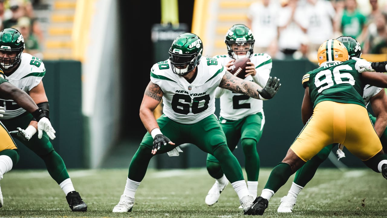
28 minutes ago, GFB said:
The thing I‘ll never understand about the current Jets look is that they built the entire new uniform around the “>” shape, but left out the 80s logo that would ties the entire concept together.
YEP.
The only thing that doesn't make sense is keeping a form of the wordmark from the old/60s set.
-
2
-
-
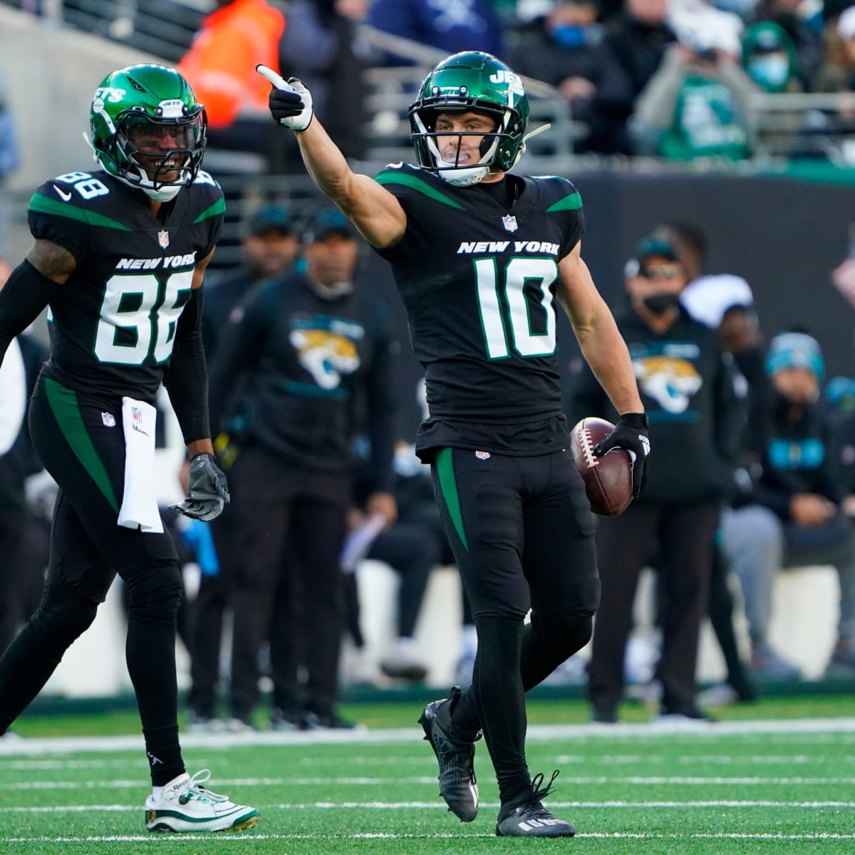
46 minutes ago, tBBP said:
Since it appears the Jetjack is in full effect...
...I can't even believe I'm about to post this, but:
I'm legitimately amazed and thus cannot believe how much these uniforms have grown on me! Granted, much of it has to do with the color green, but for what these are, they're actually really solid. I can even deal the green-on-green look, as well. But only these combinations.
This, however, can get gone:
(Along with the white-on-black they've been doing the past three weeks...that can get gone, too.)
I'm there with you. While I would still advocate for a combination of the 60s and 80s looks (or really their current green helmet with the 80s/90s logo on the 60s-style striped-up uniforms), the current uniform is not bad, per se when none of the elements are black and there's contrast between the elements. (Yes, that's a lot of caveats, but this is my long-winded way of agreeing with you: they aren't terrible uniforms when worn properly.)
-
2
-


/cdn.vox-cdn.com/uploads/chorus_asset/file/22847291/1339887704.jpg)
/cdn.vox-cdn.com/uploads/chorus_asset/file/23942628/usa_today_18862277.jpg)


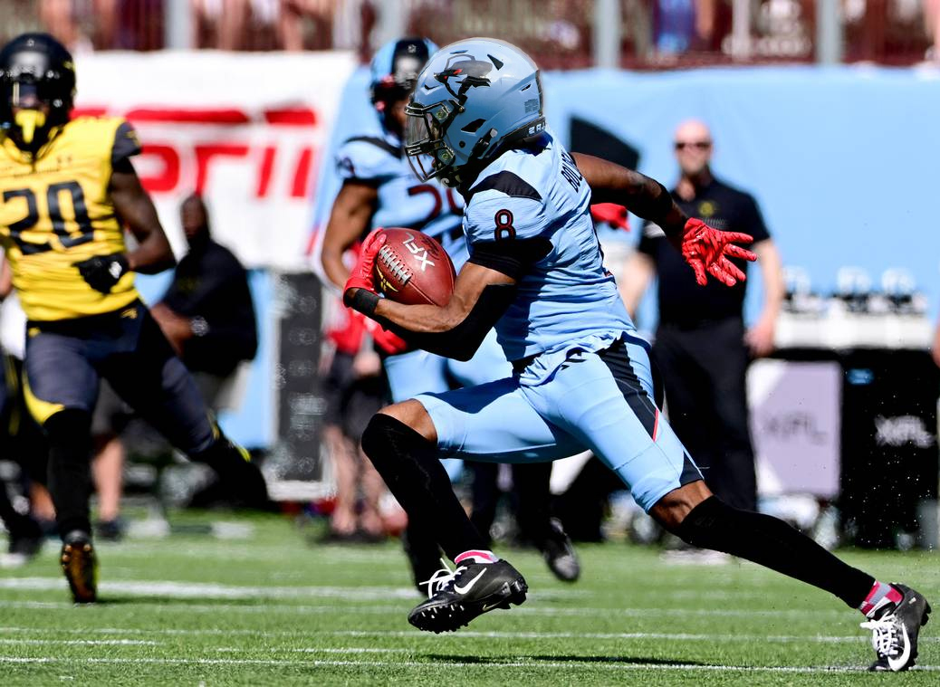
XFL 2023 Logos, Names and Uniforms
in Sports Logo News
Posted
Though if they want to stick with the R/D/whatever letter logo, I think they could fix the helmet to better fit the overall look of their XFL 3.0 uniforms. Just make the logo black and add the thin red stripe to both the helmet stripe and the logo.