


Ted Cunningham
-
Posts
1,286 -
Joined
-
Last visited
Posts posted by Ted Cunningham
-
-
I believe the Mets or Pirates did this at one point for the surname "d'Arnaud". Just flipped a P. It was a bit more effective for that name because there was no E.
-
 1
1
-
-
6 hours ago, JTernup said:
Something good could still be improved. In life perfect can be the enemy of good, but in uniform design we shouldn't settle for good when perfect is attainable. I think the above mockup is just an objectively better and more cohesive uniform than what Ole Miss took the field in yesterday.
To preface: this isn't an attack directed at you, JTernup. It's simply a counterargument to the views you expressed here.
1) "In life, perfect can be the enemy of good, but in uniform design we shouldn't settle for good when perfect is attainable" This seems contradictory to me, unless you mean to extract uniform design from life generally. If perfect has the potential to work against good, then why would one work to attain perfect at the potential cost of good? (I'll come back to this in a moment.)
2) While the mock-up arguably presents better color balance between the three main uniform elements (which could make it a better uniform in your opinion [I don't think we can say "objectively better" simply because aesthetics rely so heavily on personal taste]), it also deviates from those elements that make Ole Miss look like Ole Miss. Adding another color between the white shoulder hoops is the big one there. Ole Miss football, generally, has had double white shoulder stripes on its color/home jerseys. Yes, there are examples of them with other stripes, but the most identifiable and most used look is the double white shoulder stripes (be that on navy, red, or even powder blue). As for the particular uniform yesterday, the white pants definitely changed the look, arguably, more drastically than the change in jersey color. But because the general idea behind the jersey remained the same, Ole Miss still looked like Ole Miss.
I think this is interesting because it gets at a discussion we come back to on these boards from time to time: thinking of the appeal and attractiveness of an identity "in a vacuum" vs. in the context of the look in a team's history (be that context based on success in that uniform, longevity of the look, etc.). The former, "in a vacuum", is "perfect" as you've described above. Sure, a perfect look, applying all of the "generally accepted axioms of good uniform design" (which don't necessarily have to be explicit, but stuff like "color balance", mirrored elements between home and away uniforms, symmetry, etc.) could be attained for every team. However, that ignores the other elements that factor into why identities are successful or "good": identifiability, nostalgia, success, longevity, or simply because it looks cool even if it goes against one of those axioms of good design. In an effort to attain perfect, what makes identities like Ole Miss's good, can get stripped away. For example, adding red between the white shoulder stripes takes away from a key identifying feature of Ole Miss's football uniforms. They also look like Louisiana Tech in the mock-up. The mock-up doesn't have that quintessential Ole Miss look, even if it has arguably better color balance.
The look could be improved, but without respect to the context in which the uniform exists and why it looks like it does, it wouldn't be Ole Miss because it doesn't have those characteristics that are tied to Ole Miss's football identity.
(As for my own opinion on the uniforms they wore this past Saturday, some others pointed it out above: the regular grey pants would have made more sense. Rough Photoshop:)

-
3 hours ago, mgdmhl said:
(any reason to post this image)
Nice.
-
10 hours ago, WavePunter said:
I have never liked racing stripes, generally, be that in football or baseball. This is the first picture I've seen to convince me that it could look OK. The consistency between the different elements on stripe width and spacing makes this a good look. Going this route, Texas A&M could distinguish themselves from the myriad other some-shade-of-red and white schools across the South.
-
4
-
-
On 9/20/2019 at 7:47 PM, mkg74 said:
Suppose to be before the draft. Sometime in October. I wouldn’t mind seeing some traditional mixed with newer elements. Nothing too crazy though.
So to try and understand what would be traditional or newer (and this is for the boards in general; not just mkg74), using the AAF as a barometer (as it's the most recent attempt at a major spring league): would the AAF's uniforms be more on the traditional or "newer" end of the spectrum? Given the XFL's uniforms the last time around compared to the NFL's of the time, I'd guess the XFL would be aggressive for it's 2.0 debut. However, I feel like the AAF was more conservative, though not necessarily traditional. I wonder if the XFL will follow the same sort of precedent and go with a more conservative, but still modern look that employs a decent color balance for each team.
-
7 hours ago, Ice_Cap said:
How is it boring?
While I agree with very little that mkg74 has pointed out in the latest pages of this thread, I can see how "boring" would apply to the NFL. And I also think it's a little difficult to describe why, exactly. I've been on the outside looking in on the NFL for a number of seasons now. (The last time I had a team I followed closely was when the Buccaneers won the Super Bowl back during the 2002 season.) Since then, I've kept an eye on the Steelers only because of proximity. I've watched games just about every Sunday. But I haven't followed entire seasons much; I haven't paid attention to off-season moves, storylines, etc.
It seems like parity in the league has increased significantly. (I'm not sure if this is due to any direct rule changes, etc., or is just the way the business is evolving.) But that's why it's hard to describe why it's boring. On it's face, parity, as a concept, would draw in more viewers: a majority of the teams have a shot at at least making the playoffs, so fanbases stay engaged longer. Further, a roughly equal portion of talent on either team in any given match-up should make the individual games more exciting. (Any team can win on any given Sunday.) And yet, that same parity makes every team feel like the same 50ish dudes dressed in 32 different color combinations. While I'm sure that fans can point to certain vague characteristics or particular elements that make teams "unique", and while there are minute differences in talent levels between the teams, from an outsider's perspective, it doesn't matter which teams are playing or how high-quality the talent and performances are. The games and teams all feel kind of the same.
(Moreover, I presume some of this also has to do with how centralized everything is within the NFL's headquarters and corporate structure. Everything about each team is property of the NFL, and all the broadcasting happens through the same national networks. I am thinking of baseball, and to a lesser extent, hockey here, where it seems like teams have more control over their own affairs. That is especially evident with the regional sports networks carrying a lot of individual games with broadcasts geared much more to the local audience. ATT Sportsnet in Pittsburgh regularly includes references to places in and around Pittsburgh, references that yinzers would get, and using color commentators who played for the Pirates and Penguins. Those teams' broadcasts feel far more tailored. NFL broadcasts on radio maintain this to a degree, correct? But admittedly, my regular exposure to the NFL is on TV, so I'm not sure.)
I realize this is long and, especially with the third paragraph, a bit rambling. But I hope it illustrates how the NFL could be seen as boring, especially from the perspective of a sports fan who doesn't have a particular team or set of players I follow closely.
TL;DR: I can see how the NFL could be perceived as boring. While the level of talent and play may be high, it also feels too even and too centrally controlled. No teams really stick out as unique either by players or by style of play.
-
1
-
-
10 hours ago, fbjim said:
Those were always really nice uniforms. Much as I love the use of light blue in sports, though, the best Chargers look for me has always been the royal blue Dan Fouts look.
It always seemed to me that the uniforms the Chargers used between 1974 and 1987 were stuck in limbo between the collegiate/powder blue era and the eventual evolution to the full navy look of 1988 to 2006. There were some elements that seemed to bridge the gap between these two periods, but it always seemed unfinished or too busy. The uniforms (even with their slight tweaks from 1974 to 1987) never seemed to commit to one distinct look or feel. (For example, the white shoulder hoops on which the bolts appear seem out of place when all the other major elements are either blue or gold.)
-
2
-
-
On 12/7/2018 at 11:28 PM, BJ Sands said:
Yes. Thank you. Stirrups are dumb.
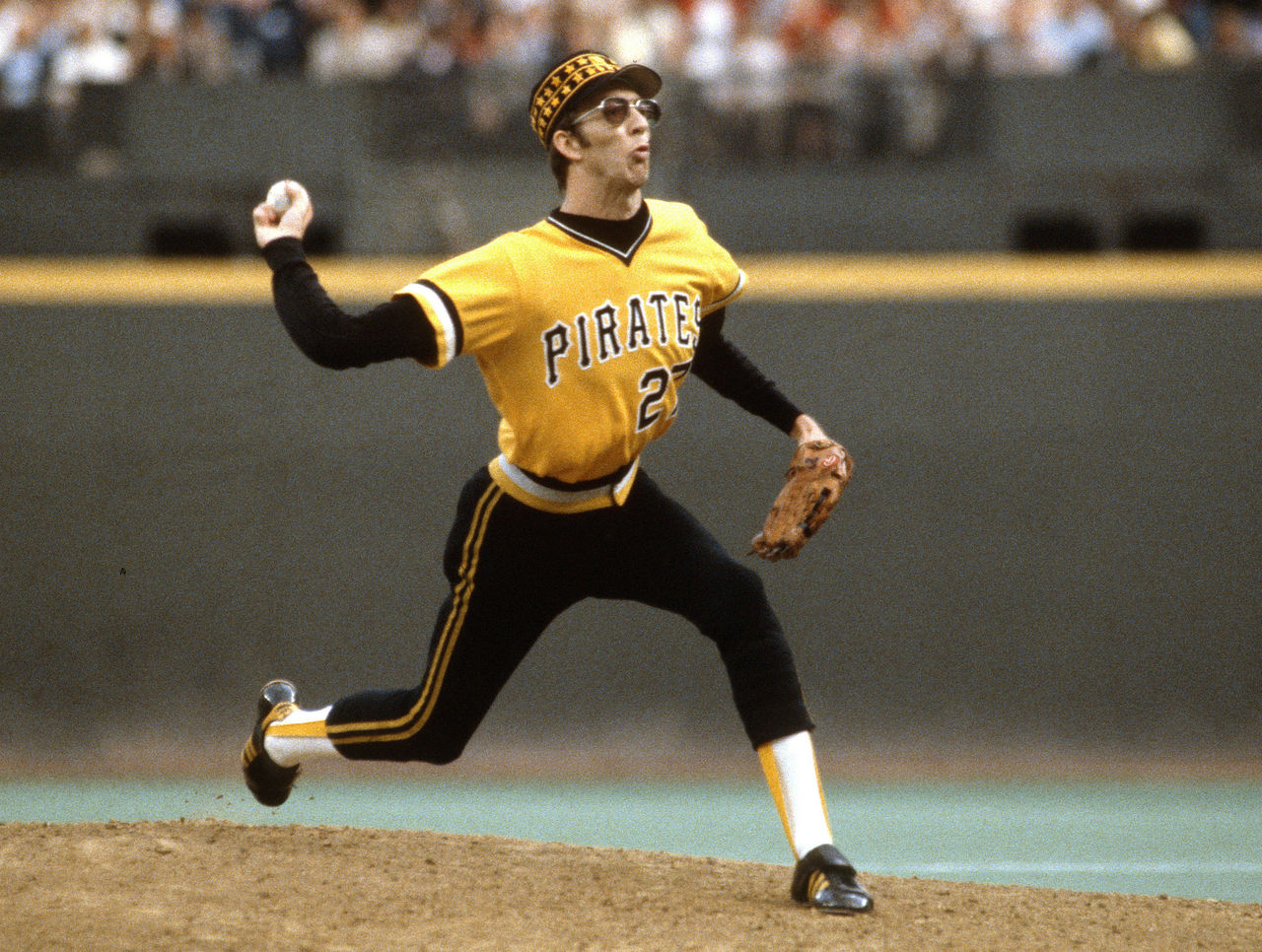
I liked this post, but to be clear (and more specific), there's a certain style of stirrups that I think are truly dumb: Baseball aesthetics in the 70s and 80s were at an arguably all-time low. And stirrups with enlarged loops were a big part of that:
I just don't get the mid-calf, tight pants, and stirrups with only the stirrups themselves showing-look. (And that doesn't even address the pull-over jersey and sansabelt, etc.)
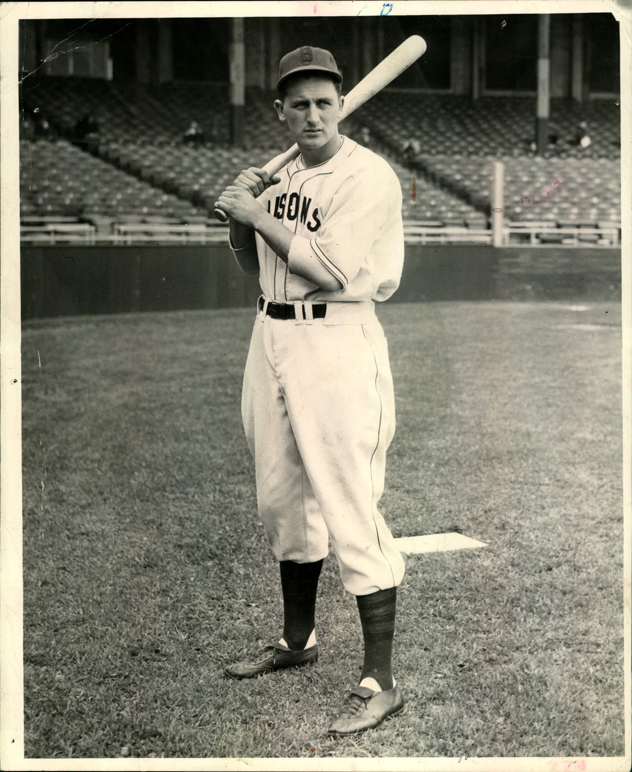
In the 40s, 50s, as well as likely before and after that time (though the 40s are what stick out most to me when thinking of this style), baseball uniforms obviously included stirrups as well, but the openings were far smaller, showing much more color and any potential striping.
Now, as with all things related to sports aesthetics (and really design and art), this is all opinion. I understand that there are many that would disagree with me because the uniform worn by Teke is one that represents baseball as it was when they fell in love with the sport. I just think that stirrups like those in the second picture can offer more the overall look of a uniform.
-
7
-
-
On 10/15/2018 at 1:48 PM, oldschoolvikings said:
Any particular inspiration for the sleeve stripes here, OSV?
-
55 minutes ago, johnnysama said:
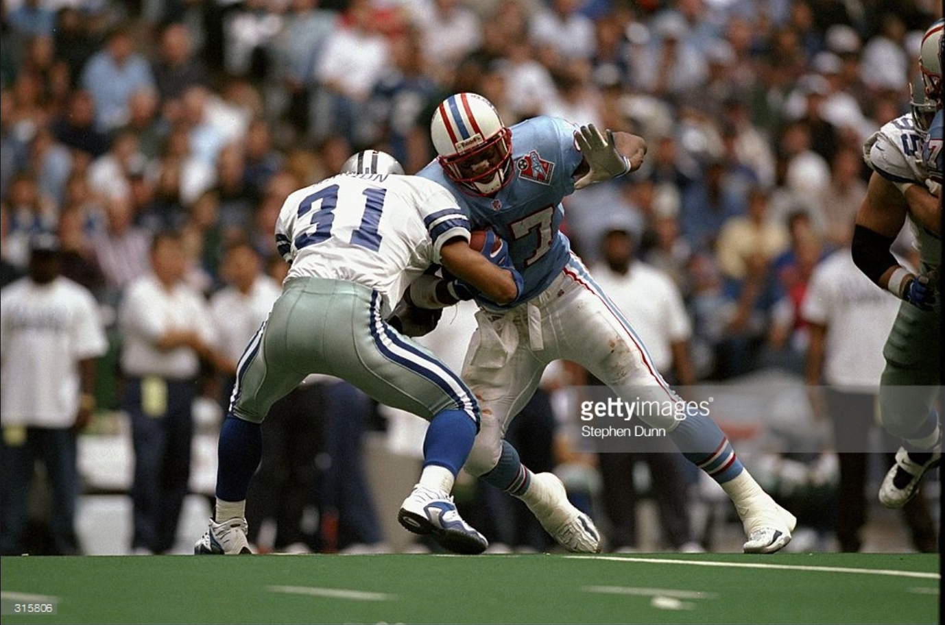
I was clarifying that the Oilers wore white-on-white only in their last season under that name in 1998. Sorry for the confusion. It's too bad, those blue jerseys were beauties.
Got it. And no kidding, those were excellent uniforms.
-
1
-
-
24 minutes ago, johnnysama said:
The white-on-white combo was the only set worn by the Tennessee Oilers in their lame-duck season under that name in 1998.
Just to be clear: Are you asserting they only wore white over white in 1998? If so, I believe that's right. Or are you saying the whole time they were known as the Tennessee Oilers? That was for two seasons, and in 1997, they wore blue twice. Once against the Dolphins, and once at the Cowboys.
I just wanted to make sure I understood what you meant.
-
1
-
-
On 5/29/2018 at 10:58 PM, clonewars2008 said:
Not sure if this was said already but I think that the Colts should go back to the blue facemask and blue pants for the away uniform.
It's not an awful look, but I'd have to guess that, in today's NFL, the Colts would wear solid blue socks with those pants. And that would diminish the look.
-
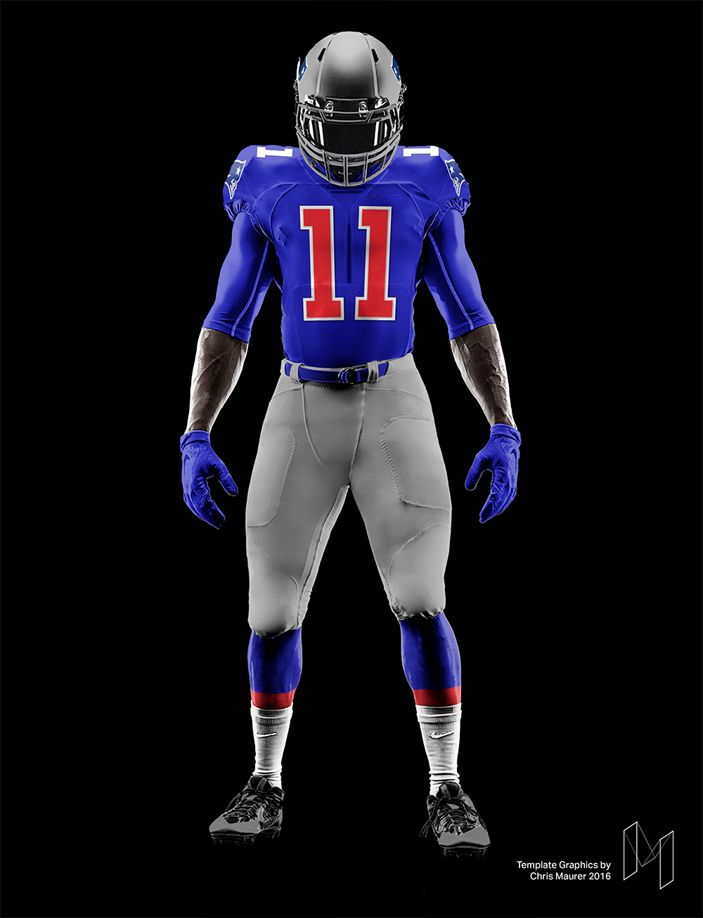
12 hours ago, FinsUp1214 said:
Of all the Flying Elvis uniforms, this one looks best to me (even with the mismatched number color):

P.S. on that one: Flying Elvis is better in royal blue than navy to me.
Really unpopular opinion: This is the best the Patriots have ever looked. I would change the pants stripe (as I think the stripes within the stripe which mimic the logo are a little too busy) to something simpler. Otherwise, that's it. The contrasting numbers and grey facemask MAKE this uniform for me.
I mocked it up on a modern template just to get a better feel for it if it existed today:
-
4
-
-
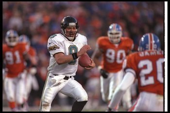
On 11/14/2016 at 9:38 AM, Rj0498 said:
Speaking of California NFL teams, I think these were the chargers best look

Certainly far better than what they have now.
-
Man, the better the graphics get in Madden, the deeper the uncanny valley gets. Those player models look awful.
-
9
-
-
You just HAD to post a pic of a knockoff, didn't you....THIS looks better than 84:

Further, by using a knock off as the example, cubsfan2015 undermined his argument for why this jersey is superior (at least in my mind). The color the Dolphins use now for their aqua is one of the best colors used in the NFL currently, far outstripping any other shade of the color they've worn since 1966.
-
2
-
-
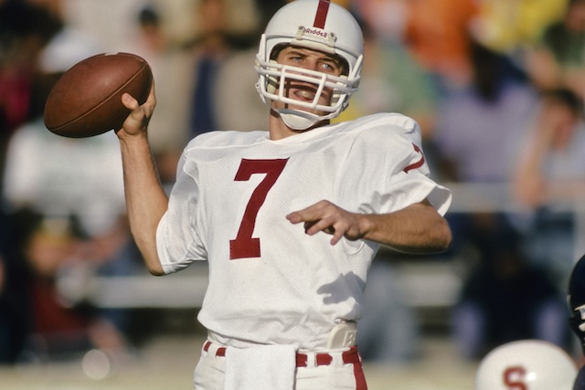
It was just a color change for when Elway was at Stanford. Still, a nice job.
-
1
-
-
I visited a friend in Boston back in the summer of 2003, and the Cavs were in town for either summer league or a summer preseason game. Either way, LeBron was walking through Quincy Market drunk off his ass. He would have been 18 at the time.
Point it, LeBron James has lived a charmed life with access to way more than most. Can you imagine if he had gone to college? He (and the circus that surrounds him) would have destroyed any athletic department he touched.
What has LeBron James ever done off the field that makes you think that? You gotta have something better than your 18 year old drunk in Quincy Market story. What circus? Guy has been the Derek Jeter of the NBA when it comes to citizenship. If LeBron was forced to play a year or two in college there is no doubt in my mind he would of been a model student athlete until his time came. Nothing has ever gotten in the way between him and his craft. Ever.
He would certainly have been a better student athlete than Jameis Winston, and Winston didn't "destroy" Florida State's athletics program by any means. Maurice Clarett and all his issues didn't destroy Ohio State. Shoot, even Penn State's football program is still standing, and what happened there was far worse than anything any single student athlete has done.
Edit: I don't mean to trivialize what happened at Penn State. I'm making the point that "destroying" an athletic department seems like quite the hyperbole.
-

This one is impressive. Nice find.
-
I'm looking for that font (Script and numbers):

"Tuscan" will get you close on the chest script.
The numbers look custom...like the characteristics of Tuscan were edited into another stock font.
As Buc said, those numbers have been modified from their original form. During that game (against WVU), I was initially trying to think of where I'd seen them before. Then it occurred to me: they're essentially the same numbers that the Phoenix Suns wore in the 1970s, just without the modifications. I don't know if that helps at all in your quest to find the set, but at least it gives you some more resources from which to pull if you decide to create them yourself?

-
I would have to see the Triads' 10k to know how many people they employ and what taxes they are paying back to society, but admittedly, those have been hard to find.
+5 Excellent.
-
http://www.ebay.com/...7610#vi-content
i started laughing when i saw this. the description calls it a "hard to find authentic game worn jersey". look like someone took a mo williams jersey and added IRVING in block letters.
I wonder who "Kylie" Irving is.
-
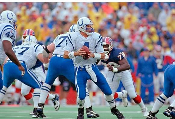
Orange Crush Broncos taking on the Jaguars in the 1996 playoffs.
I remember this game not because it was only Jacksonville's second season and they weren't supposed to do as well as they did but because some lineman for the Broncos (I don't even necessarily remember if it was offensive or defensive) didn't get off the field in time before the next play started, costing them a penalty very late in the game. Now that I'm thinking about it, I believe it was a defensive lineman and this was during Jacksonville's last scoring drive that put the game out of reach for Denver. What I remember vividly was 1) how orange the guy's uniform looked as he was walking off the field, even in artificial light; and 2) the broadcasters laying into the lineman calling him lazy, etc. for not getting off the field fast enough. (Admittedly, he did walk off the field; he didn't hustle at all and Mark Brunell was quick enough on the snap to get a penalty out of it.)
-
There're a fair few fonts that approximate that style of lettering. A quick Google search of "license plate font" came back with several that look about like that.


College Football 2020
in Sports Logo News
Posted
I don't know if you can get those two looks to be harmonious simply because the elements that make them what they are don't work together without feeling overdesigned. The argyle is intricate and fussy compared to the almost overly-large, bold stripes of the throwback. The pants stripes match the sleeve stripes match the helmet stripes in terms of line weight on the throwback. Using argyle on two of those elements (pants and helmet) while having plain stripes that don't match anything else on the sleeves would look disjointed.
Now I say that with it being my understanding of what you're saying above. Two other options you may mean instead are:
I'd argue that, besides any nostalgia, what makes the throwback successful is that it includes a fair bit of variation in color because the stripes are so large while still staying within the rough definition of "traditional" stripes. So many college uniforms have plain/solid-color pants sometimes with the addition of (again) fussy, overly-intricate elements that don't necessarily translate well at distance (e.g. team names, piping instead of stripes [though that fad has faded somewhat], logos, patterned stripes, etc.). Seeing big stripes like UNC's (or even just complete waist to knee stripes, generally) is refreshing. And my argument against "fussy" detailed elements isn't even necessarily an indictment of UNC's argyle. I think it works alright for them. I do think argyle is disproportionately viewed as positive on these boards because of so many designers working it into their concepts. But I also don't think it's bad in practice. It's just not the best option for football.