


Ted Cunningham
-
Posts
1,286 -
Joined
-
Last visited
Posts posted by Ted Cunningham
-
-
11 hours ago, nuordr said:
Pretty close to solid, but the stripes on the white pants and white away uniforms are just powder/columbia - white - powder/columbia and the stripes on the white helmet are navy - powder/columbia - navy. Like.. why mismatch them?
-
 3
3
-
-
30 minutes ago, MJWalker45 said:
A lot of them will say "tradition". Ohio State is one of them, because only football doesn't use the font that gets used by every other sports team at the school. Others make a slight change, like USC and Oklahoma, and apply it to the whole school. Others like Kansas are going back to block numbers because trying to have all sports teams in Trajan just doesn't work for football. For non Power 5 schools, I think it's not happening because UA, Nike and adidas don't see the benefit in doing the work for it. that's why you'll see most of the MAC wearing some version of the same templates. At one time Toledo and Bowling Green were wearing the same uniform, just in different colors.

Those are pretty clearly different sets of numbers, though.
(I'm not trying to be a jerk, but I do think the discussion is more nuanced than that. It has a lot to do with money, how it's spent on various sports at these schools, and how that does or doesn't mix with tradition moreso than strictly being related to tradition.)
-
7 hours ago, plastictaxicab said:
Nope, not Futura. You can tell by the straight angle on the upper terminal of the 2.
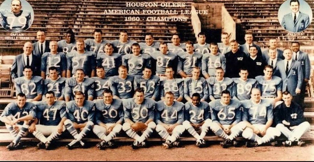
I've seen several different names for the set of numbers the Oilers used in 1960, including "Athletic Gothic" and "NCAA Gothic". I don't know that there was one standardized set of numbers like that back in the 60s, or if each manufacturer had its own iteration. But it was a fairly popular number set (behind various block fonts, of course). A few of the Continental Football League franchises used them, The Washington Huskies used them, Vermont and Columbia used them, and they were littered across high school football uniforms throughout the 60s and 70s. I have a couple iterations of them that I use for concepts and such. The first, I think I got from someone posting it here, waaay back in the day. The second is from the Nike catalog:
The first iteration seems to be at least somewhat closer to what the Oilers wore in 1960. The weight was lighter and the curves felt a bit more humanist (akin to fonts like Gill Sans and Johnston, as opposed to more geometric-looking sans fonts like Futura or Century Schoolbook). The second, like I said, is from the Nike catalog. I am not sure if it's their propriety version or if it's a direct copy of something that preexisted this option. While not geometric by any means, it is just a bit squarer and a little more vertically proportioned. The 2009 Titans throwbacks, while still mostly looking like the top, tended a bit more toward the bottom version than the 1960 or 1994 versions.
The Oilers used this set of numbers for one year, in 1960:
Then, for the 1994 75th anniversary throwbacks, the numbers seemed to take on more of a 2:1 or 1:2 ratio instead of a 1:1 ratio. What I mean by that is, with 5 for example, instead of the number being roughly evenly divided between the top half and the bottom (bowl, or in old style figures, descender), the top half is roughly half the height of the bottom half. An exaggerated example:
Stretching of the numbers on the various cuts of players' jerseys likely had an impact on the proportions as well. (See the 0s below between 90 and 50.)
Another fun fact about the 1994 throwbacks is that the 2s did seem to have different upper terminals (mentioned previously in this thread in relation to the numbers not being Futura). The 94 2s apparently had horizontal upper terminals more akin to Helvetica. (A still photo of a player wearing a 2 from this game would be nice. These images are screenshots of the game from YouTube. It used to be one could find a few photos of these uniforms online, but they seemed to have disappeared into Google's new search algorithm.) This was a break from what they wore in 1960 (as evidenced by the photo of Billy Cannon, no. 20, above).
Then lastly for the Titans/Oilers, are the 2009 AFL 50th anniversary uniforms. The numbers on these skew slightly more toward the Nike version. Certainly more vertical, but not quite as rigid as Nike's version.
Another fun fact: the away uniforms appear to be wrong. The away uniforms in 1960 featured red numbers on the road. The 2009 throwbacks had blue numbers with red outlines/strokes.
Like I said earlier, this set of numbers crops up in a lot of other places as well. Here's a uniform catalog (originally posted on Uni-Watch) that shows this set of numbers as an option.
And speaking of another UW, Washington used these numbers on their throwback back in 2007. Because this was a Nike uniform, it's likely that this uniform featured a set of numbers much closer to the ones from the Nike catalog, posted above. I don't say that they're exactly the same, however, because the 0 is more of a rectangle with rounded corners than an oval.
I think this set of numbers is neat, both for its general design and its variations. Hence this dissertation. Haha.
-
11
-
-
I saw the Bucs play the Brewers on Saturday, and among the myriad black and gold jerseys, I saw a nice Expos Vladimir Guerrero throwback. No idea what the connection was, if any, but it was there.
-
1
-
-
On 6/23/2023 at 1:35 AM, Discrim said:
Funny you should mention that...there seems to be an emerging contingent of Steelers fans in my neck of the woods.
The common explanation for this is that a generation of Yinzers moved away during the late 80s when steel was dying off. Now there are enclaves of Steelers fans all over the country because of this emigration. I feel like sports broadcasters talk about how well the Steelers' fans travel, and while there is some truth to that, really it's more that there are just expat Pittsburghers and first-generation diaspora in a lot of other parts of the country.
-
2
-
-
While I don't think they're 100% linked to each other or that there's even a direct link between the two, when I see factory pomo in the context of sports, I think of its coinciding with an era of "just because we can doesn't mean we should". I feel like, especially toward the latter half of the 90s, a lot of designs became a lot more intricate and/or well outside the norm because of the rapid advance of computers and technology during that time, and the proliferation of software that came prepackaged with various clipart and other resources, many of which heavily leaned on factory pomo aesthetics. Again, I don't think there's a provable link between the two, and I'm not suggesting that the proposed Clippers logo was designed in PowerPoint 97. But the fairly rapid pace of change to uniforms starting in that era and factor pomo being prevalent at the time are inextricably linked in my head.
-
1
-
-
On 6/23/2023 at 6:59 PM, oldschoolvikings said:
The chrome helmet is terrible.
While I'm not the biggest fan of chrome helmets, generally, it has been WKU's primary look for 10+ years, and I think just out of being used to it, it doesn't bother me. (How do you like that for a clause-filled, run-on sentence? Haha.)
I would prefer the red and white iteration of Ohio University that they used to be. But I also don't hate the chrome, and the rest of these uniforms are pretty nice. So all-in-all I'd say it's an improvement.
-
1
-
-
2 hours ago, Mingjai said:
Washington’s one of those schools that doesn’t need any white on their home uniforms. I wish they’d use this set as a basis—add a purple W (with no white outline) on the helmets and single purple stripe the helmet and the pants and they would look classic. I’m a sucker for rounded art-deco numbers.
I've often thought the same: this would be a great set to build from. My biggest thing with these is just making sure the purple is very obviously purple. The lighting during that game made it look very blue, and the plain gold helmets obviously made this look like Notre Dame quite a bit. But yes, agreed: add some distinguishing touches here and there, and this would be a nice look for Washington.
-
1
-
-
That's the first thing I thought of too: The stripes sure look like Colorado's.
-
2
-
-
Backpedaling for just a second to the orange pants-specific part of the discussion: If they were to do orange pants with the away jersey, I feel like for balance, this is what they'd have to do:
As others have pointed out, both the red numbers and the orange socks with orange pants look are both a bit heavy feeling.
-
8
-
 3
3
-
-
I think I said this in the 2022 college thread at one point, but two major things throw me off about this helmet:
- The non-shell vent cutouts look AWFUL on any helmet that isn't black (or maybe navy). They aren't holes in the shell; there's plastic in them! Why can't that plastic be colored the same as the shell? (Hint: It's got to be because Riddell is first a company trying to sell its product, and those vents are distinctive. Anything to make them stand out arguably helps their brand.)
-
The top bar(s) of the facemask being missing looks weird. Facemasks have had those since well before I was born, so I'm used to seeing them there. All of the sudden, there isn't one on this model. And that looks weird. Not to mention that, combined with the shape of the visor itself, makes this look like a motorcycle helmet.
- A subpoint to this is also that the facemask fastens on the sides behind (or inside?) the shell instead of on top. When I first saw these, I thought "Well, it will kind of be like 50s/60s helmets where the facemask only connected on the sides and didn't go around the top." But even then, the facemask fastened on the outside of the helmet. So there was simply more facemask to see. As a result, there was more contrast between shell and facemask. Now, the facemask is reduced to almost being an extension of the visor, in some ways, at least from a shape and real estate standpoint.
- A second subpoint about the facemask: black on black helmets, like the Steelers, look way less weird, especially from far away because it's harder to see the details, especially at any distance. However, lighter combinations (especially with dark visors like Elliot's) or higher-contrast combinations (especially if the facemask is darker than the shell) look weird, or at least very different than what I'm used to.
Summing up point no. 2 as a tl;dr: With the Axiom, the facemask is part of the helmet instead of being something that is affixed onto the helmet, and it's jarring to see a football helmet that departs from what has been a fairly linear evolution of helmet styles. (Not to mention it looks more like a motorcycle helmet now.)
-
3 hours ago, DCarp1231 said:
Washington QB Sam Howell made the switch to the Riddell Axiom helmet. Is he the first QB to do so?
Kenny Pickett was wearing it last year.
-
1
-
-
11 hours ago, Discrim said:
Eagle Mustangs...hm. Guess something eagle related was judged to be too hokey or something.
Haha, bummer that we couldn't get the Eagle Eagles.
@colinturner95 This is a great series; thanks for posting.
-
Were there copyright/trademark issues with using the previous logos? Or was everything changed to "refresh" them? I honestly can't remember if that question was asked/answered.
-
On 5/3/2023 at 9:58 AM, MJWalker45 said:
With his taking pride of place at midfield, do we expect to see the full logo on the helmets as well?
It's a shame they just slapped the new head on the old mascot logo. While it's cleaner and the line work is sharper, the newer cardinal head looks like it's looking up and away at an angle to its right; kind of like it got distracted by something. This is as opposed to the old logo looking straight ahead (or straight behind, as is the case for the older full-mascot logo) or maybe just slightly up.
I guess there are trade-offs with the cleaner line work, etc. But the older version looks more alive, for lack of a better way to describe it.
-
2
-
-
Also, rewinding just a bit:
- When previous posts talked about Houston wearing a red helmet and blue jerseys, I, too, thought of the Memphis Express of the AAF. Keep the white pants though; no need to go red/blue/red/blue.
- I think contrast is key for Houston: with both options going over white pants, I think they'd look good in either of a blue helmet/red jersey combo or a red helmet/blue jersey combo. Even if Buffalo got a wild idea about making their 90s look (or something similar) permanent, there's enough of a difference in the two looks that having both Houston and Buffalo in red/blue/white/(whatever color socks) would be fine.
-
2
-
 2
2
-
We've been past "dazzle" fabric (is that the actual term for it, or just our colloquialism?) for long enough now that when I see it (like in those pictures of the Eagles uniforms, or on UCLA's pants or whatever) that it looks dated. The same kind of dated that an original Riddell Revolution gives off now. Not ancient history by any means, but also not at all modern. Kind of in that gap between old school/throwback and modern: it just looks old. While I think some teams might benefit from going back to that look, it would also take a while to get used to seeing it again, if the entire garment were made of the same even shine that pants and jerseys were made from in the 90s/2000s. It would also take some getting used to seeing a new iteration of the dazzle/shiny concept too, like the trim on the hockey uniforms in the above posts if that were translated to full garments. But for me, anyway, that might be easier to stomach simply because I could see that as more of an evolution instead of going back to something that is associated with a time when football uniforms were bulkier and seemed clunkier or even slower (because of their size).
Kind of a stream of consciousness there, but my overall point is dazzle as we knew it looks dated now.
-
15
-
1
-
 1
1
-
-
24 minutes ago, DCarp1231 said:
Resurrecting the thread after a couple month hiatus-
We go down south into the NFC South for Tampa Bay-
C&C appreciated as always!
There's something kind of 60s-restaurant-sign about this that I like. I understand what you're going for here, but I think I get it only because I know that Tampa Bay uses a sword on a flag already. In a vacuum it doesn't read that way. I realize it would probably take some doing to keep the simple, angular look while also working it more toward looking like a flag. But connecting the T portion with the B portion would help. Also, there are several inconsistencies that could be cleaned up, like the lighter stroke weight on the hilt and handle, the fact that you can see a little tiny bit of the blade under the hilt (on the right), and the end of the blade coming close to, but not lining up with, the top of the flag. Tighten that up and get the flag looking a bit more like a flag, and you've got something fun going.
-
7 hours ago, Brave-Bird 08 said:
Yeah, the NFC South has gotten really bad, especially considering it used to give us:
Though, to be pedantic, and while the above is very nice, the NFC South never really gave us any of that. That would be mostly the NFC West with some Central mixed in. The NFC South has always felt like a lot of black and silver (of varying shades) with some nice accent colors mixed in.
-
1
-
-
7 minutes ago, Sec19Row53 said:
Found it!
YES. I searched high and low for that graphic. I was going to post it with no comment for the old heads around here. But I couldn't find it.
-
8 hours ago, Sec19Row53 said:
Please visit this thread

I'm frankly surprised the conversation was allowed to continue as long as it did before someone brought up the point less reel line mint thread.
-
I really like the Mystics and Liberty uniforms. That Liberty verdigris/patina green is a really nice color.
-
2
-
-
16 hours ago, Echo said:
Sure, I mean, if you want to live in AJ McCarron's shadow...
This may be better suited for one of the 1,000 iterations of "right uniform for right player" threads over in Sports Logo General Discussion (and I know you're being facetious), but my immediate and reflexive reaction to that was "Hey, AJ McCarron's correct jersey is only a Battlehawks jersey now". Haha.
-
2
-
-
9 hours ago, gosioux76 said:
1. That '80s-era helmet template is so damned nice.
Thanks, I made it myself!
-
1
-


College Football 2023
in Sports Logo News
Posted
Also, as a side note: Elon Musk has messed up Twitter so bad now that the tweets of individual accounts no longer appear in chronological order? (Presumably it's "algorithm"-based?) I was trying to see if there were any still photos I could post of what I was talking about re: the Citadel's uniforms, but all I can find when clicking on their Twitter profile is tweets from 2018?? That guy is so dumb; it's shocking.