


Ted Cunningham
-
Posts
1,286 -
Joined
-
Last visited
Posts posted by Ted Cunningham
-
-
Yeah, I'm not sure if they have to order them themselves (presumably so?). I do figure they (the teams' equipment personnel, specifically) are responsible for attaching them, at least.
I'm not so much bothered by teams not adding patches for a bowl game, anymore. It would be one thing if modern uniforms weren't already so patch- and little detail-heavy already. For USF, for example, you'd ostensibly have an Adidas logo, the USF bull logo, and the AAC conference logo on the front in addition to a bowl patch. That's a lot of extraneous clutter. (I suppose the argument could be made the other way too: "What's one more patch if there's already so many?") I feel like bowl patches meant more when they were the only thing that was out of the ordinary on a much simpler jersey. Not to mention the designs in the past were almost invariably the same ones worn during the season for just about all teams and therefore the only thing distinguishing the uniforms in photos would have been the bowl patches. In other words, many teams now wear unique combinations every week, and so it would be easier to tell that a particular look was only worn in the bowl, even without a patch, because that was the only time the given team wore that look in their season. (I don't necessarily think that's the case for this particular game, but I feel like that's far more likely to happen now than it was 30 years ago.) All that to say a missing bowl patch doesn't bother me too much given today's uniform aesthetics.
-
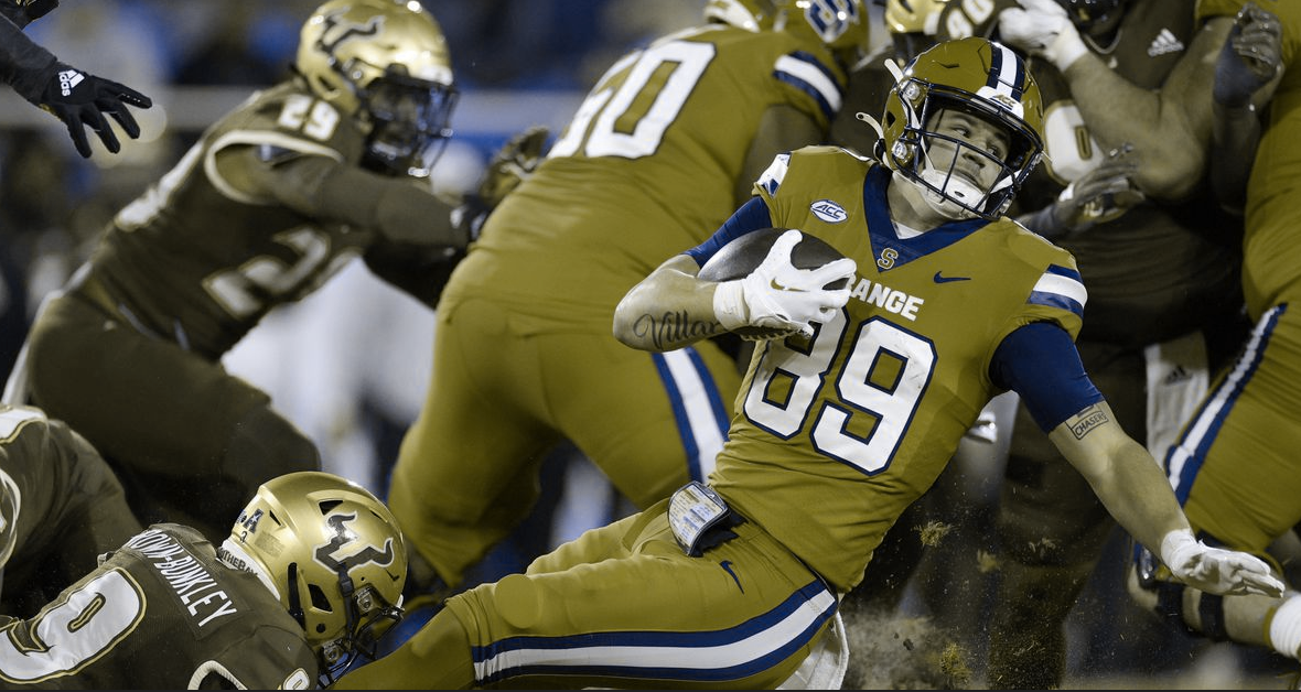
Visual aid:

While I am generally not a fan of "monochrome" looks or the jersey and pants being the same color, this works as a gestalt: orange and green contrast pretty well with each other, the colors are pretty vivid/saturated and they're the schools' colors. It's not just white vs black looks that have become more commonplace.
As I was typing thing, I realized that, with orange being closer to red, this might actually present some color-blindness challenges:
Not as egregious as the NYJ v BUF game (because 1, Syracuse is wearing orange instead of red, and 2, USF's green is darker than the Jets' green was in that game), but still not a ton of contrast.
-
 5
5
-
-
Credit where it's due: The Dolphins were well dressed last night within the bounds of their current uniforms. Truth be told, the same could be said for the Titans.
-
3
-
-
It's interesting how, in the course of a few posts on this topic, no one has advocated for a direct return to the 70s-90s look (and @MJD7 expressly refuted it), and yet the combination of posts illustrates the slippery slope right back to the throwbacks in question. "I would keep the modern look, but go with athletic gold and keep the old horn." "Yeah, and I'd also get rid of the patches and gradients." We're down to discussing the number font at this point, and that's the critique that's also leveled at the Steelers whose uniforms are otherwise essentially unchanged since the late 60s. It's like, collectively, it's not enough until the uniform just is the throwback.
This isn't a criticisms of anyone expressing their opinions, to be clear. I just find it interesting that there's always a tweak or two to make, and in many cases these proposed tweaks would end up pushing a look back toward a throwback/older look.
-
6
-
-
36 minutes ago, WJMorris3 said:
Point of order: it's going to be a 5+7 model next year thanks to the Pac-12 demise. Also they're forcing the top 4 to be conference champions so even if Notre Dame goes 12-0, they can't be seeded any higher than fifth.
Ah, I didn't know that. Thanks. That's an interesting wrinkle. And it makes sense that they would only want one non-P4 conference champ.
-
I generally fall into the camp of "win the games on your schedule" but college football is just too many teams playing too few games competing for too few spots to rely solely on record. (That's why, for instance, any comparison to the NFL or especially MLB doesn't work. The fields in those sports are far smaller, and the teams involved play more games, so records are more indicative of how good a given team is. Further, in the case of MLB, they play so many games that flukes and aberrations don't really exist in a team's record. [An aside: Divisions, in that case, actually work against the weight carried by wins and losses as opposed to winning certain conferences meaning more to evaluating college football teams. Yes, I'm still salty that the 2015 Pirates had to play a one-game wildcard "series" as a 98-win team.])
Now, we can say "the committee should have weighed this, the committee should have evaluated that", but the committee didn't do it in any of those ways. If the committee valued wins so highly, that's the rule they would follow. But they don't. If wins mattered most, it would result in a Michigan, Washington, Florida State, Liberty playoff, and while that would be sticking to the rule , that's almost unarguably not the best teams playing each other. There have to be other inputs because teams don't play enough games and enough opponents in common to evaluate only on wins.
Next year should be an improvement as essentially you'll have the top 10 getting in (covering the Power 4 champs and the 6 at large teams) plus two lower-ranked conference champions. And I'm sure there will be arguments made about how they should just take the top 12 and how nos. 11 and 12 are better than a no. 19 Sunbelt champ and no. 24 CUSA champ. But, the criteria are clear: those last two "other champion" spots go to conference champs, not necessarily the best teams (however the latter is determined).
All of this to say that if the criteria for picking the teams is clearly stated (or more clearly anyway), I can live with the results. But this system of human beings going based on vibes rooted in some vague "rules" is decidedly worse than the BCS for making selections, and I'm glad to see the back of it.
-
4
-
-
1 hour ago, Carolingian Steamroller said:
I also think that in 2020, had the Rams trotted out a road jersey that was a copy of the royal throwback but with white and navy only and changed nothing else about what they wore in 2019, this board would've exploded with applause.
Meaning they wear royal/athletic gold at home and navy/white on the road? I was just thinking about that reading through this stuff and looking at those pictures of those late 2010s uniforms. Like, if the uniforms themselves were the same design (be they either the throwback or the modern) and the only differences were that at home they were royal/gold and on the road they were navy/white, I think I could get behind that. Something like a late-90s/2000s Washington State: two different helmets depending on where they're playing. In the modern uniform context:
Home:
Away:
I don't think that I'd advocate for this, specifically. (I think I fall somewhere between the hard-line throwback and the modern look, but consistent use of royal and athletic gold, including the helmet.) But I also wouldn't hate it, either.
-
5
-
 2
2
-
 3
3
-
-
1 hour ago, BBTV said:
Eagles need to find a way to bring the kelly greens to Dallas. Just take the field in them - the league isn't going to cancel the game.
I was thinking about this recently: What would be the punishment if a team wore their alternates one too many times? A fine or something? Because like you said, BBTV, they're not going to cancel a game because a team is wearing the "wrong" uniform, especially if that uniform still contrasts with the team they're playing. I could see, perhaps, sanctions of some kind (stripping owner voting rights or some kind of cap-related or draft-related penalties) if a team just refused to go back to their primary look in favor of an alternate (like if the Eagles tried to just wear kelly green for the rest of the year), but one game?
I thought it was wild how the Rams exposed how silly the rules about primary uniforms are when they moved back to LA by changing literally all of their uniform elements except the shirts themselves, and the league went along with it. From a merchandising standpoint, sure, the jersey is important. But from a brand standpoint, I'd argue the helmet is more important because it serves as de facto logo in many applications. And the Rams just kind of made up a new helmet design for that temporary time before their new uniforms. (Sure, it was similar to a look the franchise wore in the 60s, but it wasn't a throwback.)
-
One other detail from the MAC championship: Miami is wearing a helmet with script Miami on one side and numbers on the other with a stripe that incorporates their design for honoring the Miami tribe of Oklahoma.
-
2
-
-
20 minutes ago, PERRIN said:
I'm also in agreement that the current uniform set and uniforms are a much better fit for the Seahawks, though the throwbacks are undeniably gorgeous. A darker blue, vibrant green, and gray, is a perfect color scheme for a Seattle team. Personally, the current set is just a bit too complex, with a bunch of details that I don't really see the point of, like the patterned numbers and the chest stripes. Heck, for the sake of compromise, I'd be super down to even tweak the shade of green to be closer to Kelly and less like battery acid. I'd also be absolutely down for them to fully replace white with grey, and wear a grey away jersey. Their wolf gray jerseys have always been a fan of mine.
Here's a concept idea I had for them a while back, mellows down some of the jersey elements and tweaks the coloring a little bit to feel more like a balance between modern and classic elements. Not super sure how well it works, but it was a fun exercise. The Seahawks are quite the tough team to redesign.
I think this works well as a concept and is pretty logical. It's nice work, especially the actual stripe designs and color balance. However, I feel like this would suffer from the same "Is it white and dirty? Or just a different color?" thing that LA's bone uniforms do. Without any white, the grey reads as dingy white (because generally we're used to seeing white somewhere in football uniforms, especially away jerseys) instead of grey, a color separate from white. (I hope that doesn't come off as a strict criticism of your concept; I just don't think that eschewing white for another light color works in real life as well as it does in concept.)
-
On 12/1/2023 at 10:09 AM, Carolingian Steamroller said:
I don't think they're far off now. I think they had it down more or less in the 90's.
I'm being a little pedantic here, admittedly, but that photo has a fairly pronounced teal split-tone in the shadows. I think you're right that this photo illustrates the idea. But it is a little misleading in that the helmets (more silver than anything) still didn't really match the pants (more teal or blue or just darker than the helmets) in the 90s. They were closer than they are now, certainly. And granted, all of that doesn't speak to whatever the styleguides and official colors are/were either (which I think still differ to the color values used in reality on physical materials).
-
Visual aids for conference championship games at noon EST (both of which are all monochrome affairs, white v. dark):
Big XII:
I really like OSU's emphasis on black lately. I'm usually an advocate for using the brightest colors as the primaries, but the Cowboys look good in black. And this isn't a white/orange vs. orange/white game, as a result.
MAC:
Still, for monochrome, not a bad look. There's just enough red on Miami's uniforms and just enough gold on Toledo's (albeit not in this picture; there weren't many good ones anywhere online) that this reads as a red/white vs. blue/gold game.
-
1
-
-
7 minutes ago, CDCLT said:
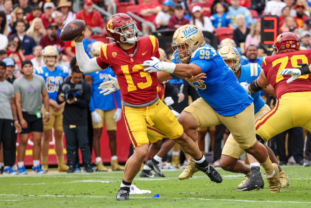
The one thing that most folks miss about color v color for USC-UCLA is that both teams used to share LA Memorial Coliseum - that's why they both wore their home uniforms, because it was a home game for both teams. It doesn't hold the same weight when that history isn't behind it.
Yep. That's why color vs. color rivalry games wouldn't really work like USC-UCLA does (or did, as you posit, CDCLT): one team is almost always decidedly the away team, either by actually playing in the opposing team's home stadium, or the neutral site being closer to the opposing team's campus.
-
1
-
-
On 11/14/2023 at 9:08 PM, oldschoolvikings said:
This is so weird and disjointed. And yet, I like it; especially the home and away looks. (The single black stripe on the white helmet is wild, for instance.) Any explanation for why you went this direction?
-
23 minutes ago, Germanshepherd said:
The over/under for Nebraska-Iowa today is 24.5.
We may never see a total this low again in our lifetimes.
That's B1G football* my friend!
My dad once said about a particularly low-scoring Nebraska-Penn State game (while we were flipping stations on a Saturday some years back), "I tell ya, they'd run the ball underground if they could."
*Admittedly, Ohio State and Michigan are not generally included in this tongue-in-cheek characterization.
-
 3
3
-
-
13 hours ago, Green27 said:
My best of Week 12:
Long live color v color in rivalry games
This got me thinking: While I like color vs. color as much as the next person (as long as there's enough contrast), USC/UCLA feel more "right" than others to be color vs. color in a major rivalry game because of the game's location. While this game was played at USC's home field, both teams call LA home. It would be odd to me if Ohio State wore red in Ann Arbor, for instance. And then on the other side of that statement, if a rivalry game were played at a neutral site every year, then by all means, both teams should wear their color/home jerseys. (Though the only consistent example of that that I can think of is Army/Navy, and there wouldn't be enough contrast there with their regular home jerseys.)-
2
-
-
1 hour ago, Green27 said:
And the stinker...Rutgers, you are playing the team famous for wearing the same home uniform for centuries, so why would you choose nothing but white and black to matchup with the stadium infamous for wearing white and dark blue? So many Big Ten members wear red, so avoiding it makes sense in many cases. This is NOT one of them.
Ehhhh. I can see the logic behind your reasons here, but I wouldn't say this is a "stinker" or otherwise bad-looking game: There is no monochrome at all, so that's a huge plus to start. And black is technically one of Rutgers' colors. Plus, this was played in bright sunlight, so even from far away, the difference between black and navy is pretty clear. And the red is prominent enough (logos and numbers, as opposed to just outlines or some other smaller application) to add that much more contrast. I would argue that a game like Kansas/K State looked worse because Kansas wore predominantly non-school-color monochrome uniforms (after dark).
Edit: Just to be clear, I understand that this is your best-of list (and to a larger extent, all of this is opinion-based), so my response is just that: a response. That's not to dunk on your list. As a matter of fact, I appreciate the effort of including pictures!
-
2
-
 1
1
-
-
11 hours ago, DCarp1231 said:
Gosh, I just love BC’s uniforms. The black over grey is incredible stuff.
Yeah, I was just thinking the same thing. The orange detailing really puts it over the top, too.
-
1
-
-
Understood. Apologies I didn't see the post. Thank you!
-
Just for the sake of posting visual aids and because I watched part of this game last night, Wyoming at UNLV was pretty solid:
-
17
-
-
Hello mods! Hopefully this is not a request that has already been addressed somewhere else: Would it be possible to simply merge 2023 NFL Season week by week uniform match-up combos: From HOF Game to Super Bowl LVIII and NFL 2023 Changes and call it something like "NFL 2023 Season Discussion" or something similar? While having two threads isn't necessarily harming anything, most of the discussion is happening in the week by week matchup thread (at least of late) and as a result, the differentiation doesn't seem necessary anymore. If I recall correctly, the matchup thread was originally started so that the matchups could be posted each week, and members could discuss updates, etc. strictly related to what teams were wearing that week. And then the "main" thread was for all the rest of the discussion about the given season. Now, it just seems like each thread has roughly the same topics (or at least the same subject coverage), but canzman posts the matchups in the matchup thread. Otherwise, there doesn't appear to be a thematic difference anymore. (I feel like I even remember seeing members post stuff along the lines of "I can't remember if it was said in this thread or the other one, but..." indicating ambiguity in where it is appropriate to put a particular post/topic.) As such, would it be possible to just merge the two?
-
As far as the Seahawks go, I think the throwback is the superior look. As others have pointed out, the royal and kelly together, offset by the silver, especially in sunlight (which, I know, is rare in Seattle), is a great look. Plus, the color balancing and size of the individual elements make that uniform visually pleasing. (There aren't many overly fussy details.) However, with the general discussion in this thread about throwbacks and how they're nice as throwbacks occasionally throughout the year, I was curious what the look would look like with the Seahawks' other two colorways (modern and 00s) as a way to modernize. So here are (roughly) the three colorways on the same picture:
Throwbacks:
2000s colors:
Current colors:
A couple observations: 1) The 00s colors need navy to offset the other two. The Puget/gunmetal blue is too washed out on its own, especially near/up against that lime green. So I think that would be out, unless all of the silver elements become gunmetal blue, and all of the royal elements are navy. (That was too much effort, frankly, for me to quick-and-dirty photoshop that. Haha.) 2) The modern colors work well with the throwback look. That might be the key to a somewhat conservative modernization a la Minnesota or Cleveland.
-
7
-
1
-
-
Just now, AppleValley2020 said:
I just wished they painted the end zones Grey, along with the throwback set. Reminds me when my dad would take us to the games in the Kingdome.
Same. Well, in so much as I wanted to see the endzones in silver. I never went to the Kingdome with my dad. Haha.
-
5 hours ago, Sport said:
Like the Longhorns basketball short?
I'm sure it will be worse/more contrived/trying hard to be "clever" compared to those shorts.


Minnesota Vikings Uniforms
in Concepts
Posted
I learned something new: the Vikings played without sleeve stripes on their purple jerseys for the majority of the times they wore them in 1973.