


Ted Cunningham
-
Posts
1,286 -
Joined
-
Last visited
Posts posted by Ted Cunningham
-
-
20 hours ago, SFGiants58 said:
It’s close, but the Oilers’ 1960 font was somewhat less well-produced.
Serifs on the 1 are the biggest separation.
From a few months back in the other thread: a discussion about "Athletic Gothic" and its variations:
-
 1
1
-
-
Ah yes, the Standford Carolina Gamecardinal!
-
1
-
-
1 minute ago, BBTV said:
There's something goofy with the coloring on the one on the right (just look at the pants stripes!) but the one on the left is how the OGs looked IRL. The green was darker - especially the helmet. The Eagles I saw last night were not the same as the ones they were throwing back to. The helmet was enough to bring it down. Not that it wasn't a good looking uniform, just not very accurate as far as throwbacks go.
And the NOB font is jarring if you grew up with the original.
I know what you mean. There was something a little more "dead" about the kelly green that the Eagles used in the 80s/90s. It wasn't dark green/forest/hunter/whatever. It was still kelly green. But the throwbacks (both these and the ones they wore in 2010) are a very vibrant shade, compared to what they were throwing back to. And I agree: I certainly don't think it was a bad uniform. I would prefer them to wear these throwbacks to what they currently wear, in fact. But they definitely looked different from what Randall Cunningham et al wore.
-
4 hours ago, Cujo said:
Merge the two threads.
Name it "2023 NFL Uniforms"
Call it a day.
How do I retweet on here...
-
2
-
-
I go back and forth in my thoughts on the Buccaneers uniforms: Both looks, the original orange and the pewter/red, are solid. For both, it's more about what combinations they wear and how they wear them than any major design elements putting one above the other. When I conceptualize what the NFL would look like if I picked all the uniforms, I go back and forth on which look the Buccaneers would go with. All that to say, I think they're both solid, so I really don't care which way they would go, so long as they use them.
As for this logo vs. the current iteration:
Not only is this the superior mark (with its simpler, more consistent design employing a "ragged" look throughout), it's also fits the era from which it comes: the mid 90s. It feels similar to some styles of clipart that were popular then, especially in Office 97. It has a similar look to these:
While certainly not the same, these all evoke a certain current that was popular at that time.
-
9
-
-
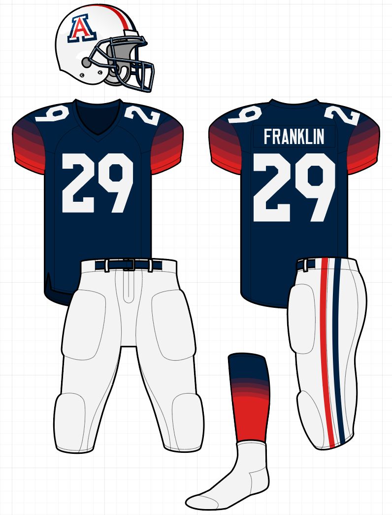
8 hours ago, TruColor said:
I am admittedly biased since I've been a Cardinals fan my whole life, but the Cards' White uniforms are really growing on me. I really like the reflective Silver "Framis" striping; I wish more teams that use metallics would use this:
Agreed. When I caught highlights of that game vs. SF, my first reaction was "Oh, wait, who is that? That's a really good looking game." Then when I realized it was Arizona, that kind of confirmed what I had figured: the away uniform, especially, is a massive improvement over what they had been wearing. I think the white sock phase is just a phase that we'll have to deal with temporarily. Red socks would look better with this look, so it can certainly improve. But even with the white socks, this looks like nice.
-
5
-
-
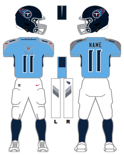
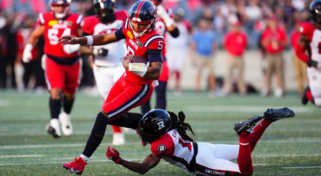
16 hours ago, jerrylawless3 said:
First in-action look at the throwback Oilers helmets for the Titans. Initial thoughts – the stripes look extra large and modern helmets cause some awkward logo placements.
While they are big, I think the stripes look about right. The Oilers (at least of the early 90s) had pretty wide striping too.
As for the logo, I am presuming it's harder to place the decal (at an accurate size) in the middle because of the various ways that facemasks attach to the helmets now. And the Titans' equipment folks must have been instructed not to either have the facemask/clips overlap the decals or not to cut the decals where that would have been required to center them. "Protect the integrity of the mark" or similar thought, I suppose.
-
8
-
-
They could just solve this by going back to the not-a-gradient gradient!
*ducks*
-
4
-
 1
1
-
-
On 10/9/2023 at 1:02 PM, GriffinM6 said:
This is what Ohio State wore sometime between 2012-14. They had red and white versions and they were essentially 90s fauxbacks.
I think the Browns could maybe pull off a wider stripe with numbers, but that's all dependent on what number font they'd use on the helmets.
Likely a pretty unpopular opinion, but I would be very pleased with Ohio State wearing this full time, as long as the pants were grey. I love how bold (downright gaudy) the stripes are.
-
1
-
-
45 minutes ago, tBBP said:
This is of course no fault of yours, but thay graphic shows just how ill-conceived the cutesy notion of the "Tennessee notch" was and is and what happens when CFCS goes too far.
Then again, backwards 1s just about as Snatit as Snatit can get...
(Uhhh, what's the "Tennessee notch?" Is that the serif thing?)
-
1
-
-
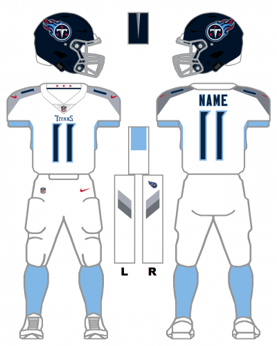
Yeah, within the bounds of all of Tennessee's possible current combinations, I feel like this would probably be the ideal away combo for me. (Maybe light blue pants with navy socks would be tied with this look? Though I feel like that might be a little bottom-heavy for my taste.) Again, within the bounds of their current options, I like the following:
Is it ideal? Not really. But I could live with it.
Fun fact: as far as I could tell from the GUD, they've not worn columbia blue socks with their white pants away before. (I had to make that graphic.)
-
4
-
-
9 hours ago, SFGiants58 said:
If you're gonna do faux-leather, just ditch the stripes and brightly-colored facemask. Black or leather-colored facemasks would work best with faux-leather.
Using a darker-colored leather texture on the helmet graphic would've been better, possibly one with fake stitching in certain sections.
I don't necessarily think that's what Cujo was going for, though, unless I missed something. That replica isn't intended to be a faux leather helmet. It's just another iteration of the Browns' current helmet in their color scheme. It just happens to be brown (because that's one of Cleveland's colors).
I also don't think characterizing this Brown's helmet as "white for white's sake" is accurate either. Their first helmets were white, so there is precedent for using a white helmet. The stripes and brown facemask also modernize that look a bit while better tying it to the rest of the uniform (at least from a color balance perspective; a white helmet with grey facemask and no stripes would stick out a bit more than what they're going with). My personal preference would be for the stripes on the helmet to match the pants stripes.
-
5
-
-
12 hours ago, kb105 said:
It's wild how much more "normal" that makes that helmet style look. And while not having the "brow bar" (is that the actual term for it? I like it) was the norm for several years in the 50s/60s and into the 70s for certain players, not seeing it on modern helmets is kind of jarring, especially when the facemask color contrasts with the shell.
-
4
-
-
And then there was the time that Iowa dressed like the Stee--oh wait. (Haha.)
-
1
-
 1
1
-
-
On 8/28/2023 at 2:12 PM, TrueYankee26 said:
I might be the only one who does not hate the new FOX CFB scoreboard. Yeah it is too big but I kinda like the wackiness of it.
There's something very mid-90s about it that really hits me in the nostalgia. I don't even know how to describe it, exactly. But the angled logos, the scripts all over everything, it looks almost like NBC's football graphics from the mid 90s.
-
1
-
-
10 hours ago, upperV03 said:
Perhaps an unpopular opinion, but these are dumb. Couldn’t even get the helmet and pant stripes right since they’re a catalog order and were therefore limited in terms of striping patterns.
I wouldn't go quite so far as to say these are dumb. I like them despite the issues. But I absolutely agree with the second part. The helmet and pants stripes are very much "Well the template can do this. If you want it closer to the original, it will have to be custom. OK, the template version is good enough."
-
1
-
-
13 minutes ago, VikWings said:
I (mostly) agree with this rule, but I say the jersey or pants must be white, a white helmet almost never works (unless you're the Chargers). I always hated how the Titans looked going White/Columbia/Navy or White/Navy/Columbia, for example.
Yeah, there's something off-balance about that Titans example: It's bottom-heavy. But I don't think that idea of imbalance applies, necessarily, to Baltimore. Even though the helmet, jersey, and pants are different colors and none of them are white, it still reads like a proper home/color uniform, because the pants are the lightest color of those three elements. So the uniform still looks "balanced" to me. That same perception of balance is why I don't like it, aesthetically, when a team wears a lighter color jersey over darker pants. (For example, WVU once played Kansas State while wearing navy helmets, gold jerseys, and navy pants. It looked very awkward to me.) Even though the jersey is a color other than white, it reads like an away uniform.
-
2
-
-
Visual aid:
-
2
-
 1
1
-
-
51 minutes ago, Ark said:
Hey Tampa Bay is wearing pewter pants on the road, that’s great!
Yeah, that's just a pretty good looking football game, generally.
-
6
-
 1
1
-
-
On 8/14/2023 at 8:57 PM, BBTV said:
I'm genuinely curious - where are "x.com/" links coming from? Anything I see on a desktop browser or mobile is still "twitter.com/".
I think it depends on how it's shared. x.com seems to be somewhat of a veneer/parked URL overlaying twitter.com's extensive infrastructure. It's just for show. As soon as you click on an x.com link, it redirects to a twitter.com link. As others have pointed out, if a user were to just change the "x" to "twitter", it seems to work fine.
Yet another half-step/ill-advised degradation to Twitter's platform.
-
1
-
-
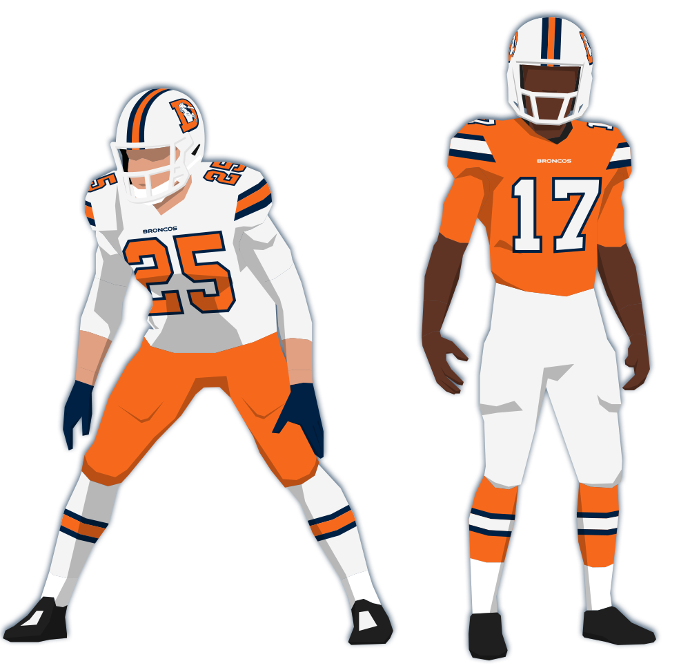
7 hours ago, GhostOfNormMacdonald said:
Honestly, if the broncos wanted to use that helmet after a rebrand and fill the white-orange-white gap In the uniform landscape that's been missing since the bucs dropped Bruce, I'd be completely fine with it
Kind of along these lines?
I tried to stick with generally what TB used when they were orange and red (which fits pretty well with what the Broncos' orange jerseys look like), but with these colors, it ends up looking like one of Syracuse's many recent new uniforms.
-
13
-
 4
4
-
1
-
-
3 hours ago, Eszcz21 said:
Purdue definitely looks better than they've looked the last few years. However, this is the uniform they should of went back to.
But why do the helmet and pants stripes not match?

-
8
-
1
-
-
18 minutes ago, tBBP said:
...the big boys make power plays to snatch up the smaller boys whom they feel can somehow add value to their outfit...
This is a great analogy. I remember Southwest buying AirTran, in large part, because it gave them Atlanta. But Southwest only flies 737s, so all of AirTran's 717s were sold off. I'm not saying Rutgers is the AirTran of D-1A college football, but the B1G brought them in for New York.
-
1
-
-
1 hour ago, buckeye said:
I'd imagine they keep a non-conference matchup going moving forward
Each situation is unique, but I'm sure the same was said for Texas/Texas A&M, WVU/Pitt, etc., at least unofficially.
Edit: That is to say, I would be surprised if they spent a nonconference game on maintaining a former conference rivalry (even if it's THE rivalry for the given school) when there has been very little precedent for that in the modern realignment era (2010ish to present).


/cdn.vox-cdn.com/uploads/chorus_asset/file/12821623/20131130_kkt_aw3_111.0.1511975343.jpg)


2023 NFL Season week by week uniform match-up combos: From HOF Game to Super Bowl LVIII
in Sports Logo News
Posted · Edited by Ted Cunningham
Emphasis added in the quote to highlight the inspiration for my post.
Not to kickstart an "intellectual dishonesty"/Browns & Ravens debate, but a hypothetical: If the impossible came to pass and the city of Houston/Texans ownership got a hold of the Oilers IP, would anyone miss the Texans or their identity if the NFL/Texans did an NBA-Bobcats/Hornets switch, in which the Oilers history ends in 1996, and restarts in 2002 (or even go farther and just say the Texas were a separate team that ceased to exist)? I'm not arguing the practicality of the situation (as I don't think it's practical or that it would ever happen). But if it did, would anyone miss the Houston Texans beyond "Their logo was pretty clever"? Forgettable color scheme, forgettable uniforms, only four double-digit-win seasons, never made it past the divisional round of the playoffs. I guess it's been so long now that there's a generation of football fans who grew up only knowing the Texans, so maybe? I guess it would depend on how long this hypothetical would take to play out. But while the Texans identity is OK, it's just that: OK. The Oilers brand was/is much stronger and more recognizable.
Anyway, this post made me think. Mods, if this is appropriate elsewhere, please move it.