


burgundy
-
Posts
3,441 -
Joined
-
Last visited
-
Days Won
1
Posts posted by burgundy
-
-
I noticed this oddity with the Nike Youth Replica while looking at jerseys on Fanatics:

(No idea what's going on with that crappy sleeve photoshop job)
-
17 hours ago, monkeypower said:
Here are the pics (I don't know why the link in that post above didn't directly embed the tweet).
It's not very clear from the pictures here, but the sleeve stripe colours are flipped on each arm. The left sleeve of the black jersey (as seen in the side profile) has white at the front of the jersey and the red at the back, but red at the front and white at the back on the right sleeve (as implied by the front-ish shot of the black jersey). You can also see it on the red jersey in the wide shot of all three jerseys. The left arm has white at the front while the right arm has black at the front.
I'm not sure where I stand on these jerseys, it's just kind of a lateral move in my opinion. I was a fan of the chest stripes, but I don't think it's a huge loss or anything.
I like the idea of the stripe, but it would be greatly improved with the removal of the logo from the sleeve. Then it would be a unique, quirky, but simple stripe design. Instead it's a cluttered mess. Logos on top of stripes always look terrible (with the exception of the Seahawks).
-
41 minutes ago, the admiral said:
Ugh, this again. As an Irish-American Notre Dame fan and a disaffected Washington fan, they are not the same. Not even remotely.
-
 5
5
-
-
On 7/1/2020 at 12:36 PM, colinturner95 said:
Notre Dame football at the very least has been a much more competitive team in the last 5 years than Cal and UCLA.
I could also be reaching on this, but is it fair to say Notre Dame is a much bigger national brand than both Cal and UCLA?
Notre Dame probably sells more merch than UCLA and Cal combined. Their fanbase is massive. How much of that merch is UA stuff I'm not sure. All the shirts I've bought during the UA run have been made by Champion.
-
3
-
-
2 hours ago, Gothamite said:
I mean, this is bad.
It would be pretty good, except for the bizarre tilt to the top of the letters. Looks stupid when the C is by itself, and worse when the CLT are together.
They also have a very slight (and inconsistent) curve to the vertical strokes, making it even worse. It looks like it's melting, or like it's a bad photocopy of the actual logo.
-
12
-
-
26 minutes ago, SmackNCheese said:
am i the only one who could only ever see raw meat in the old collar pattern?
It does kinda look like muscles and tendons now that you mention it...
-
On 4/17/2020 at 8:52 AM, panthers_2012 said:
Good update for them. I agree, the bearkat head logo looks a little weird, but better than their old one.
And where have I seen that old logo before

I'm amazed they got away with such blatant yet poorly executed theft for 19 years.
-
1
-
-
4 hours ago, radchad said:
Cal used to give the QB and punter the same number. It allowed them to pull off fake punts every once in a while, including this beauty by Jared Goff:
Pretty clever.
And a lot less complicated than this mess Pitt tried to pull off:
The punter was #98 and that's backup QB Jeff George Jr. in some weird 98/96 hybrid. It didn't work.
-
10
-
-
7 hours ago, jp1409 said:
Brandiose at it once again. What a :censored:show...
At what once again? This is nothing like the rebrands they're infamous for. It's not an anthropomorphic gummy bear swinging a bat. This is pretty restrained for them.
The claw marks on everything is definitely overkill. The F logo is all that needed them, and even that could have been executed better. The red pants are bad. They might be somewhat salvageable if everyone wears them up with black socks showing, but we know that's not happening. Also a black belt and piping down the side. Who thought solid red pants would look anything but terrible?
-
10
-
-
I can't even close some of the the ads. Clicking the X just takes me to the ad page. So I can't escape the unending cycle of borders.
-
There's an ad for Charmed that keeps coming up, and even after the border disappears nothing is clickable. Then it'll close and reopen with the border, leaving only a split second window to actually select something. It makes the mobile site unusable.
-
1
-
-
I'm getting the screen framing ads too, and it's annoying as hell. It's not just a one and done pop-up either. It keeps cycling through ads so there's continuously an animated ad around the screen.
-
The concepts section got hit hard. 29 pages of spam threads and growing.
-
8 hours ago, pmoehrin said:
Ok, but the Detroit AAA affiliate in this is Lansing and the NY Giants have Akron, so I'm not really sure what your point is.
Toledo to Detroit = 60 miles
Lansing to Detroit = 90 miles
Is there a reason you chose to work with the specific list of minor league teams that you did? You went down to single A for teams like Lansing, while ignoring triple A teams like Syracuse. And why'd you move the Redbirds to Omaha? What's the method to your madness?
-
I don't like the circle avatars, although mine does actually kinda work in a circle.
-
Notre Dame (all sports): My dad is a huge ND fan, as was his dad before him. My parents were raised Catholic, and I'm of Irish heritage. Plus I like wearing Kelly green.
Detroit Tigers: Living in the Toledo area, they're the "local" team, and my family are Tigers fans.
Washington Redskins: My older brother started following them when they played the Bills in the Super Bowl, and like many things I just copied him, and we've been suffering ever since. I've come very close to giving up on them recently, but then my name would make no sense. If I ever were to abandon Washington, my team would be the...
Green Bay Packers: My dad's team. Plus their uniforms are beautiful, and I love the whole small-market-fan-owned thing they have going on. I almost bought my dad stock for Christmas when it was available, but I was poor and had just started a new job at the time.
Detroit Red Wings: See Detroit Tigers.
Toledo Mud Hens: Toledo.
Toledo Rockets: Toledo.
Toledo Walleye: You get the idea.
Ohio schools NOT named Ohio State: I live in Ohio, so I root for in-state schools. Living in Ohio as someone who's not an OSU fan, I've grown to hate OSU and their fans, and their pompous "We own this state" attitude.
Los Angeles Clippers: I don't really care about the NBA, but if I did, the Clippers would be my team because my dad's cousin played for them (and was probably the best player on the team) back in the days when they sucked.
Everton: Just because. I don't really follow the EPL, but I figured I should have a team.
-
I think the addition of black to the Lions' uniforms was a good thing, once they refined it with their current look.
-
1
-
-
Lions vs. Chargers 2007
First year in current Charger unis, second to last year in Lions old unis

The only difference between that Lions uniform and what they wear now is the number font...
...and the pants and helmet striping, and the logo.
And you call yourself a Lions fan, pfft.

-
For any of the other coaster nerds out there, Arrow Development/Arrow Dynamics:

...and Geauga Lake:

Montgomery Ward:

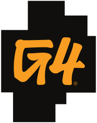
G4:
-
1
-
-
And evidently there's some talks of Notre Dame joining the Big XII for everything but football. Doesn't seem of high likelihood, probably just ND looking for a way out of the Big East.
If that were to happen, one thing's for sure: their baseball team would get slaughtered.
-
A 22 team conference? Really? Ugh...
-
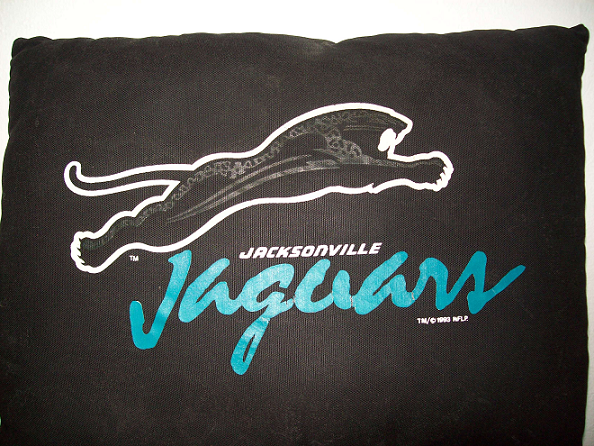
Here's a pic of the pillow with the original Jags logo:
-
Not a full uniform, but...

The somewhat infamous original logo for the Jacksonville Jaguars, bound to be the franchise's primary logo but unused due to a potential lawsuit by Ford.
They made some merchandise with it. I'll look for a picture that I have and update asap.
I had a t-shirt with it back in the day...I think it's gone now...
I have a pillow with that logo on it still up in my bedroom.


Simon Fraser University Drops Clan Nickname
in Sports Logo News
Posted
I don't know about the KKK, but my racist uncle has a Canadian buddy that flies the "Confederate" flag. My racist uncle just loves it, and mentions it every time he talks about visiting his Canadian friend.