


burgundy
-
Posts
3,444 -
Joined
-
Last visited
-
Days Won
1
Posts posted by burgundy
-
-
On 6/23/2022 at 8:34 AM, buckeye said:
Toledo has new plain uniforms with the Michigan State number font. It'd be really nice to see some of the MAC teams get some uniforms that have a unique style to their school, not ones straight out of the catalog.
It's disappointing that Toledo has been stuck with catalog uniforms since switching to Nike. However, the notches in the MSU numbers actually work with Toledo's logo, so I don't mind it. Heck, their "Toledo" wordmark used notches 13 years before MSU did it.

-
 7
7
-
-
10 hours ago, Lights Out said:
I've said it many times, but the 1993 uniforms were the best the Patriots ever looked and they made a big mistake by ever changing them. Even the red numbers on the home jersey would have stopped being as much of an issue once everything switched over to HDTV.
Count me as another fan of the 93 look. I love the red numbers and mismatched shoulder numbers, and the pants stripe was unique without being ridiculous. Then they stripped it of any character in 94 before getting a bit goofy in 95.
-
2
-
-
22 minutes ago, fouhy12 said:
Some possibilities for when they could wear them:
Week 1 at Miami - they wore the 09 version of the red jerseys at Miami, but never the current one. Wearing red and white may be more appealing in the September sun than the usual all navy, assuming Miami wears white at home. The Dolphins breaking out their throwbacks to make this an old-fashioned game would be fun!
Wouldn't it make more sense to wear them in week 17 when they play Miami at home, so the New England fans get to see them? And of course the Dolphins should wear the white throwbacks for the perfect matchup. They could obviously debut them before that (my bet's on Chicago), but that matchup is too perfect to pass up.
-
3 hours ago, oldschoolvikings said:
OK, here's the same font with the doo-dads and gizmos lopped off...
I think it's probably hard to argue with the idea that the simplified version is a better looking font... it just is. However, I'm not sure it fulfills the basic goal of what I set out to do, which is create a font that would visually recall the new wordmark, but still be usable.
That does look much better, but I understand what you mean about it not fitting your original goal. I have some ideas that might work if you'd like to try it. In the wordmark, only the E has the swoopy notch, and it leads into the middle stroke. I suggest trying the notch only on the middle of 3, 6, 8 and 9, with the 8 having a second, flipped notch that aligns with the bottom line of the middle stroke. The tail serif could still work, but looks a little wonky on the 7. Maybe take a cue from the top of the A and have a vertical stroke before going diagonal? Like the Bucs' 7.
-
1
-
-
On 6/15/2022 at 1:31 PM, MJWalker45 said:
Will anyone even notice? It does look better though.
On 6/15/2022 at 3:55 PM, dont care said:Who will notice? Seems really pointless and a waste of money.
3 hours ago, DCarp1231 said:
Considering this is what Marathon stations have looked like for the last three to four decades:
I think people will notice. Sure, the logo isn't much different, but that new canopy design is drastically different.
I like the updated logo. The new canopy is fine, but wouldn't say it's better. It definitely doesn't feel outdated anymore though, and from my experience, there are quite a few Marathons that are VERY outdated. If they're trying to appear more modern, maybe they'll finally replace the pumps and broken card readers that are from the 90s.
-
1
-
-
Get rid of the notches and Viking sails and that's a pretty good modern number font. They don't need all the extra little details to be cohesive with the wordmark, as long as they look like they're in the same family. The uniforms are a definite upgrade over what they have, and a nice blend of eras. The helmet wings do look a bit weird with the green outline though.
-
4 hours ago, NFLfan10 said:
Look at the Chargers, for instance. Navy and royal aren’t anywhere on their home or away uniform, yet both of these colors are featured as “Color Rush” looks.
I think the original rules for Color Rush allowed for teams to use their historical colors, which is how we got the Chargers in royal, Jets in kelly, Saints with old gold, and Rams in athletic gold. So as long as an alternate is designated as "Color Rush" it can use former team colors in a non-throwback uniform.
-
8
-
-
4 hours ago, CDCLT said:
As fair as I'm aware, the NFL has a rule that states the team's alternate (unless it's a throwback and designated as such) can only be a color that's found on the home or road jersey. It's the same reason the Jets have the stupid black stroke on the numbers - it allows them to make the black alt. The Niners' black one is also different because it was a Color Rush jersey - I believe those were allowed to bend the rules.
The 49ers' black uniforms actually pre-date Color Rush. I think the black in the logo, as well as their history of black drop shadows is what allowed them to have black uniforms.
-
3
-
-
28 minutes ago, CDCLT said:
The Rams couldn't introduce a black set, right? Because they don't have black on any of their primary home/road uniforms. When the Comrades introduced their new set they said that the black on the white jersey is what allowed them to create the god-awful black set.
If there's one thing I appreciated about Washington's new uniform reveal, it was their blunt honesty about why they made such a dumb decision.
-
13
-
-
11 minutes ago, oldschoolvikings said:
Am I the only one that always reads that web header as “hog shaven”?
If I had a hog that was ugly as those uniforms, I'd shave his butt and tell him to walk backwards.
-
1
-
-
2 hours ago, guest23 said:
Let's hope not! Using Bone in lieu of plain old white jerseys was the best design innovation to happen to nfl uniforms in the super bowl era.
-
3
-
 2
2
-
 8
8
-
 1
1
-
-
6 hours ago, LMU said:
Quite frankly, the Angels didn’t get the memo on what City Connect is. This is more taking a page out of the Rays’ book and coming out with a fauxback, as these look like what the team would have looked like if they’d appeared a decade earlier.
That's a good thing. These are easily the best of the series. That A logo is the best logo they've ever had. It looks like a classic uniform with a few quirks, instead of wacky for the sake of wacky.
The Dodgers didn't really get the memo either, and put in less effort. "Slap Los Dodgers on there and make the sleeves look sweat-stained. Done."
-
8 hours ago, Dynasty said:
Something I just noticed about is the colors for Washington via Pantone. From what it looks like, they changed the shade of the burgundy to more of a maroon color.
https://teamcolorcodes.com/washington-(Commanders)-color-codes/
Was this announced at any point during the unveiling process because I must've missed it. I also haven't seen the new and old uniforms side-by-side, so I don't know how different they are to one another.
Team Color Codes is a very poor reference for official colors. They not only get the current burgundy wrong, but they say Washington used the same shade from 1983-2020. They used three different shades during that time, with the one they reference being used from 2002-2015. They also used a brighter gold for most of that time.
I do have questions about how well the fabric colors actually correlate to the Pantone colors though. When they darkened the color in 2002, the uniforms also seemed to get a bit darker, but the fabric color didn't seem to change in 2016 when they last darkened the Pantone color.
-
8 hours ago, DCarp1231 said:
They could still use the previous white pants with the b/g stripe and be completely okay
They could, but they won't. The previous gold pants would look even better, but they won't use those either, and I'm not sure they even have them on hand anymore.
-
2
-
-
6 hours ago, M4One said:
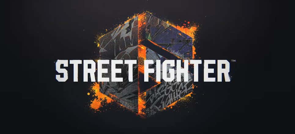
Seems like they have changed the logo.
It's still bad. The "Street Fighter" graffiti script in the lower part of the "6" should have been the logo. It has some issues, but at least it feels like a proper evolution of the logo.
-
10 hours ago, DCarp1231 said:
The only passable uniform combo they have. Unfortunately, the blank white pants keep it from actually being a good uniform combo.
-
3
-
-
I never had a hat, but this was Notre Dame's X-line logo:
It actually showed up on non-Zephyr merchandise too, like these WinCraft decals we had.
This one includes a bonus rear view!
-
1
-
-
The old logo is nothing special, but the new logo is giving me anxiety.
The "l" tries to be too cute by following the curve of the "e", and just ends up looking bulbous and wonky.
And then there's the "p"...
-
9 minutes ago, flyersfan said:
The black base stinks, they should be team colors. Overall, it’s a template. They’re always going to look good for some and terrible for others.
as a Jags fan I view those individually, they’ve had a lot of wooooof designs, this one is okay in comparison
While none of them are great, the Jags and the Panthers are easily the best, since black is a team color and the 80s/90s aesthetic works for both teams. The scripts also contrast against the color of the block letters, while teams like the Raiders, Steelers, and Saints get completely lost. The Bengals, Falcons, and Ravens also work pretty well for what these are. The rest are not good, and should be in team colors.
-
4
-
-
4 hours ago, GDAWG said:
He's back in the NFC East:
-
9 hours ago, Sport said:
Dreck. Just read this was created by an agency and NFL creative services was involved, which is why it looks like a characterless Super Bowl logo.
I really hate this realism trend in sports event design. There's no statement here, nothing that captures the essence or feeling of the event. It's just a photograph (word chosen carefully) of the object. How is it we're in decade 4 of vector sports artwork and we're actually devolving?
Totally agree. This isn't a logo, it's a photo-realistic illustration. The rules of logo design have been completely thrown out and replaced with soulless and cluttered imagery devoid of creativity. I hate it.
-
6
-
-
1 hour ago, oldschoolvikings said:
After seeing this mock-up, I have to say that many of these do indeed look stupid, and are objectively bad.
-
2
-
1
-
-
Awful. It looks like a crappy MMA logo. And that's probably on purpose, since the supposed main character of SF6 is an MMA fighter. They're throwing away decades of brand recognition for a boring, generic logo, with a boring, generic MMA fighter as the face of the game.
-
2
-
-
4 hours ago, oldschoolvikings said:
So in this picture the Gamblers are wearing the dark gray pants with their away jerseys. And in their reveal video, they show them wearing both the dark gray and the light gray pants, but the dark gray with white is actually labeled as the Away uniform. So are they wearing both pants, or did they screw up and give them the Bandits' pants for part of the shoot and not bother to fix it?


College Football 2022
in Sports Logo News
Posted
Obviously it's not perfect, but as far as catalog uniforms go, it works better than most. In an ideal situation, they'd have a custom number font to match the wordmark, but they gave that option up when they switched from UA to Nike.