-
Posts
3,441 -
Joined
-
Last visited
-
Days Won
1
Posts posted by burgundy
-
-
10 hours ago, TruColor said:
It’s not metallic, and it’s really not copper.
If everything that’s been described to me is true, then we will be getting a unique color palette in sports.
There’s really not much Black any longer, and Yellow will only be present in the helmet logo (as before).
Since you told us the beak color of the helmet logo, can you tell us what color the head is? Is it still cardinal (or metallic cardinal, like the black helmet)? Or is it this supposed maroon? I just find it very weird that they would introduce orange to the color scheme, yet keep the beak yellow. Seems like an odd inconsistency and a missed opportunity, since cardinal beaks are actually orange.
I 100% trust your info on the helmet, but I'm still very skeptical of this other guy that's giving jersey and color info.
-
 2
2
-
-
20 minutes ago, CaliforniaGlowin said:
Recent history has shown that some fans can do a better job than the team can do.
Yes, but that wasn't the point. Of all the people that submit a logo, only one person will get compensation for the time and effort they put into their work. And even that person will probably be compensated way less than they deserve.
-
 4
4
-
-
2 hours ago, Glover said:
Gotta love when a billion dollar franchise asks its fans to do free work.
-
7 hours ago, HopewellJones said:
A lot of unknown potential for this new set to be a disaster, but can we all at least just take a second to appreciate that the current set is finally dying

-
 1
1
-
 6
6
-
-
1 hour ago, 4_tattoos said:
Alright Josh Harris & Company. There is only one way any new name change should go....
HOGS!!!!!!!


In the mean time, gold pants for the Commanders would be swell.
"Washington Hogs" feels a little lacking. "Washington Warthogs" sounds better as an official name, while obviously allowing for "Hogs" to be the shortened nickname. And while I would love for them to have a better name, I give this about a 0.1% chance of happening. I just don't see the NFL allowing yet another name change in such a short timeframe. New logos and uniforms would be allowed (and are desperately needed), but I think we're stuck with this dud of a name.
1 hour ago, CaliforniaGlowin said:Commanders changing their name and branding after the sale would be very MiLB-ish.
As a fan of the Mud Hens and the Washington [insert name here]: How dare you besmirch MiLB by suggesting that Washington could rise to their level of respectability!
-
 4
4
-
-
1 hour ago, TruColor said:
No - not that crazy. The hints are all out there about the helmets...when you see them, you'll say "of course".
 On 4/9/2023 at 4:01 PM, burgundy said:
A white helmet with metallic gold/copper flakes? An anodized red facemask that can look various shades of red depending on lighting? A bit larger helmet logo that's metallic and has gradients like the one on the black helmet?
Am I getting warm or cold?
White with metallic gold or copper flakes = Sand = Sonoran Desert
-
 1
1
-
-
What thell is going on here?

-
9 minutes ago, WBeltz said:
Hopefully this means the Steelers can do the Batman throwback now.
This is the only positive that could come out of this template change.
Although I'm not sure it's a time that Pittsburgh fans want to recall.
Hot take: I think the Batman jerseys work much better with their pants and helmet than their classic sleeve striping does.
-
 9
9
-
-
3 hours ago, TruColor said:
All I will say about the helmet (yes, I have a picture that I have promised NOT to share), is that when you see it, you'll think "of course...it all makes sense now".
I think.
I will also say is that from what I know of the uniforms that the helmets do tie into the uniforms, but I have a number of questions about that...the things I'm hearing don't all make sense to me.
A white helmet with metallic gold/copper flakes? An anodized red facemask that can look various shades of red depending on lighting? A bit larger helmet logo that's metallic and has gradients like the one on the black helmet?
Am I getting warm or cold?
-
34 minutes ago, AndrewMLind said:
Can confirm through multiple sources the Panthers (and most NFL teams for that matter) will be on Nike's Vapor Fusion template this season. Won't be able to get confirmation or further details from the Panthers until Tuesday, though. I have asked how that will impact their TV numbers and collar, as I suspect they may have larger numbers and no contrasting collar.
Gross.
The Fusion is such a massive downgrade from the Untouchable, but Nike gonna Nike, and push their "innovation" because they can't leave well enough alone.
-
 5
5
-
-
39 minutes ago, Sec19Row53 said:
Because they like what they get from Ripon?
Ripon has an elusive technology that allows them to create an accurate forest green.
-
 3
3
-
 1
1
-
 10
10
-
-
1 hour ago, Kiltman said:
* Unless their attempt to get the league to allow third helmets is permitted.
Fair point, but I would hope that there's a limit to how many times the league will submit to Jeffrey Lurie's peer pressure.
-
 1
1
-
-
-
33 minutes ago, Captain Poncho said:
Given the impeding redesign and the fact that an alternate helmet has to stick around for five years (right?), it'd have to take into account at least some elements of the potential new designs.
Nope, only jerseys have to stay for five years, because that's what sells the most. The Eagles' black helmet will be a one and done, and the Rams showed that even primary helmets don't need to last very long.
-
 5
5
-
-
2 hours ago, TruColor said:
My Reddit contact said that the Draft Hats we're seeing are placeholder hats or something. Not the real ones.
I'm calling bullsh!it on this one. The hats are in stock and ready to ship. They wouldn't manufacture thousands upon thousands of placeholder hats that would be obsolete by the time the draft happens.
My guess is that this reddit guy is looking at photos that have terrible lighting and/or saturation. Cardinal and gold in poor lighting look an awful lot like "maroon and orange".
-
 7
7
-
-
5 hours ago, IceCap said:
Despite using the same artificial sweetener they taste differently. Usually the ZERO stuff tastes closer to the regular version while Diet is a bit more of its own thing.
It started with Diet Coke. Diet Coke is actually the no calorie version of New Coke. New Coke died but Diet Coke stayed. Coke Zero is the no calorie version of Coca-Cola.
That's an interesting historical quirk, and explains a lot.
-
 2
2
-
-
9 hours ago, Cujo said:
Well. That was a fun, off-topic rant, wasn't it? "GAHH WHY THAY PRODUCE THEM POISON DIET DRINKZ WHEN THE ORIGINAL ONE WILL GET YOU THE REAL DIABETUS!!"
Good thing you don't run Pepsi Co.

Thanks for making me sound like Tnak, but that's not at all what I said. My question is why have two no-sugar versions that use the same artificial sweeteners? Aspartame has a very noticeable flavor to it, so if the goal is to make it taste more like the regular drink than Diet, why use the same sweetener when other no calorie sweeteners are available? I'd like a no-sugar option, but aspartame is a no-go for me.
-
10 hours ago, wildwing64 said:
New logo is alright, but the black text and outline around is a bit much. It fits better on the Zero can than it does on the regular - and that was a deliberate choice:
Quote“We think that the non-sugar segment of colas will continue to grow very fast in this country. We’re seeing consumers pivoting,” Laguarta said, noting that zero had already been a “strategic” product in Europe and elsewhere.
To that end, “zero sugar is going to be the protagonist of our communication strategy,” Porcini told CNN.
To highlight the zero line, the new logo uses black font and a black border, a nod to Pepsi Zero’s black can and label.
I've never really understood the shift from "Diet" to "Zero Sugar", while still producing both products. They both use aspartame and acesulfame potassium, and they both taste terrible. I guess the Zero Sugar drinks might be slightly less terrible, but they're all the same thing to me. They could use sucralose, allulose, or erythritol to differentiate one, but nope. They both have that distinctive aspartame taste, so why should I buy Zero Sugar if I already don't like Diet?
I guess what I'm saying is, making Zero Sugar the focus of the brand is stupid.
-
 2
2
-
 1
1
-
-
2 hours ago, Ferdinand Cesarano said:
I was hoping for them to follow the good example of Burger King, and just go back to the best-known logo. But if this is as close as we are going to get to the real Pepsi logo, then I guess it'll have to do. It's definitely an improvement over what came before. Still, the flaws in the font would be so much less irritating if the lettering were in blue instead of black.
Burger King didn't go back to their old logo either, but they did a much better job of making it feel like they went back to the old logo. The font in the new Pepsi logo is just so obviously wrong, and the black looks out of place.
-
 5
5
-
-
1 hour ago, HOOVER said:
Yes, and the draft cap is brand new.
So, 1 hat out of 260 other hats listed on Fanatics used Athletic Gold in the artwork. 1/260.
Now do the tees. I just flipped through 5 pages and found 1 Yellow Tee and 1 other shirt that had Athletic Gold in the design. That's 2 out of 360 tees.The t-shirts I found with athletic gold:
Spoiler


And some other stuff with athletic gold:
Spoiler


-
 5
5
-
-
4 hours ago, 4_tattoos said:
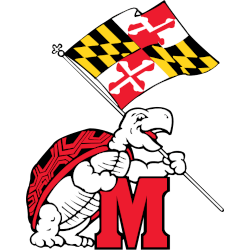
By virtue of being from Maryland I've blindly supported their athletic programs my entire life because, homer. With that being said, Testudo is a lame mascot in every form. And this is coming from a guy the was a Ninja Turtles fan growing up. Give me state flags, banners and the letter M any time over the Terrapin.
I think I have a solution.

-
 7
7
-
 1
1
-
 22
22
-
-
36 minutes ago, 4_tattoos said:
The state flag branding isn't exactly a recent trend for UMD.
The use of the flag/banner on uniforms should definitely be toned down, but not completely scrapped. Like mentioned before the football team's uniforms are pretty tame from the neck down. The flag design needs to stop covering the entire helmet. It's never been a good look.
At least that logo has Testudo holding the flag. They haven't used a logo with Testudo since 2012, and the turtle shell helmets were back in 2011. A whole decade of nothing but flag imagery across all their sports. They may as well be the Maryland Marylanders at this point. They've been so focused on the state's unique flag that they've forgotten about the school mascot that is also incredibly unique.
-
 1
1
-
-
9 hours ago, oldschoolvikings said:
Maryland needs get away from the flag heavy stuff and lean in to the turtle.
Short of Under Armour completely collapsing and getting out of uniforms entirely, I don't see that happening. As long as Kevin Plank still has a flag fetish, Maryland will plaster it all over.
-
3 hours ago, WestCoastBias said:
Notre Dame announced they're wearing green Sept 23rd against Ohio State
Too bad it's still the crappy blue-numbered green jerseys. I really hate Under Armour and their stupid insistence that all green uniforms across all sports have to have blue numbers/script outlined in gold. It sure would be nice if ND were the next team to announce their departure from UA.
-
 2
2
-


Arizona Cardinals new uniform extravaganza
in Sports Logo News
Posted
Cardinisation