


burgundy
-
Posts
3,444 -
Joined
-
Last visited
-
Days Won
1
Posts posted by burgundy
-
-
1 hour ago, oldschoolvikings said:
OK, you're gonna have to give me a few seconds to look at this uniform, since this is the first time in my life seeing it.
OK... I looked at it. Don't like it.

-
 2
2
-
-
1 hour ago, oldschoolvikings said:
There has never been a uniform in any sport at any level that made royal blue and black look good together.
Come at me.
-
4
-
-
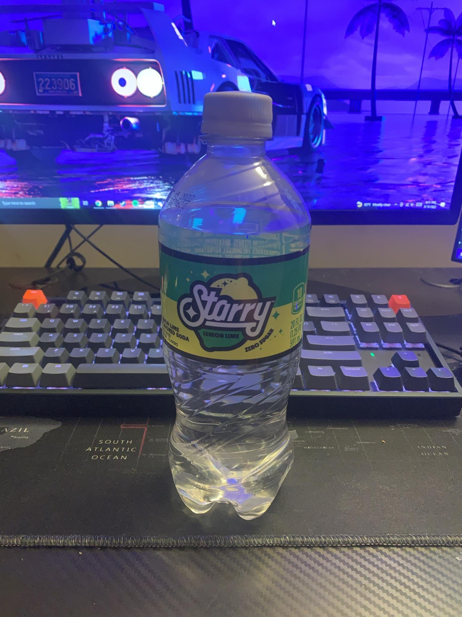
On 10/3/2022 at 9:40 AM, kmccarthy27 said:
Looks like Pepsi gave up on Sierra Mist and is launching Starry to replace it. (
Goddammit, Pepsi. Stop it with the rebranding, and just accept your place as the #3 lemon-lime soda. Sierra Mist was, is, and (after they revert again) will be a perfectly serviceable name for when waiters ask "Is Sierra Mist okay?" The last time they changed the name everyone still called it Sierra Mist, and by the time any fountain labels were changed to "Mist TWST", they were already bringing back the Sierra Mist name.
That said, the logo and label are pretty decent designs. Better than the crap they usually rolled out for Sierra Mist.
2 hours ago, CDCLT said:I guess an unpopular opinion would be I actually prefer Sierra Mist to Sprite. It's sweeter and I like it more. Hopefully this Starry is similar to Sierra Mist in flavor.
I actually prefer Sierra Mist too. It has a cleaner taste, if that makes sense. 7-Up, and to a lesser extent Sprite, leave a distinctive aftertaste in my mouth.
-
1
-
-
On 9/15/2022 at 9:15 AM, Clintau24 said:
Soooo, yea this one's been crazy. The photo of the orange mask with jersey material was only posted on Instagram, so they kinda buried it a bit. Turns out that's just the sleeve stripe on a navy jersey.
I've confirmed that Auburn doesn't even have orange jerseys. It's not happening. A lot of fans are upset now because of the hype and playing it up from the football team, the staff members changing their profile images to orange, the other Auburn teams sharing how much they love orange jerseys, and so on. It's a risky move, but the hype and engagement were incredible. Even for me and I didn't engage all that much.
And for the humble plug, here's an article I wrote a few years ago about the history of Auburn's orange jerseys when they returned in 1978. There's always a lot of misconceptions around them.
Seems very similar to when Notre Dame started their "Irish Wear Green" campaign, and then didn't wear green.
Speaking of which...
On 9/15/2022 at 2:55 PM, mbannon92 said:Notre Dame adding white NOBs to their green jerseys for this weekend’s game against Cal.
If they’re gonna stick with the navy numbers, they should have made the NOBs gold - that white sticks out like a sore thumb.
The white names show just how terrible those blue numbers are. Blue on green works fine for merchandise, but is absolutely abysmal for on-field visibility. Everybody told them the first time they wore these, and again when they announced green was returning. Yet ND and UA continue to be stubborn and stick with their flawed brand consistency. I wonder if they'll wear blue socks like they did last time, which made it even more of a mess.
-
1
-
-
1 hour ago, Chawls said:
2. I sincerely don’t know what you mean about the Vikings uniforms being of the time. Do you mind elaborating please?
The references to "the sails of Viking longships" in an otherwise classic-inspired uniform is very 2010s. Make the white sleeve stripes straight across and remove the weird number serifs, and that's a timeless look.
-
2
-
-
21 hours ago, CaliforniaGlowin said:

This team is a bottomless pit of stupid.
-
 4
4
-
-
3 minutes ago, LA Fakers+ LA Snippers said:
I felt like farming for likes today, so here's yet another photoshop of what WAS should've done. They could even keep the black number outlines.
Lipstick on a pig. There's no saving that uniform design with just a color change.
-
12
-
-
15 hours ago, 4_tattoos said:
The longtime fans WILL accept a hog mascot. Which means they're probably going to choose a George Washington-esque historical figure for a mascot instead.
I'm fully expecting a Homelander knockoff as the new mascot. His cape will be the D.C. Flag.
-
1
-
-
5 hours ago, 4_tattoos said:
Commanders release home jersey schedule. Facebook post said the pants' color are TBD
Commanders announce 2022 home jersey schedule
-
1
-
6
-
-
4 hours ago, NH4 said:
Notre Dame’s Shamrock Series uniforms in Las Vegas vs BYU. Probably my favorite Shamrock Series uniforms but I’m a sucker for white and gold
The Magic Underwear uniforms.
The shoulder stripe design is a bit much for me, but otherwise not bad.
-
1
-
-
These stripes are definitely painted:
-
4
-
-
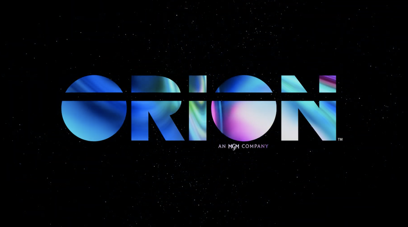
38 minutes ago, TrueYankee26 said:
Even Orion Pictures (I did not expect that) gets a brand new logo.
Old logo
New logo
And the video of the new logo
-
3
-
-
5 hours ago, MJWalker45 said:
Nevada getting rid of asymmetrical helmets.
Is the silver painted in the same finish as Notre Dame's gold? I like it. The thin white outline around the logo is unnecessary, but otherwise, that's a great look for them.
-
1
-
-
9 hours ago, NH4 said:
Also, something kind of interesting
7 hours ago, TBGKon said:FIU Baseball has used it in the past.
What the hell are "Parthers"?
-
1
-
-
41 minutes ago, TrueYankee26 said:
Polium One.
That whole thing is a crypto scam, so it's no surprise their logo looked like a ripoff. The image of their "console" was also taken from someone else's concept.
They've since changed the logo to a stick of butter being shoved into a hexagon:
-
On 7/9/2022 at 5:06 PM, DCarp1231 said:
Anniversary patches for Washington-
It continues to baffle me why they insist on using the burgundy W on a burgundy background everywhere except the helmet. It looks pretty good on the Helmet, which is the only good part of the rebrand, and is a primary piece of branding... yet nothing else matches it. This franchise is such a dumpster fire.
Can Dan Snyder be kicked to the curb already? What are the other owners waiting for?
-
10
-
-
On 7/10/2022 at 12:26 AM, mafiaman said:
When did CAL become a “big game” jersey day?
Oh how the mighty Irish have fallen…
How the hell does Notre Dame wearing green against Cal mean they've "fallen"? They don't wear green for only "big" games. They've worn them against Army, Boston College, and a mediocre Florida State that was not the team it used to be. Green was originally used as a clash against teams like Iowa and Navy before away jerseys were used. USC is obviously the most famous and frequent opponent for ND to wear the green against, but there's really no rules they've followed for when they break out the green.
-
9
-
-
13 hours ago, Discrim said:
IIRC ND is rather insistent that both blue and gold be present on any green jerseys nowadays...why they feel it has to be in "green version of white jersey" form, I don't know, when "green version of home jersey" tended to work much better. Hell, inverting the numbers to gold trimmed in blue would be an improvement here.
Yeah, they've been very strict about brand consistency since UA took over. It makes sense to want consistency, after years of wavering between Kelly and Forest green, athletic gold and metallic gold, and even sometimes royal blue instead of navy. Unfortunately, for some reason they decided navy outlined in gold looked good on green, and have stubbornly stuck with it. For apparel it works fine, and the script on baseball and basketball jerseys kinda works, but the numbers are just awful. Gold numbers would look a bit better, but I'm not sure their current shades of gold and green have enough contrast between them. It's probably a nightmare for colorblind people. I've always thought the best green jerseys were when they just swapped out blue for green, leaving white numbers. The Dan Devine era jerseys really weren't that great, with a brighter, more yellow athletic gold that did not match the helmets at all. The Weis era green jerseys always felt too dark and muddy for my liking. The Willingham jerseys got it right, but they got embarrassed in them, so we never saw them again.
-
1
-
-
1 hour ago, CaliforniaGlowin said:
Seeing those two together makes the second one look almost teal

It pretty much is just dark teal. The Eagles' Midnight Green is Pantone 316 C, right by the Jaguars' original teal at 315 C. Jacksonville has since updated to 3155 C, which is used by other "teal" teams. The LA Galaxy used 3165 C, and called it teal. And of course there's the Hornets, who use 3145 C. Then there's the Sharks, who have used all of those as their teal.
-
6
-
-
6 hours ago, oldschoolvikings said:
Does anybody else remember the 80's Jerry Faust era green jerseys? Weird little blue stripe hidden on the sleeve...
It's extremely difficult to find images of that jersey. I'm doing a deep dive and coming up fairly empty. It's from the 1983 USC game in South Bend. Can anybody else find a better image?
A few more pictures:
Similar to UA's current philosophy, Gerry Faust decided that a green jersey MUST include blue, giving us these... unique stripes. Faust even said they were one of the ugliest uniforms he'd ever seen. The blue stripe was the "Madonna Blue" they wore at the time that was basically royal blue. Faust's use of Madonna Blue was an attempt to go back to ND's traditional blue and gold after years of wearing green under coach Devine, but he wanted to go back to the school's original shade of blue instead of navy. Of course, like much of his tenure at ND, he came up short at that too. If they used the original blue, they'd look like UCLA:
-
1
-
-
I love when Notre Dame wears green. I've probably embraced the kelly green more than most, as I've worn almost exclusively green ND gear since at least 2004. I'd have the football team wear green 3 times a season if I had my way. But not in those current jerseys. The blue numbers on green are illegible garbage. People (and announcers) have been saying so since they first debuted, yet UA and ND have refused to go back to what worked. I really want to be excited about green jerseys coming back, but those blue numbers really put a damper on it.
-
2
-
 1
1
-
-
17 hours ago, Volt said:
....as you can see here. This look is complete trash.
If the Panthers go with a Blue alt helmet, they need to wear it with all Blue unis, or with the all-white unis. It will look like spit-up with any other combo.Blue jersey with white pants and blue socks seems like the best combo with a blue helmet. No thanks on the mono-blue.
-
5
-
-
23 minutes ago, MJWalker45 said:
It was a stock Under Armour number set. No one else probably wore them other than high schools teams based on how ugly they were.
Are you certain that it didn't become a stock font after being designed for Toledo, like the Maryland and Texas Tech fonts? The earliest catalog I can find is from 2013, which shows this exact group of fonts.
https://issuu.com/kollegetown/docs/kollege_town_under_armour_2013_football/78
-
2
-
-
21 minutes ago, BigDmo said:
Just NASA lol
Definitely inspired by NASA's worm logo font (appropriate for a team named Rockets), but not the same.
FUN FACT: Gene Kranz, the Chief Flight Director of NASA's Gemini and Apollo missions, is from Toledo.
-
1
-


2022 NFL Season week by week uniform match-up combos: From HOF Game to Super Bowl LVII
in Sports Logo News
Posted
Same reason everybody else wears white socks with white pants. Kids and morons love the icy white yoga pants look.
Also, they kinda deserve to look like trash as long as Snyder owns the team.