


pepis21
-
Posts
2,752 -
Joined
-
Last visited
-
Days Won
1
Posts posted by pepis21
-
-
On 7/23/2023 at 3:47 AM, Bomba Tomba said:
Why does this look like an indie album cover
Have no idea but here is even more Ekstraklasa teams.
Radomiak Radom:

Górnik Zabrze:
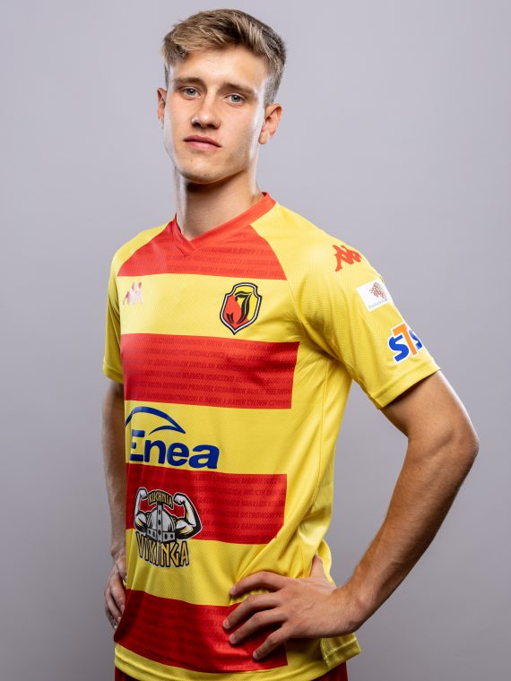
Ruch Chorzów:
Puszcza Niepołomnice:
-
Still no Suns leaks? Iirc ticket holders on 23.07 should saw uniforms on some event with no phones or cameras allowed, but still there should be a chance that someone smuggled some kind of device to make photos.
-
Legia Warszawa away (home carried from last season):
ŁKS Łódź:
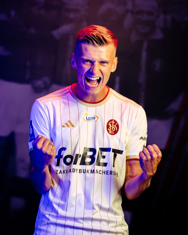
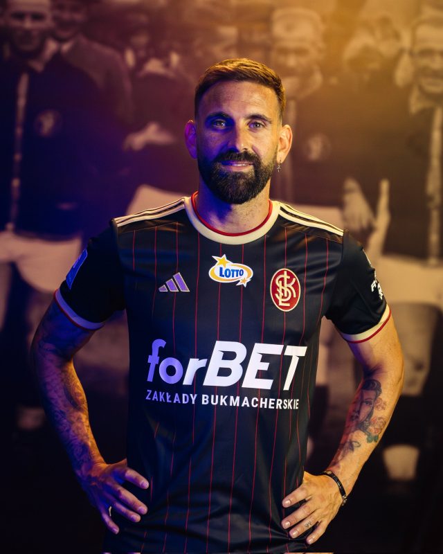
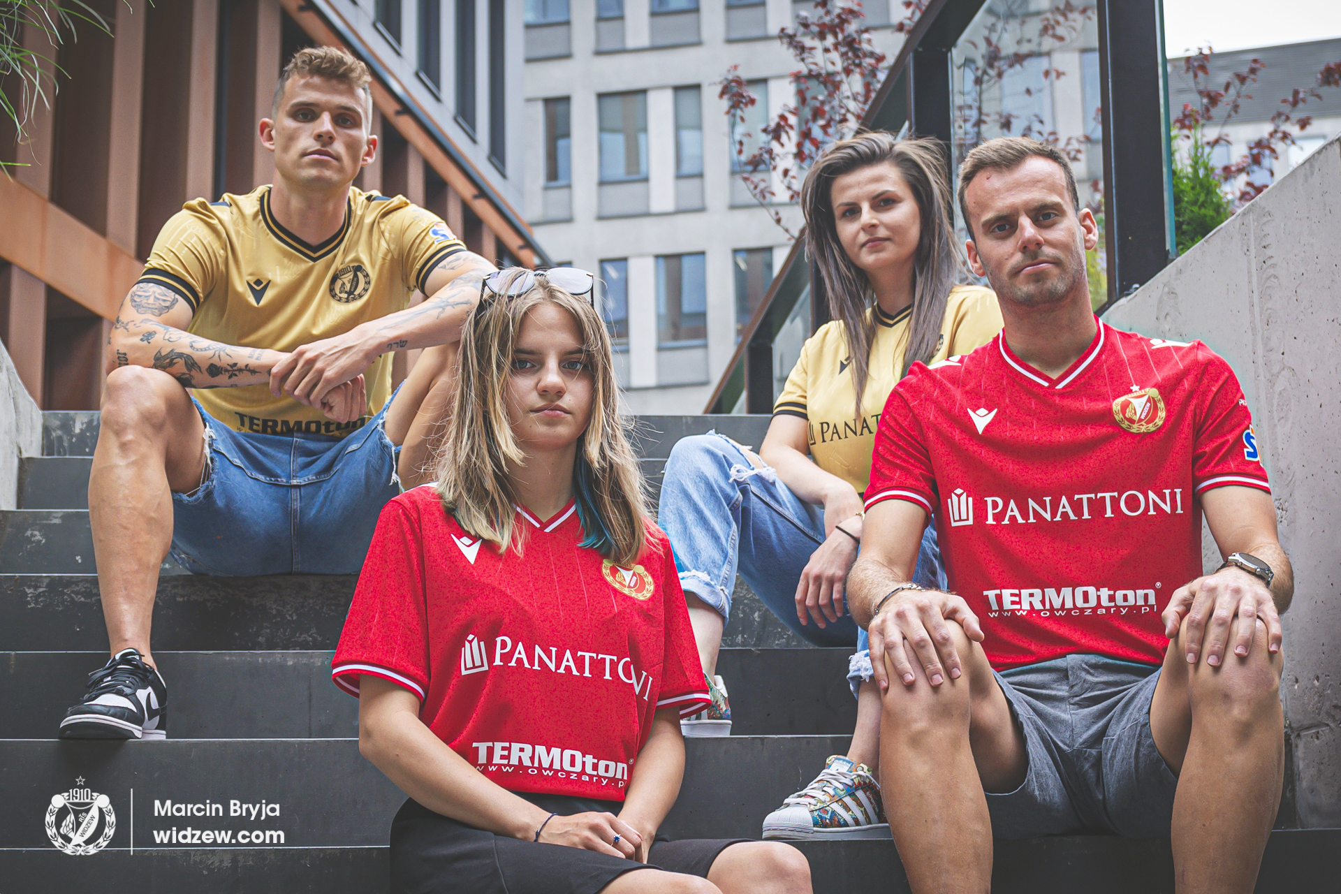
Widzew Łódź (swtich from Kappa to Macron):
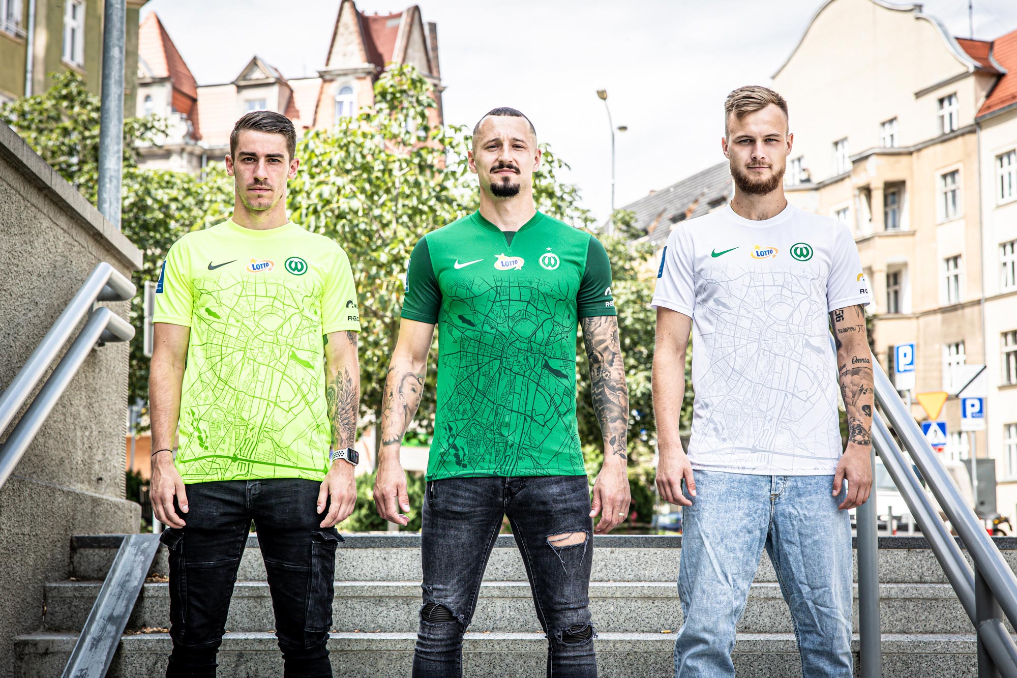
Warta Poznań:
Jagiellonia Białystok:
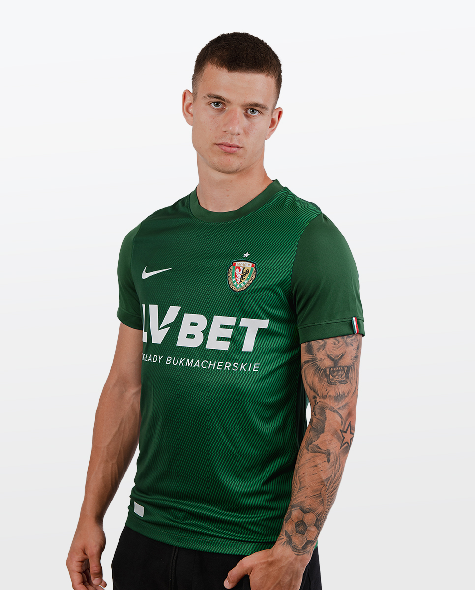
Śląsk Wrocław home:
-
Korona Kielce home (after presentation they decided to recolor suzuki logo to black), away and 50th anniversary:
Piast Gliwice home, away and third:
-
Pogoń Szczecin:
Home inspired by mosaic around the town:
Away inspired by crocuses that grew up on Jasne Błonia Square and Chrobry Embankment:
Third inspired by water (Szczecin is a town with harbor) and night life in Łasztowna neighborhood:
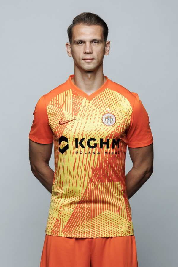
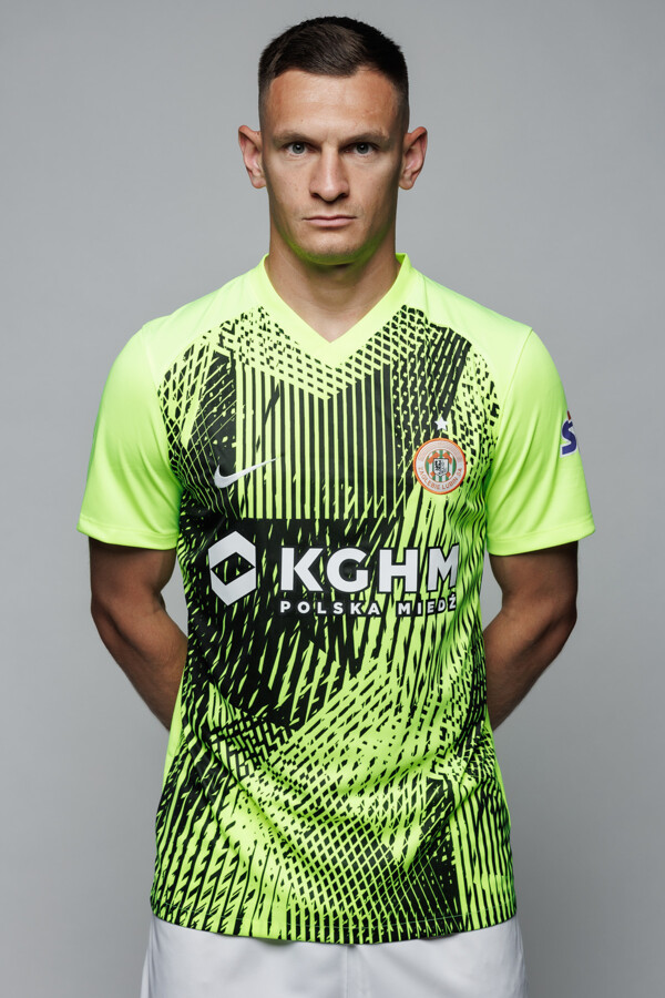
Zagłębie Lubin, theoretically they are inspired by copper mines but in facts this is Precision IV teamwear (home is with custom colors):
Lech Poznań third (home and away i presented in my previous post):
All shirts are inspired by Locomotive which stand near their stadium
-
 1
1
-
-
Be prepare for In-season tournament champs banners under roof.
-
 1
1
-
 1
1
-
 2
2
-
-
On 7/5/2023 at 4:58 PM, monkeypower said:
While we're still DuckJacked,
So are you thinking that Johnny Canuck should replace Orca as a primary logo for Vancouver?
-
1
-
-
Intresting that numbers font is same as current and not from leaks.
-
1
-
-
On 7/7/2023 at 1:02 AM, Frylock said:
Yep, that’s in addition to the Raptors and 1994 FIBA championship logos posted above. Turd O’Gravy is so stuck on what he’s done in the past, along with a cloying “don’t you know who I am?” attitude, it’s left a sour taste in mouth for most of these logos.Need to add my two cents because I remember when he rant over Lions Throwback (yes, a throwback) calling it bland and boring and blame nike designers for that and even when people explained him "Dude it's a retro from 30's" he was like "So what?" and keep rant over it. It was so funny to read that conversation.
Anyway he is egocentric but we can't take from him that some of his works are still beloved.
-
2
-
-
To be fair those new Suns jerseys using same wordmark as current so if someone have no idea about them changing uniforms he'd probably unnotice that on Summer League jerseys.
-
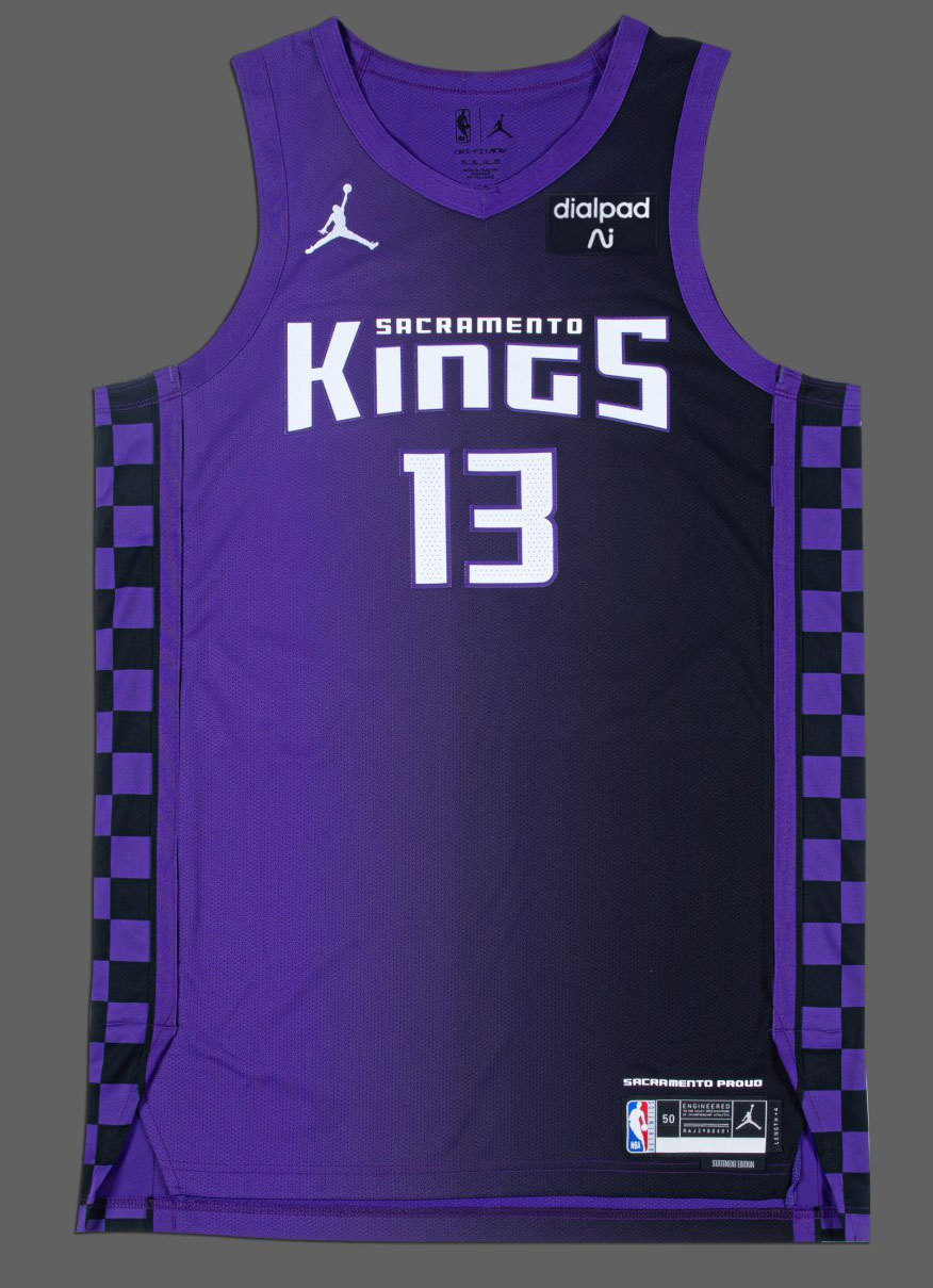
2 hours ago, SantosD_ said:
Statement jersey got leaked on twitter
via: @AndrewMLind
So we could assume that shorts going to have same design as their 20/21 City?
-
6 hours ago, DJT said:
First of all I like that they kept overall design. New wordmark is huge upgrade especially over that Sac thing. Away uniform for me is perfect and reminds me of days when they were really good team (robbed by refs against Lakers), but I've got problem with home which I haven't if they only reverse black with purple on wordmark and numbers.
I hope third gonna be purple with black/white details and white/black wordmark/numbers.
-
2
-
-
Raków Częstochowa switch to their 4 supplier in a 5 years. This time it's adidas (kits from locker room which is old miteam):
Warta Poznań changed their crest to reflect one of the original from past:
Before you said it look like Wolfsburg then Warta is much older than VFL and they were first with "W" as a crest.
Lech Poznań:
-
1
-
-
Intresting. Real deal? Production error? Why they didn't unveil this in last season if they sold them in last year?
Anyway it's not a bad change but also kinda change for change sake.
-
1
-
-
1 hour ago, JustABallCoach said:
Rockets have changed their Twitter header and profile picture to the toothed Rocket era logo and secondary logo.
Next season is 30th anniversary of their first championship so they are eligible for retro and now there is 20 years since they ditched those logos.
-
So 'SAC" is stay with us. Is that mean it's unlikely to see Sacramento on jersey instead of Sac? I hope not.
-
Cuba kits except home (or at least I didn't find it in catalogs) are teamwear.
-
1
-
-
FIBA 1994 World Championship logo is in Factory pomo style as well:
-
3
-
-
2 hours ago, VampyrRabbit said:
Not sure, I think the logo is really nice as it is and the Fleur de Lys and wrought Iron style detail at the top of the logo looked good.
But you're talking about 2013-2023 logo and this logo is indeed good and even better than good. Now they switched to basically alternate logo with slapped text underneath. Utah Jazz made same mistake in last year
-
4
-
-
25 minutes ago, VampyrRabbit said:
The Pelicans have revised their logo for next season.
Why they did that? WTF is wrong with this league?!
-
1
-
-
1 hour ago, VampyrRabbit said:
2026 is when the ban comes into effect.
And only on front of the jersey. Sleeve will still be allow.
-
4 hours ago, Jezus_Ghoti said:
Fans in Canada and the men's team players were rightfully pissed off that they played in the World Cup and couldn't get anything more than an off-the-shelf template kit from Nike, and now Nike turns around and gives them this garbage??
This is maybe the ugliest thing ever worn by athletes representing Canada on the world stage:
This is also a teamwear (Strike III) and it was quite obvious that they wouldn't get a bespoke kits until 2024 when there's gonna be a new batch for MNT.
-
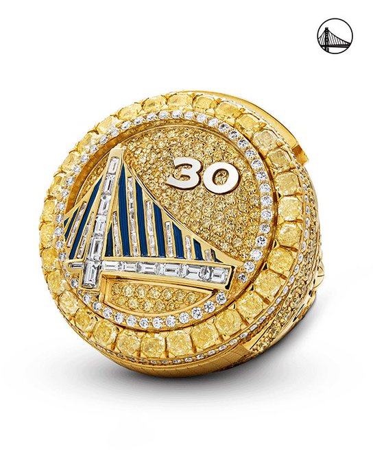
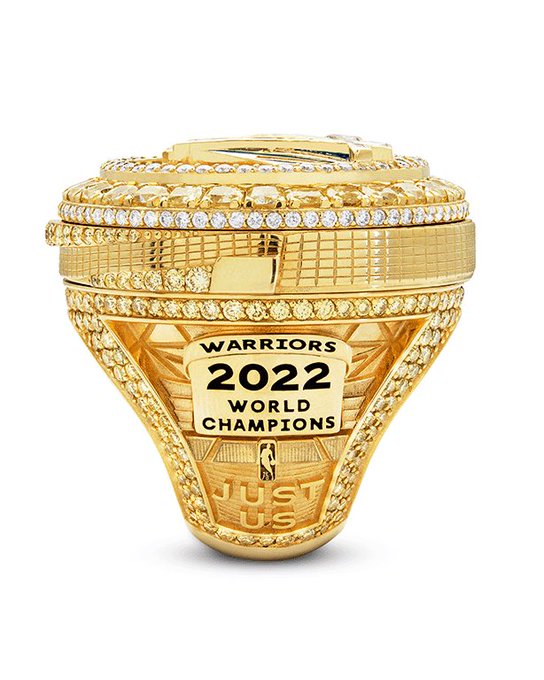
On 10/19/2022 at 10:21 PM, M4One said:
Golden State Warriors with their very expensive, not cheap at all, ring. The top twists to reveal how many titles the player has won.
Now I notice (better late than never) that they used Copperplate for numbers while new font for text. Wonder if this has something to do with 75th anniversary of club and league.
-
I know that is hard to expect too much from Fanatics but from all Major leagues NHL draft caps are the lamest one not for the first time.
-
1
-


2023 - 2024 NBA changes
in Sports Logo News
Posted
I wonder how different is bounce of the ball on that court, also how hard those led screens are and if they add additional protection to prevent cracking (imagine impact from landing after power dunk). At this moment I'd say it's more like a gimmick, but in near future I could see that as a real deal.
On the other side I heard that Suns unveiling is on 1st August. Can someone confirm that?