


pepis21
-
Posts
2,745 -
Joined
-
Last visited
-
Days Won
1
Posts posted by pepis21
-
-
9 hours ago, Old School Fool said:
City uniforms this year are a big case of "Don't judge the leak" if I've ever seen one.
It's true especially swingmans always looks slightly worse than authentics, atlhough Nuggets is still dumb with 5280 as a wordmark.
Speaking of marketing bs, this my favourite one (from Lakers):
QuoteWe went with the all-black uniform because when we first got to LA, we didn’t know who we would be. The only idea of what we could be was the picture we had in our heads when we closed our eyes. And we were extra thoughtful with the purple and black trim detail. The trim goes from purple to black to purple as a nod to the sky after a California sunset. It’s a part of the day after golden hour when you can’t help but reflect on what you want and how much further you have to go.
-
 1
1
-
-
40 minutes ago, TBGKon said:
It has adidas logo but is definitely not made by adidas. Wonder what happened here?
-
2 hours ago, Digby said:
Those are soccer shorts. We really can't help ourselves, can we?
In Europe most bball leagues have numbers on shorts although mostly on left side not right.
1 hour ago, CitizenTino said:Know who else doesn’t like numbers on shorts? Nike. The Heat equipment staff has to put the numbers on the players’ shorts themselves.
That's actually nothing weird, because in most of times teams customize their uniforms by themselves anyway.
-
Numbers on shorts are pretty neat idea
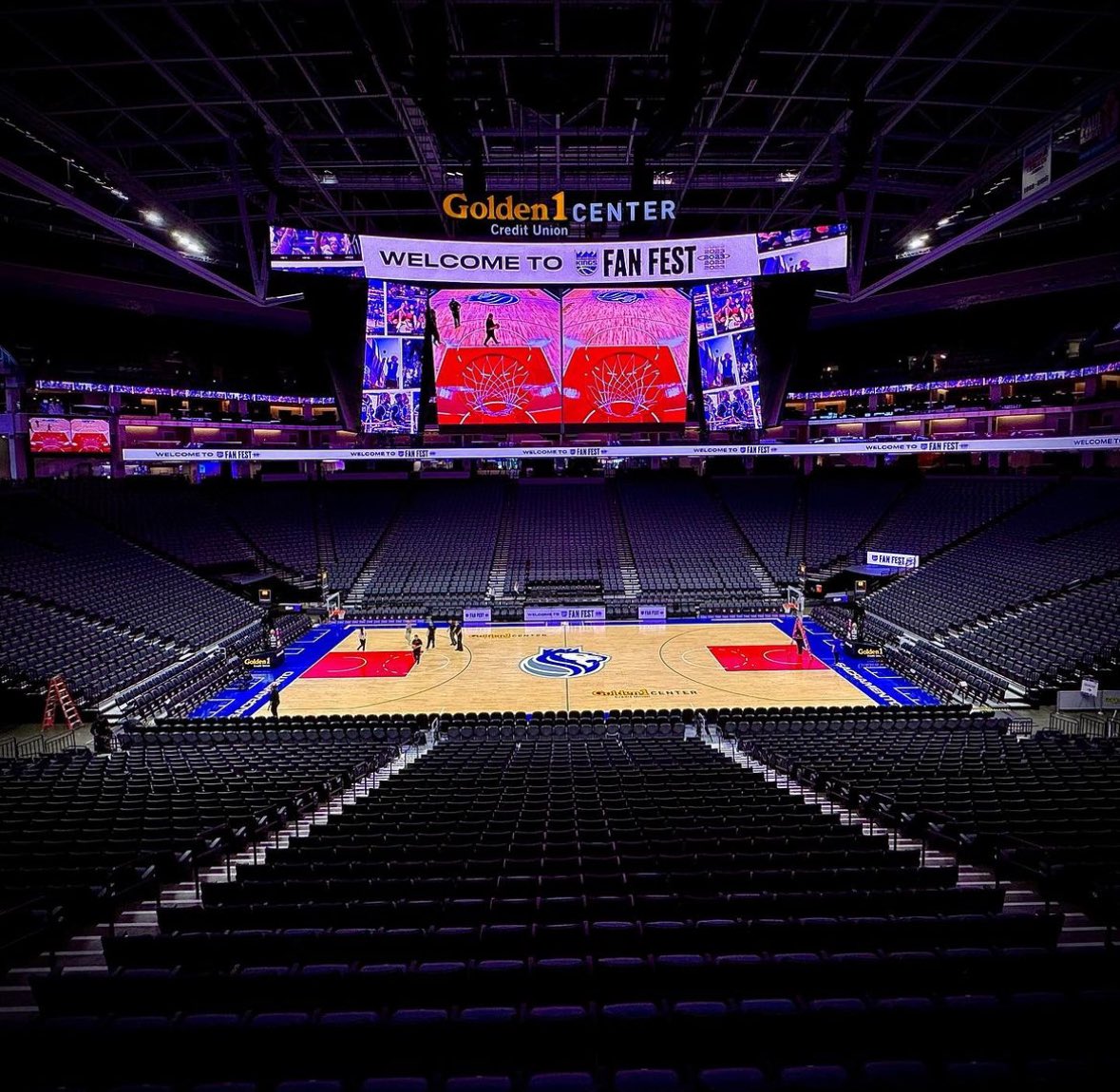
Court:

-
 1
1
-
 1
1
-
 1
1
-
 1
1
-
 2
2
-
 1
1
-
-
I like trophy behind logo on center circle, because it reminds me of Larry O'Brien trophy in Finals back in the day, and until I see a real photos that's the only thing I like. By the way at first I thought these courts are made from PVC, but then I read that article from ESPN.
On the other hand I wonder how Lakers and Clippers would storage these? IIRC the reason why they don't have any City or Classic courts are lack of space in storeroom for that in their arena.
-
6 hours ago, Morgan33 said:
Using any of the three Liberty designs would have been a better direction to take.
Or bring back this:
Whatever that new sweater is, it doesn't look good. Why there is no connection between sleeves and hem? Blue on sleeves make sense, because creates fading effect, but on hem blue is forced. Whole sleeves design imo fits better to Blackhawks (reminds of digital six) than Rangers.
-
Pelicans and Rockets already indicated they gonna wear City in tournament so maybe special uniforms will be in knockout round or maybe they ditched the idea.
-
20 hours ago, kimball said:
Huh. I guess there's not much they can draw from, especially since they don't acknowledge the Sonics history, logos and colors.
I know, but they already had 21 uniforms (19 before 21/22 season and 22 soon) which sounds quite shockingly.
-
3
-
-
1 hour ago, -Akronite- said:
EuroLeague has an improved talent level and it can be argued their rules are smarter/better enforced for a more watchable product.
Two rules that NBA should take from FIBA is goaltending and no defensive three-second violation. It would improve defence.
Overall rules should be unified across NBA, FIBA, NCAA and others, but I don't think that anyone from us will live to that day.I didn't notice that before, but Hornets actually had correct NOB font on their Classic:
Why they can't did that back in 2017-2020?
-
2
-
 4
4
-
-
49 minutes ago, MDGP said:
Luka Doncic scored 9 points in 5 minutes and Kyrie Irving didn't play. The Mavericks would've won by 30 if both played a full game.
Who cares about Kyrie and Luka if it's still the best league in the world with the best players in the world. Mavs should've won easily even without them.
Anyway I'd strongly recommend to watch some EuroLeague games, is really enjoyment, maybe even more than NBA nowadays. Today there is El Clasico, good game to start.
-
17 hours ago, Foxxtrot44 said:
Back when the Jazz were polling fans on new colors, I suggested that Ryan Smith had the hubris to ignore fans and fight to keep the black and yellow.
So it begins...
https://www.sltrib.com/sports/jazz/2023/10/25/purple-or-black-utah-jazz-owner/I'd suggest him to confuse DWade mom even more and instead of sticking with black-yellow or return to purple just change it to Red-Teal-Vegas Gold and add another colors to Jazz palette.
")
-
13 hours ago, kimball said:
Fair. It's not good, but at least the elements are cohesive unlike the NBA 75 jerseys.
That OKC was a 75th Remix too.
11 hours ago, Germanshepherd said:the Noah Lyles agenda lives on
Lives on , because he is right and if he isnt't then remind me who's won Mavs-Real game?
-
4 hours ago, kimball said:
MOST? We were watching the same games right? The only teams that knocked it out the park that year with their City Jerseys were the Pelicans, Grizzlies, Jazz, Suns and Thunder.
Yes, most. Look at the graphic posted by @SantosD_. Suns and Jazz not had new uniforms in that year.
-
Can someone tell me why Cavs and Jazz have NOB below the numbers? I understand Hawks and Warriors, because it might be something which is a nod to 70's, Thunder also utilize that in their statements but Cavs and Jazz? On the other hand 5 teams with NOB below numbers is a record I guess.
BTW. Lockervision is now updated over 23/24 season and two insteresting thing about it.
First, now jerseys are presented without a sponsor patches. Second, Rockets alternate are not updated over red trims.
3 hours ago, kimball said:Portland Trail Blazers (When are we going to get a completely plaid jersey? It's a matter of time. It's a fun design and tie into team history, it works as a City Jersey).
They've already had that in 17/18 season.
55 minutes ago, kimball said:I'm not sure if that's sarcasm or not ...
Oh c'mon, most of 75th Remix uniforms was truly amazing, best batch of City without a doubt.
Anyway I'd like to see a comeback of Rewind.
-
3
-
1
-
-
Don't tell me Pelicans will be glow in the dark, because it looks like it might be.
Why Celtics didn't use Futura for numbers?
Nuggets is pure :censored:.
Detroit once again have numbers on centre when they should have on left side.
Blazers is nicely.
Wizards look like some Magic the gathering cards.
OKC is ok, nothing special to be fair.
Hornets is medicore
Hawks, why a in atl is lowercap?
-
2
-
-
13 hours ago, deltarich87 said:
Uniform is Yay Yay and the court is Meh Meh. I don't know if I good see, but on shorts lion has red eye and on court it seems to be blue.
PS: I love that wink to 2002 WCF in release clip.
-
1
-
-
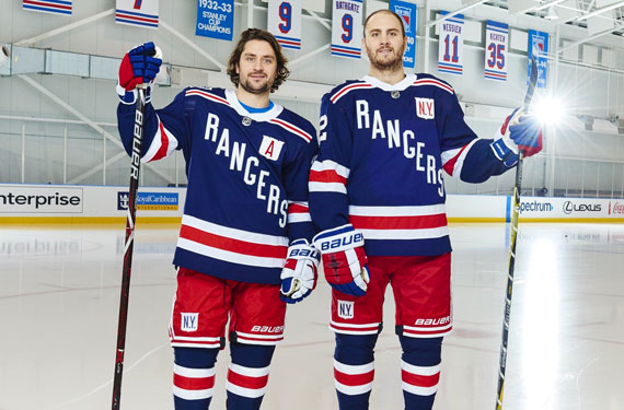
Knicks photoshoot
They keep sans serif numbers from last city.
-
3
-
3
-
-
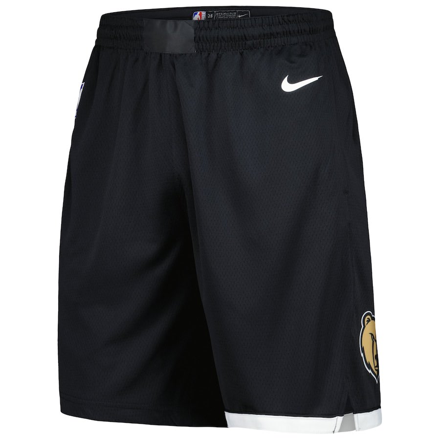
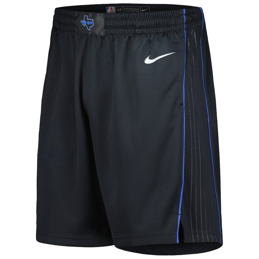
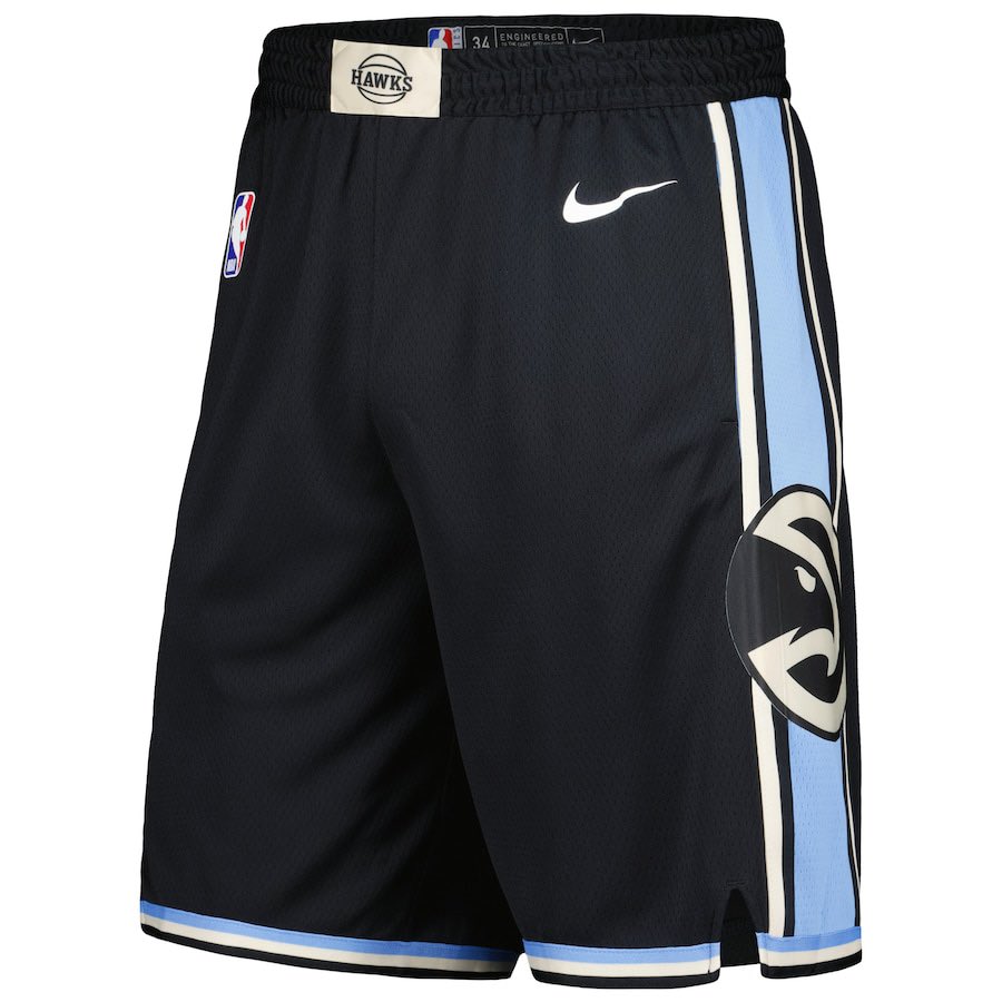
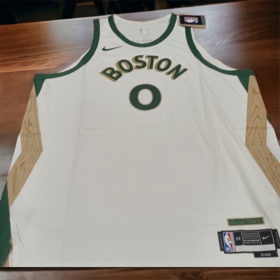
Some shorts from Itstheshorts.
Grizzlies:
Mavs:
it's black indeed
Bucks:
Hawks:
Cavs:
Another look on Boston:
16 hours ago, UncleJunior said:
One of the better City uniform from this batch.
17 hours ago, TaylorMade said:
Did I supposed to see something there or is it a blank post?
-
1
-
-
-
23 hours ago, CitizenTino said:
Cavs city edition unveiled at a season ticket holder event tonight. It’s a collab with the Playhouse Square theater district down the street from the arena.
I like it, it really look like a theater interior. That font is pretty similar to last season Hawks
4 hours ago, SantosD_ said:
Celtics city edition (via: Twitter/X)
Woah, lovely one!
2 hours ago, SantosD_ said:despite the weird drop shadow I really liked it
Should we use this to watch it?
Wordmark is weird but jersey is nice.
-
2
-
5
-
-
21 minutes ago, ruttep said:
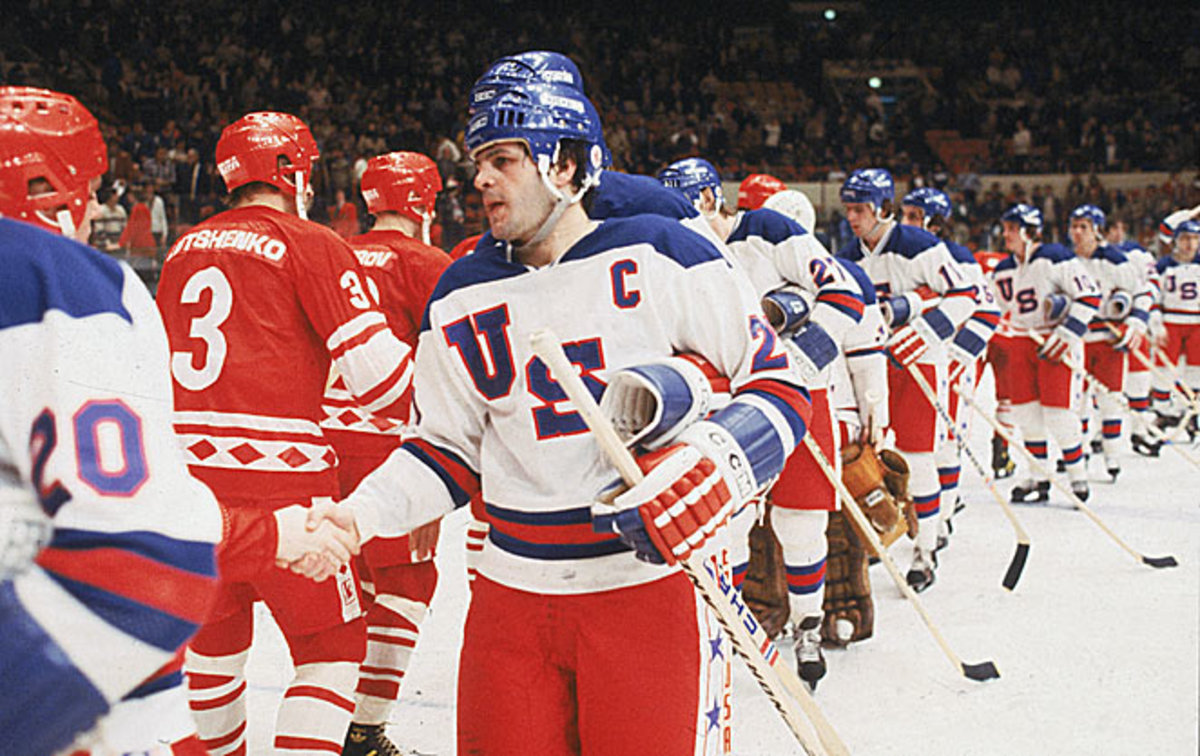
I think that was mostly due to Reebok's 2007 obsession with removing hem stripes for no apparent reason.
IIRC there was a reason of that. Reebok planned sweaters to be tucked into pants, but NHL banned that in last moment.
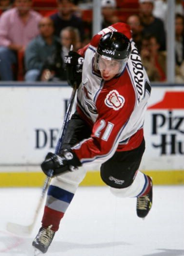
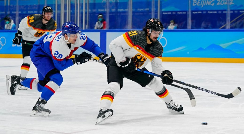
On 10/16/2023 at 10:46 PM, Ridleylash said:
For Germany and USA it works well, because yokes had same color as helmets, but Avs and Canada are not good.
-
1
-
-
50 minutes ago, Germanshepherd said:
Quite fair point but also quite funny since he is wearing City uniform on his avatar.
-
6
-
-
11 hours ago, Lights Out said:
"Ass" is exaggerating it, I think, but they're very uninspired.
I will be in opposition, because I like it and I really mean it. Mostly is the font they've use on wordmark along with design of it which is a nice variation about 90's. Of course it would be better if it says Clippers, but it doesn't change the overall look. Color combo suprisingly works together.
Whole uniform give me weird autumn vibe even when I hate autumn and I know it's white not cream and light blue is more associated with winter.-
3
-
-
Dallas Mavericks was beaten by Real Madrid. Noah Lyles strikes again


NFL 2023 Changes
in Sports Logo News
Posted
I wanted to post same movie, because youtube algorithm threw me it on proposal.
I didn't know there is something like a uniform police on a games.
I'm also kinda disappointed they didn't mention CCSLC in "Fandom" chapter, but on the other hand many of concepts there are better than real product so it might be why.
True, but nike is now a supplier so it's understandable. If it was reebok they would be reebok centric.
PS: Has Brendan ever blinks? I feel like his eyes want to suck out my soul through tv.