


Digby
-
Posts
6,700 -
Joined
-
Last visited
-
Days Won
20
Posts posted by Digby
-
-
1 hour ago, The_Admiral said:
Do you remember the brief but intriguing noise about the Expos moving to Boston? I think it got the same cursory attention as Norfolk did.
I don't even remember it happening in real-time, but when I read again about it years later, I kind of assumed it was an idea planted by John Henry staring into an overleveraged abyss before the pink-hat-era cash cow really took off, and before they figured out how to get concerts and football and obscure Irish field sports into Fenway on every other Sox off-day.
-
37 minutes ago, tBBP said:
Wanna stop by for a second to say to all those who swear up and down that yellow should never touch white: take a good look at this. 1) it ain't illegal, not even in the "rule" of tincture; and 2) when done right it can be mighty effective. (Also works for a team with a nickname inspired by space...)
Galaxy use a nice deep shade of yellow that makes this work. Don't think I'd want it as their default look but for a cycle every now and then, it's nice. The negative-space sash is pretty creative and decent-looking, too. Color scheme reminds me of their final years pre-Beckham and pre-rebrand, whether or not that's intentional.
-
 1
1
-
-
MLS was seemingly so all-in on the mono looks for so long that I can't remember many instances of contrasting socks, and socks only, being the first-choice combo. The last couple years of Chicago Fire's identity crisis they were doing navy shorts/shirts with red socks. And I remember that (horrible) Revolution away a couple years ago with the then-Spain design and the split two-tone blue trim, paired the aqua-ish blue socks with white shorts and shirts. But that's all I've got.
The Whitecaps kit is a little lacking to me... between the badge and the lack of hoop and the lack of light blue, just doesn't feel like "them". Maybe including the other blue instead of white as a third color would've helped.
-
15 hours ago, Walk-Off said:
"The Giants obviously still play there." That statement by Rob Manfred is one more reason for my longstanding suspicion that the MLB establishment has regarded the A's as a geographically expendable franchise and has seen Oakland as a geographically expendable location for a team.
The other three multi-team markets are also the biggest MSAs in the United States; SF/Oakland is something like 12th. Granted SF/Oakland punches above its weight economically and culturally, but by that token so does Boston. So from a purely cold analytic perspective, there is probably some truth to that.
The Bay Area jumps up that list quite a ways if you go up a rung on the census area ladder and include San Jose (not to mention all the $$ there), which is why that feels like such a missed solution. Regardless of this latest tech bubble apparently popping, I'm still taking the Bay over Las Vegas 10 years from now.
-
2
-
-
Convinced that Rob Manfred was the victim/champion of some recruiter's error, and that he was meant to be the CEO of a small-time hospital group or pamphlet-printing agency, and he had never heard of Major League Baseball until now. He's been faking his way through ever since.
-
19 minutes ago, hereandthere said:
Oh, come on, this has to be one of the most incredible and visually coherent home/away sets ever made.
(I understand if MNUFC fans don't love it becuase they want the wing back, but as a neutral non-US kit fan, I absolutely adore both of them)
There's a nice (IMO) unintended consequence of Adidas holding back its new template for the international summer tournaments this time, and kitting out MLS in last year's template for the 2nd year in a row. We've got more teams than usual that have a nice, coherent "set" of home and away jerseys that work nicely together even if they aren't the classic/boring simplistic color swap.
I know that home/away jerseys feeling part of a set has never been a requirement in soccer, and especially not in the last few years where even the NBA and MLB are getting in on wacky alternate kits so that they can sell an entire differentiated line of merchandise to fans. And I do like plenty of kits that aren't matchy-matchy. But, sometimes it's nice to have that coherence across the brand, especially in MLS where the teams are still searching for brand establishment and relevancy.
(That said, I do wish that said Adidas template allowed for more customization, and less gigantic armpit panels. And I also wish MNUFC would just own the anthracite color already.)
-
3
-
-
Sorta off-topic but these unveil photoshoots have become so strange. Who is wearing a jersey tucked in to pleated khakis???

-
 4
4
-
-
I know the simple white jerseys as away kits always got dunked on, but I actually think Orlando would've looked better as plain white; the dark purple, metallic gold, and red color scheme for the trim works fantastically well and those pieces pop just fine on their own. That light lavender tint does distract from it a little bit. That said, I thought the updated USL badge would've been a fun novelty but I'm surprised how much I legitimately like it (apart from the outer lions looking like chimps). Feels like it could be the primary if they wanted.
FC Dallas got real weird. Points for originality. The marketing copy for that one goes on about jet afterburners, for some reason.
I like all the rest of this new unveil batch, lots of ideas that are simple but well-executed and just interesting enough. Austin got beat to that kit by Vermont Green FC but I do really like this take on the partial logo trend with just the tree/roots thing.
-
1
-
-
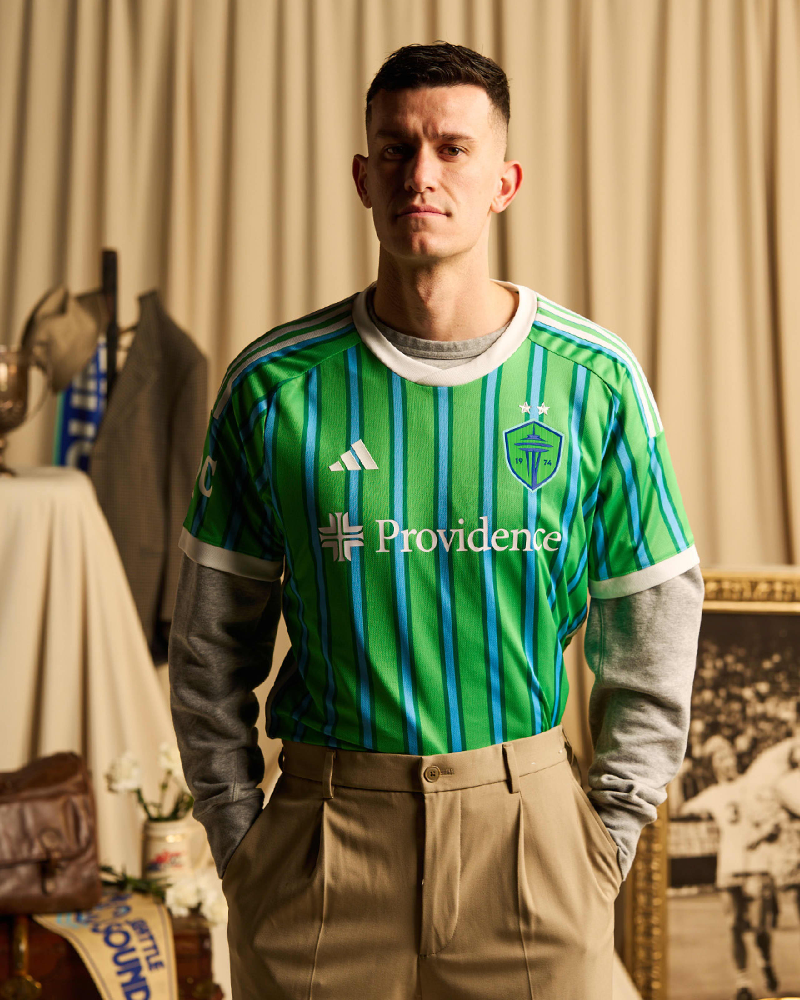
1 hour ago, TacoCat83 said:
That darker green is the same green that got used back in 74.
Honestly if they switched that out with the regular blue it would of worked better.
I think I'd lose that green entirely and/or set fewer stripes on the shirt. Like the idea, not the execution.
I'll reserve judgement on the colors of the applications til we see the real thing but yeah, I'm wondering if the Adidas design team had guidance and ideas for a retro look but didn't get to see the rebrand assets until way late in the process and didn't design with them in mind.
-
3
-
-
Hard to get a true read on the colors from these photos... I think I like the lighter green? Even though the overall look feels too washed out. Also not sure about the double pinstripe, that darker border color kinda muddies things up.
-
4
-
-
38 minutes ago, upperV03 said:
The shorts do have the asymmetric trim, but the colors are flipped from how they appear on the shirt. It’s inexplicable though that the socks don’t have the asymmetric adidas stripes.
I guess asymmetric socks would be a real headache for the equipment manager?
-
Asymmetrical trim bothers me, especially if it's only on the shirt! Sigh. Also feel like, given the "24-7" theme, they could have used a more neon/vibrant shade for the blue instead of their standard, muted light blue. But maybe I'm reading too much into marketing.
-
This center-stacking of the two logos is way too much, they need to be more closely spaced... the sponsor logos for Miami and Portland are both distractingly low.
Love Houston going with purple -- agree that it would look better with some kind of deep space graphic (or woodgrain!) but also, when the color scheme is so bold and unique for the league, I don't think you need to worry about other design elements as much.
-
1
-
-
I don't think these copywriters have ever seen ripples in water before. Also a miss to go with navy shorts again, this one would benefit even more from the red shorts. But, I suppose this is nitpicking in the grand scheme.
-
3
-
1
-
-
I like red sleeves as a change of pace for the Revolution, though it seems that AND the dotted pinstripes are too many design elements. One or the other would've been nice on their totally plain previous home kit. Also, what does any of this have to do with the Boston Tea Party?
-
3
-
-
1 hour ago, upperV03 said:
The interesting thing is that they didn’t just slap the USL crest on there, they updated and modernized it a bit. This version has “Orlando City” arched across the top, whereas the USL crest had “City” below the lions. The lions themselves also appear to have been cleaned up substantially and now extend beyond the shield shape. Here’s the original USL crest for reference:
I noticed that as well, which makes me curious about the final product -- does the old one belong to their old league? Did they think it was too cringe to put on a shirt in this era of Take Us Seriously MLS? Or maybe just a clever merging of eras if they use fonts and lions that are closer to the current one.
-
12 hours ago, FiddySicks said:
I’m not saying I even necessarily buy into a lot of that, but that’s the common explanation. It’s a league who’s main TV event is one of the biggest TV events of the year, and they had the ability to combine it with one of the highest grossing pop stars of all time. I don’t necessarily blame them for that, but there’s definitely an element to it comes across as annoying. It just feels like the further consolidation of entertainment (and for the producers, wealth) that we’ve basically seen everywhere else.
I don't know that it's nefarious illuminati stuff or anything, but it does generally reflect the overall cultural moment of monoculture and everything having to be all-or-nothing. Which, if you're not a superfan, I can relate to that being tiring and fatiguing. Also they're both too good and too famous so that the endless content about them is pretty dull, it really brings out the most vapid space-filling tendencies of the TV guys. Like anything else, there's more fun in rooting for an underdog.
Personally I think these pairings are much funnier when it's like, a septuagenarian play-by-play guy who's totally oblivious to who Kate Upton is and needs it explained to him. Or the embarrassing mismatch of like, Kim Kardashian marrying Kris Humphries for a couple months.
Anyway, I think those are all valid reasons to be tired of Swiftce or whatever it is, but the way the invalid reasons have made the worst people in the world completely lose their minds has made it all worthwhile IMHO.
-
Feels very disconnected to me from front to back, not just because of the colors but also the switch from smooth organic curves on the front to the very modern, angular color-blocking effects on the back. The Adidas template underarm thing does not help matters here. Also could use some blue socks, but hey.
-
7
-
-
I've been to some Cape Cod League "stadiums" (using that word generously) where the houses in the outfield have backyards that function as their own personal, permanent luxury boxes. Living the dream.
That new Marlins Park is right in the middle of some residential blocks in a way that kind of shocked me for such a new build, but not in a charming way.
-
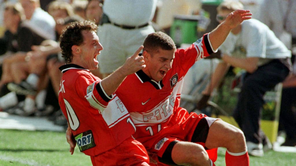
Wait a second. My memory of the OG Chicago Fire kit was that the chest stripe trim and the wordmark were navy, not red and silver respectively. Google seems to suggest that both of them existed for some period of time?
-
 1
1
-
-
Also, no team needs a court that looks like a concrete court. A gray-washed shade of wood is plenty of effect but we couldn't be content stopping there. The Nike City design movement is just non-stop simulacra, we can't let anything represent a team or city in an abstract way or build a connection, it's always something painfully literal that lacks any tact whatsoever. But I guess that's just the cultural moment in general.
-
3
-
-
9 hours ago, Old School Fool said:
The Grizzlies doing it is just weird, I don't associate Memphis with street ball, I associate it with Three 6 Mafia, Elvis, and MLK. Also, I am very aware how weird it is I have mentioned those three things like that.
-
1
-
 1
1
-
4
-
-
Three Point Contest
Pos. Player Team Height Weight First round Final round G Malik Beasley Milwaukee Bucks 6–4 187 G Jalen Brunson New York Knicks 6–2 190 G Tyrese Haliburton Indiana Pacers 6–5 185 G Damian Lillard Milwaukee Bucks 6–2 195 F Lauri Markkanen Utah Jazz 7–0 240 G Donovan Mitchell Cleveland Cavaliers 6–3 215 C Karl-Anthony Towns Minnesota Timberwolves 7–0 248 G Trae Young Atlanta Hawks 6–1 164 Slam Dunk Contest
Pos. Player Team Height Weight First round Final round G Jaylen Brown Boston Celtics 6–6 223 F Jaime Jaquez Jr. Miami Heat 6–6 225 G Mac McClung Osceola MagicNBA G League 6–2 185 F Jacob Toppin New York Knicks 6–8 200 We've got the lineups for the All-Star Weekend to be played on the gaudy terrible lightup court too. Jaylen Brown and a bunch of rookies! McClung's not even on a two-way this year apparently.
-
Your deadline wrap per the Athletic:
QuoteRobin Lopez to Kings; cash to Celtics
Jaden Springer to Celtics
Dalano Banton to Trail Blazers
Cory Joseph and cash to Pacers; second-round pick to Warriors
Draft rights to Israel Kamagate to Clippers; cash to Nuggets
Doug McDermott to Pacers; Marcus Morris, second-round pick and cash to Spurs
Patrick Beverley to Bucks; Cam Payne, second-round pick to 76ers
Royce O'Neale, David Roddy to Suns; three second-round picks and salaries to Nets; Yuta Watanabe to Grizzlies
P.J. Washington to the Mavericks; Grant Williams, Seth Curry and a first-round pick to the Hornets
Spencer Dinwiddie to Raptors; Dennis Schröder, Thaddeus Young to Nets — update: Raptors will waive Dinwiddie
Daniel Gafford to Mavericks; Richaun Holmes, future first-rounder to Wizards
Bojan Bogdanović, Alec Burks to Knicks; Quentin Grimes, Evan Fournier, Malachi Flynn, two second-round picks to Pistons
Danuel House to Pistons; second-round pick to 76ers — update: Pistons will waive House
Gordon Hayward to Thunder; Tre Mann, Dāvis Bertāns to Hornets
Kelly Olynyk, Ochai Agbaji to Raptors; Kira Lewis, Otto Porter, 2024 first-rounder to Jazz
Buddy Hield to 76ers; Marcus Morris, Furkan Korkmaz and three second-round picks to Pacers
Monté Morris to Timberwolves; Shake Milton, Troy Brown and a second-round pick to Pistons
Xavier Tillman to Celtics; two second-round picks and Lamar Stevens to Grizzlies
Simone Fontecchio to Pistons; Kevin Knox and more to Jazz.-
2
-


MLS Kits 2024
in Sports Logo News
Posted
IDK, I think there's simply too many light blue shirts in the league right now. Particularly with Adidas's insistence on one single template and repeated design motifs, this feels like an unnecessary regression in terms of individualized designs for teams. Not every team needs to do a municipal flag kit, also, but if Atlanta must do so, I will also note that their flag is a medium-dark blue and a deep, mustardy gold.