


Digby
-
Posts
6,701 -
Joined
-
Last visited
-
Days Won
20
Posts posted by Digby
-
-
3 hours ago, WBeltz said:
No, the rest of the crest is there. You can see the white and blue stripe that usually falls behind it.
Oh you're right. I got confused that I didn't see the extra black backing to the crest that they've been using on the keeper kit but not the outfield.
I do agree that the charcoal/anthracite of yore was the way to do it. Black is boring, light-ish grey is just kinda...there. But something in the middle of those was really interesting and iconic.
-
lol, absolutely called it that they kept the In-Season Tournament branding so generic and terrible just to make it that much more of a clear path for a corporate sponsor. Though I didn't anticipate that they'd find an extra level to the European soccer mimicry.

-
 7
7
-
 1
1
-
-
Just now, TBGKon said:
Portland did a good job converting baseball to soccer.
Portland doesn't count in my book, since it was originally a football field and race track way back in the day. Baseball was the odd fit, if anything -- a literal parking lot of foul territory, and outfield grandstand angles that make Fenway look reasonable by comparison.
-
1
-
-
Plus bonus rendering of the current Comiskey converted to soccer for the Fire and/or Red Stars. Points for creativity. I don't know that baseball-to-soccer conversions ever quite work. Though this looks better than Atlanta and Arlington if they actually manage to totally demo left-center field.
-
2
-
-
Also looks like they're using the bird/star without the surrounding shield, same way the Northern Lights kit is doing it?
-
The A's managed to play at the Coliseum when Oakland was drowning in crack, and when the Black Panthers and the cops were openly at war across town. I don't think some Denny's parking lot break-ins are really why they're fleeing now.
-
9
-
-
1 hour ago, BBTV said:
(oh... and 1-800-Gambler, because someone with a problem is totally going to call that.)
They'll include the disclaimer text inside the three-point lines, with a 50 percent opacity.
-
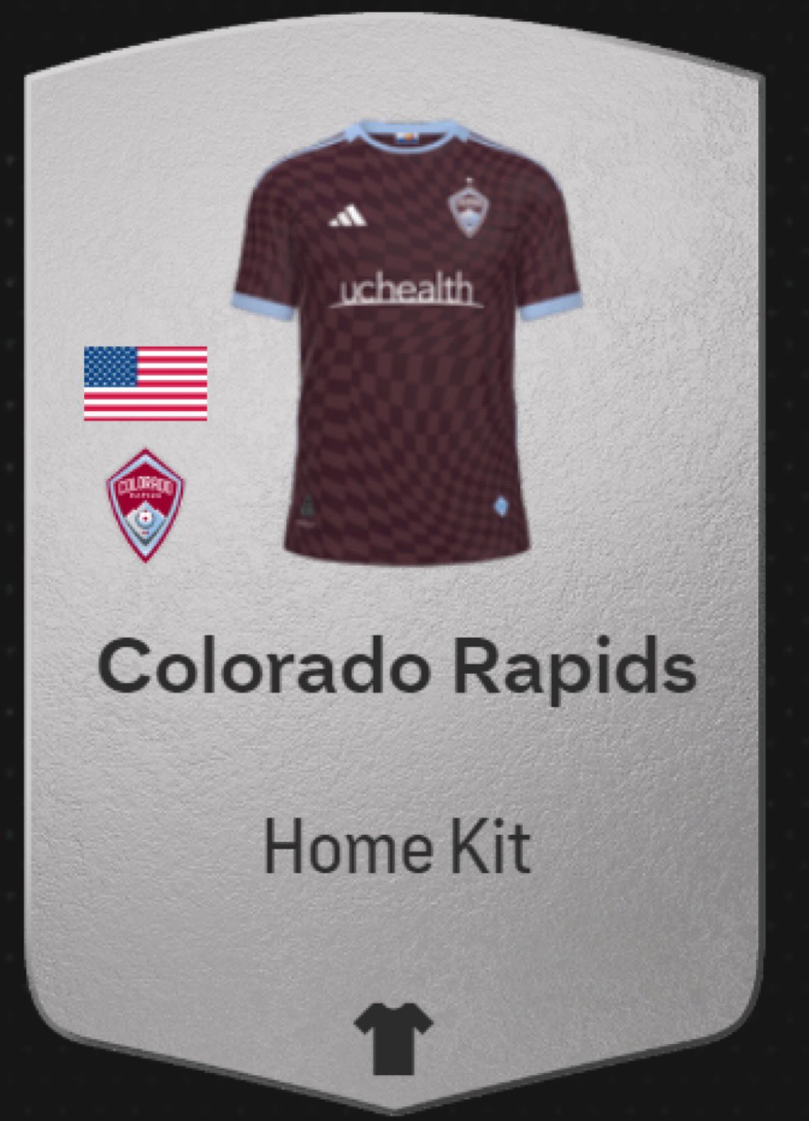
I like the design but I have to be the dissenting voice because I am really tired of light blue in MLS. More than a third of the league has a light blue shirt or had one within the past five years (assuming Montreal's icy blue away leak turns out true), and nearly all of those used a darker blue as its secondary color. That's too many! On first glance I thought this and the current NYCFC and Colorado away are the same shirt, just with different prints on the chest.
-
1
-
-
How goofy is it that Doc Rivers gets to coach the NBA All-Star Game after being on the job for a week? Hilarious loophole in the rulebook. If I'm the NBPA I'm using the opportunity to drag the league for instituting games-played minimums for player awards but conveniently forgetting games-coached minimums for honors like this.
-
1
-
-
Kinda surprised that MetLife gets the final, although I suppose it makes sense to nudge it as east as possible for timezone reasons, and you can't beat New York from a hosting amenities perspective, even though public transit from there to MetLife is a nightmare.
-
2
-
-
Few teams have managed to do the current trend in a way that ages poorly the way the Pacers always have. The homely serifs, corny futuristic, helvetica-chic modernist, overly busy all-American retro, whatever you call mid-2000s paneling and Agency font, the modern roundel, the insistence that graffiti is uniquely reflective of your own city...
-
4
-
-
Come to think of it, I'm surprised they didn't dig up the corpse of the Hickory uniform concept for this ASG.
-
2
-
-
In design, but not sports. Didn't go to design school. Now I do more UX/UI work instead of graphics/branding. All of that is to say I've had a weird career path and maybe not what you're looking for, but most people do truthfully. It's a challenging field to break into, there's a lot of nepotism and there are always people who want the work but don't want to pay for it.
It's important to have a portfolio, but also to have a network. Putting your designs on Behance or whatever is obviously necessary but it's also the easy part. The tougher part is having a network of people who will employ you or recommend you for employment. Take relevant internships (but make sure they're paid). Be communicative with fellow designers, but also non-designers. Consider your skillset T-shaped; it's good to demonstrate real expertise in one or two things, but also competency in other related things. Consider whether you want to work for an agency, in-house, or as a freelancer. (And be realistic that freelancing is NOT for everyone or even most people.)
I don't have sports design-specific suggestions, but these are just ideas for the field at large.
-
2
-
-
How do these Celtics lose to these Lakers, at home, on a night without James OR Davis? 4 to 6 weeks later than usual, but the midseason mental slump that defines these Celtics teams has arrived again.
-
On 2024-01-31 at 3:34 PM, GriffinM6 said:
Random thought, but I wonder why Adidas has yet to do bespoke pre-match shirts for MLS. I know it's not their tip-top league or national team that they're the supplier for, but you'd think they'd try and grow their MLS revenue a little more.
It's especially puzzling because the special pre-match shirts that they do (i.e. Juneteenth, 4th of July, Childhood Cancer, Pride, etc.) seem to be pretty popular among fans.
I suspect they just don't sell a ton of MLS merchandise even compared with their B-tier teams internationally. If third kits used to sell so poorly that they're only just coming back after a 10-year hiatus, and the league/Adidas has still resisted the temptation to do anything more than a single new jersey per year for each team. Would love to see the sales numbers leak sometime for MLS teams and teams internationally to compare. (The holiday/charity ones are easy, since the expensive and logistically difficult parts are the same and it's just the printing (cheap and quick) that has to change between teams.)
Adidas has certainly been investing more creativity and bespoke-ness into its designs for MLS these last couple years, with the leaks from this year suggesting this might be the best yet, so we'll see if that also prompts a wider bloom of more merchandising.
-
1
-
-
There's a long thing on MLSsoccer.com explaining the formulas of putting the groups together but I couldn't make any sense of it. Sure, why not.
-
There are sort of parallels, but the GSW second peak after the first apparent fall wasn't as long and sustained the way the Patriots' was.
What are the parallels? Brady/Curry surprisingly leaves, also surprisingly ushers new team to title. Draymond sort of fits the Antonio Green or Aaron Hernandez, but has contributed substantially more while also not doing anything THAT bad (that we know of). Maybe Kerr would be left exposed by his former bestie the way Belichick was, but it's hard to see him looking as old and behind-the-times the way BB does now, short of a radical and unlikely rules reinvention that drags the game back to pre-LeBron defense and physical play.
Plus, Kerr started his head coaching career relatively late, so in theory he could catch the Popovich/Nelson class of most wins if he coaches mediocre teams for 20 more years, but I don't really see him doing that the way Belichick wants the Shula record. (Does Kerr have the highest win percentage among coaches now? 2nd place behind the guy the Bucks just fired?)
-
Didn't hear much more about the Celtics vs Pacers uniform matchup being put to a public vote, so not entirely sure the NBA followed through with it, but either the suits or the general public decided this should be a white City uniform vs. a black City uniform in the end.

-
 3
3
-
 1
1
-
 1
1
-
-
Whatever happened to that event where they'd make 3-person teams with an NBA player, a WNBA player and an old head? Bring that back, give me something to actually root for.
-
3 hours ago, TacoCat83 said:
The irony that RSL is basically going to wear a part of Colorado's crest on their jersey is hilarious.
Not only that, but they're also doubling down on mixing the Real Madrid-cribbed name with the Barcelona color scheme. Blech.
15 minutes ago, hereandthere said:I don't like the Real Salt Lake one at all. It looks like a very bad fan design. Mountains? Good. Stripes? Good. Mountains and stripes? Hell no.
I think the way they handled the mountain + stripe thing juuust about works... but for me, the contrast raglan sleeves are the one extra element that's simply too much going on.
-
2
-
-
I logged into Twitter so you don't have to.
-
6
-
-
There, I fixed it.
-
7
-
 3
3
-
 9
9
-
-
The uniform matchup for this Tuesday's Celtics/Pacers game is up to a FAN VOTE. Green vs gold, please.
-
2
-
-
In general I like the occasional use of minimal, alternate logos on some of these jerseys (i.e. last year's aways for LAFC and Minnesota), but I don't think Toronto's is strong or interesting enough to use in this way. And the graphic just looks like a big shrug of a design. Glad to see the red trim back but I'd like to see more of their charcoal as a tertiary color too, maybe pairing this with charcoal shorts for a change?
-
6
-


:format(jpeg)/cdn.vox-cdn.com/uploads/chorus_image/image/54503429/1969.0.jpeg)


2023-24 NBA Season thread
in Sports In General
Posted
Your deadline wrap per the Athletic: