


Brave-Bird 08
-
Posts
5,169 -
Joined
-
Last visited
-
Days Won
15
Posts posted by Brave-Bird 08
-
-
5 hours ago, oldschoolvikings said:
The what now?
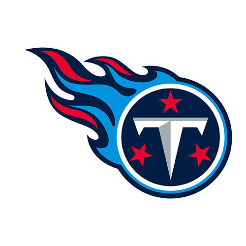
- Titans is a standout moniker, unlike "Bears," "Lions," "Commanders," etc.
- Like what Nashville did with the Predators, which is equally an awesome brand, they chose a starting point of something unique to the city and built around it -- in this case, the Parthenon.
- Logo is tailored for a football helmet, and is a perfect balance of signifying the locale (Tennessee flag motif) and the moniker (shield, flames, the sword effect of the T).
- Colors are fantastic
- Their previous uniforms were modern classics
My tongue is halfway in my cheek here, but sorry that they created a brand in the late 90s and didn't use a brutalist hand-drawn logo and walk out with northwestern stripes on their sleeves...
-
 4
4
-
-
Jamal Anderson has been pretty tight with the Falcons brass the past few seasons, and he's cleaned up his act seemingly after some pretty embarrassing incidents that lead to some concern about his state of mind on a daily basis.
Not making light of it, but the point I am making is he's probably not the person to take anything they say with anything other than the grainiest of grains of salt.
It's possible he has been informed by officials there are new unis, but simply doesn't understand the process. It's just as likely that he read a post from someone on Reddit or X and has taken that as his confirmation, because, as I said, he's got some cobwebs in his attic.
Either way, I would say it's probably a safe bet for anyone to say they have been informed the Falcons are getting new uniforms because there's no way Arthur Blank isn't going to follow in the trash-stash-rehash Nike uni cycle b/c the current jerseys aren't popular at all.
-
1
-
-
16 hours ago, (probably)notabandwagonfan said:
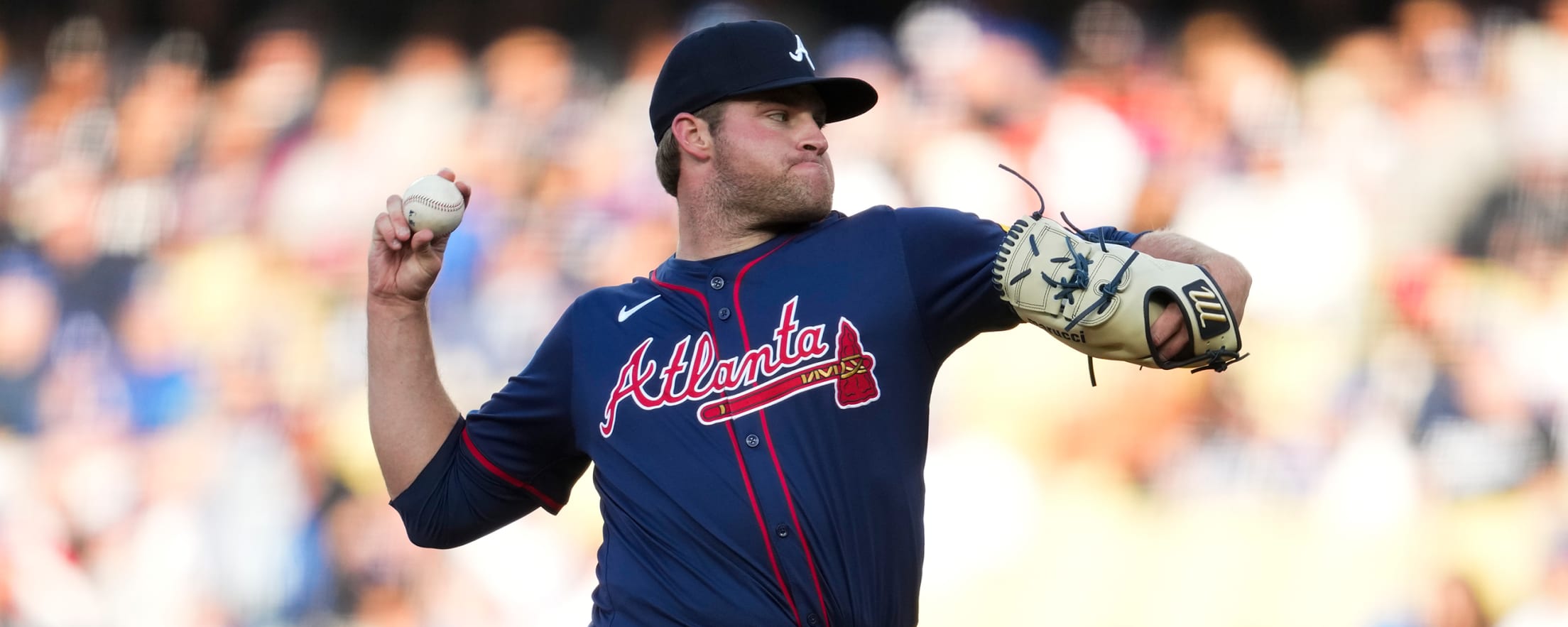
I meant from Spring Training. I was hoping they would darken the navy but they didn’t
Their previous ST jerseys were sans piping.
Accounting for the fact I know from experience as a photog that lighting makes all the difference, I have seen enough of these two jerseys in different lighting to confirm that the difference in blue to what looks like purple is stark.
2023
2024
Just following the logic of color application, I should prefer the bottom jersey over the top one. But I don't.
What has bothered me more than anything about the Braves uniforms in general since this template switch is the wordmark-tomahawks have been shrunk considerably, which just makes these jerseys look more like cheap knock offs than they really are.
On the TV feed last night the red piping gets lost. I would rather it just be a solid blue jersey, because as I've stated before -- the red and blue mixing together without white to break it up just "purpifies" the jersey at a glance.
It makes me long for the old BP-esque road jerseys, which they wore too often and I very much disliked at the time. But just in photos there's such a difference to me in terms of one of these looking like a pro ball uniform, and one looking like the players are wearing something that should be retail-only.
-
1
-
-
Extreme Taylor Twellman voice "what are we doing?"
The Titans brand is top notch, the idea that they would revert to the Oilers look but keep the moniker doesn't make any sense.
Just clean up their slot-machine-of-random-uniform-features clown suits -- right now they are dragging down a distinct, thoughtful brand with embarrassing unis.
-
1
-
-
46 minutes ago, TheBigFiz21 said:
Not sure if it was discussed after we found out the cherry blossom CC was on its last breath this season, but is there any guy feeling they could re-color the jersey instead? I could see the Nats sticking with the cherry blossom theme, but maybe try a cream or off-white base & gray script for their 2025 version.
Faux marble would be sick too. I don't think the DC Defenders even described their helmet finish as that (I think it's supposed to be a. camo pattern), but it's what my brain sees it as and it looks nice.
-
2
-
-
1 minute ago, bbush24 said:
The fact that for 6 of 7 games in a series, the Nuggets are wearing two different uniforms that both refer to the elevation of their city is just a joke. I cannot wait until this gimmicky city era is dead.
we might have to wait for hell to freeze over
-
 1
1
-
 1
1
-
-
I dislike the Broncos uniforms the more I see them.
-
8
-
 1
1
-
-
Maybe I am missing something, but I thought the issue was that Houston wore essentially an Oilers uniform and that it wasn't just the color that prompted the cease-and-desist.
I mean it's still really dumb. Part of me wonders if the logic behind it was that if Houston sold those UH jerseys that say "Houston" on them, that it would bite into the sales that the NFL sees for the Titans throwbacks -- which I am sure more people in Texas are buying for nostalgic reasons than Titans fans are buying.
Still, a really, really, really dumb and pathetic complaint by the NFL. But it kind of makes sense...
-
1
-
-
1 minute ago, PhlyBoy said:
As a Wisconsin guy, I have noticed the amount of Brewers powder blue perch is incredibly high with fans. It was popular as throwback gear before the City unis came into existence, but now (and added with the new alternate "grill" logo), it is very interesting to me. I wouldn't be shocked for that color to ever disappear from the Crew's identity because of the success rate of the city gear.
Furthermore, powder or light blue seem to be a hit with any team that uses it.
-
5
-
-
I love, love, love everything in here. The wing sleeve stripes for Cleveland are so classy, yet distinct. Completely nailed it. Amazing how such a small change brings that entire branding suite to life.
-
So, Braves are at the Mariners tonight...
Atlanta is once again in their grey road uniforms, which they have worn in every road game so far this season (14 for 14). No sign of the "new" blue alternates that they wore for the duration of spring training.
And the Ms might be showing why; they are in blue tops and there's a distinct difference between the blue in their caps and the shirts.
Both the Braves shirts from ST and Mariners shirts I am looking at tonight are a lighter shade of navy and in certain lighting almost look purple. The difference between them and the blue of the New Era caps is annoying.
I wonder if the Braves have resisted wearing theirs for that reason?
UPDATE: I just looked at the Braves shop and they don't even have the blue jerseys to purchase unless it's a youth or women's. I wonder if they have officially canned them already?
-
1
-
-
The very 2003-esque second-tier team shoulder crescents are now constituted as a throwback...
...and I don't mind it a damn bit. That's a nice look for WVU, especially the stripes kind of do the whole pick-axe thing without looking ridiculous.
-
8
-
-
Just now, oldschoolvikings said:
Yup. It sucks.The best way I can describe it is it looks like it's bleeding. When there are two complementary colors already there (steel blue and new blue), throwing red in at that level is just loud and unnatural looking. It's the same effect TCU had with the purple, black and red uniforms -- which quite literally had a blood motif to them.
When a uniform is primarily red, or uses red as its complementary color, it looks great. When red is used as tertiary and it's competing with another complementary color, it stands out and not in a good way
-
Just want to chime in on the news regarding guardian caps.
I would bet that the statement made about the allowance of players to wear guardian caps, if they please, is more of a covering-their-ass statement from the NFL than anything else. If they were to say anything on record about them not being allowed in games, or just not preferred for aesthetic reasons, that could literally be used against them in litigation later on.
Treading lightly, but I don't envision many players being willing to wear those things during games. These athletes are already taking a calculated risk with their lives to play this game, I am not so sure that they're going to be that motivated to strap those clunky contraptions on their heads.
I could be completely wrong about this, but I don't think it's as big of a news piece as it is.
-
2
-
-
2001 was peak NFL to me. Everyone had a really nice home and away. I even really liked the Patriots uniform back then.
-
2
-
-
It says on the Texans landing page for the reveal that the alternate is the "first City Edition" in the NFL. It actually says that. Could be a case of their production team just lazily throwing words around, but could be an indicator of how talks with Nike have gone and lead me to believe what I suspect is going to be a shift towards some very unconventional alternates (I try to block it from my brain, but the Commanders black uniform very much fits this mold, as did the Falcons gradient which was reminiscent of the Hawks)
-
1
-
 1
1
-
 1
1
-
 1
1
-
-
Glaring issue is that there's white trim in the stripe on the red pants, but not in the sleeve stripe or the helmet horn it's married to.
Again...it's little attention-to-detail things that always feel like get through the cracks during these redesigns. How did anyone look at that entire uniform and not immediately say "wait, hold on, we need the center stripe on the horn to be white on the jersey and helmet."
It hurts my head.
-
8
-
-
Alright, I've got to say, after seeing them on players and not the retail version/retail render leak, these are really nice.
- home uniform is classy as hell, it really lets that great primary logo do the work, which I appreciate.
- road is rather meh, I just think the colorway is dull b/c the numbers are now dark blue instead of red
- you can tell that the red helmet is really the core focus of this redesign, and they kind of worked backwards from there. It's freaking great. I just don't like the all-red uniform, it's really loud.
- the H-Town alternate isn't the game changer I think we envisioned it, in fact I am pretty bored with it
-
6
-
-
Why wouldn't the Texans use the opportunity to enrich an alternate in the light blue instead of just using it as trim? That alternate is a major disappointment, especially because the numerals are red but the H is blue, so it's going to look disjointed.
They look like a college team. The number font is a downgrade. Oof.
-
I don't know if this clicked for anyone else, but it also appears very obvious that the notch that everyone is comparing to the Chargers lightning bolt is from the jaw line in the logo.
Like, I don't even really see mountains represented in that sleeve cap design. It's a very awkward, directionless concoction of layered geometric shapes.
I'm sorry, but the design element aspects of this entire uniform is hot garbage, amateurish and unfinished looking. The only redeeming quality is that, yes, if they wore them in the combinations presented on the team store models, they'll look good from a stadium seat or on TV at a glance.
But if 10 CCSLers were given the same general prompt the Nike team was, 10 of us would knock it out of the park compared to what we got.
-
9
-
-
3 minutes ago, Bruhammydude said:
Crazy just how much they look like a recolored Chargers from this angle:
Why not just fill in the whole sleeve cap? Now it just looks like a lightning bolt.
These are the worst pant stripes in the NFL. They look like they're wearing flag football flags around their waste
-
6
-
5
-
-
Now that I have let the Broncos set sit for a minute:
- the pants design just doesn't look right. It's not really emphasized in much of what they officially released from the reveal production, but it's going to stick out as one of the worst parts once we see them in action
- the disconnect when it comes to combinations is wild to me, it feels like when high schoolers go on recruiting visits and just throw random unis on for photoshoots. Why in the world is white-navy-navy a combo that you are unveiling as a primary?
- the more I look at the sleeve cap, the more I dislike it. The puzzle pieces don't fit together, if that makes sense.
And the helmet decal on the shell looks cheap. These unis aren't good. The number font change is a downgrade, the triangle motif is so silly.
This is a mess, honestly.
-
2
-
-
I mean, that Giants throwback came from the same source that got the Broncos uniforms 100% accurate.
-
3
-
-
Ugh, this is the beginning of the end. The flood gates have been opened. Toothpaste is out of the tube.
This league will be unrecognizable in a few more seasons.
-
7
-
1
-
2
-

/cdn.vox-cdn.com/uploads/chorus_asset/file/24496541/usa_today_20155081.jpg)

/cdn.vox-cdn.com/uploads/chorus_image/image/72137147/1477327548.0.jpg)


MLB 2024 Uniform/Logo Changes
in Sports Logo News
Posted
What I don't understand with this City Connect program is there's an opportunity to really let some colors pop, but Nike seems insistent on using deep colors and/or black. It's fun when you use a dark base and then let brighter colors pop as trim, NOB, etc., but it's a bit overkill at this point.
This was an opportunity for the Tigers to have some splashes of orange in a third jersey, and instead they unveiled something I wouldn't be motivated to wear in the slightest. Plus, this whole double-bar stripe suddenly becoming a universal Detroit-stripe, across the NBA, NFL, and MLB, is kind of weird. I don't particularly like the motif but it shows up over and over again -- it even used to be a pretty common thing on these boards, so it's weird seeing it actually applied by Nike in multiple instances.