


Brave-Bird 08
-
Posts
5,170 -
Joined
-
Last visited
-
Days Won
15
Posts posted by Brave-Bird 08
-
-
I may have posted this a few times before, but I don't think the Houston Rockets should ever sway from their current look...at least not for a long while. I think they're a modern classic.
-
 1
1
-
-
Okay, this is probably a highly unpopular opinion, but whatever. This?

Wordswordswordswordswordswordswords. Blahblahblahblahblahblahblah. Yadayadayadayadayada, etc.
Sorry, I didn't read all that... I was was too busy staring at the best uniform in football.
OP is trolling
-
1
-
-
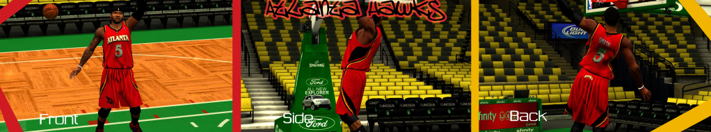
If you go to Hawks.com, look at the court, uniforms, or anywhere else, the primary is clearly being phased out. It's nowhere on the team website.
-
The Atlanta Hawks new primary logo. The old one is not used anywhere on their website, court, or uniforms.
-
One of the BETTER uniforms in college football.

-
More importantly: The Brewers' current identity is a GREAT, well-rounded, well executed identity.
-
4
-
-
IMO, the entire Brewers identity is fantastic. As much as the 'MB' mit logo is well-done, it's still awfully retro and generic. I love everything about the Brewers modern identity.
-
1
-
-
I like this look:

I like this look:
There's people that don't like this?
-
- i like the Bengals current uniforms and hate their old ones
- i think the Chiefs & Redskins look dated/old/tired/boring, not classic
I can agree with the first part of this. If the Bengals could just drop the white side panel on the colored jerseys, They'd have a GREAT update of their old uniforms.
-
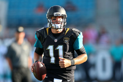
The Jaguars look great from the neck down. I hated the design when first unveiled, but in action it's a fun, modern look...until the players' heads turn.
Also, I still think Arizona have a wonderful modern uniform.
-
These uniforms are kind of fun. I cringed and vomited when they released them...in fact, the weird shoulder gloss panel things and the suspended pants insert bothered me, but I think I'm the only on on these boards who saw them in action and said, "Eh...it's 2013. Let it happen."
-
I don't like how the piping runs the back of the pants. I'd also prefer the old M-and-Flag logo from 97-2000 on the helmet.
-
In honour of the recent Hockey Hall of Fame class...
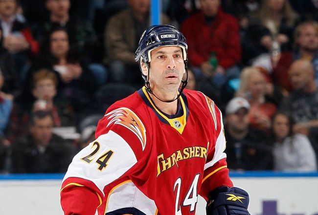
To put into perspective how terrible the hockey scene in Atlanta is...
...I have no idea who this is. No clue in the world.
-
I prefer Charlotte's new uniforms to its old ones.

-
Arizona Cardinals home uniforms are great, and now superior to a lot of other teams because of the new collars.
-
I thought that the Cavs black alternate from the 2010-2011 were cool. It's basically the Lebron James jersey with the 90s Cavs colors

Definitely. My favorite Cavs jersey of all time.
-
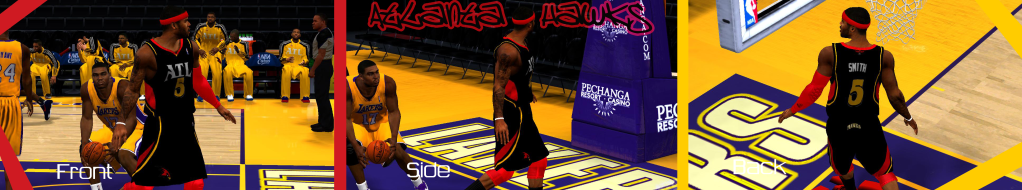
IMO this would be a perfect look for the Hawks--concept by me, video game rendering by lord knows who.
-
Unpopular opinion:
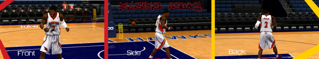
Not only do I prefer the old script, number font, and colors of the Atlanta Hawks, but this is my favorite jersey they have worn in my lifetime. Prepared to be judged...


Unpopular Opinions
in Sports Logo General Discussion
Posted
This