


Brave-Bird 08
-
Posts
5,170 -
Joined
-
Last visited
-
Days Won
15
Posts posted by Brave-Bird 08
-
-
If this is true, the NFL teams that have quickly moved on from a Nike-lead redesign are:
- Buccaneers
- Jaguars
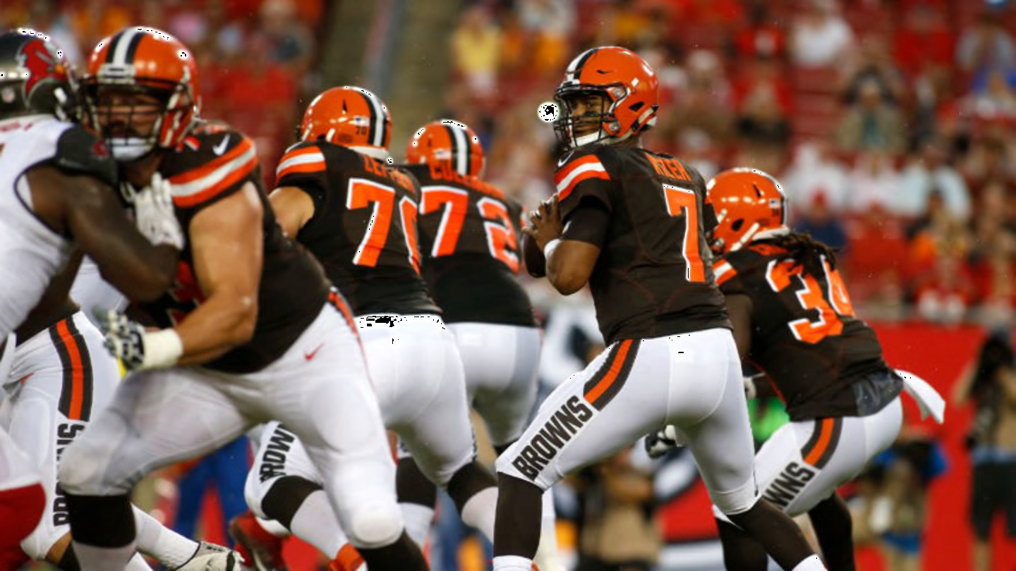
- Browns
- Lions
- Jets (rumored)
- Titans (rumored, badly needed)
And my guess is the Falcons explore this for next offseason, while the Commanders under new ownership without question probably will).
If you're Nike, how are you not seen as an objective failure at this point? Everything you're cooking in the kitchen is getting sent back.
-
 17
17
-
1 hour ago, Chromatic said:
If you're referring to the Brady era Patriots uniforms, they definitely weren't. Not only did they look worse, they looked way less "traditional" than the current Falcons uniforms, even with the abbreviated wordmark.
I'll always see the Belichick/Brady Patriots uniforms as the "NFL Europe Meta"

-
5
-
 1
1
-
 1
1
-
-
1 hour ago, LunarLeo said:
This is my preferred route for my home team Falcons. Would love if they switched designations for the home uniform and helmet shell. The current uniforms aren't all that bad to me, but just not something I would go spend money on to wear out in public. I almost always get vintage gear to represent the team. Most fans agree as well. The new unis remind me of when the Hawks changed in 2015, to the trendy volt color. Needless to say it wore away quickly amd they have a gorgeous set now. Falcons need to recognize the same and go old school. We have an amazing set that's top 3 imho
Can't echo this enough.
I personally think the Falcons current uniforms are good, for what they are trying to be: cutting edge, but simplistic in design. And I understand that the 2003-Present logo is kind of the mark of the Blank estate, so as long as they own the team it's likely to not change (could be wrong about that, but it's a stamp that signifies to the shift from the Rankin Smith era to the Blank era).
But me and my friends gobble up the throwback gear and never are wearing the contemporary stuff. I have one of the Nike gradient jerseys and honestly it pairs pretty nice with black jeans and black shoes. Other than that, my Falcons hats, shirts, coffee mugs, heck, even my mini-helmet I keep at my work desk is from the 90s.
If the original logo could just be slightly adjusted to where the bird's face doesn't look like it has a petrified expression, I think going back to it would get an overwhelmingly positive reaction from fans. It looks more like a sports logo. The current logo just reeks of both catering to youth and the early 2000s when graphic design in sports went a bit *too far* thanks to digital rendering.
And in a league where there's too many teams electing to wear all-black, why not be the NFC team with red helmets and jerseys? The Chiefs are the only team in the league that wears red + red (unless Houston is going to change that in a few months here). With the two-helmet rule, Atlanta could have a red-red-white home // red-white-white road // black-black-white alternate, toss in some grey pants as an option, and bam, you not only have made every fan happy (because the fanbase can't agree on which era to go back to), but we'll have a design that doesn't spoil after a few seasons like the past two have.
-
2
-
 1
1
-
-
The Titans need new uniforms more than any of the others mentioned. I'm all for it.
-
12
-
-
36 minutes ago, BlazerBlaze said:
Really wish somebody would have gotten a pic of Giorgos Giakoumakis at Media day. There's been zero hints/clues of what ATLUTD's new away is going to look like.
My wish: white shirt with primary logo in standard colorway.
My fear: Peach base from head to toe.
-
Carp. you really think that concept is awful? I think it looks incredible.
But yeah, I would re-iterate. Anybody can get behind a keyboard and get the internet riled up over stuff like this, and Reddit with its anonymity is probably the worst source you can use without corroboration.
Same as the Broncos rumors, I think it's all people just looking for dopamine hits by breaking the internet knowing this is the time of year people are sitting around speculating about these things. I actually think it's extremely unlikely a paralegal, even without an NDA, would be willing to compromise their position by leaking something like that -- especially admitting they work with Nike. Seems really strange.
-
7
-
-
My biggest pet-peeve with the Buccaneers, since they are actually wearing red tonight, is that the orange stroke on the numerals is too similar to the red and makes it look like the numbers are just pewter-red-white instead.
They should widen that stroke, change the shade of orange, or even drop the pirate ship logos from the sleeves and add a stripe sequence where the orange pops a bit.
Just a shame that the color is part of the scheme, but really gets drowned out by all the pewter and red.
-
6
-
1
-
1
-
-
With all of the blue in the Rams uniform, the all-blue for Detroit is just unacceptable. Grey pants would make this game so much easier to look at.
There really needs to be a branch of the NFL that governs uniform matchups from the top, down.
-
6
-
-
Houston's problem is the *way* it wears its uniforms, not the uniforms themselves. Unfortunately it's almost a guarantee that we will get monochrome dark, white and alternates with the redesign and they will be digging more into diluting their look than anything else.
The color blocking -- sigh, that is barely a thing these days -- on the original uniform was so great.
-
16
-
 2
2
-
-
1 hour ago, ruttep said:
Shouldn't this be proof enough that letters/numbers do not belong on the pants of a football uniform?
It's unbelievable to me that this was an NFL uniform.
-
11
-
 1
1
-
-
I just don't like Seattle's new color scheme and the way they are applying it. The hues in the green and blue are too similar, one needs to be lighter and one darker for better contrast. The lighter color in the key-line is confusing -- is it going to be used a lot? A little? In this case it's an entire base for a sweater, and it just clashes like crazy with the badge colors.
Still snagging a cap with the whale logo on it though.
-
2
-
-
Commanders are definitely the worst offenders. At least with the Eagles, Texans, Vikings & Cowboys there's some white in the helmet.
-
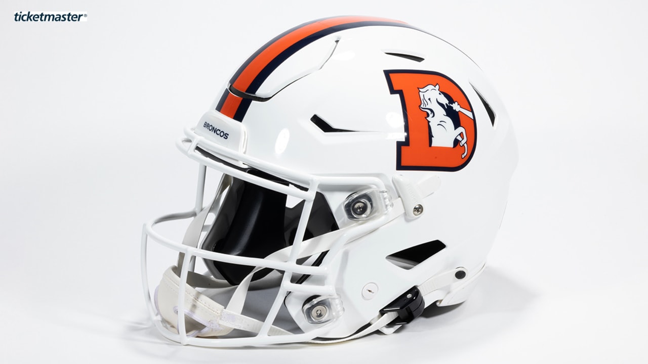
What makes the Broncos white helmet good is the D logo -- it combines really well with the helmet stripe to provide perfect color balance. It's just a damn good helmet. The white horse is also insulated by the orange D.
Trying to put the mostly-white demon horse logo on a white shell would make them look like a high school/college team doing some last-minute shell x decal mixing, which is the worst.
-
8
-
-
Netherlands, or FC Cincinnati?
-
20 hours ago, Pabig93 said:
I miss that Leeds logo. It was really cool and they should not have rejected it.
Yeah. I understand why it was despised, objectively. But personally love it. Gives Columbus Crew vibes.
-
Every layer of that post re: Broncos is not credible. I wouldn't read into it at all.
-
2
-
-
6 minutes ago, kaleb_girod said:
Didn’t the Lions remove black from the color palette with their new uniforms? But now they want to bring it back??
How about the Lions just not have a Color Rush? I mean aren’t their new “favorite” all-blue and all-white combos enough?? Sheesh.
Don't underestimate the sway of some marketing person either internally with Detroit or at Nike being like, "yo, that all-black slaps" and everyone being like yeah the Cardinals did it! The Falcons did it! We need to do it!
-
1
-
-
"Gentleman, bear witness. While I've been mourning the Falc-jackings that never were, one of them has been unfolding here before me. This is no 2023 NFL changes thread, this is a party."
-
5
-
-
8 minutes ago, the admiral said:
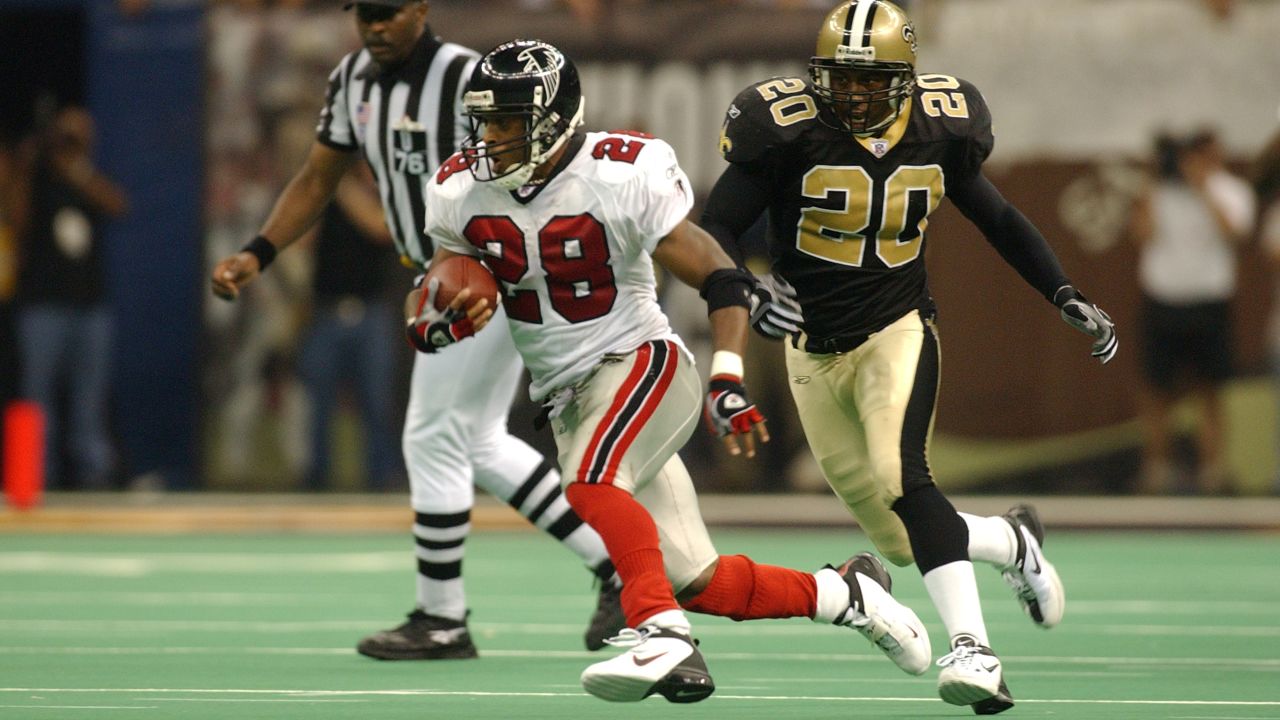
The Falcons have never had a great uniform. The original with red helmets, black jerseys, and white pants was good enough, but pretty much an export of the Georgia Bulldogs. Something that attempted to be a real UGA/GT synthesis, not just a little gold strip of masking tape on the helmets, could be interesting, but then you're bumping into the Saints a little. The '80s red/silver was also good enough, and everything from Dirty South Raiders onward has been bad. Always gives the NFL in Atlanta a "we're here because demographically we have to be" vibe, to be honest.
1) "The Falcons have never had a great uniform"
2) "We're here because demographically we have to be"
I'm sorry, but what?
-
14
-
-
10 hours ago, MCM0313 said:
So did the Falcons in this picture. So beautiful.
This reads like I've been mistaken for a Saints fan.
I'm... I am going to need the rest of the year to recover from this...
-
4
-
-
I don't mind that change for the Mets. I have always had appreciation that they iterate the cap logos to match the jerseys -- like the road caps from a few years ago that had the silver monogram outlined in orange to match the shirt -- but in both the silver and this case, the cap logo is a bit too busy. Doesn't need to be, and it's okay for cap logos to not entirely follow the style of a jersey script.
This will probably help with cap sales too, which wouldn't surprise me if that is why they changed it.
-
3 hours ago, kaleb_girod said:
Saints are absolutely gonna go all-black Sunday with playoff implications on the line. No way they go gold.
Hell, maybe they even go black over white again like last season lol.
I weep, because we had it SO RIGHT.
-
14
-
3
-
-
Not entirely against adidas bringing back these tapered, swooshy stripes. Will need to see it on a full kit. Feels so mid 2000s to me.
Nike utilizing single side panels is not my favorite, especially if it continues down the shorts (Tottenham's third kit, for example)
-
2
-
-
The NBA is going to look better today than it has in years.
-
8
-


/cdn.vox-cdn.com/uploads/chorus_asset/file/19233155/jenkins.jpg)
2024 NFL Changes
in Sports Logo News
Posted
I'm in the camp that the "legacy" uniform is boring. The helmet is great, but just standard stripes and block numbers are as dull as it gets.
To me, the proper New York Jets uniform is the Testaverde/Curtis Martin era uniform -- callback to the classic with a darker shade of green. They really just needed to figure out the striping application.