


Brave-Bird 08
-
Posts
5,180 -
Joined
-
Last visited
-
Days Won
16
Posts posted by Brave-Bird 08
-
-
Unless I am having a Mandela-effect moment, that cat looks awfully similar to a popular cartoon cat though I can't put my finger on it...
-
that jersey style by UA is not great, but at least when Cincinnati wore it there was a pattern so it had some sense of detail to it. LIU's colors are so good, they could rock plain jerseys and look incredible. I'm not a fan of those random jersey stripes though. Looks like blank stickers.

-
 1
1
-
-
That same point about Lurie is what I try to explain to Falcons fans. Arthur Blank got the new logo project going the second he took over the Falcons, it's the differentiator between everything he did for the franchise and how absolutely soulless it was beforehand. I get the old logo has gotten more popular as it's entered the realm of nostalgia, but there's no chance Blank would go back to it full time.
-
I hate to say that my brain has adjusted to seeing all white uniforms, even though I don't like it. It's kind of like how soccer kits have for some reason shifted to being the same color head to toe much more often than not. Annoying, uninteresting.
It's just going to make the beauty of the throwbacks even more apparent when they're worn, which might just lead to more teams shifting back to a traditional aesthetic. Finger's crossed.
-
1
-
-
^ those alternates were so bad that they were good, I can't explain it. Every time I am reminded of them I spam all of my UF friends with photos and no context, but DEEP DOWN on the inside I admit to myself they absolutely are like something I would have whipped up myself and tossed in the concept boards 10 years ago without apologizing.
The issue they have with the new alt is the same Boise State ran into, which is that if you are blue and orange there's really no way to make a black jersey that doesn't look muddy unless you remove one of the colors altogether. In Boise State's case they just went with black + blue + grey and left the orange out. Granted, I not only don't think it looks any better, but it deviates from the school's brand and therefore isn't necessary. Another example is the Knicks alternates, which in some iterations have been orange numbers/lettering with white trim on black, making them look more like they're in Halloween jerseys than anything else.
As Dr. Ian Malcolm said, just because you could doesn't mean you should.
-
1
-
-
The black UF jersey was doomed to look bad, the blue and white GATORS script just drives it down. Looks like a "blackout night" alternate a high school team ordered half way through the season.
-
6
-
 2
2
-
 1
1
-
-
17 minutes ago, philly97flyer said:
The Phillies don’t have a City Connect uniform yet, which is why they’re allowed 5 right now. Once they get theirs next year, they’ll apparently need to drop one of the existing 5
oh duh.
That's fair, will have to redirect my disdain for them to another area.
-
16 hours ago, hormone said:
I am curious as well. Also, red, white, blue, gray, and powder blue doesn’t add up to 4+1CC. Am I missing something?
I mean the Phillies still have white, grey, cream, powder blue and red. I think teams get exceptions for anything that is considered a non-regular rotation uniform (like a throwback, or in the case of the Blue Jays, the Canada Day uniform), but that doesn't add up for Philadelphia because they wear the powder blue every Thursday home game.
Annoying b/c Atlanta had to drop their cream jersey AND the City Connect was apparently b/c they were informed by MLB about this new four shirt rule, so they wanted to use the CC uniform as an opportunity to preserve a permanent chance at showcasing the overall look of the Hank Aaron-era uniforms.
Yet Philly is trotting out five total uniforms regularly.
-
1
-
-
MOD EDIT
-
1
-
-
Y'all, all the Texans have to do for a "throwback" is wear red socks with the blue pants.
-
1
-
1
-
3
-
-
Suns uniforms are great. Such an improvement over the generic design of before. Yes, would prefer the basketball be orange, but I think Conrad made a pretty solid argument for why it's not.
-
2
-
 1
1
-
-
It's the blue hue in the Jaworski/Carmichael era green that to me just looks more like midnight green than Kelly, though I was born in 1990 so the most common reference of it I have is the Super Bowl, where the lighting made those uniforms look pretty drab. But most photos I can find it looks really dark.
Did these look way more close to Kelly green IRL or something? What am I missing here?
-
On 7/28/2023 at 3:25 PM, Red Wolf said:
Could be worse
EDIT: For clarity, I think the new ones are solid, but the number font should be a standard block instead of the Texans thing. But nobody pays me to be the uniform nerd at Arkansas State despite my lobbying.
the 49ers called and want their color rush uniforms back! (I just wanted to say that to highlight how stupid it was that the 49ers looked like this)
-
2
-
-
The only challenge is the "Carmichael uniform" would be pretty difficult to replicate on a modern jersey template. I personally agree with OSV and think it would be worth it to create a cleaned up sleeve and go with it.
You could run the w-g-w stripe both across the sleeve cap and inserted in the sleeve cuff and just leave off the fat middle stripe, which never made sense to begin with.
Of course, those jerseys aren't Kelly green so there would be no hype ::shrug:: -- I do find the throwback they went with very bland and too similar to the New York Jets of the same era. But throwbacks are still fun. I had fun when the Broncos wore the candy striped unis. I enjoy it all.
-
take these conversations to Reddit lol
-
5
-
1
-
2
-
-
That color scheme for UTEP is so good, they should go to it full time.
-
3
-
-
All of those B1G uniforms look great except for Minnesota, because of Flecking course
-
6
-
3
-
-
I miss when NBA teams had all sorts of interesting collar designs.
The way Nike keeps going with plain sleeve cuffs and collars just makes everything look so cheap and bland. Pelicans uniform here is no exception.
-
3
-
-
I like these. The helmet looks really good. The uniform its paired with is fine. I think there’s still this aversion to NFL becoming like CFB and teams blurring the lines of having a core home and away look, but the uniform isn’t bad.
I wouldn’t come close to comparing this to the Lions, who have both an unusual helmet and a very unusual/bad grey alt and stuck them together non-sensibly. This alternate for Denver looks polished, it just doesn’t look like the Broncos to me.
-
1
-
-
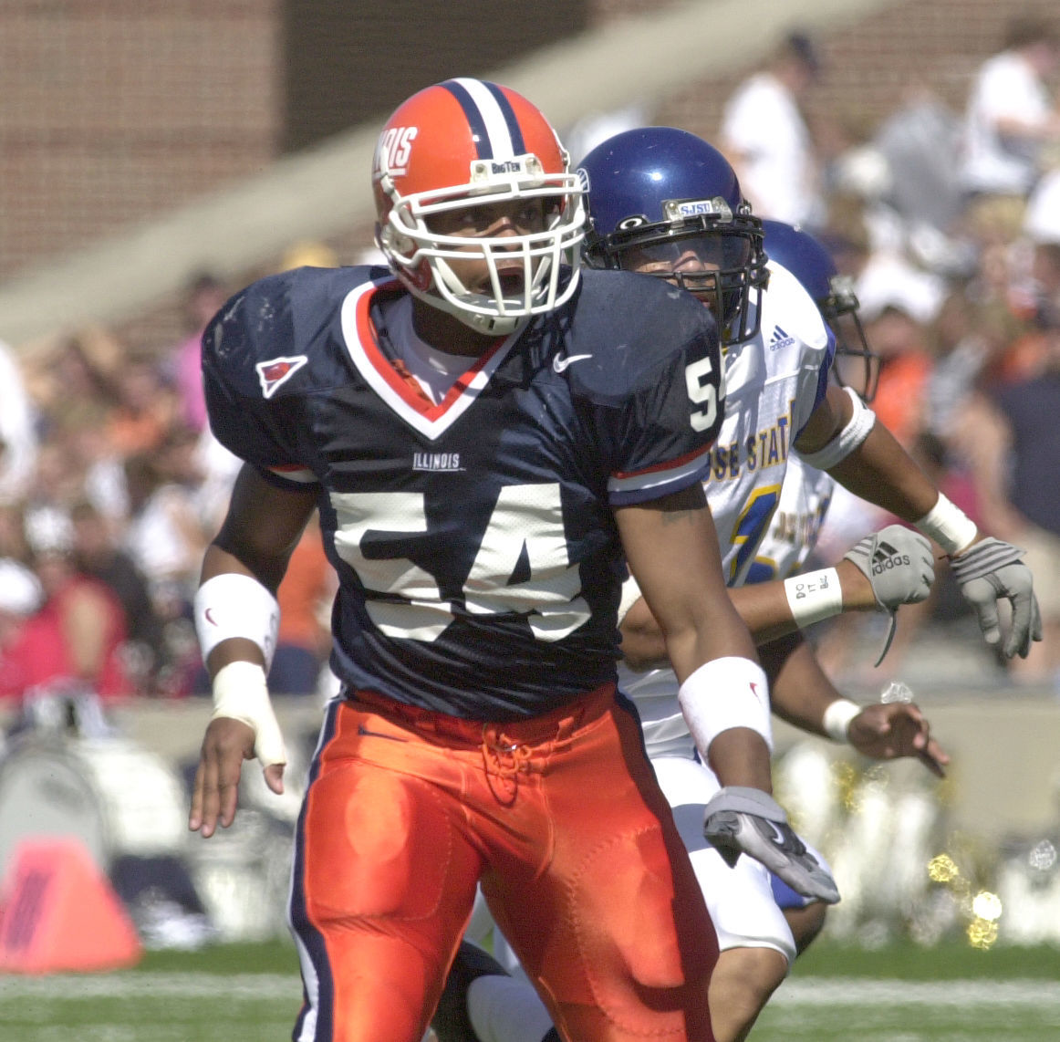
The distinction I would like to see between the two schools is that Illinois is blue, orange and white while Syracuse should be orange and blue with minimal white. I'm not sure why but I was a huge fan of this look for Syracuse (and materially could probably get a much more vibrant color of orange + lighting is better since Carrier Dome renovations).
To me, Illinois in contrast looks best like this:
And as so many have pointed out: Yeah, at this point, the two schools need to actually get together and pick lanes, because it absolutely has seemed like Illinois has been just copying Syracuse's homework the last decade or so.
-
8
-
-
Yeah, Illinois looks enough like how they should look for my satisfaction. Their previous uniforms were so bad, I am kind of surprised we are getting complaints here.
-
3
-
 1
1
-
-
That helmet looks incredible.
-
7
-
-
Yeah, the Angels current branding has really good bones, wheras that throwback may get an ovation just b/c it's a throwback and different -- but let's be real, that cap logo isn't good, neither is the wordmark. There's nothing special about those.
If the Angels would add some sky blue where grey is in their current set, fix the red jersey to have color contrast, they would be perfect.
-
2
-
1
-
-
Very nice from Louisiana Tech!
Also LOVE the Ohio State alternates, those are kind of a no-brainer and surprised it took them this long to roll them out, but I am annoyed they are wearing them against a team that will be in all-white.
I would prefer that alternate for them to be a road option, but I understand them wanting to wear it at home. Would have picked an opponent that was likely to be in colored pants and helmets though.
/cdn.vox-cdn.com/uploads/chorus_asset/file/24282279/usa_today_19599771.jpg)

/cdn.vox-cdn.com/uploads/chorus_asset/file/23943074/1236541597.jpg)


/arc-anglerfish-arc2-prod-pmn.s3.amazonaws.com/public/MJBWP2XGCZG3VA256MNVD6VR4A.jpg)


College Football 2023
in Sports Logo News
Posted
Annoyed we only got a look at one uniform. But as I’ve said many times before, their marks are so good that no design quirks are needed to make them look distinct and unmistakable. Glad apparently people at Cincinnati thought the same thing.