


Brave-Bird 08
-
Posts
5,188 -
Joined
-
Last visited
-
Days Won
16
Posts posted by Brave-Bird 08
-
-
1 hour ago, GhostOfNormMacdonald said:
I would have loved to see fauxbacks for the newer teams
The Texans could just wear white jerseys, navy pants and red socks and that would count for them -- home or away.
-
 2
2
-
-
If the Nuggets just removed the dumb gradients off the side, these uniforms would be more than worthy of hoisting a trophy tonight
-
2
-
-
That dog logo is good. I know the designer went kind of crazy with all of the subliminal details, but if you didn't know about them it just is rendered well in general
-
4
-
-
The NFL could have done "Throwback Thursdays" for TNF and given each team throwbacks for home and away, which would probably create more jersey sales than the Color Rush program did (especially b/c teams had to be forced to wear their already existing road uniforms after the color-on-color failed).
But you know, I guess we will leave the logic to the people getting paid the big bucks
-
12
-
 2
2
-
-
If the Lions wear blue pants that is going to look amazing
-
6
-
-
the 2002 Bills redesign had some major CFL feel to it, not sure why. 12 year old me thought they were awesome...
...he was wrong
-
5
-
 2
2
-
-
The City Connects all look mailed in, just like all the crap NBA alternates we have been getting every year.
Nike is slowly dissolving the uniform integrity of sports
-
I love the Eagles kelly green, but always found those jerseys boring.
I'll always be a sucker for the funky sleeve striped jerseys in the darker green.

-
5
-
-
6 hours ago, adsarebad said:
They are on the inside

HOWLING
-
1
-
-
Nike absolutely blows
-
4
-
-
It is probably either announcing they are wearing red helmets for the 2023 season
Or it is absolutely nothing, which wouldn't surprise me either.
-
Ooh man, let the speculation begin
-
1
-
-
15 minutes ago, eRay said:
We can make whatever we want on here. We don't have to answer to owners, stakeholders, marketing execs, focus groups, etc.
Who knows how many times those people have gotten in the way of designs this board would love.
Such a great point as well, and unfortunately I think a lot of the marketing research stuff actually dumbs down what teams do, because there's a natural disconnect between them and how a sports uniform should look
-
1 hour ago, DCarp1231 said:
It truly is one of life’s greatest mysteries how a lot of CCSLCers have what it takes to create incredible timeless identities for professional sports teams yet uniform manufacturers and teams employ absolute imbeciles for the process.
My ONLY opinion that gives benefit of the doubt to manufacturers is that it's easier to create designs that look great in a graphics design program, while doing it in an actual real-world application can get complicated. But even this sentiment can easily be argued by the fact Maryland had those crazy airbrushed helmets, jerseys from Nike and UA in the past have been pretty detailed. But it does seem like lately, with Nike especially, they are going for simple and easy to apply designs (Jets boring triangles, Falcons triangle side panels, Cardinals basically recycling what the Lions did a few years back, etc)
But, if we ever saw anything like the Jaguars, Buccaneers or Browns uniforms from Nike's first round of having their hands on the NFL, people on these boards would have gasped at how bad they were -- even as concepts, which usually get more of a thumbs up for good work, even if they're crazy.
It is mind boggling that more of us didn't actually get jobs working in these areas, I even tried for a long time and couldn't get in anywhere. Right now somebody at Nike who really loves drop shadows, text on stripes and gradients has too loud of a voice and too many people scratching their back...
-
2
-
-
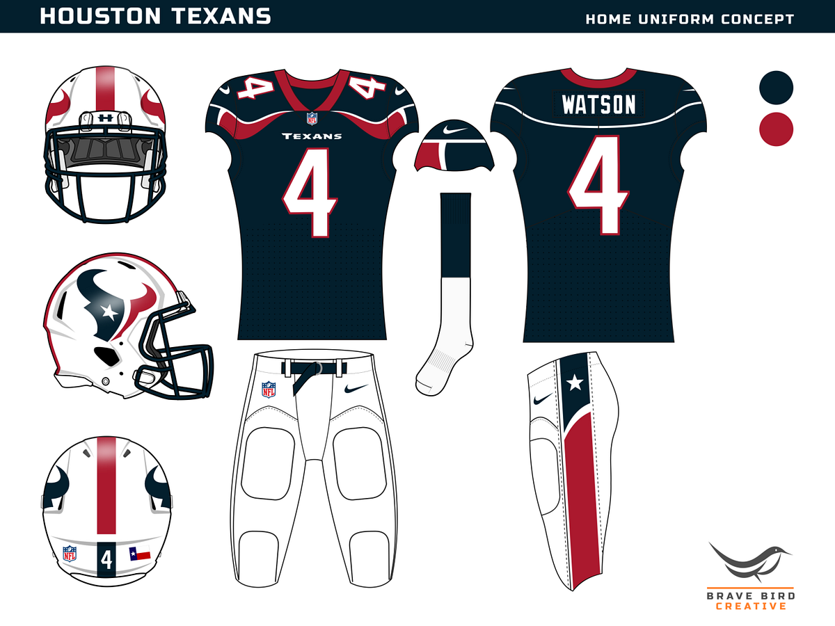
I know what the Texans should do
-
3
-
 2
2
-
 2
2
-
-
My only request for the Falcons is that they wear the throwbacks 3 times, don't wear the gradient, and keep the all-black and all-white looks to one or two times a piece.
-
1
-
-
if the sleeve has to be rolled up for the core of the concept to show its face, the concept sucks
-
3
-
1
-
-
sorry, I am bored with these
-
8
-
-
Don't underestimate the gaudiness of scorebugs, especially if we are going to be seeing this on FOX. FOX already has a full side-to-side banner for college basketball that is the most unnecessarily busy scorebug I have ever seen, and we still have 3 years before kickoff. Who knows how annoying scorebugs and just overall screen overlays during sports broadcasts will be by then? (for example, I can just see live betting lines and what not taking up a side bar or something)
-
14 hours ago, WestCoastBias said:
See, this is phenomenal. It's still a shift in direction from what we have gotten in the past, but it's actually applicable, scalable as a concept and refined.
We got the sketch-on-napkin version of this, which is just so pathetic.
-
4
-
1
-
-
39 minutes ago, Krz said:
Honestly, I really like pretty much everything. The font is unique, presentation is modern and memorable, and I think the city specific elements will develop more overtime. I’m glad one of those concept logos that crammed elements of all 3 countries into a trophy shape wasn’t chosen, but we still get to highlight the sites. I hope more cities end up looking like LA than Houston. The one problem is the logo clip art, I’ll be interested to see how they apply it.
No instance of applying the clip art is worth interest.
There is also nothing memorable about each city being assigned a color scheme. Atlanta's is blue and green? Like, meh, okay. Means nothing to me.
I've already seen usage of the blob lettering where I literally cannot tell what it says.
Entire thing is a disaster
-
7
-
-
8 minutes ago, DCarp1231 said:
Probably an unpopular opinion, but throwbacks should always be worn against division rivals or longstanding conference rivals.
Also, alternate uniforms like Washington’s all black, Seattle’s wolf grey, Cincy’s all white, and Cleveland’s all brown should be worn in matchups that, historically, don’t matter.
This is correct.
-
1
-
-
the potential to fuse elements of Canada, USA and Mexico into a logo was what had me excited about this.
HOLY F--- MY EXPECTATIONS WERE LOW BUT WHAT IN THE ABSOLUTE TARNATION IS THIS
-
4
-
-
all sorts of random fonts get used for merch, I would not read too much into that
-
10
-


NFL 2023 Changes
in Sports Logo News
Posted
Plus it's annoying that Carolina would remedy the shoulder stripe, but not address the fact the TV numbers need to just be removed and that the pants stripe needs to be fixed to terminate at a point. Also, the shoulder loop going all the way around on the old template was 10x better than the way it is on the jersey Chark is wearing