


lahaye7
-
Posts
1,329 -
Joined
-
Last visited
Posts posted by lahaye7
-
-
REjoice! I saw UVa has put logos on BOTH sides of their helmets!!! Hope this is a new trend.
-
 7
7
-
 3
3
-
-
-
wondering if the NFL would allow teams to change the alt helmets decals only? Like say the new saints Louis vitton one be modified to the 69 preseason one?
-
46 minutes ago, pagan696 said:
what i like about the new black alt Cards helmet is the gloss black with red metallic flake. The Panthers would have been better with gloss black and a blue metallic flake (think old school Superman comics hair color style).
what i dislike about the black for the Cards, is the logo doesn't have strong contrast on the black background. the logo is clearly visible on white. maybe a white outline on the logo for black helmet would help make logo stand out better. i think from a stadium viewing distance, the red on black disappears and all you'll see is the yellow beak and white eye.
much like Louisville's back/ cardinal helmet.
-
20 minutes ago, JayMac said:
I don't feel like I'm jinxing anything by asking this. Has there been a GFGS helmet unveiled yet this summer? I don't think there has been and I am shocked.
grey is hopefully a college/ HS thing only.
-
1 hour ago, Old School Fool said:
We've had surprise uniform stuff the last few years. The most infamous one being the Ravens gold pants which were one and done because the reaction was so negative.

Chiefs and Rams once busted out throwback helmets without any prior announcement.
I won't be surprised when a team unveils a new helmet suddenly before kickoff. It's rare that these things happen but I can see it. The question is will any of these alternate looks have staying power because some do and some don't. I feel like NFL teams are more self aware about knowing if their look sucks than in any other league.
I remember the mustard britches for the Ravens (I actually like them, my Retro Bowl Ravens rock them) I hope you're right, I like surprises.
-
3
-
-
I posted a few years ago in a college fb thread that we would see a full Vader (all black) vs full Stormtrooper (all white) game every week in during the season. I see that pretty often. I don't think it will happen in the NFL, but I agree, we will see some mixing and matching. They will continue to have a uni schedule, I do not think NFL teams will have a surprise kick off combo like cfb schools do.
-
at least all these alt helmets have some uni element of the teams current unis. Except the GD Saints looking like seahawks / Louis Vitton polished turd.
-
Anyone like to see these teams go full time in CC unis? I think the Angels could, their CC unis have more personality than the current ones. DBacks too. Marlins just some more colors but I'm not going to beat that rotting corpse. Astros need to incorporate some of their CC elements.
-
 1
1
-
-
my City Connect Uni ranking (because no one asked)
1. Miami
2. Arizona (cream pants were a must)
3. KC Royal Fountains (love the cap)
4. Southside
5. Angels
6. Cubs
7. Astros
8. Giants
9. Colorado (cap kills it)
10. Brewers
11. San Diego
12. Nats
13. Boston
14. Dodgers
-
1
-
-
21 hours ago, agentrygraphics said:
Something that was perhaps missed in the Saints reveal that really really bothers me.
It's 2022 and the Saints STILL cannot, for the life of them, get their gold tones to match across the uniform.
I get it...metallics are difficult to match...but we have seen other colleges and pro teams match or get metallics to a decent matching level.
I was really hoping that the Saints would finally fix all the mis matching golds, change the black jersey to Archie Manning era one and maybe a 1969 preseason black helmet. INSTEAD they might just be teasing us with a full blown NIKE reboot with this new louis vuitton helmet.
-
1
-
-
when dark colored pants are worn high cuffed, with contrasting socks or stirrups, it's WAY better. These long pants look like 80's football coaching ones, with the slash pockets.
-
5
-
-
looks like Los Dodgers changed their CC caps. Went with a black bill and moved the Los Dodgers to the side panel. Traditional LA on the front. Brutal look.
-
my City Connect Uni ranking (because I'm killing time before a brewery trip)
1. Miami
2. Arizona (cream pants were a must)
3. Southside
4. KC Royal Fountains (love the cap)
5. Cubs
6. Giants
7. Astros
8. Colorado (cap kills it)
9. Nats
10. Boston
11. Dodgers
Just my .02 It's Craft Beer Snob time.
-
1
-
-
these rox CC unis are pretty good, I just hate the cap.
-
1
-
-
On 4/18/2022 at 10:55 AM, MJWalker45 said:
I'd rather they use champagne instead of white on the sleeves, but they pretty much just went with their original uniforms and it still works out well with the current templates.
These helmets look great from the side but horrible from the back. I think this, Philadelphia and Houston are fighting for the worst uniforms.
dark blue facemasks would help, but their look is darn good.
-
3
-
-
On 4/23/2022 at 8:44 PM, Marlins93 said:
I could be mistaken, but I am under the impression that the Marlins have not worn their black alternates even once this season so far. It could this be the end of an error?
what you did there? I saw it. Anyway, I agree, Blue marlin alt for next year.
-
11 hours ago, MJD7 said:
Count me in the camp of not at all liking the change away from Bulldog Bold to a more basic block. It was a custom font that was subtle and reserved, but still felt unique and fitting for Georgia. It was one of my favorite custom fonts out there, for sure.
It's especially odd coming off of a National Championship win in the Bulldog Bold uniforms, although it reminds me a bit of Florida State's redesign the year after their 2013 championship.
I thought their font was fine, but this is looks like how UGa is supposed to look imo. Gives us something to talk about in a light sports calendar.
-
1
-
-
I'm sure there are other examples , but has any player ever had a uni upgrade like Matt Ryan ? Falcons to Colts?
-
4
-
-
On 2/21/2022 at 11:14 AM, Mingjai said:
Maybe I'm a sucker for art deco, but the numbers on the throwback uniforms Washington used many years back (no to mention the originals on which they were based) were fantastic.
I have been clamoring for the Sonny Sixkiller font for Washington for years.
-
1
-
-
I just want the rejected ones released too, so we can all have barf all over our keyboards
-
2 hours ago, Ninoners said:
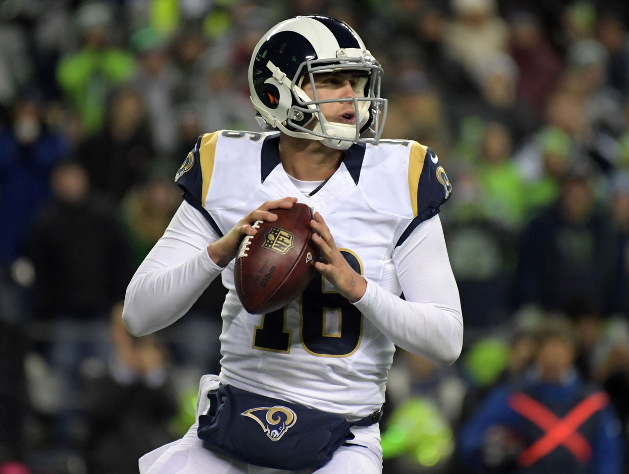
Maybe I'm an optimist. Maybe I'm being naive, but I don't think the NFL is going to turn into College FB with regards to the multiple helmets. I think we will see the majority of teams have 1 alternate shell, and some won't have any.
I just don't see the league allowing a free for all where we see a team like the Jets having green, white, black, and anthracite/gray options in one year.
Oh, I don't see them have multi colors like college, just a white alt if they do not have a historical alt one (Ravens, Texans, Jags come to mind)
-
1
-
-
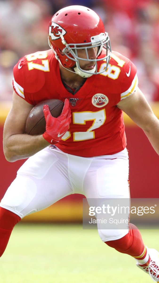
I wouldn't be shocked that most teams will have a white alt helmet in the coming season. The whole football universe seems to love the stormtrooper/icy white costumes.
-
5
-
-
On 10/5/2021 at 1:29 PM, Hat Boy said:
That USA sweater is grotesque.
cold grotesque garbage. How come US can't have an eagle in the style like the Finland one? I don't mind nike going to go in a different direction, but this looks like someone threw darts and hit Boring and Ugly in the word cloud.
-
1
-


NFL 2022 Changes
in Sports Logo News
Posted
college fb schools have been hammering this for a while now, I'll never get it either