

Lights Out
-
Posts
15,318 -
Joined
-
Last visited
-
Days Won
21
Posts posted by Lights Out
-
-
14 minutes ago, bushy said:
they’ve got the worst brand in basketball IMO.
It's not the most inspiring look, but no way is it worse than the Thunder, Nets, Rockets, or Jazz.
-
 3
3
-
-
On 4/27/2024 at 1:33 PM, DCarp1231 said:
New uniforms for West Virginia
Looks like USC-meets-Cal.
-
22 minutes ago, burgundy said:
Black wordmark and numbers on a black jersey is always terrible.
I think it would be fine if the outlines weren't so thin. Legibility is going to be a serious issue.
-
2
-
-
Their previous logos have never been anything special either, but this one is rather boring.
-
17 hours ago, Brian in Boston said:
For example, the Detroit Lions last introduced new uniforms less than a decade ago... seven years to be specific.
I mentioned this earlier in the thread, but the Lions' last three uniform sets all lasted less than a decade. It's nothing new and I would assume their futility on the field during that period has to do with it. They kept tinkering with their look to turn the page from a previous failed era.
-
2
-
-
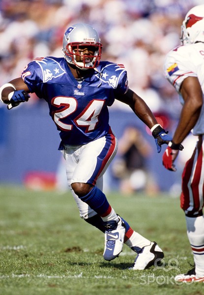
17 minutes ago, OnWis97 said:
In 1996, some teams had nice uniforms and some teams didn't. But they all had clear identities.
I'm not saying I love every team's current uniforms, because I don't. But looking around the league, the only teams I don't think have a clear identity are the Cardinals, Saints and Commanders. The Texans were also on that list until today.
The rest of the league, no matter how conservative or modern they are, at least have something that stands out, whether it's a color, a font, a striping pattern, etc. In 1996, we still had the Bills and Giants dressing exactly the same from the neck down and the Falcons trying to cosplay as the Raiders. Half the league had a basic black, silver or white helmet and unlike today, there were no alternate helmets that allowed teams to try something else. Merchandising has grown since then and forced teams to put a little more thought into it, not that they always succeed.
-
1
-
-
19 minutes ago, 29texan said:
"Nice" is subjective.
This was in 1996, btw:

I guarantee there'd be people bitching about those, the Eagles, the Niners, and the Ravens if this was 1996. There'd probably even still be grumbling over the Falcons and Jets "going BFBS" and the Jaguars using such a "gimmicky" color like teal. The Panthers' uniforms would probably be compared to the Arena League.
Of course, that would all look quaint compared to the meltdowns that would ensue over the Broncos' redesign the following year.
-
9
-
-
1 minute ago, tigerslionspistonshabs said:
If the entire league rolled back to 1996, people would immediately start pining for 1986.
-
8
-
 5
5
-
-
I like that horn helmet a lot. Always nice to see teams do something more inspired than the usual logo.
-
1
-
-
2 hours ago, ruttep said:
This is a lateral move, at best.
Seeing it laid out like this, I like how the new road jerseys have more orange than the old ones.
-
10
-
-
58 minutes ago, CreamSoda said:
how did Denver see this:
and decide to go with this instead?!
just an all time head scratcher. Such a miss on so many levels.
Not every team needs to look exactly the same as they did 50 years ago at all times. Especially for a team like the Broncos whose greatest success has come in modern uniforms.
-
16
-
 1
1
-
 1
1
-
 1
1
-
-
Now that we've seen the whole thing, I like Denver's new uniforms except for the weird triangle motif. I hope they do a slight tweak as soon as they can and get rid of those.
-
6
-
-
2 minutes ago, HOOVER said:
I remember when these debuted...it was a big deal. This striping pattern resonated down through high school football for over a decade.
But, it's run its course (years overdue) and it's yet another example of why non-traditional uniform elements typically don't stand the test of time.These uniforms lasted almost as long as the ones they replaced. I'd say they did stand the test of time.
-
6
-
-
13 hours ago, Kirill_The_Thrill97 said:
CTESPN's alleged leak of a new Vikings alternate...
This looks so fake that I'm starting to doubt all their previous leaks. In addition to the wordmark issue that others have pointed out, the NOB is also sloppily misaligned. It looks like someone's first attempt in the Concepts board.
-
1
-
-
On 4/12/2024 at 9:31 AM, Sykotyk said:
As for why the city is playing hardball? They just spent $200m two years ago to renovate the stadium and now want an entirely new stadium.
This is the exact same BS that Alex Spanos pulled in the '90s that got the ball rolling on the Chargers' eventual relocation. He demanded expensive renovations to the Q, got them, and then immediately started demanding a new stadium and threatening to move to LA.
I hope this doesn't end in Cleveland losing the Browns again, but I won't be surprised at all if it does. The NFL's greed is out of control.
-
1
-
-
9 hours ago, Chawls said:
As more alleged leaks trickle out, I’m starting to develop an unsettling feeling that the Texans are going to be this season‘s Commanders in terms of having uncoordinated and overthought uniform sets.
We've already seen the jerseys and none of them are as bad as those god-awful Commanders road jerseys.
-
4
-
 1
1
-
-
41 minutes ago, 8BW14 said:
The Texans did not need to change. I’ve been saying that the whole time. These new uniforms are trying way too hard. They had a good thing going and effed the whole thing up.
The Texans' old uniforms were as boring, mediocre, and anonymous as their play on the field for 99% of the time they were in use. Frankly, the horn stripes from the new set are the kind of thing they should have done all along instead of recoloring the USC template from a catalog.
The new uniforms might be "trying too hard" (I don't think so) but the old ones weren't trying at all. They finally have a real identity now.
The only thing I don't like is neither of the home jerseys matching the road and alternate, but that's nothing we haven't already seen countless times in the NFL.
-
6
-
 2
2
-
 2
2
-
2
-
3
-
-
Erik Kramer's jersey looks almost exactly the same as what they just unveiled.

-
15
-
-
I don't like the star tacked on at the side, but I don't see a problem with the H itself. Whether this was intended or not, the double-struck blackletter font evokes the classic oil derrick logo without actually using it and pissing off the Titans.
I'm not sure I love it as a helmet logo, but as a secondary logo, it's fine. It's better than this, which they never used anyway.
-
4
-
-
The Lions' new look is pretty solid. The BFBS alternate is going to have some serious legibility problems, though. Last time they tried this, they included some white trim so there would be actual contrast. Not sure why they didn't do the same this time.
-
2
-
-
While I prefer the logos/wordmark they have now, I otherwise agree that those uniforms were better. The only issue was the helmet finish, which looked good in photos (like that one) but was an eyesore most of the time on TV... so of course that was the one thing the Jets didn't fix.
-
1
-
-
4 hours ago, AstroCree said:
Is that now 3 teams that have gone back to their previous throwbacks after the "Nike-ified" changes? Says a lot about their creative department.
I think it says more about the franchises involved than it does about Nike. The Jets, Browns and Bucs were all coming off some of the worst on-field eras in their history and figured they could boost sales and morale by pandering to their fans' nostalgia for better times. It's just marketing 101.
It also needs to be pointed out that all three kept some of the modernized elements from the uniforms they ditched instead of throwing all the way back.
-
7
-
-
2 minutes ago, PurpleHayes said:
7. Trying to deflect blame, Nike claims that it was all the NFL's idea, pointing to Step #4.
It's Steps 1 and 2 that make it the NFL's fault. At the end of the day, because of their exclusive contract with the NFL, Nike is obligated to humor all the dumb ideas that the out-of-touch suits come up with.
If Reebok was still the supplier, we still would have gotten Color Rush or something along those lines, just with super-stretchy fabric and piping and panels instead.
For better or worse, all of this was inevitable when the NFL moved from having several different suppliers to centralizing around one. Color Rush would have never been possible back when some teams wore Nike, some wore Adidas, some wore Puma, etc. As always, the buck stops with the league and their unlimited desire for money.
-
5
-
1
-
-
1 hour ago, PurpleHayes said:
what else is Nike really going to say? That the tail wags the dog?
Nike is the tail. The client (the NFL) is the dog.
As for "the next five years at least" - I assume Wood is just being modest. Their outgoing uniform set only lasted, what, seven years? The one before that lasted eight. And the one before that lasted six. It would be presumptuous for a team that can't go a full decade without redesigning their look to start touting the next set as their "forever uniforms." And by not making such a firm public commitment, they're also covering themselves in case the fans don't like the new ones.
-
4
-


24-25 NBA changes
in Sports Logo News
Posted
The Rockets' logo is a mess and their uniforms are the equivalent of wallpaper.
I also forgot how bad the Cavaliers' brand is now. Summer League uniforms and a logo that looks like it was thrown together in five minutes on MS Paint. The Raptors are pretty bad too - the chevron-themed uniforms are interesting, but the logo sucks and ditching purple continues to be a huge mistake.
Point is, it could be a lot worse than what the Nuggets are doing now.