

Lights Out
-
Posts
15,318 -
Joined
-
Last visited
-
Days Won
21
Posts posted by Lights Out
-
-
20 hours ago, ruttep said:
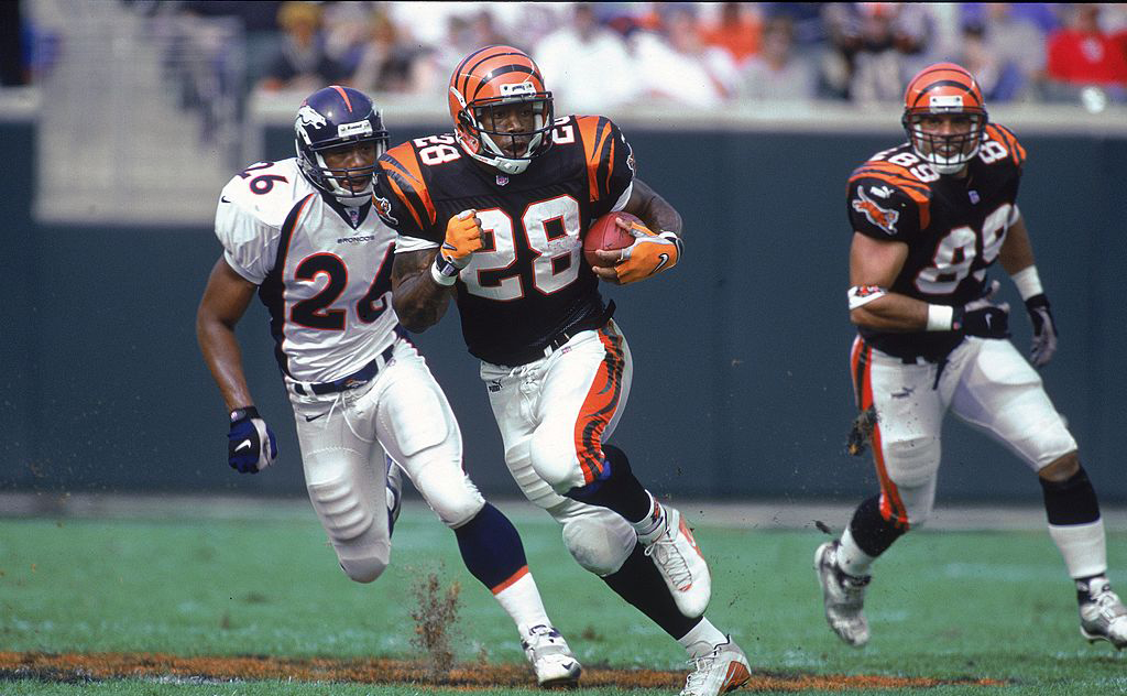
Best uniforms in Bengals history. Change my mind.

I agree, with the caveat that I wish they had orange jerseys and pants in the rotation too.
I know some people like their current uniforms, but there's just too many things they get wrong with the stripes to make them better than the classics. It's like they went out of their way to avoid black stripes on an orange base.
-
 1
1
-
-
On 11/11/2023 at 12:05 PM, the admiral said:
I know I'm being Unfair to LeBron, but a lot of the NBA uniform weirdness we have now lies right at the feet of the mid-2000s Cavaliers, who, rather than using LeBron to elevate the team's brand for the long term, went for short-term gains by creating as many LeBron jerseys to sell as they could with the CavFanatic mashups. I don't think the NFL has fallen to point-and-click recolors yet, but they will.
You have a point, but the CavFanatic program started in 2008-09, which by that time there had already been special uniforms around the league for preseason games in Europe, "Latin Nights," St. Patrick's Day, etc.
-
 1
1
-
-
12 hours ago, kaleb_girod said:
Man, I really do love the Jets helmet color, but it just simply doesn’t match the rest of the green in the uniform. You can say it’s a materials issue, but it’s really not. The green on the helmet is much brighter and more vibrant than the stripes and numbers on the jerseys and pants. It’s pretty obvious on this broadcast.
The Jets' helmet is weird because it matches fine in photos but looks like a completely different color half the time on TV. I think it's the finish that's the problem. They should probably switch to matte helmets.
-
20 hours ago, tBBP said:
I don't think they've had brown pants of any kind since sometime around the mid-late '90s when Marcus Harris was tearing up receiving records.
They've tried brown pants occasionally since then.
-
1
-
-
4 minutes ago, kaleb_girod said:
Does anyone know how the Raiders and Cowboys still have metallic pants, but no other team does?
I’m sure I’ve missed the reason, but always been curious.
They don't use Nike's pants.
-
2 hours ago, VDizzle12 said:
I almost spit out my water when the creative director said that when designing uniforms they have a "reductive approach." Testing what they can take away to streamline/simply the designs.
I don't think they're lying about this. See: Jacksonville, Arizona, Miami, Atlanta - not to mention a lot of what they've done in other sports recently. If anything, they've gone too far with being reductive.
But if the team doesn't want that approach, they have to try something else, like those ugly Commanders uniforms that Dan Snyder's wife insisted on.
-
3
-
-
21 minutes ago, GFB said:
Are you referring to the elongated stripe? Then my guess is that most of the pants are being hemmed because players now prefer to wear their pants above the knee instead of over the top of it.
There's been a noticeable difference in both the shape and width of the stripes and how thin the outlines are now ever since they changed from Ripon (or whoever their supplier was) to the standard Nike gear in 2019. This is also why the shoulder stripes look closer to UCLA stripes now and don't use dazzle fabric anymore, and why the TV numbers have shrunk to the point where they should probably get rid of them.
Their uniforms just look a little worse all around than they used to. Unsurprisingly, it was their meddling owner who pushed for this shortly after buying the team:
QuoteOwner David Tepper heard the request last season and wanted the new uniforms approved by the NFL and implemented in time for 2019.
"Dave was all for it if it was going to help these guys. The players mentioned it to him and he said, 'If the players want it, let's go with it,'" Toner said. "Dave and (team president) Tom (Glick) were the catalysts in getting it done."
https://www.panthers.com/news/panthers-new-uniforms-2019-nike-vapor-untouchable
-
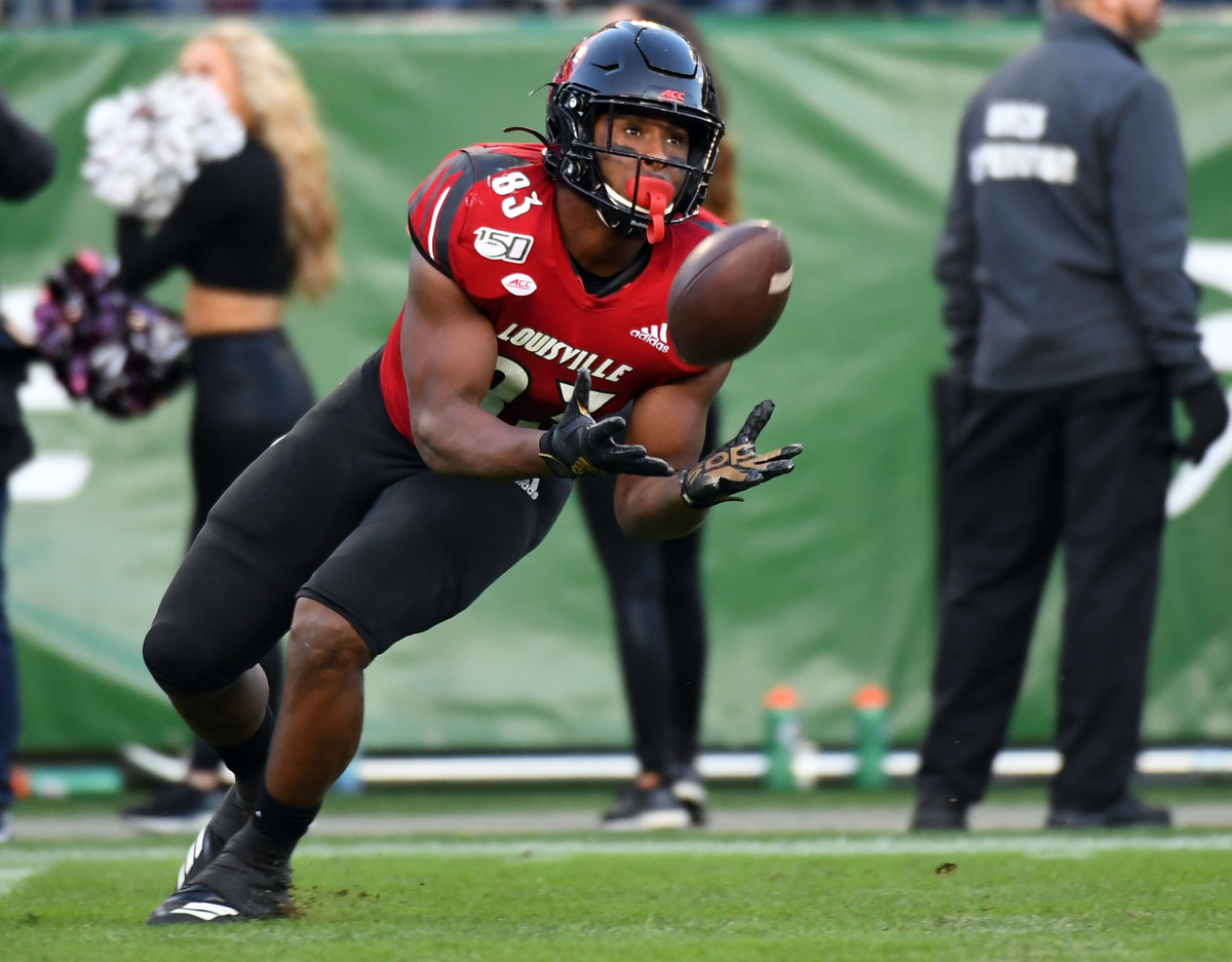
14 hours ago, oldschoolvikings said:
Every time Louisville is on TV I’m stunned at how terrible they look. It seems like every time they’re wearing something brand new I’ve never seen before and it’s inevitably just as awful as the last thing I saw them wearing. What a dumpster fire of a visual brand.
They need to start over with that big goofy bird they have painted at midfield and burn everything that came before.
I think their current uniforms, despite being derivative of Oregon, are fine. More or less the best Adidas can do. The ones they replaced were awful, though. Just look at how they slapped the TV numbers on to accommodate those poorly-designed wing stripes.
-
1
-
-
1 hour ago, DCarp1231 said:
I’d rather have these-
Over the jumbled up mess of the Brady-era set
They're just as bad as the Brady uniforms. They're the kind of uniforms you'd expect from Robert Morris or Samford, not the #2 NFL team on the Forbes list.
-
3
-
2
-
 2
2
-
 1
1
-
-
12 hours ago, BBTV said:
Baseball is also a bad comparison because the Marlins wouldn't pay anyone to play there
That's kind of the whole point, though. The Heat have good ownership. The Marlins have had nothing but terrible owners running a franchise in a top-20 TV market like it's in Glendive or North Platte.
Ownership and management are what make the Heat good, not the location that the other teams in the market aren't benefiting from because they're poorly-run.
-
2
-
-
On 11/5/2023 at 3:10 PM, Cujo said:
Can we be honest? The Heat wouldn't be and would never be shyte if they couldn't lure players because of the location/weather.
The Dolphins haven't won a game that actually mattered in almost 23 years. Them, the Marlins and the Panthers have combined for one ring since the Heat drafted Wade. Same location/weather, very different results.
-
3
-
-
I genuinely don't get all the hate for the Jets' current uniforms. They've always seemed fine to me. It's their Create-a-Team logo that's the issue, but that's been the case for 25 years now.
-
6
-
-
I like that Eagles concept, but I'd reverse the colors of the helmet wings - make them white with silver outlines.
-
A lot of the clamoring for full-time throwbacks ignores that uniforms aren't the same now as they were in the '80s, '70s, '60s...
Design elements made for long, floppy Durene sleeves aren't going to look as good on today's tiny sleeve caps, UCLA-style shoulder loops stopped being actual loops long ago, etc. It's easy to overlook these small details when they're worn once a year, not so much when they're worn for every game. Look at how the Jets' previous uniforms gradually decayed through the years as the basic construction of the jerseys kept changing. They looked good in 1998, they looked hideous in 2018. It got progressively harder to make the 1960s-style stripes work on modern templates and actually look uniform across the whole team. Even in 1998, they already had to sacrifice the bottom stripe on the sleeves because there was no room for it anymore, even though the whole point of the original design was that it was a giant Northwestern stripe with the TV numbers embedded into it. And they had to keep compromising from there.
Also, it's not really about the uniforms for a lot of these people, it's about nostalgia. Even if their favorite team perfectly replicates their old look down to the last stitch, the novelty will wear off in time, especially if they aren't winning.
-
20 hours ago, currymvp2024 said:
The #1 pick was not part of the trade and the hornets didn’t even have the best odds. or are you referring to the conspiracy?
and would making the Hornets more attractive really be more profitable than potentially 2-3 straight Lakers/Heatles finals?
The #1 pick wasn't part of the trade, but it was a likelier outcome with the rebuilding package they traded for than it would have been with Pau and a treadmill team. They also got another lottery pick in the trade.
No league wants to be stuck owning one of its own franchises for any longer than it has to. The optics are terrible and it's just a bunch of extra expenses they have to deal with. The MLB went scorched-earth to rid themselves of the Expos as soon as they could: threatening contraction, playing games in San Juan, refusing to make September call-ups when they were in the running for a playoff spot in 2003, discontinuing all TV coverage and English-language radio broadcasts, etc. The NBA fortunately didn't have to stoop to that level to sell the Hornets.
-
1
-
-
16 minutes ago, currymvp2024 said:
why did he veto the CP3 trade then? doesn't add up
He was acting as the owner of a financially-distressed franchise at the time and understood that the #1 pick made it more attractive to potential buyers than a treadmill team with Pau. Very different situation than what he normally would have loved to see as commissioner.
Even then, the trade that actually happened still involved a star being traded from a smaller market to a larger market.
-
1
-
-
12 hours ago, Carolingian Steamroller said:
I don't think the Texans uniforms are forgettable. The custom font is one of the better ones that came out of the early 2000's, the jersey stripes are simple and modern and the combinations work really well, including the "Battle Red" stuff.
Houston should remember the example of the team that left, sometimes you do get it right the first time. It's been pointed out every time the rumored uniform change is brought up but just wait until these uniforms are gone.
Were the Oilers IP be transferred, I think there'd be at least a fauxback. The Charlotte Bobcats never quite created a visual identity that lasted or stuck which isn't true for the Texans. I do think there's some appreciation for the Texans IP.The Texans' uniforms have existed for a long time, but have they really stuck? To me at least, they're just a visual representation of mediocrity. People look at them and think of David Carr getting sacked a million times, the Rosencopter, and blowing that 24-0 lead to the Chiefs, not any positive memories. The only thing that ever stood out were their red socks on the road and they got rid of those after 2008. Everything about their brand has always felt like a placeholder because they can't have the Oilers back, from the generic color scheme and name to the recolored USC template.
Comparing these uniforms to the Luv Ya Blues is crazy, they're not even in the same stratosphere. There's a reason why UH, Rice and the Rockets have all paid tribute to the Oilers but nobody will ever do the same for the Texans.
I think the Bobcats' inaugural uniforms and even their second uniform set had more character than anything the Texans have ever worn. They should have been the Apollos instead.
-
5
-
1
-
-
On 10/28/2023 at 12:22 AM, ruttep said:
Previous Twitter link died, hopefully this one stays up
I actually like the sleeve stripes, weird as they are. I wish the hem stripes matched.
The logo doesn't suit the design very well, though.
-
1
-
-
1 hour ago, throwuascenario said:
Also unpopular but: the Dolphins current uniforms are mostly better than the throwbacks. I like the old shade of aqua better and the current number font totally botches some numbers. But other than that, I think they're superior. That throwback logo is unusable as a modern NFL logo. The 90s logo is a little cartoonish but miles better than that one.
I also prefer their current uniforms. Even the number font - the curves give it a slight Art Deco feel that's appropriate for Miami. The throwbacks have a worse logo, the exact same sleeve stripes that the Browns and Steelers are already struggling to make work on modern jersey templates, and a glaring mismatch between the helmet and pants stripes. If they absolutely have to go full-time throwback, the 1987-1993 uniforms were so much better.
-
2
-
 1
1
-
-
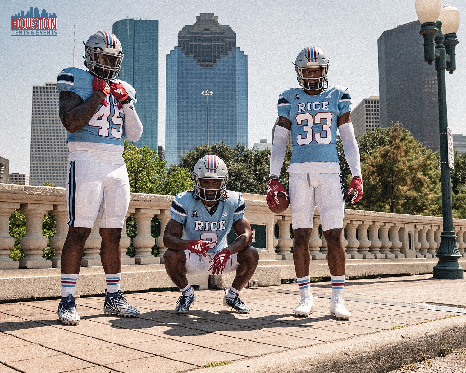
4 hours ago, TBGKon said:
Safe to assume Rice will get the cease and desist too? Theirs does include navy and silver, but we all know what they were doing.
Those don't even look like the Oilers from the neck down. That would be a big-time overreach by the NFL and the Titans.
-
6
-
-
1 hour ago, the admiral said:
Stern was a visionary but also a traditionalist in that he firmly believed every team should have a star player so that local fans are engaged with the team and want to see them play. That seems so quaint and provincial now.
Stern was once quoted as saying that his dream Finals matchup was Lakers vs. Lakers. He would have personally traded all those local teams' stars to the Lakers if he could have.
-
1
-
-
I'm surprised at how much I like some of these courts (others, like the Bucks', are hideous) but I don't get why they all have to be the same generic template.
-
2
-
-
It's like a cross between the Nets' and Thunder's crappy logos, but for soccer instead of basketball. The cliche wannabe-Euro name also isn't helping.
-
2
-
-
I don't mind the patches being on the front like in other sports, but I hate that it's only being done to make room for jersey ads that shouldn't exist in the first place.
-
4
-
/cdn.vox-cdn.com/uploads/chorus_image/image/46764520/bal-the-sun-remembers-picture-sept-21-2014-20140921.0.0.jpeg)


/cdn.vox-cdn.com/uploads/chorus_image/image/72835630/usa_today_21827102.0.jpg)


MLB Stadium Saga: Oakland/Tampa Bay/Southside
in Sports In General
Posted
The A's will be a huge flop in Vegas just like the Chargers have been in LA. It was never the city that was the problem. It was the douchebag cheapskate owner, and he's moving with the team.