

Lights Out
-
Posts
15,321 -
Joined
-
Last visited
-
Days Won
21
Posts posted by Lights Out
-
-
Just now, SFGiants58 said:
With who’s running the Pats’ ship right now? They’ll ruin whoever they get.Good point. They might have to pull the old "retire or you're fired" on Bill.
-
Of course the Patriots finally suck just in time for one of the most stacked QB classes in years. The schadenfreude isn't even enjoyable since it'll just end with them getting Caleb or Maye and ruining the NFL for another 10+ years.
-
On 10/13/2023 at 3:01 PM, Carolingian Steamroller said:
Oddly enough, the Football Team aesthetic solved a small problem with the original Gibbs look in that they removed the helmet stripes which that set inherited from the 70's which, though lovely, didn't match the bicolor striping.
#BringBacktheFootballTeam

Neither of those are particularly good. Those helmets always needed a two-tone stripe to match the rest of the uniform. UVA made it work back in the day. There's no reason why Washington couldn't have done the same.
-
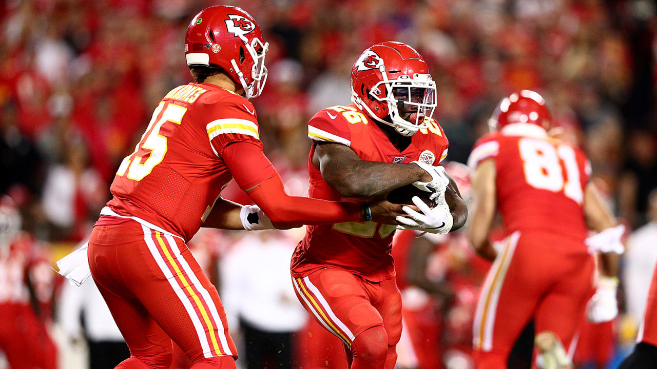
On 10/12/2023 at 7:41 PM, Cujo said:
Would be nice if the Chiefs used matching stripes.
Technically they do. The stripes on the red pants match the stripes on the white jerseys. They just weren't designed with the modern monochrome fad in mind. Case in point: the red pants were introduced in 1968, but the Chiefs never wore all red until 2013.-
 5
5
-
 2
2
-
 1
1
-
-
3 hours ago, Brave-Bird 08 said:
I never appreciated either of these uniforms as a kid. This is what last night's Bengals-Cardinals game should have looked like. Even if back in 2003, Cincinnati wore black pants on the road (they had them but wore them at home only), this would have looked great.
Cincinnati's current road set just looks wrong b/c there isn't enough orange in the jersey, then the road socks are just plain white, it looks completely off. Arizona? They looked like a high school team that ordered a "blackout" uniform halfway through the season as a treat for having a team GPA above 3.0, or something like that.
Those particular Cardinals uniforms still do nothing for me and aren't much better than their current ones. I don't think they've ever had a good home uniform, at least not in the modern era.
As for the Bengals, black pants would have been okay, but what they really could have used was orange pants to match the helmet. It's crazy that they've never once had that as an option.
-
1
-
-
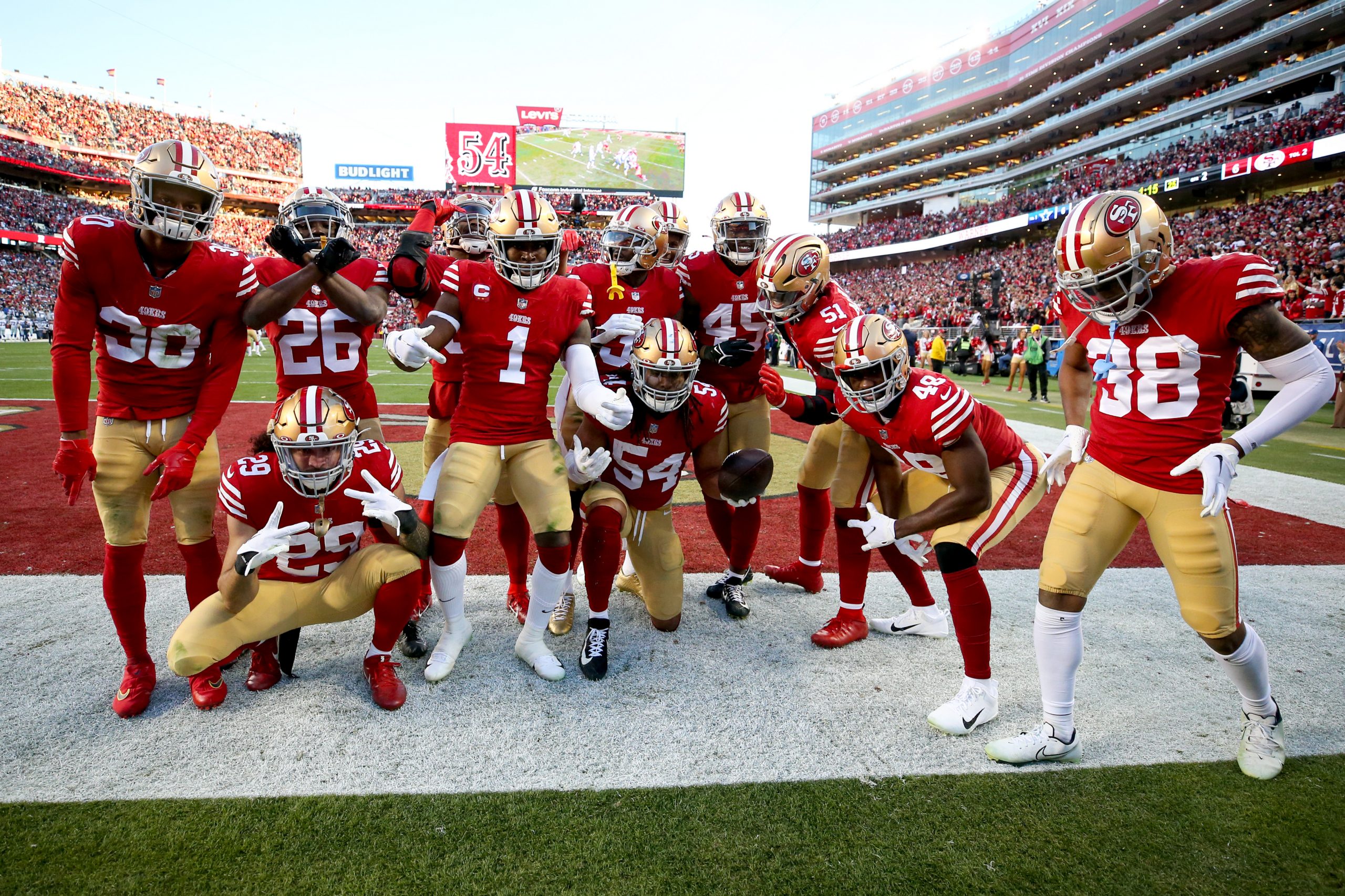
20 hours ago, ruttep said:
Just curious, where does the 49ers uniform rank for you, because it can be argued that the 49ers gold pants are not the same color as the helmet
This is disingenuous. The Niners' pants are as close as they can get when accounting for the inevitable differences in materials and lighting.
The Cowboys aren't even trying. They've even given up on any pretense of "silver-blue" and are just trotting out in powder blue pants.
A better comparison would have been the Saints, and while their uniforms still have plenty of issues, even they fixed their helmets at some point to match everything else better.
-
9
-
-
2 hours ago, MilSox said:
Alleged Bucks city edition leak.
Ugh, I hope that's fake. They barely even try when it comes to neon green, yet the keep trying to force blue on us.
The Sonics want their uniforms back.
-
1
-
-
52 minutes ago, currymvp2024 said:
Even this is infinitely better than that ugly heat culture crap:
This is cherry-picking. Most of the sleeved jerseys were clownsuits, and a lot of what people complain about with City Editions applied just as much to them.
-
9
-
-
Adidas sucked by the end of their time with the NBA, and anyone pining for the days of sleeved jerseys is forgetting how ugly they usually were. A lot of them still would have been eyesores even if they didn't have the sleeves. The players hated them, too.
Ads on jerseys are the league's fault, not the supplier's. The NBA logo was already removed from the front of the jerseys during the Adidas era specifically to set the stage for ads. Jersey ads still would have happened even if Nike never got the contract.
As always, the real problem is the lack of competition. Adidas has its own severe flaws and excesses. Under Armour can't afford to keep up in the arms race anymore. Fanatics is synonymous with cheap crap. Nike is far from perfect but there aren't any clearly better options out there, so Nike ends up being the easy "default" choice because of their popularity and cultural cachet.
-
16
-
1
-
-
The Rays have scored a whopping one run in their last 32 postseason innings. I don't think a throwback jersey is the problem.
-
6
-
-
On 8/31/2023 at 11:39 AM, DCarp1231 said:
I don’t mind shoulder wordmarks
There's nothing intrinsically wrong with them per se, but because we've all gotten so used to wordmarks being centered underneath the front collar, it just ends up looking like a production error to have them on the shoulder instead. The Seahawks are an exception because there's at least some actual design there and it's not just tacked on like the other two examples.
-
2
-
-
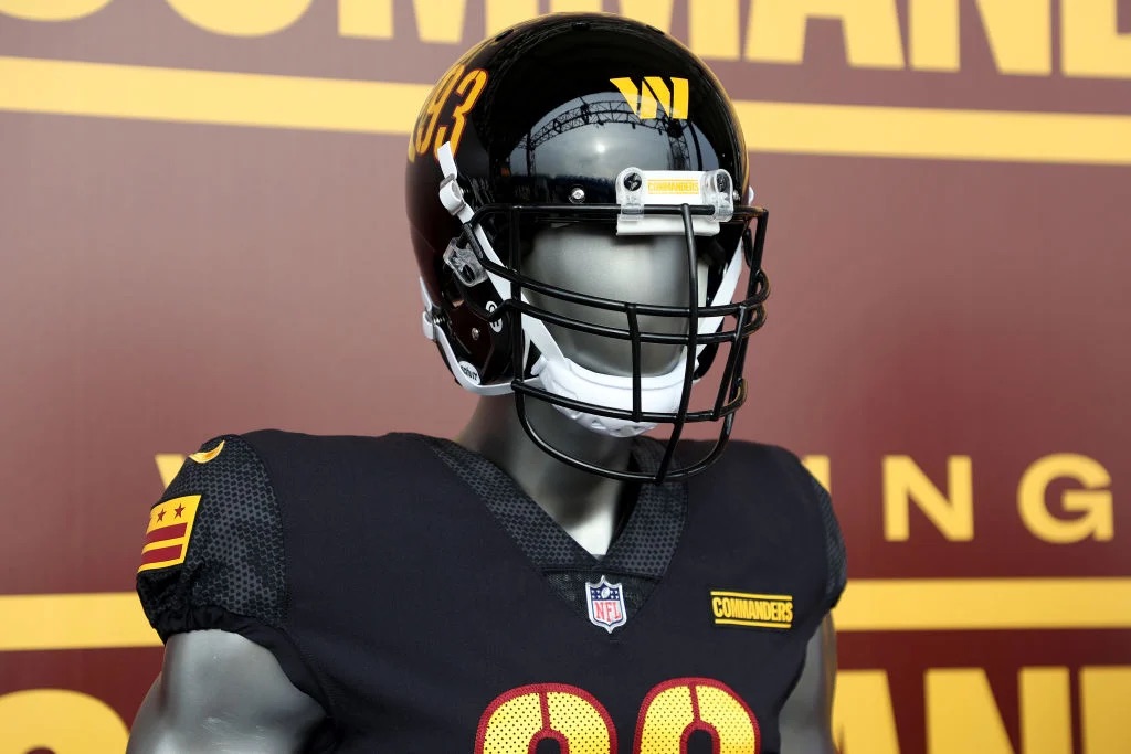
11 hours ago, oldschoolvikings said:
Everything About Louisville’s uniform package is atrocious.
I don't agree. It's a fine look that's only held back by Adidas' stretchy fabric.
-
1
-
-
18 hours ago, Ark said:
Texans uniforms are like a slightly different (and worse) version of the Patriots previous uniforms, and the Patriots own that look
That's a stretch. They're a recolor of USC's uniforms.
-
3
-
-
1 hour ago, Old School Fool said:
Just look at this garbage. An otherwise great helmet is ruined by this goofy uniform.
I swear, that uniform reminds me of this.
It's as if Snyder was specifically looking for what was hip in college football a decade ago. Out of touch doesn't even begin to describe it.
-
2
-
-
In hindsight, there's probably a decent argument to be made that keeping the logo/uniforms and just changing the name to something more respectful would have appeased everyone. On the other hand, they were still owned by Dan Snyder at the time and he was always going to handle this in the dumbest and most ridiculous way possible.
-
7
-
-
On 9/20/2023 at 1:34 AM, Old School Fool said:
The upcoming NBA season is going to have some interesting new broadcasts due to Bally Sports' tomfoolery. So far it seems like the Suns games will be on a local network known as Arizona's Family Sports, the Utah Jazz will return to KJZZ and the Wizards will air on a rebranded NBC Sports now known as Monumental Sports Network. I am very intrigued by the return of the unique local flavor of sports broadcasting, something that was sorely missed over the last 15 years.
I'm assuming the same stuff will occur with MLB next season as Bally Sports' issues came up in the middle of the season, giving MLB and the teams no time to get something going.
KJZZ is owned by Sinclair, so I'm guessing they'll just use Bally's graphics without the Bally logo (like KTLA does for Clippers games).
-
21 hours ago, MJWalker45 said:
This is better than what they're rolling out.
Nothing about it says "Indiana." They look like the generic rival team from a movie. The new ones aren't particularly good either, but at least they've got the traditional IU on the helmets and the right shade of crimson.
-
This whole situation is very bizarre. The Twitter rumors appear to be farfetched based on what's actually been reported so far, but I also find it hard to believe that his health is the reason why he quit either. The Bears surely would have announced that themselves and wished him well. Instead there was a circus of a press conference followed by a resignation letter that wasn't even on the team's letterhead. So either the Bears' PR department is even more inept than their play on the field, or there has to be more to this story.
-
20 hours ago, crashcarson15 said:
High school look for a high school program.
Eh. It's better than their last attempt at BFBS.
-
12 hours ago, DCarp1231 said:
Honestly I’m okay with Miami sacrificing a true throwback game in order to wear as much aqua as they can. This game is so visually appealing
Their modern uniforms are better than the throwbacks anyway.
-
4
-
 1
1
-
 10
10
-
1
-
-
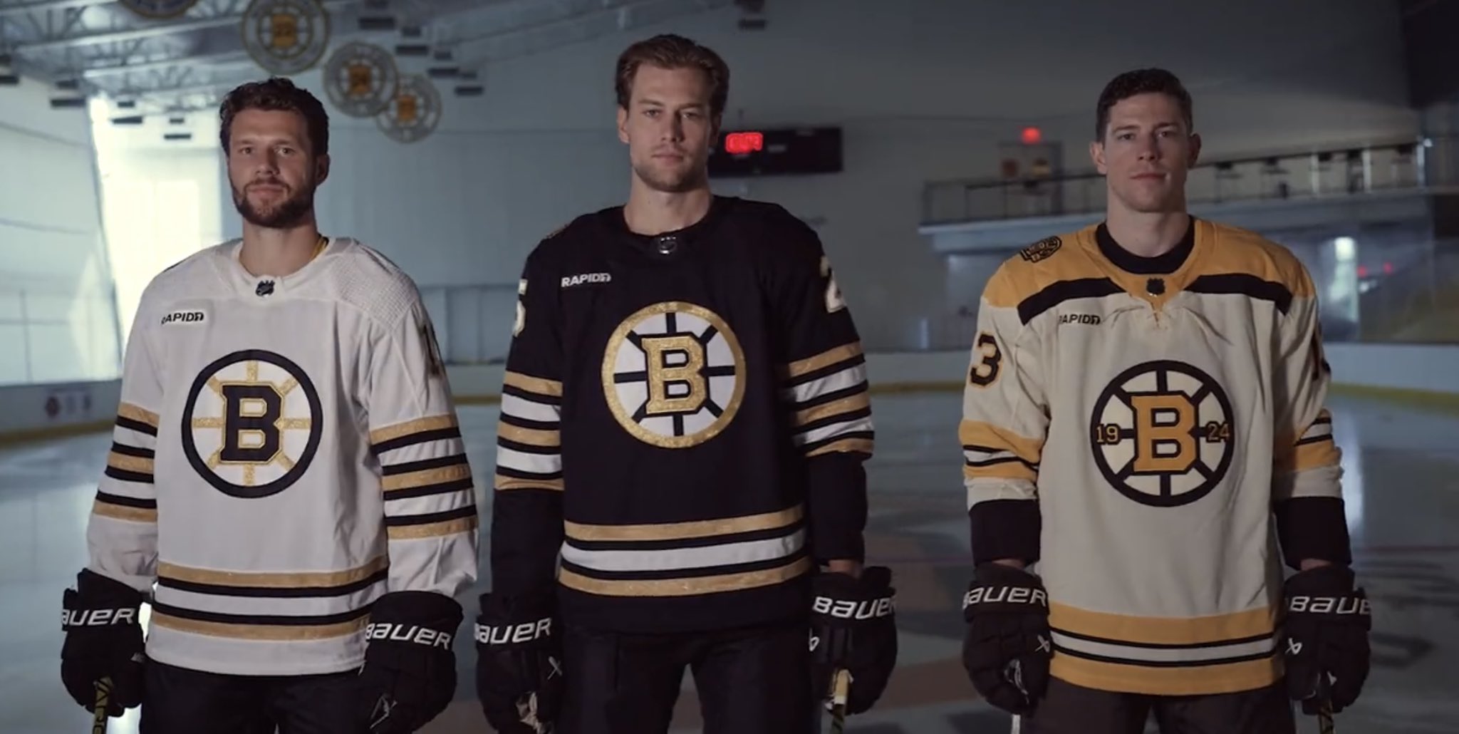
12 hours ago, JohnnyCowboy5 said:
The home and road are too Steelers-esque. They don't feel quite right for the Bruins. The third jersey is better.
-
The black and gold alternates are better than the normal home and road.
State flag > looking like Team Germany in a FIBA U19 tournament.
-
1
-
-
3 hours ago, simtek34 said:
Oh?
I'm amazed that they've found a way to make their uniforms even worse. Imagine how bad those silver pants are going to look with the navy jerseys now.
-
5
-
-
Ole Miss' uniforms haven't been particularly good since the '90s. Those navy accents on the jerseys made a huge difference.
-
5
-
3
-
/cdn.vox-cdn.com/uploads/chorus_image/image/65144369/1161850882.0.jpg)
/cdn.vox-cdn.com/uploads/chorus_image/image/70754219/1286054210.0.jpg)


/cdn.vox-cdn.com/uploads/chorus_image/image/71873983/1455628073.0.jpg)


2023 - 2024 NBA changes
in Sports Logo News
Posted
"Ass" is exaggerating it, I think, but they're very uninspired.