

Lights Out
-
Posts
15,339 -
Joined
-
Last visited
-
Days Won
21
Posts posted by Lights Out
-
-
Ouch, this is a OITGDNHL moment if I've ever seen one.
Kind of funny to look back on all the fear and paranoia of Nike "ruining the NHL" when Adidas dropped out. Nike would be a godsend compared to this.
What's next when Fanatics doesn't work out? Is Bettman going to stitch the jerseys himself in his garage?
-
 6
6
-
 3
3
-
-
6 hours ago, Chewbacca said:
I do not understand how anyone likes Arizona’s new alternate uniform. It looks awful and straight out of the Reebok era of wordmark jerseys.
The wordmark is the only decent part - that and the captain/alternate patches.
-
3
-
-
If I didn't know better, I'd wonder why BYU was wearing the letter K on their helmets.
I know the checkerboard era has been divisive for Kentucky fans, but it's been a net positive for their football program, which finally has a look to call their own.
-
2
-
 1
1
-
-
I also liked those SMU uniforms.
-
3
-
-
21 hours ago, WSU151 said:
I’d say the NC State one is an upgrade. The shoulder stripes are/were really gimmicky.
I liked the shoulder stripes. NC State's uniform history has been boring as hell, but with those, they finally had a design element to call their own and that could have been a modern classic had they just stuck with it.
Besides, the weird sublimated side panels are a lot more gimmicky in a bad way. They're already dated before they've even seen the field. The shoulder stripes were just a modern take on old-school Northwestern stripes.
-
1
-
-
This one was probably the best-looking overall, though I still have some quibbles with that Titans look, and the Rams of course had the mismatching helmet issue.

-
5
-
-
On 1/21/2023 at 12:44 AM, Germanshepherd said:
More adidas leaks
The Washington jersey is the only good one there. ASU and NC State are both huge downgrades, and Mississippi State must have asked Adidas to make them look like a high school team from 1983.
-
I guess I'm the only one who thinks that Caps sweater is really nice? The Canes', on the other hand, is boring.
-
13
-
 1
1
-
-
Well, Brady's narcissistic Farewell Tour: Part 2 has officially backfired. It's so obvious that Gisele was right and he should have stayed retired after last year.

-
1
-
4
-
 2
2
-
-
What a pathetic call. Such a bad look for the sport.
-
7 hours ago, Cujo said:
Poverty franchise will just replace him with another scrubass coordinator.
Staley's probably not even getting fired, and if he is, all Dean wants for a coach is a cheap sycophant who's just happy to have a job. The next guy won't be any better.
-
More proof that San Diego was never the problem with the Chargers. The real problem was, is, and always will be the family of cheap inept weasels in the owner's box.
-
4
-
-
10 minutes ago, eRay said:
I enjoy the overall visual vibe, but some of the details bother me. Namely, why build an entire font off your old script to be used for "MINNESOTA", the M logo, and jerseys numbers, then change that script?
The script appears to be a middle ground between the old-school cursive and the Metrodome wordmark.
-
It's nice to see the road pinstripes back, I guess. The rest of the look feels interchangeable with half the other teams in the league.
-
2
-
-
31 minutes ago, FiddySicks said:
Lol that roughing call against the Falcons would piss me off so much if I wasn’t so biased. Lol oh well!
That was the most pathetic call I've ever seen, and Brady has had plenty of bogus calls in his favor over the years to choose from. It was a normal sack like you see in any NFL game. I don't even care about the Falcons and I was pissed when I saw that.
-
1
-
-
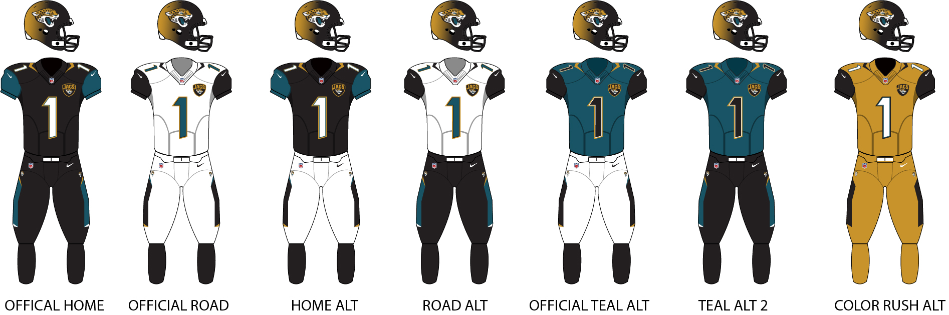
The Jaguars were so close to wearing their only good combo today, but alas, they went with black socks instead of teal.
-
5
-
-
This is really nice. Only suggestion I would make is flipping the colors of the white jersey's sleeve stripes.
-
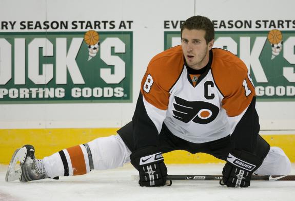
On 8/22/2022 at 1:13 PM, spartacat_12 said:
I actually didn't mind this Flyers' look. I think if they had gone with an orange version at home instead of sticking with black, they would've been received a lot better. They really need to go back to the single layer black letters for the captains instead of the white outlined in black on a white outline.
I also liked that look for the Flyers, and I agree that an orange version would have been nice as well. The sleeve stripes were almost wing-like. A while back, I made a concept to that effect.
I also think the Islanders nailed it with their Edge 1.0 look and every change they've made since then has been a downgrade. The orange sleeves popped, especially on the road whites. And as much as people complain about phantom yokes, I think they were used to great effect here. The front numbers were unnecessary, and the shoulder patches should have been on both sides, but beyond those minor details, this was a fine look. Unlike most of the early Edge experiments, this could have been worn in any era without raising an eyebrow.
-
3
-
-
On 8/4/2022 at 10:07 PM, DCarp1231 said:
From the shoulders down, this is the best the Jaguars have looked
I always did like the teal jersey (black numbers and all) and the white jersey. The other two, I could take or leave.
-
6
-
-
17 hours ago, WSU151 said:
This is one of those actions where I ask: Why didn't they do this when Bill was still alive?
Maybe he didn't want them to do this while he was still alive.
-
1 hour ago, LAL_BITW said:
new Lakers classic edition revealed
Even knowing the history, it still has to be said: UCLA wants their uniforms back.
-
3
-
-
14 hours ago, AFirestormToPurify said:
Remember how we all (or maybe it was just me?) thought Adidas was gonna completely ruin NHL uniforms like Reebok did and force 3 stripes on every jersey?
They didn't put 3 stripes on every jersey, sure, but they still made sure to put their stamp on every single jersey with those ridiculous-looking collars.
-
1 hour ago, tBBP said:
So exactly what "Statement" is this supposed be making again??
"We tried nothing and we're all out of ideas."
-
5
-
-
22 hours ago, fbjim said:
The "sand"-colored Padres uniforms were simultaneously great, and a nice subtle tribute to their old yellow uniforms, even if that wasn't the intent.
Not sure how unpopular this opinion really is. IMO, those uniforms were the only redeemable aspect of the Padres' navy era.
-
2
-


Unused Logos and Uniforms
in Sports Logo General Discussion
Posted
Clemson was apparently considering a full Bengals-inspired look in 1997:
https://www.ebay.com/itm/285200373866
They ended up toning it down to just having the tiger stripes on the collar for a couple years.