

Lights Out
-
Posts
15,339 -
Joined
-
Last visited
-
Days Won
21
Posts posted by Lights Out
-
-
The helmet sucks, but everything else is pretty nice. The "country roads" theme is clever.
-
They literally just recolored the previous uniforms and called it a day. The striping is the same. Lazy, lazy, lazy.
I love how the entire marketing campaign is "Purple is Back!" and the actual new uniforms are being hidden as much as possible.
-
 9
9
-
-
This Cavs rebrand is horrible. Just switch to brown and orange and promote the 2K League logo to the big-league club, it's not hard.
-
On 5/28/2022 at 1:30 AM, Old School Fool said:
I will never understand why they moved away from this logo. It was perfect in every single way. I'm a Lakers fan but this was probably my favorite logo in the league at the time and is still in my Top 10 all time NBA logos. I can just hear "They Reminisce Over You" playing as I stare at this logo and if you know what I'm talking about then you're really cool.

Their 2K League team's logo is better since it actually depicts a cavalier (and because "team name over basketball" logos are so played out in the NBA) but it is still better than the current logo.
For me, it's "The Second Coming" by Jewelz Santana. So glorious... victorious!
-
2
-
-
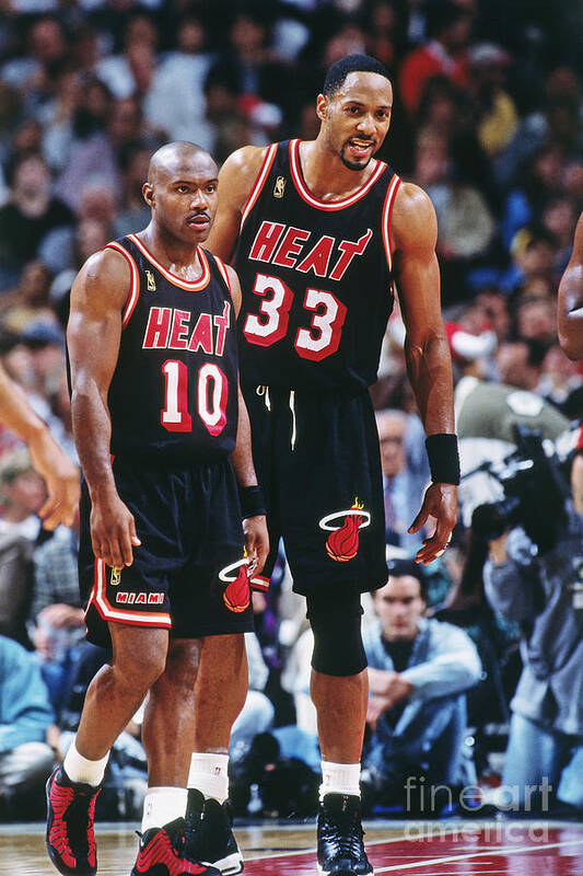
On 5/18/2022 at 12:05 PM, colinturner95 said:
Since we're talking about the Heat:
These are better than the championship uniforms.
Can't say I agree. Those are just recolored Showtime Lakers uniforms with half the stripes chopped off and an odd-looking wordmark that doesn't match anything else in their identity.
-
1
-
-
2 hours ago, VDizzle12 said:
The Spurs logos are bad, but not really all that surprising when looking around the league. The NBA has some of the worst, most amateur-looking logos out of any major US professional sports league.
The most disappointing part is how the 2K League of all things has better logos than some of the actual teams.
-
14
-
 4
4
-
-
As far as the draft hats are concerned, literally anything is better than the bootleg gas station hats that Adidas was putting out in the late 2000s.
I'm pretty sure the target audience for these things was the same demographic that only watches college basketball because "they play defense, unlike the NBA."

-
2
-
 3
3
-
-
2 hours ago, DoctorWhom said:
What the hell broke this team?
Just like the Finals last year, they actually had to face a fully healthy opponent for once. Can't always duck the top players.
-
I don't think that opinion is particularly unpopular. It's my favorite Broncos look too (also minus the helmet).
-
2
-
-
Totally agree that Akron's new look is dull, dull, dull. They've had one of the worst brands in college sports ever since they made the Z logo their primary in 2015, and this isn't helping.
-
17 hours ago, CaliforniaGlowin said:
I hope they get a team made that's more representative of LA. Both Lakers and clippers came from other cities and don't apply here.
Both names are already representative of LA despite the fact that they originated elsewhere. Lakers and clippers are types of ships and LA is home to America's busiest seaport. I don't blame people for not making the connection, though, because both teams use generic create-a-team logos that have nothing to do with their names.As far as a name change is concerned: as a Clippers fan, I'm strongly against it, and I think most of the fanbase agrees. Winning our first championship as the Clippers would be a trillion times more special than doing it as the Stars or some other expansion team-tier name because of the rough history that we'd presumably be changing the name to get away from. Does anyone think the 2016 Cubs' championship would have been anywhere near as big of a deal if they had won it as, like, the Chicago Wind or something? I didn't think so.
Change the colors, change the logos, but keep the name intact would be my choice.
-
5
-
-
On 5/4/2022 at 9:57 PM, mcj882000 said:
That they wanted to finally scrub the last vestiges of the Ballard era from their identity is still ironic to me because the new jerseys are, basically, just the Ballard-era sweaters minus the arm stripes and shoulder patches,
aka their most interesting elements:
And with a worse logo, too. Sorry, not sorry.

-
4
-
 3
3
-
-
Would have made a nice logo for the Thunder.
-
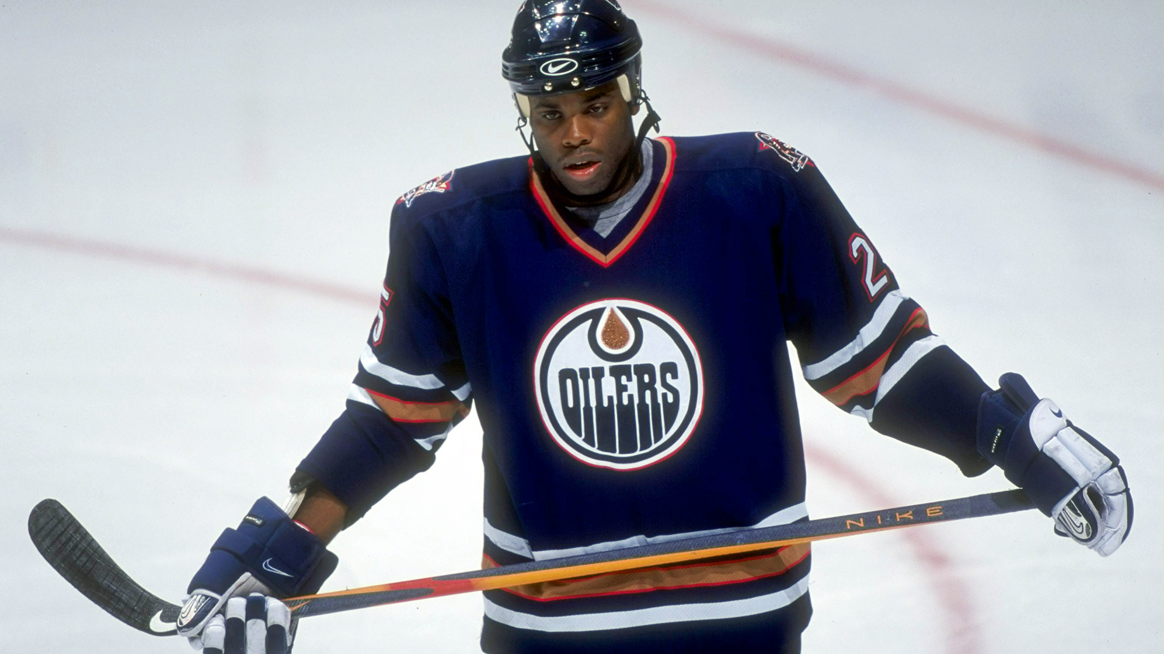
1 hour ago, Stu-BallsOmnicorp said:
Not a fan of those Edge uniforms but I did like the navy and copper set that preceded them. I definitely prefer the below to their current navy and orange uniforms.
I still think this was their best identity by a long shot... but in hindsight, I think a more industrial-looking teal/grey color would have worked better in place of red, like in this concept I made a few years ago:
-
 1
1
-
-
3 hours ago, spartacat_12 said:
The Mets' brand did just fine for 36 years before they decided to jump on the BFBS bandwagon. Having a black alternate without any black anywhere in your other uniforms isn't a solution, it just makes the black uniform look even more tacky/gimmicky.
I agree that their brand was fine without it, but it doesn't mean there can't be a place for it. For better or worse, it's part of the Mets' history now (especially since they went to a World Series in the BFBS era) and totally valid to throw back to. It's probably best to think of it like a third jersey in hockey or a clash jersey in soccer rather than a traditional baseball alternate.-
3
-
-
12 hours ago, Marlins93 said:
I never liked the Mets BFBS look and I am annoyed that they brought it back. Having said that, their black jerseys look much better with the blue piping.
I think BFBS adds a lot to the Mets' identity purely as an alternate look. It really captures that "NYC at night" feeling. Where the Mets went wrong the first time around was cramming black trim into their regular home and road jerseys, where it added nothing and only detracted from the bold color scheme and classic design. It looked particularly bad on the white and pinstripe jerseys because the drop shadows actually hurt the legibility of the script and the NOBs. They aren't repeating that mistake this time around, so it's not a problem, IMO.
-
8
-
-
Since the Mets have settled back into BFBS, I still really want to see this jersey make a comeback next:
I know it was just a templated batting practice jersey at the time, but it's good enough to be a full-time look and actually better than the black jerseys, IMO. Almost like a mix of eras since the striping isn't far removed from the racing stripes they wore in the '80s. I always loved how the black script and numbers popped off the blue base. One of those things that had no business working as well as it did.
-
 1
1
-
1
-
-
20 hours ago, heavybass said:
OOOOOOO that screams mid 90's WLAF
It screams college football circa 2011/2012. Large front logos were a trend that Adidas was trying to force back then.
This isn't even the first time the CFL's tried to hop on this short-lived fad, but now they look well and truly behind the times.
-
Those are way too plain aside from the home jersey - which is still a little too simplistic, but at least has some contrasting collar/armhole trim and that nice J-note/number lockup.
Even if the shorts are amazingly designed, I don't see how it could save those glorified practice jerseys.
-
3
-
-
Are we sure the Royals jerseys are actually navy and it's not just weird lighting in a blurry photo?
-
11 hours ago, truepg said:
Many things would be better than their current lifeless primaries. The green fir trees (trim) had become such an iconic and unique thing of theirs that they ought to include them as an integral part of their uniforms and identity and stick to it. The mashup uniforms are very decent indeed, but there are lots of ways to improve on the primary set using the fir trees and green more prominently.
What's interesting, is that the green tree trim also worked best with a black jersey base, while I'm usually an opponent of the current craze of making black uniforms for the sake of it, (or for better profit, whatever).
While not feeling it very much at the time either, I'll use this also as yet another opportunity to voice that the latest brand renewal was a lateral move at best from the previous graphic package, and really not very necessary, in terms of logos, at least.
Honestly, the Wolves had it right uniform-wise from 2008-2010 and every change they've made since then has been a downgrade (aside from maybe the updated 2010-2017 number font). Dropping green from their brand almost entirely was such a big mistake.
-
1
-
-
UCF showing once again why they're the "pick me" of college football programs.
-
3
-
-
On 4/13/2022 at 2:25 PM, pepis21 said:
I wouldn't be suprised if they redesigned trophy base since they already made a few new trophies in this season including divisional:
Wouldn't it make a lot more sense to name these trophies after players who actually played for any of the teams in their respective divisions? I don't understand how a former Celtics, Hawks and Pistons player is supposed to relate to the Pacific Division.
-
2
-
-
The Rays wouldn't have an "identity crisis" if they didn't jettison their perfectly fine 2001-07 identity for no reason.
-
1
-


:format(jpeg)/cdn.vox-cdn.com/uploads/chorus_image/image/311731/20120929_lbm_st5_620.jpg)
NFL 2022 Changes
in Sports Logo News
Posted
The throwbacks still suck no matter how many times the Patriots drag them out of mothballs.