

Lights Out
-
Posts
15,364 -
Joined
-
Last visited
-
Days Won
22
Posts posted by Lights Out
-
-
The way the ball is cut off so we can barely see any of it is going to bother me forever. It's a shame, because otherwise, this is a great update of the classics. Much better than the last time they tried to do that.
-
 1
1
-
-
The whole Syracuse-Illinois thing wouldn't be an issue at all if the team calling themselves the Orange didn't insist on prioritizing navy instead.
-
13
-
 2
2
-
-
11 hours ago, hormone said:
My .02 on everything throwback past two weeks. Bucs-cool for a game and nostalgia, but inferior to red/pewter (which I’m sure they’ve been red longer than orange). Seahawks-nice pop with those colors, but jersey is kinda plain and has logos on sleeve which some people find redundant. I’m ok with it. Cool for a game. Titans-I don’t get the super love for the uniform or name. I think they did it to cash in on Houston exploring that color scheme. They literally had that name and uniform and chose to wear white all the time and drop the name. I think they benefit from the titans being a bottom 30 uniform look. Jets - this feels out of place. Would have been better throwback if they still had the old uniforms. Their current set feels to me that it’s a modern version of these anyway. Now you have a throwback that’s better than the set it seems modeled after. Also, with it being white and how often they neglect green over white, they are playing as if they are a white team first. Vikings-like the jets, it feels too close to their home uniform, but people like the old school, so I take it or leave it. For me, I’d rather see a purple, possibly white mask on either set. All in all, they are all fairly solid looks for a game or two. Way better than wearing mono black or mono white (socks included) that everybody seems to wear now.
For me...
Bucs: Decent uniform, never liked the logo, and I agree on liking the pewter.
Seahawks: Love them, but it just dawned on me that the pants stripes don't go with anything else in the uniform and now I can't unsee it.
Titans (Oilers): One of my favorite uniforms ever in any sport. But it doesn't sit right with me for the Titans to be the ones wearing it.
Jets: I appreciate the attention to detail, using the proper font and even making sure the TV numbers are just as huge as they were back then. I prefer the updated version with black trim, but I can understand why they'd choose the uniforms worn by the New York Sack Exchange rather than the ones worn by Rich Kotite's 1-15 team.
Vikings: I didn't like this uniform very much when it was current, and time hasn't made it better.
-
1
-
-
13 hours ago, ltjets21 said:
The Giants and Rams are the only teams that come to mind
I'd add the Niners too, since the throwbacks they wore for their last Super Bowl win had some significant differences from their usual look.
-
4
-
-
18 hours ago, Carolingian Steamroller said:
Would also add that this has aged far better than I ever expected:

I've always liked the overall design, but I wish they had kept slate blue in the color scheme.
-
6
-
 1
1
-
-
1 hour ago, IceCap said:
The Titans- and the NFL- have no incentive to do either.
I'd argue that the NFL does have some incentive here. Being able to sell proper Houston Oilers merchandise would be a license to print money. I think the bottleneck here is just the Titans themselves.
-
3
-
 1
1
-
-
5 minutes ago, IceCap said:
and getting pantsed by the Brady Pats in the snow
Ironically, they wore Oilers throwbacks for that game.
I don't see the point in reopening old wounds. The franchise's only success and fan support in Tennessee has come as the Titans. The relocation was extremely controversial and not the type of thing any team in their right mind would want to remind everyone of every time they watch them play. The Oilers brand should either be sold back to Houston or left dormant.
-
2
-
-
13 hours ago, the admiral said:
They look like the Lions from a distance, but cheaper and sadder.
That's a stretch. There's a pretty big difference between Honolulu Blue and royal blue.
-
4
-
-
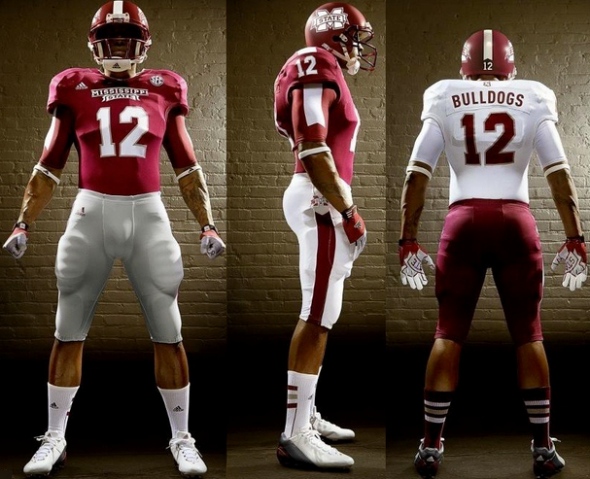
21 hours ago, whitedawg22 said:
The early-2010s Adidas uniforms inevitably look like crap due to the super-stretchy material they used. It looks like this player has saggy breasts and a backpack. It's tough to focus on the design elements of the jersey when the player silhouette is this bad.
I've been hating the super-stretchy material since the day Adidas first introduced it. It hasn't gotten any better in the past decade. I just liked the ribbon stripes as an element that was uniquely theirs. Much like NC State, Mississippi State's uniforms have been pretty dull and uninspiring outside of that one shortlived era no matter who the manufacturer is.
-
"Pigskins" is the type of name that a single-A baseball team would use for a promotional night. It's unbecoming of an NFL franchise. And don't even get me started on the people who want the Washington Football Team non-name back.
Commanders is a decent name. Probably not the greatest name they could have come up with, but also not the problem. It's the logos and uniforms that need a do-over more than the name.
-
7
-
 1
1
-
-
I don't like the helmet very much (a blue helmet would have been better), but the rest of the uniform is nice.
-
12
-
-
I'm guessing they were probably trying to avoid having silver/grey team icons as much as possible because the graphics themselves were already silver/grey, hence the inverted Raiders and Lions icons. Not sure why the Cowboys weren't given the same treatment.
-
On 7/18/2023 at 9:14 AM, cajunaggie08 said:
Here is the rest of the home uniform. Grey has been removed from the shoulder stripes so what was previously a W-G-W pattern is now W-M-W. The team wordmark has also been removed from above the numbers. The white and grey neck collar has been replaced with maroon. The M-State logo is added to the bottom of the collar which is didnt think was possible with this new Adidas template.
2022 Mississippi State primary uniform
Another Adidas downgrade. Although really, they should have never ditched these.
-
1
-
-
On 7/13/2023 at 6:47 PM, JustABallCoach said:
This shirt celebrating 713 Day in Houston might be the first official Texans product I’ve seen use the Columbia blue Texans logo
I know I’m making something out of nothing, and I shouldn’t make too much off of a fashion shirt… BUT, when ownership said they were negotiating the colors with the league I wonder if the Titans want them to drop the Navy blue so it’s not an exact match and we will see black outlines instead
EDIT - That cup looks like it’s using deep steel blue, so I’m probably just grasping at straws, but we have seen an increased use of black
This merchandise feels like it's straight out of 2005, like when Swishahouse was relevant.
-
 1
1
-
-
22 hours ago, CaliforniaGlowin said:
I just realized the clippers moved to Los Angeles and changed their colors the same year Los Angeles had the Summer Olympics. Coincidence?

The color change (and Lakers-ripoff logo) already happened in San Diego a couple years before the team moved. It had nothing to do with the Olympics, just Sterling having awful taste on top of all his other terrible qualities.
-
2
-
-
On 7/13/2023 at 10:46 AM, pelicanfan said:
i really wanted them to go back for the red and yellow look but they missed that opportunity and surely enough the hawks got their hands on it.
The Hawks and Rockets already coexisted with red and gold for a few decades, so it's not like that couldn't possibly happen again.
-
2
-
-
On 7/11/2023 at 10:56 AM, Brave-Bird 08 said:
We should consider NC State's copy-paste of the Falcons as their core aesthetic.
As sad as it is, those are their only other memorable uniforms and they're a blatant ripoff of an NFL team - and one of the Panthers' division rivals, at that.
-
1
-
-
23 hours ago, Htown1141 said:
Their templates have been really strong since 2019
Their only good templates are the cheap ones they give to lower-level schools and schools that are leaving them for another manufacturer. The super-stretchy material they've been pushing on all their other clients for the last 14(?) years has never looked good and will never look good no matter how many minor tweaks they make around the margins.As far as primary looks go, they just downgraded NC State and Kansas this offseason. Last year, they turned Georgia Tech's uniforms into an eyesore with mismatched shades of gold. A couple years ago, they made pointless changes to Texas A&M by removing the racing stripes and making the number font uglier for no reason. Even when Adidas comes up with a solid look, it only lasts a couple years and gets replaced with something worse.
They might not be as bad as they were in the 2010s, but they're still pretty bad. College football is in desperate need of more brands to compete with them, Nike and UA.
-
1
-
1
-
-
20 hours ago, JustABallCoach said:
You might not like the looks, but this is just not true. NC State is one of the premier Adidas schools and has had access others do not.
NC State's uniforms have historically been so boring regardless of manufacturer. At some point, it has to be the athletic department's fault for wanting to look bland.
That's why I always defended the outgoing uniforms with the different take on Northwestern stripes (even the slashes never bothered me). It's the only time ever, or at least in recent memory, that a neutral fan could turn on a game and know right away that NC State was playing. The new look returns to the historical norm of making them blend into the background. Not exactly an ideal branding move for a perennial .500ish program with no major accomplishments.
-
1
-
-
3 hours ago, NOLAPelicans23 said:
The In-Season Tournament really just wanted to understand how EJ's Neat-O Stat of the Night has felt
In-Season Tournament rings, Erneh!
-
19 hours ago, aawagner011 said:
Nothing new, but still interesting: Dawg Nation (part of the Atlanta Journal Constitution) did a deep dive on Georgia uniforms over the years, including various tweaks, alternates, and prototypes that were never worn. They also speculate a bit about the often worn white helmet seen on recruiting visits.
https://www.dawgnation.com/junkyard-blawg/alternate-dawgs-uniforms/FG2LNM7Y2VENLODOJS2SW6KIGU/
Interesting article. I had no recollection of UGA ever wearing red-over-black, but I can see why they never tried it again. It just looks off.
-
2
-
-
Those Kansas uniforms are high-schoolish at best. A clear downgrade from what they had before, which was already nothing special.
-
2
-
3
-
-
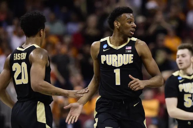
Purdue made it work.
-
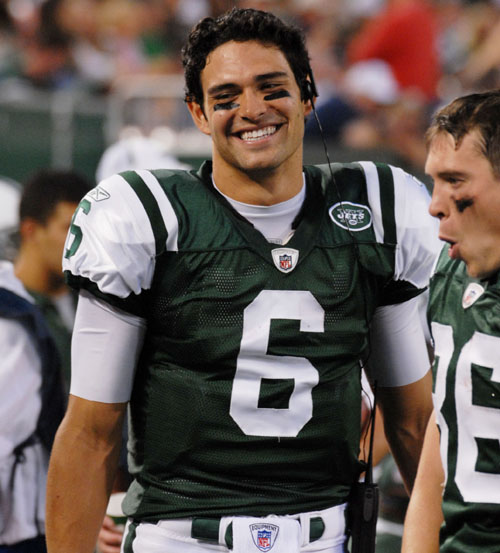
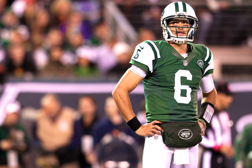
On 7/2/2023 at 12:18 AM, monkeypower said:
Reebok did better with the Jets previous set than Nike did. Nike messed it up with the mismatching greens and the more pronounced shoulder cut out, which is because the Nike jersey was the Colts jersey with a coloured sleeve, so it added an extra white line that didn't need to be there.
The one improvement Nike made, I guess, would be the moving down of the logo onto the chest.
This feels like cherrypicking. Reebok did a better job with the QB cuts, I guess, but for many players, their jerseys didn't look any better than Nike's. Maybe the shade of green looked a little nicer, but they had the exact same problems with the stripes:
-
1
-
1
-


/cdn.vox-cdn.com/uploads/chorus_asset/file/23427805/1285158257.jpg)


/cdn.vox-cdn.com/uploads/chorus_image/image/67126134/77109318.jpg.0.jpg)


NFL 2023 Changes
in Sports Logo News
Posted
This is some pathetic history revisionism from the Chargers: