


UnclearInitial
-
Posts
2,740 -
Joined
-
Last visited
Posts posted by UnclearInitial
-
-
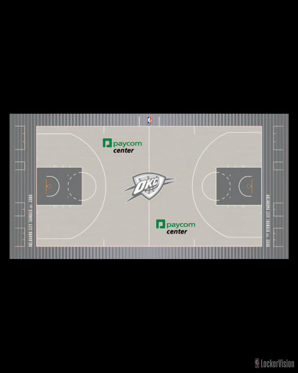
19 minutes ago, MkDon said:
A lot of new courts as well

Will they host the Nets in their black or grey on this? Would be a great time to just have a black and white broadcast.
Paycom and Love’s are probably really happy they get to be the only splashes of color in their entire City uniforms identity
-
I still feel disappointed that this is what was done for the NBA’s 75th anniversary instead of a true throwback program, maybe highlighting the jerseys from the each teams origins instead of just the popular ones from the 80s/90s. Especially considering that they’re clearly running out of ideas for the city editions this could easily have been next years (and the Jazz and Suns didn’t even do it so it feels even less celebratory)
I’m not a fan of all the mixed typefaces, even without going overboard like the Heat did.
Hawks- Just a reminder of all the things they didn’t do right in last years rebrand
Nets- If they ever go back to r/w/b this would be a good starting point, like the herringbone/ABA/00’s Nets side panels
Hornets- What a mess
Bulls- Looks like those cheap imitations of Bulls jerseys
Nuggets- Love the shorts, but maybe the worst typography clash
Warriors- Looks good but I wouldn’t have used black when you have so much other history than the alternates from the last half decade
Rockets- Out of all the eras of Rockets jerseys, deciding to highlight the short lived late 90s is what I find wrong in using these as the 75th anniversary jerseys. LOL at the explanation for the Rockets logos on the shorts, although the shorts look good
Heat- a mess. The Golden security rope stripes could have been a good basis for their own City Jersey
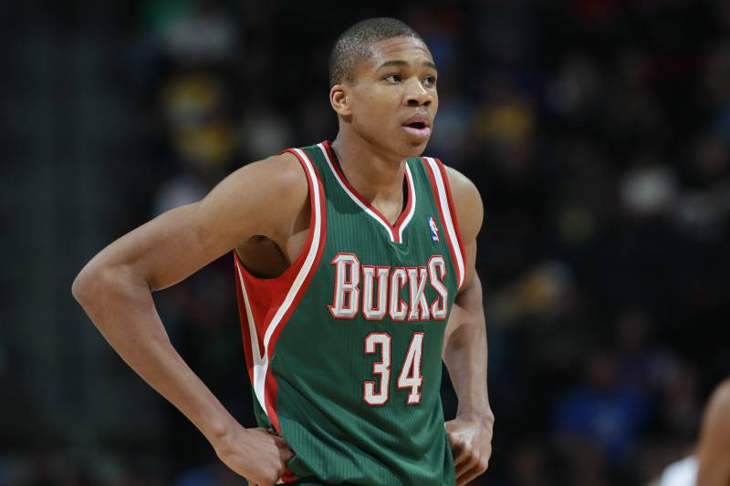
Bucks- mind boggling not to use red on these. Even the barely used blue is there and not the second most used color in franchise history?
Pelicans- Boring and with nothing to tie to their Hornets era (I guess the 3 stripes down the sides?) . Should have used pinstripes from the Chris Paul look
Knicks- another good look but for a storied franchise that has so much more to offer than the BFBS of the late 90s and 10s
Thunder- The perfect encapsulation of their identity- bland and boring
Magic- I actually really like the design (I’ve always thought the T-Mac jerseys got it backwards with the pinstripes on the sides and the stars on the front). But why i the world would you use the colors of two non consequential city jerseys instead of your franchise colors
Blazers- Like the script and plaid, should have used the sash
Kings- good look, I hope they keep the Sactown kings logo
Spurs- Fiesta is trendy, I get that. But the Spurs are 50 years of black and silver and Eurostile and it’s disappointing they used the current wordmark
Wizards- I would have liked some gold/bronze details
The Raptors, Clippers, Lakers, Wolves, Pacers, Cavs, Pistons, Mavs, Kings, Hawks and Celtics all seem to have interpreted the spirit of this promotion better than most, to varying degrees of success. Sixers are a bit puzzling, they could have done much more with their past jerseys, that feels completely like a City Jersey in no way associated to the NBA’s 75th anniversary-
 1
1
-
-
14 hours ago, BBTV said:
Did they change the max size of these patches? Almost every team's looks bigger than previous seasons.
It does. And another team changed the ad patch from a fairly small logo to a much bigger wordmark with a small logo- the Knicks
-
Anderson Varejao returning to the Cavs as a 38 year old after 5 years out the league was practically made for this thread
-
10
-
-
Shame, gold numbers would have fit in really well with that Germany kit.
I don’t know how soulless you have or be to prefer that bland corporate federation logo to the Mirò inspired one. The crest is also a major downgrade, the fully colored one is way better than the monochrome one they’ve been using lately and the generic shield exacerbates the crest within a crest.
-
3
-
-
On 2/3/2021 at 2:28 AM, dont care said:
Would you rather players have nothing to signify their accomplishments they can display at home? The team only gets one trophy
There are other ways to reward individuals for team accomplishments. FWIW, French league and league cup both give out mini-trophies
but my preference is medals, as is done in the Olympics and most other competitions outside North America. You receive them right after the game and not months later, maybe after having changed teams. They’re given out by the competition instead of the team, and the officials greeting the losers first is great. Plus the team is actually handed the trophy instead of it being handed out to the owners
-
1
-
-
4 hours ago, Digby said:
Assuming this is for the Olympics? Maybe there will be a USMNT one as well for Gold Cup, or something different.
Pretty sure you can’t wear a federation logo on an Olympic jersey
-
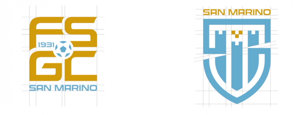
San Marino updated its logos with new logos for the federation and national team crest
It’s a bit hard to see but there’s hidden S and M in the crest, which combined with the three towers makes it a pretty nice crest. The previous one was just the national emblem inside a roundel, which I appreciated as a kind of non-professionalism kitschy look, but this can stand on its own alongside the rest. Makes sense that they wanted to capitalize on their recent massive success of two consecutive draws after six years with only losses.
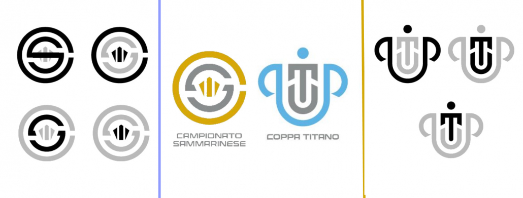
There’s also new logos for their league and cup.
-
2
-
-
I don’t know if role players really have ‘right’ uniforms, but I found Patty Mills in a Blazers uniform pretty jarring
-
1
-
-
Magenta and yellow clash pretty terribly, no? There’s definitely the potential for good kits with magenta and navy (other than the cited Cerezo Osaka, the Hamburg away Kit a few years back was similar). But I can’t think of magenta and yellow looking pleasant next to each other in any context. This might have been the one time a straight red/blue
color scheme would have been preferable.
The crest is a mess, the arch isn’t easily recognizable, the rivers don’t really read as such and the floating SC with the sideways script is just terrible. The name is aggressively boring but that has become par for the course for MLS. A problem exacerbated by the City/county divide. They need to stop trying to please everyone by going the least daring option, personally if they weren’t going to use an Olympic name I thought Gateway FC with no city name would have been great. My hope is that when inevitably change their crest they‘ll also adopt a new name.
-
3
-
-
The only name I’ve liked so far is Olympique but that’s almost impossible due to the IOC. As for the colors, the best way they can use the city colors would be like the original red trim Blues. Blue and yellow with a touch of red is a bit similar to that Rapids Colorado flag away kit but they’ve pushed the city flag so hard I can’t see them abandoning it.
-
2
-
-
18 hours ago, NicDB said:
Didn't scroll through the entire thing, but for exactly one year, a much leaner Giannis wore the Christmas unis.
He wore that color scheme for two years, also wearing the one year flat script uniform
-
2
-
-
Here’s Micheal Jordan playing an exhibition game for Stefanel Trieste of the Italian League while promoting the first Jordan’s
in this game, he ended up doing this...
...which has led to the release of a few “Shattered Backboard” colorways of the shoe he was promoting on that tour-
5
-
-
This one is kind of a mix of this thread and “Rare team matchup”, as the uniform Scottie Pippen is wearing is perfectly fine- it’s just jarring to see him in a Bulls uniform playing against the light blue Nuggets (and Carmelo Anthony)
-
4
-
-
I had chosen my previous name to comment on logos on the mothership when I was 12, trying to make it as generic and undistinguishable as possible. I’ve basically been regretting the anythinglogos moniker ever since I started regularly visiting the boards, so this is a very welcome change. My priorities haven’t changed much though

-
On the mobile site, I can’t seem to type at all if I’m replying to a post with a picture in it. Anyone else experiencing this issue?
-
-
Have we ever seen a skyline on a championship ring? Looks pretty bad tbh, should have just had the basketball/claw logo on it (or the basketball claw on top of the Larry O’Brian variant I’ve seen in a few places)
-
Pretty good, Love the font. Seems like Olympic logos are on a generally upward trajectory from the absolute nadir that was hit with the 2012 London logo
-
3
-
-
The shot clock above the free throw line TNT is using seems very unnecessary when there already is a shot clock on the scorebug and another behind the basket. Just creates visual clutter
EDIT: added picture
-
4
-
-
And in ‘news that will surprise absolutely no one’...
-
2
-
-
5 hours ago, SFGiants58 said:
I get where you’re coming from, but I vehemently disagree. The Titans’ first set looked great in the powder/white and white/powder combos, while the Texans look good in every setting (yeah, red socks on the road would be better). The flaming thumbtack and the flag bull will always look better to me.
The Oilers will never not be an awful identity, AFAIA. Yes, they passed the doodle test with clip art logo. That doesn’t mean it was good. Those floating stripes will always be hideous. The light blue was nice and all, but it needed a dark accent color. The Texans shouldn’t be forced to become the Oilers and I’m glad the Titans switched to navy helmets (the one part of the redesign I liked) to prevent them from trotting our their old designs.
Let the Oilers die.
It took almost twenty years for the Titans to start wearing powder/white, and they ditched it within a couple of years to go back to primarily navy and then switched to the current atrocities. I have trouble calling that combo “the first set” when it wasn’t worn at all until the mid 2010s. Just the switching back and forth between navy and powder shows to me that their brand isn’t all that strong and the Titans are the first to not quite know what they want to be, assuming the answer isn’t wearing swords on shoulders.
-
2 hours ago, Brave-Bird 08 said:
The Hawks don't need a complete uniform overhaul, they simply need tweaks. This uniform right here is excellent, and the red and volt create enough contrast while also staying vibrant. All they'd have to do is remove black and invert the colors for a clash jersey.
I’m a fan of the current Hawks look, but disagree on removing the graphite. It provides a nice contrast to the almost eye searingly bright red and volt. The first tweak they need to do is to get rid of the vertically stretched font in favor of the more pleasing version they use in summer league
-
7
-
-
The Lakers never looked better than in their Kobe era uniforms, especially the gold uniforms. White numbers>purple numbers (and white numbers are definitely better than anything the Lakers tried on their current purples). The Nike wishbone collar could be improved upon, and that’s essentially the only nitpick I have with that set
-
5
-


2021-22 NBA Changes
in Sports Logo News
Posted
The Heat numbers (fans can customize their own version)