


UnclearInitial
-
Posts
2,740 -
Joined
-
Last visited
Posts posted by UnclearInitial
-
-
While Pau Gasol’s right uniforms are the Grizzlies and Lakers, he was still a respectable and serviceable NBA player for the Bulls and Spurs. He played 3 games with the Bucks this season but got hurt before the playoffs started. Doubt we’ll see much more of him in the NBA. Tough to see anyone recalling his Bucks stint in a few years time

-
 5
5
-
-
They’ll probably have to change the banner when Bosh will be inducted in the Hall of Fame
Those Olympics banners are dumb too. No reason for the “HEAT” to conduct themselves like a gimmick organization when they’re the most storied of the post-ABA merger teams
-
1
-
-
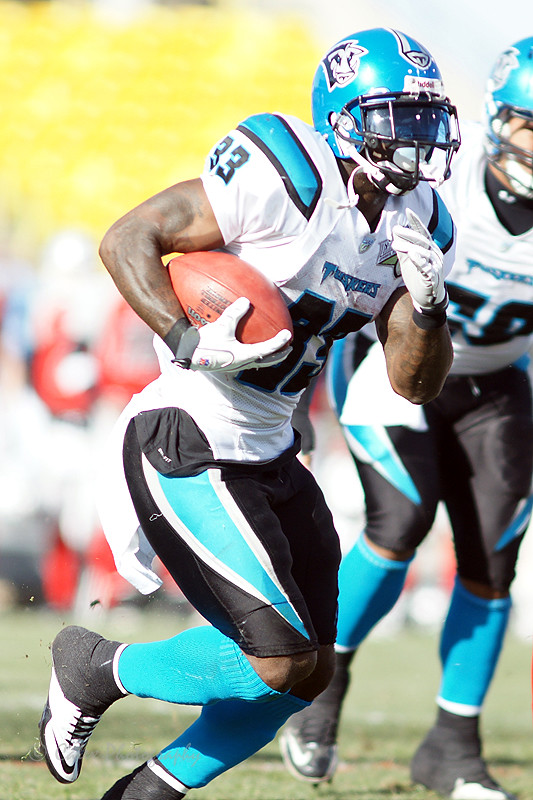
Pacers Nike era vs the last year of the Grizzlies and Lakers 2000’s looks (I’m not counting the Nuggets since every team was a rare matchup)


-
2
-
-
17 hours ago, MCM0313 said:
So Dirk has played alongside both father and son? That's gotta put him on a pretty short list, wouldn't you think?
I think it was mentioned when the trade went down that Dirk is the fourth NBA player of all time to play with a father and son. Don’t know the other three though
-
1
-
-
Thanks to his son getting traded there I found out that Tim Hardaway played with Dirk on the Mavs in 2001
He also played a few dozen of games with the Nuggets and Pacers

-
4
-
-
11 hours ago, DG_Now said:
The Titans looked best when they were first introduced.
Check out Steve McNair in Puma!

Were these Titans uniforms introduced/designed by Puma?
I’ve never made the connection but that shoulder yoke sure looks similar to the form stripe Puma used in various soccer shirts...
-
2
-
-
14 hours ago, clonewars2008 said:
This is a damn good uniform set.

A bit too bottom heavy IMO. With a blue helmet like the UFL Florida Tuskers it would look better
-
3
-
-
UEFA Champions League is updating their graphic package, brighter colors and a shift from the blue/silver look. They're also updating their intro and now the imaginary huge star-ball stadium is just a regular stadium with translucent stars on top of it


-
Unpopular opinion: Love that Jets logo. It’s the first thing you’d think of when someone thinks planes, and it works brilliantly due to being so uncomplicated. Fix the shape and the horizontal stabilizers a little and it would be perfect. Maybe even add a small NY on the tail
-
5
-
-
I love the Canucks Flying V jersey. Especially the yellow
-
1
-
-
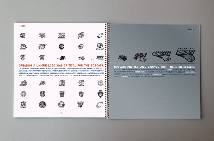
In the discussion about the Nuggets color changes on Twitter we found out that the roundel pickaxes logo was originally designed by supposed to become the primary in 1997 and was already approved by Nuggets owner but they forgot to show it to David Stern and it got mothballed until it would wind up recolored as a secondary a decade later. Todd Radom was involved in creating new uniforms (you can see it had side panels) and the mountain/DN Shield popped up
Also, the evolution of the Bobcats logo
-
Still the best looking uniform the 49ers have ever worn

-
11
-
-
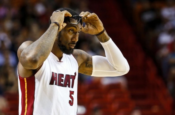
I had completely forgot Amar'e Stoudemire played for the Mavs. Heat and Hapoel Jerusalem are wrong too


-
I really like the Capitals current jerseys, side panels and all. The only thing they need to do is to put the Weagle on the front instead of the script
-
I actually think the Tarpons did it perfectly. Unique name, but a brand clearly derived from the parent with navy pinstripes.
-
1
-
-
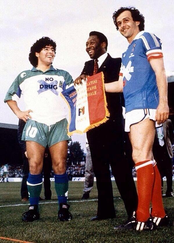
Something like that was tried in the late ‘80’s. Here’s Maradona and Lothar Matthaus with the Serie A team

they played against England and Scotland league teams but I can’t seem to find any pictures of those
-
1
-
-
La Casaca, which posts some really good stuff, made this GIF to help get the creative juices flowing. I’ve already had some fun with it.
-
2
-
-
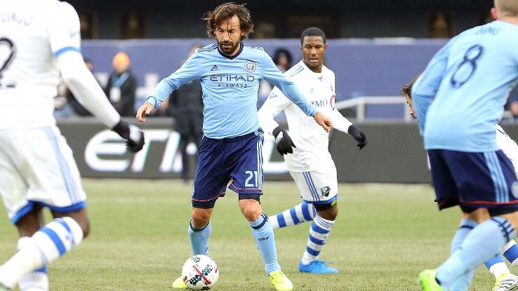
Sice Pirlo has just retired... He grew up at Brescia+ that was where he moved to regista and played a part in memorable goal with Baggio so it's not all that wrong IMO


-
Very nice ring. What does the XVH on the side mean?
-
They should just wear these bad boys with grey pants
-
2
-
-
Can't seem to find any pictures, but in 1992/93 the Irish rainbow Bucks played against the surging sun Suns
-
1
-
-
I was looking at the Bucks page and noticed that the road jerseys for 1975/76 are missing

Also, the 1993 update is registed as 1994 on the jerseys.
-
18 hours ago, McCarthy said:
Question I've had for a while: Why do entire soccer leagues all use the same number font and why do they put the league's logo in the numbers?
It's supposed to be so that you can get name+numbering done on any shirt at any shop in the world, since there's only 5 number colors for the whole league and pretty much any shop that customizes will carry the font. Plus it identifies the league, which is why the little logo is there, on top of making it harder for counterfeiters.
personally I'm not a huge fan of it, especially limiting the colors available like the EPL does, which leads to disasters like gold numbers on shirts with volt trim or black numbers for teams that don't use black
-
3
-
-
Of course, the wrongest of them all was this one at Platini's farewell game
-
2
-


Unused Logos and Uniforms
in Sports Logo General Discussion
Posted
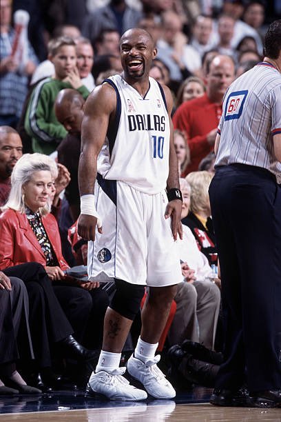
Pretty interesting article about the Mavericks nearly rebranding twice in the 90’s.
The first one looks like a more 90ified version of the current, the second one is just rough. Still have no idea why they put black on the logos only to have navy uniforms. Was black really that needed in the logo that they couldn’t replace it with navy once the NBA told them they couldn’t have black uniforms?
And a new Mavs rebrand seems inevitable at this point, but I guess we’ll start that thread once it’s confirmed.