


GriffinM6
-
Posts
8,423 -
Joined
-
Last visited
-
Days Won
2
Posts posted by GriffinM6
-
-
Based on that Seattle teaser, I'm guessing they're gonna be rolling out a dark grey/charcoal City Connect. They dropped the regular road grey this offseason, so it makes sense they'd do that if they knew the CC would be on the grey scale.
-
 2
2
-
-
Nashville is kind of in a weird spot in terms of having a true rival. Atlanta is only 4 hours away, but we already have a rivalry with Orlando, and Charlotte seems to be the number two now. Cincy is 4 hours from Nash too, but they obviously have an Ohio rivalry with Columbus. As mentioned earlier, it also doesn't help that they have bounced back and forth between conferences. Maybe a bitter playoff loss against some Northeast team will help cement a rivalry, but who knows?
-
28 minutes ago, Digby said:
I think it’s a nice fauxback. Doesn’t need the “The”, of course, which is a silly concession to the eyeroll parts of the program.
The sleeve graphic is the only thing that really lets this down. Feels like they just wanted to avoid the cultural fight of using the feather again, so they came up with this as a replacement, but it looks too off… like a really poor knockoff of the real thing. The Nikespeak can explain it however they’d like, but that’s how it reads to me.
They should've just made the sleeve design the shape of an A and fill in the top negative space with red. It would look good aesthetically and obviously fit with the brand. Other than that though, this looks really good and is still recognizable as the Braves. I'm sure it'll sell like Waffle House on a Saturday evening in Atlanta.
-
2
-
 1
1
-
-
Man, what a ride it's been. I don't think I've been that nervous watching a sporting event since Game 7 of the '09 Stanley Cup Final. I know the odds are stacked against us, but it just seems like a "Team of Destiny" thing right now. Only next weekend will tell, but damn, does it feel amazing to make it this far.
-
1
-
-
12 minutes ago, Green27 said:
The Eugene Emeralds have unveiled an alternate identity for the upcoming season, paying homage to a rather unique local bit of history.
The TLDR is in the 70’s the Coast Guard blew up a dead whale on a beach near Eugene and it went…poorly.
A great watch for anyone more interested in the backstory.
-
1
-
 1
1
-
1
-
-
13 hours ago, officeglenn said:
Fanatics makes MLB player jerseys and just slaps a Nike logo on them.
https://www.espn.com/nhl/story/_/id/35909210/fanatics-replacing-adidas-nhl-official-uniform-partner
Sure, technically Fanatics makes the MLB jerseys since they bought Majestic, but all of MLB still uses the same Majestic template with the side vents that was introduced ~2016.
-
In times like these, I'm happy I can just buy a 90s CCM Penguins jersey off ebay if I want another one since they wear pretty much the same thing now.
-
4
-
-
Yeah, I really don't like the lack of pre-7:30 ET start times and mid-week games this year. 3:30 start times for games are great because you can get done before 7 and are still able to do whatever you want with your Saturday night. I've gone to two of the three Atlanta home games so far, and it's been a doozy dealing with getting back home and just not having the energy to go out afterward.
-
2
-
-
2 hours ago, Ridleylash said:
Well, already not off to a great start here,
 me. Can't wait to see how bad Fanatics :censored:s up the merch now that they have full control.

-
11
-
-
It really sucks seeing Miami having to play Drake, one of the better mid-major conference winners out there in the first round. Of course, the committee had to send us all the way to freaking Albany, NY rather than let us play in Orlando where we'd actually have fans show up too.
-
Korea looks awesome, but you may want to get rid of the Russian flag on the sleeve cuffs of the blue jerseys.
-
1
-
-
I know I'm kinda late to the party on Japan, but I gotta say I do like your idea of adding pink to the mix. Maybe you could try doing navy, gold, and pink? Like the Pelicans but with pink replacing red.
-
1
-
-
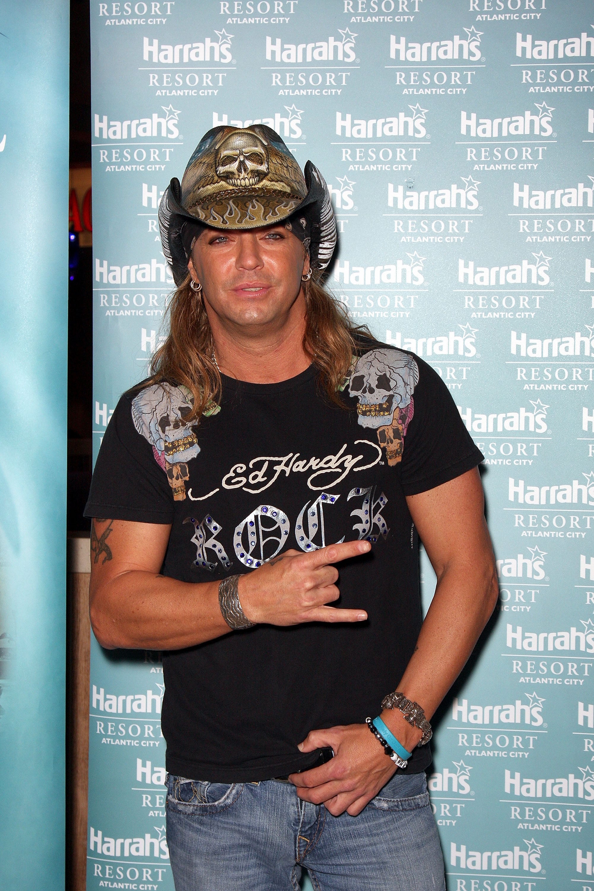
Ed Hardy is suing for copyright infringement on this one.
-
 1
1
-
-
I love how both the Jags and Panthers initially unveiled uniforms with pants colors they wouldn't end up wearing in an actual game until 15+ seasons later (teal for Jax and black for Carolina).
-
7
-
-
Dartmouth looks really good. Absolutely love the blending of the academic and athletics logos.
For Wagner, I think they could use a little more grey. Maybe even just a pair of pants for each set or an alternate helmet?
-
1
-
-
23 minutes ago, jerrylawless3 said:
ECU unveiled... these.
I'd replace the white with yellow and these would look a lot better. Happy to see a team try out lavender unis though.
-
2
-
-
Czechia looks amazing. Reminds me a lot of the Coogi-inspired Brooklyn Nets uniforms.
-
1
-
-
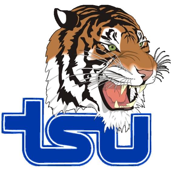
On 2/9/2023 at 12:02 AM, Darth Brooks said:
My high school (well, the local school) uses clip art, as in a clip art tiger straight from the disk they handed out with the first copies of Corel draw (or was it Illustrater?)
I would love to make a custom one tiger for them.
That's actually taken from Tennessee State's old logo.
-
Glad to see you're back! Would definitely like to see you add some explanation behind your design choices.
-
1
-
-
I'd say I'm a fan of a lot of the uniforms you're making, but there's so much lacking on your team crests. Many of the lines and strokes are thin and whispy. They suffer from the same problem as the original/current Ottawa Senators logo.
-
1
-
-
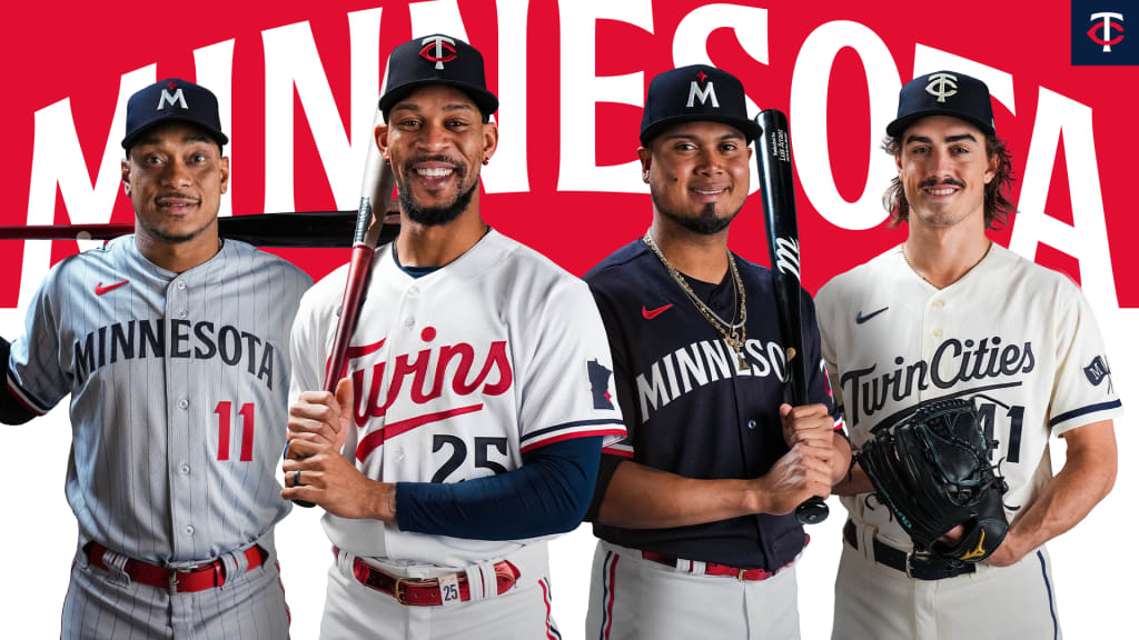
Luis Arraez modeled the Twins' new navy alternate jersey in November when they unveiled their new uniforms. He got traded to the Marlins in January.
-
3
-
1
-
 1
1
-
-
45 minutes ago, NYCdog said:
The Dynamo haven’t had a white change kit since 2015. The last 8 seasons, they’ve gone exclusively with orange primary kits and black change kits, which better aligns with their badge. Also orange and black is a very strong brand colorway that’s unique in MLS. They’ve just squandered the opportunity to build upon this with terrible wooden spoon quality squads.On their primary kits, I'd love to see them use the powder blue that they used to use and the Dash still use. They can keep using just the orange and black on the secondary.
-
3
-
-
Marist is definitely one of the best ones yet. Love the diamond pattern. Reminds me of a brighter version of Temple.
-
1
-
-
I absolutely HATE the idea of Miami going to the B1G. I know our fans don't like the ACC, but it makes the most sense geographically. If we did have to move, I would be open to joining the Big 12 since they've got UCF and we could start an actual football rivalry.


 me. Can't wait to see how bad Fanatics :censored:s up the merch now that they have full control.


College Football 2023
in Sports Logo News
Posted
The only good chrome helmet is TCU's purple, but even that isn't better than their regular purple, black, or white.