-
Posts
8,397 -
Joined
-
Last visited
-
Days Won
2
Posts posted by GriffinM6
-
-
Great work as always. Really love the mountain design on the primary.
As an aside, your work on these state soccer league series has inspired me to go back and redo my Georgia Soccer League that I posted on here back in late 2016-early 2017. Stay tuned for that sometime in May.

-
 1
1
-
 1
1
-
-
-
I can't get over the fact they put the logo and number on opposite breasts. That looks terrible.
I also guarantee they add cream pants to this set by next season, much like the Dodgers and Rockies getting rid of the dark pants.
-
4 minutes ago, Sec19Row53 said:
Per the twitterverse (and @TruColor) the unveiling is next Thursday
https://www.compare.bet/en-us/news/sources-arizona-cardinals-expected-to-unveil-new-uniforms-on-april-20-at-the-van-buren-in-phoenixOh god, I'll be on a 3-hour flight when the unveiling happens. Looking forward to seeing 10+ pages added when I land

-
 7
7
-
-
2 minutes ago, HOOVER said:
Kinda rubs me the wrong way when a team’s helmet doesn’t match its official logo.


-
 7
7
-
 1
1
-
-
I know others were saying they like that MLS teams are starting to use simplified crests for their kits. I noticed Atlanta using one for their goal-scoring graphic, and I gotta say, I really like it. Hopefully it'll be used on the next secondary kit in 2024 and maybe they'll start selling merch with it as well.

-
 6
6
-
-
26 minutes ago, Andrew_Gamer_NZP said:
Rockies wearing white pants with the city connect jerseys tonight.
That looks sooooooo much better than the green pants.
-
 8
8
-
-
3 hours ago, CDCLT said:
This is great! I'm really looking forward to the rest. I love these three teams except for TN's blue front panel, I don't think paneled caps work unless the panel color matches the jersey color. Nice work!
Agreed on this take. Maybe an Expos pinwheel-style hat would work best as a way to get all three colors in there.
Cali and Florida look fantastic.
-
48 minutes ago, AndrewMLind said:
Can confirm through multiple sources the Panthers (and most NFL teams for that matter) will be on Nike's Vapor Fusion template this season. Won't be able to get confirmation or further details from the Panthers until Tuesday, though. I have asked how that will impact their TV numbers and collar, as I suspect they may have larger numbers and no contrasting collar.
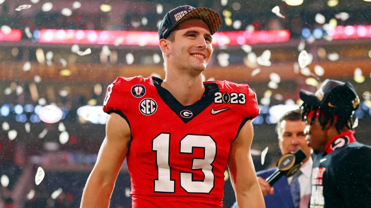
Are you sure that there would be issues with contrasting collars? Georgia wore the Vapor Fusion template in the natty and they had contrasting collars work just fine.


-
4 minutes ago, DJT said:
Not good. But first city edition for next season has been released.
Hideous, looks like a 4 year old splattered a bunch of paint all over the wall.
There was this reply in the comments though, which would've made it somewhat better.
-
 1
1
-
 2
2
-
-
Hopefully the Panthers stripes will taper the same way as this old Bowling Green jersey.

-
 7
7
-
 3
3
-
 1
1
-
-
19 minutes ago, ralphz said:
Let me be the one to coin "WFWS" ... unless someone already beat me to it.
What about "IFIS" or
 Icy for Icy's Sake
 ?
?
-
 1
1
-
 1
1
-
-
2 hours ago, tBBP said:
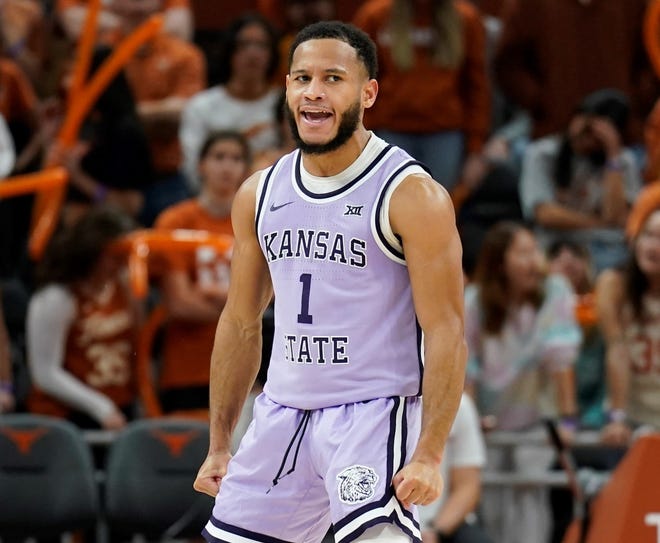
You plucked it right out of my head—except I was actually thinking of another Kansas State colorway:
Now, I know the faded-purple hue miiiggghhtt be a bit much for an "away" uniform (I'm only calling it that until Nike inevitably finds some other hackneyed "name" for home/away/alternate MLB uniforms), but I say: why the heck not?? Maybe not that purple, perhaps just a tad bit more to the silver/gray side (to replace the silver), but THAT colorway—double purple—should be Colorado's colorway going forward and for all time.
*I might have to get back in the kitchen on this one...

*SHAMELESS PLUG*
Made a concept to fit this vibe a few years ago...

Obviously replace black with deep purple though.
-
UCONN and FAU both look fantastic. My only gripe is with the knee striping on UCONN. It would definitely look better if you only kept the vertical striping.
-
 2
2
-
-
8 minutes ago, BBTV said:
But when some big fat defensive tackle has to wear something like 52 because the punter is 97 and kicker is 99, it'll look dumb.

Looks fine to me.
-
 4
4
-
 3
3
-
 2
2
-
-
19 minutes ago, HOOVER said:
I don't hate it. What I do hate is the rest of the proposal which allows kickers & punters to wear 0-49 and 90-99.We'll never see kickers & punters in 1-19 again after everyone else on the team takes those single digit & teen jerseys. Can't wait to watch #99 Justin Tucker run on to the field for an extra point.
Stupid.
I'm used to seeing college kickers wear numbers in the range specified, so it really doesn't bother me.
-
 5
5
-
-
The only good chrome helmet is TCU's purple, but even that isn't better than their regular purple, black, or white.
-
 1
1
-
-
Based on that Seattle teaser, I'm guessing they're gonna be rolling out a dark grey/charcoal City Connect. They dropped the regular road grey this offseason, so it makes sense they'd do that if they knew the CC would be on the grey scale.
-
 2
2
-
-
Nashville is kind of in a weird spot in terms of having a true rival. Atlanta is only 4 hours away, but we already have a rivalry with Orlando, and Charlotte seems to be the number two now. Cincy is 4 hours from Nash too, but they obviously have an Ohio rivalry with Columbus. As mentioned earlier, it also doesn't help that they have bounced back and forth between conferences. Maybe a bitter playoff loss against some Northeast team will help cement a rivalry, but who knows?
-
28 minutes ago, Digby said:
I think it’s a nice fauxback. Doesn’t need the “The”, of course, which is a silly concession to the eyeroll parts of the program.
The sleeve graphic is the only thing that really lets this down. Feels like they just wanted to avoid the cultural fight of using the feather again, so they came up with this as a replacement, but it looks too off… like a really poor knockoff of the real thing. The Nikespeak can explain it however they’d like, but that’s how it reads to me.
They should've just made the sleeve design the shape of an A and fill in the top negative space with red. It would look good aesthetically and obviously fit with the brand. Other than that though, this looks really good and is still recognizable as the Braves. I'm sure it'll sell like Waffle House on a Saturday evening in Atlanta.
-
 2
2
-
 1
1
-
-
Man, what a ride it's been. I don't think I've been that nervous watching a sporting event since Game 7 of the '09 Stanley Cup Final. I know the odds are stacked against us, but it just seems like a "Team of Destiny" thing right now. Only next weekend will tell, but damn, does it feel amazing to make it this far.
-
 1
1
-
-
12 minutes ago, Green27 said:
The Eugene Emeralds have unveiled an alternate identity for the upcoming season, paying homage to a rather unique local bit of history.
The TLDR is in the 70’s the Coast Guard blew up a dead whale on a beach near Eugene and it went…poorly.
A great watch for anyone more interested in the backstory.
-
 1
1
-
 1
1
-
 1
1
-
-
13 hours ago, officeglenn said:
Fanatics makes MLB player jerseys and just slaps a Nike logo on them.
https://www.espn.com/nhl/story/_/id/35909210/fanatics-replacing-adidas-nhl-official-uniform-partner
Sure, technically Fanatics makes the MLB jerseys since they bought Majestic, but all of MLB still uses the same Majestic template with the side vents that was introduced ~2016.
-
In times like these, I'm happy I can just buy a 90s CCM Penguins jersey off ebay if I want another one since they wear pretty much the same thing now.
-
 4
4
-


/cdn.vox-cdn.com/uploads/chorus_image/image/72114905/1475676785.0.jpg)


Division 1 College Conference Realignment
in Sports In General
Posted
Should've called it the WAC-SUN.