


GriffinM6
-
Posts
8,382 -
Joined
-
Last visited
-
Days Won
2
Posts posted by GriffinM6
-
-
6 hours ago, ManillaToad said:
Oh and Stefon Diggs is outright not wearing socks. Hope he gets fined
Looks better than the tights look people keep doing. Also, that's how they do it in college, so it doesn't really bother me.
-
 1
1
-
-
36 minutes ago, pepis21 said:
Since nike takeover the league, swingman version always have a pockets. Authentic and game-worn don't have them.
Doesn't look that bad.
You're right, it looks downright awful.
-
2
-
 3
3
-
-
Has A&M worn maroon pants since they started wearing their current set? They would've looked nice against Arkansas' W/R/W.
-
1 hour ago, colinturner95 said:
nope. they had a unique thing for one season and then Nike added it to the catalog and it's become stale.
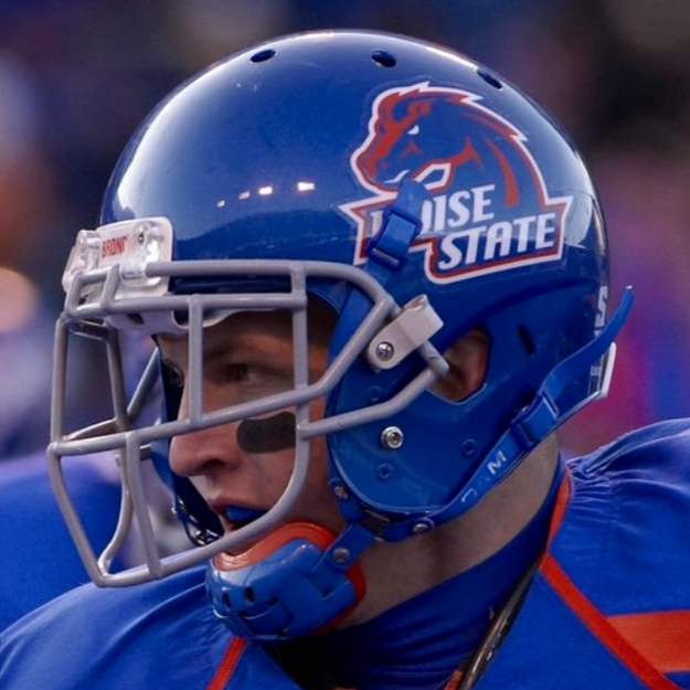
this might fall into unpopular territory but I think they should lead with the throwback logo:

The current logo set is starting to feel like its course has been run.
While I like the updated throwback logo, I kinda wish they'd use the horsehead with the script underneath again like when they first rose to national prominence. I always thought it fit very nicely on the helmet.
-
2
-
 1
1
-
-
That France kit is pure class. I think they need to make a full-time return to royal blue from here on out.
-
1
-
-
I think it's pretty good. The colors look nicer than the old look, though I can't help but think the crest is missing something. I feel like it needs some other kind of text besides the 1974.
-
1
-
-
Me after reading these last few replies:
-
1
-
-
3 hours ago, kylonian said:
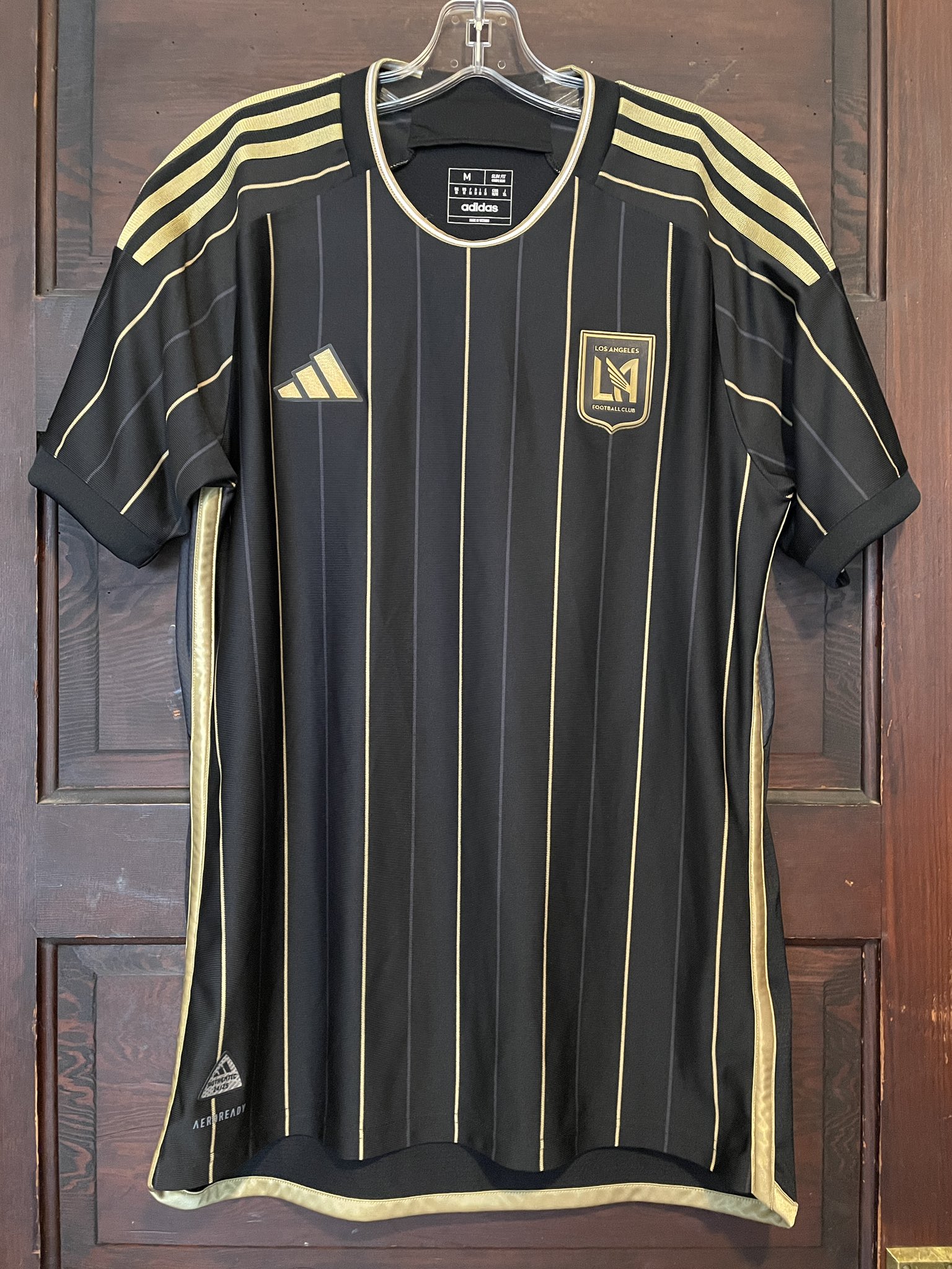
Didn't expect to be starting this so early but here we are! LAFC's new primary has leaked and personally I absolutely love it, gorgeous. Will be such a shame if it's spoiled by the huge Flex logo, but pinstripes seems like such a correct choice.
This also confirms that MLS will be using the same 2022 World Cup template from Adidas next season.
I really like this kit, and I think my only nitpick is that they should put that think collar striping on the sleeve cuffs too. Though it's possible this is a replica shirt and the authentic may actually have the sleeve cuff striping.
-
1
-
-
Would it KILL the Cardinals to wear white pants with their red jerseys?
-
11
-
-
There are some really good looking games today. Clemson vs. FSU, Cincy vs. Oklahoma, Michigan vs. Rutgers, Marshall vs. VT, etc.
-
3
-
-
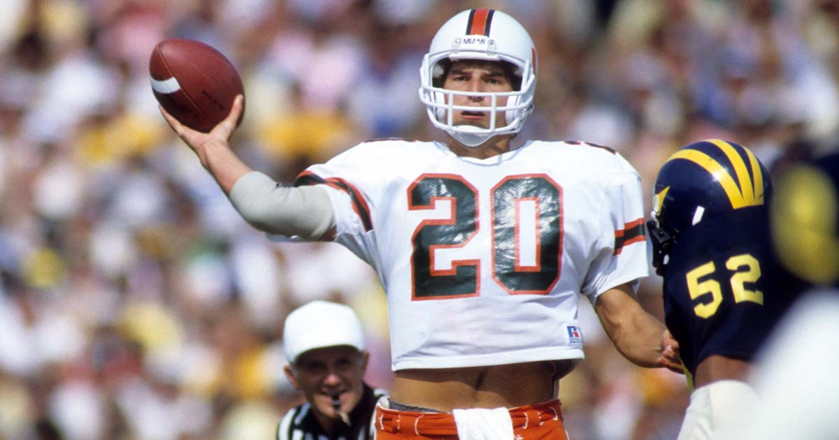
33 minutes ago, Carolingian Steamroller said:
Are you talking about the Miami Hurricanes or the Miami Dolphins?What team is in the photo I quoted? Also, look at my sig.
-
29 minutes ago, Carolingian Steamroller said:
Well it does match the orange helmet and I would argue that helmet should have a color balance that leans toward the brown rather than orange. I think it matches the jersey terrifically. Now the pants have a wider brown center stripe but then you mess with the striping proportions on the helmet compared to the non-alternate helmet and I think it's simpler just to roll with the stripes they did.
Again, I don't think they messed up at all. I thought it looked really slick.
Addendum: This swapped helmet/pant stripe deal is also found in the U.
And as a fan of Miami, I can't stand it anymore. The helmet stripe looks so much better. A lot of times the pants striping can end up looking brown on TV.
-
5
-
-
1 hour ago, BBTV said:
Is there any evidence that sports stadiums draw people to actually live near them? I'd personally not want to live in a complex featuring a major sports arena (and I go to tons of games via my 2-mile walk or short subway ride) and if they're high-value units, are the people affording those units really die-hard baseball fans?
No statistical evidence, but I can guarantee you that many of the people who live at the apartments at The Battery where the Braves play are die-hard fans and go often. This new proposed St. Pete plan would be very similar to The Battery, including the fact that there's dogs**t public transportation in the area.
Not a fan of it, and hope the city of Tampa can work something out eventually with St. Pete to get the Rays across the bay.
-
2
-
-
On 7/23/2023 at 8:22 PM, Cujo said:
Even worse after last night.
-
Saints sleeve logo looks super tiny on the new template. Reminds me of how the Seahawks sleeve logo looked on the Reebok uniforms.
-
9 hours ago, ramsjetsthunder said:
He's right...
-
3
-
-
18 hours ago, Pigskin12 said:
Mariners wore the aquas on the road in Chicago yesterday, which they (as far as I know) only do when the home team is already wearing blue, navy, or black and they don’t have a choice. The Sox were wearing white for this game though. I can’t recall Seattle doing this any other time this season, but I love it. So tired of them wearing navy all the time.
I saw them play against the Braves back in May and they wore teal against the Braves' City Connect. They've probably done it more than a handful of times this year.
-
2
-
-
2 hours ago, SFGiants58 said:
It's giving me these vibes:
Slate blue is too close to a bright orange lighting-wise, and red + orange is hard to pull off in any circumstance. You'd probably be looking at a faded version of the above jersey in terms of the aesthetic.
No, no, he's onto something here...
-
1
-
 3
3
-
-
32 minutes ago, nuordr said:
New Maryland Terrapins Black Uniform:
Overall, I like Maryland's new/throwback look, but it would help to have more yellow. Even just a thin stroke on the outside of the helmet and pants stripes would really help.
-
6
-
-
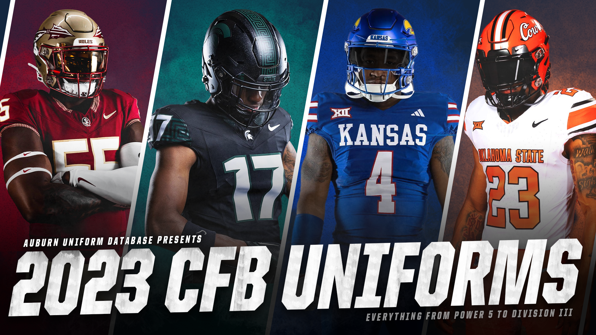
3 hours ago, Clintau24 said:It's finally here!Here is my annual run-through of every new uniform, helmet design, logo, patch, turf field, etc. revealed for the upcoming season. From the top schools all the way to Division III.115+ schools and conferences featured. Over 250 photos used.It's all right here: https://auburnuniforms.com/2023/08/22/2023-cfb-uniforms/
Fantastic job as usual, but Georgia Southern is in the Sun Belt, not FCS.
-
On 8/16/2023 at 3:05 PM, MJWalker45 said:
Sevilla still without a front of shirt sponsor for the SuperCup.
I really wish teams would use front numbers if they're going without a kit sponsor. Without something there, it leaves the kit feeling empty.
-
Love the shade of gold on Vandy's pants. It's not that typical washed out Nike khaki. Great idea going with a simplified look.
-
5
-
-
1 hour ago, TrueYankee26 said:
Call me crazy but Rome Latinos
Since there are lots of Latinos in baseball and the word comes from "Latium" which is of course where Rome is

I wouldn't see that going over well with the majority demographic from that area of Georgia.
-
1
-
 1
1
-
-
Orioles in Orange at Mariners in Teal is one of the greatest uniform matchups in MLB history.
-
5
-
1
-
 2
2
-
 1
1
-


2023 NFL Season week by week uniform match-up combos: From HOF Game to Super Bowl LVIII
in Sports Logo News
Posted
This would be a pretty decent looking game if the Cardinals would just WEAR WHITE PANTS.