


GriffinM6
-
Posts
8,382 -
Joined
-
Last visited
-
Days Won
2
Posts posted by GriffinM6
-
-
Tulane wearing all black on senior day.

-
26 minutes ago, MCM0313 said:
Wait, when did the Hurricanes wear yellow?
I think it's just a fauxback.
-
 3
3
-
-
I really like the last two! A few suggestions...
Arkansas State
- Move the sleeve stripes a little further up towards the shoulders
- Add sleeve numbers
Coastal
- Incorporate black somewhere
- Add sleeve numbers
-
Italy's 2024 kits have leaked.

And there's finally a clear side view of the tusks.
I'm really disliking this template. Adidas absolutely killed it in 2022, but 2024 seems to be a crapshoot so far.
-
1
-
 1
1
-
-
Panthers wearing blue socks with their black jerseys and pants for the first time in forever it seems like.
-
6
-
 1
1
-
-
Looks like Miami might have new black and throwback uniforms this year. Just came across them on Fanatics.
-
2
-
-
Is this your concept? If not, this post should be in the MLB 2024 Uniform changes thread.
-
9 hours ago, panthers_2012 said:
Frontier League newest team
Could be interesting
Why the hell are there 2 H's in this name? I was always under the impression that it was spelled Chowda, not Chowdah.
-
I think it really just depends on the team. I like the Maple Leafs look, but I don't think the Penguins would look very good with black helmets and white jerseys.
-
1
-
-
Amsterdam and Dublin look spectacular. I really like where you've started for Leeds, but it feels like there's something missing from the top of the knight's helmet. Perhaps you could add a flume like UCF's logo.
-
4 hours ago, ruttep said:
This is embarrassing. You're doing a throwback theme for the game and you're not going to wear white pants? What is wrong with you? At least my Niners will look respectable.
Y'all are crazy, this is a great look with the black socks. It'll still be a nice looking game with good contrast.
-
7
-
 1
1
-
-
21 hours ago, MJD7 said:
I’m surprised this hasn’t been mentioned yet, but Uni-Watch did a piece on the new Nike template, giving us our first look at an actual jersey.
This looks to confirm that the collar insert is still there, which makes me glad I got my Twins authentic jerseys this year.
Overall, I think it’s a bit of a mixed bag. Some elements of the new replicas are an upgrade over the old ones, as I never liked the “stripes” effect that the material of the old Majestic replicas gave. I also like the stitched Nike swoosh and hope the new replicas will include elements such as patches & front numbers.
The sleeve stripe style on the old template was better though, in my opinion:Based on this pic, it also appears the Rangers are thickening the red and white outlines on their home script. I actually think it's an improvement because it makes it look less whispy and thin.
-
7
-
-
Went to the Atlanta Gladiators game on Friday, and something really annoys me with their white look. The sleeve stripes have no navy on them, while the socks stripes do. I think it looks way better on the socks because the light blue, yellow, and white don't have enough contrast. Not sure why they don't change this.
-
1
-
-
20 hours ago, GriffinM6 said:
Absolutely beautiful match-up in Pittsburgh today between FSU and Pitt.
More context with pics.
-
7
-
4
-
-
Absolutely beautiful match-up in Pittsburgh today between FSU and Pitt.
-
2
-
-
1 hour ago, TGroce said:
I LOVE these
These are way better than the black or grey ones. Tennessee has only worn the traditional orange jersey how many times this year though?
-
2
-
-
The NFL is lame as hell for this, but UH can just claim that they used uniforms with the blue from the city flag combined with their standard red and white.
-
2
-
-
On 10/24/2023 at 12:18 PM, sudden said:
They really need to try orange socks with this look. They've only used orange socks at home since this rebrand.
-
1
-
2
-
-
4 minutes ago, officeglenn said:
The team is currently using a secondary logo as their Twitter profile pic. The chrome circle/lines without the rest of the shield with "SD" replacing "FC" in the middle:
Just checked this out on my phone, and wow, hahahahahaha that SD is so damn tiny. I even have perfect vision and it's barely noticeable on mobile. It looks like it belongs to some team from Detroit instead. This is such a colossal brand failure. Thankfully, they still have time to fix it by 2025.
-
7
-
-
There's like 5 or 6 Cowboys players wearing navy socks instead of white and it looks pretty nice. Brandin Cooks is one of them.
-
3
-
-
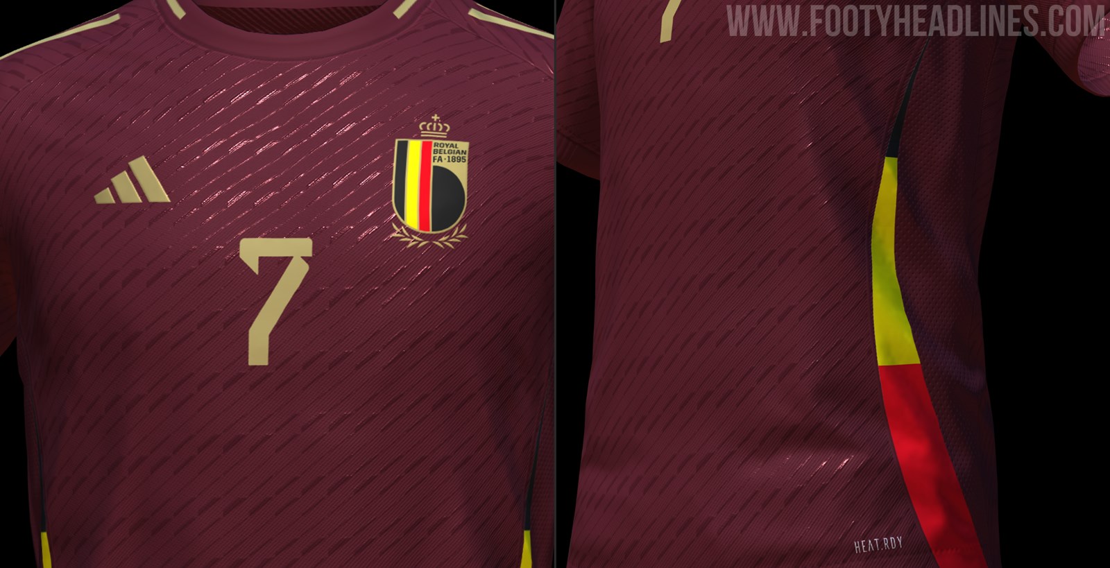
Some 2024 Adidas kit details have begun to leak. Looks like they'll be on a new template that's inspired by the 2006 World Cup, which took place in Germany.
Large Images ahead...Spoiler
Belgium Home:
Argentina Home:
Argentina Away:
There were a few other leaks, but I can't copy the images from Footy Headlines.
-
2 hours ago, Jer15 said:
I assumed that the WNBA would find a permanent home in the Coca-Cola Coliseum or Paramount Centre (sharing it with Raptors 905 makes some sense to me).
This is what Atlanta does. The Dream used to play at FKA Philips Arena, and then at Georgia Tech's McCamish Pavilion, and now they play at the Gateway Center Arena where the College Park Skyhawks also play. It's only a 3,500-seat venue for basketball, so I imagine they get a decent crowd for home games.
-
1
-
-
25 minutes ago, BBTV said:
Didn't Ohio State have a helmet with a really thick stripe a few years ago? I vaguely recall it, but maybe not. Either way, maybe a thicker stripe would help that Browns helmet. And maybe numbers on the sides, just to make it a little less white.
It's already not a genuine throwback, so why not?
This is what Ohio State wore sometime between 2012-14. They had red and white versions and they were essentially 90s fauxbacks.
I think the Browns could maybe pull off a wider stripe with numbers, but that's all dependent on what number font they'd use on the helmets.
-
4
-
-
2 hours ago, CS85 said:
It looks like the "Who's that Pokemon?!" silhouette for a lame pokemon that's a cartoony steak.
Looks like the steaks from Madagascar lol
-
1
-
 1
1
-
 3
3
-

.jpg)
.jpg)
.jpg)


/cdn.vox-cdn.com/uploads/chorus_image/image/72829642/BAK_8362.0.jpeg)


/cdn.vox-cdn.com/uploads/chorus_asset/file/12821623/20131130_kkt_aw3_111.0.1511975343.jpg)


New Blue • Houston Rockets Rebrand (City Uniform 11/26)
in Concepts
Posted
Man, this might be one of the most well-done concepts I've ever seen on the boards. The new color scheme looks fantastic, and the logos are all really well done. You did a great job mixing old and new elements to create the perfect look.