


GriffinM6
-
Posts
8,404 -
Joined
-
Last visited
-
Days Won
2
Posts posted by GriffinM6
-
-
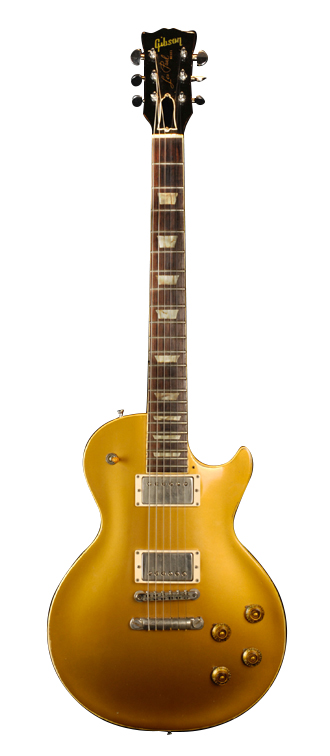
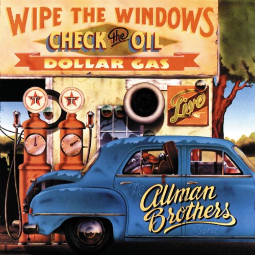
We now head to Middle Georgia for our first team in that region of the state, the Macon Ramblers. The Allman Brothers Band was based out of Macon, and what's arguably their most famous song is called Ramblin' Man.

NOTES:
SpoilerI have included a larger view of the crest, since it appears rather small on the presentation template.
Crest
- The MR monogram is based on the A and B on the Brothers of the Road album cover
- The guitar is a silhouette of the 1957 Gibson Les Paul used by Duane Allman
- The colors give off an early 70s vibe and are taken from the Nashville Sounds unused color scheme from their 2014 rebrand
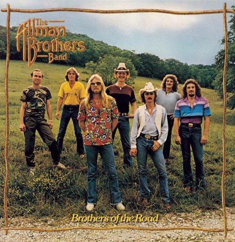
http://ecx.images-amazon.com/images/I/61tuhsq0PoL._SL500_.jpg
Primary
- Features a sash representing the standard six strings of a guitar
- The number font comes from the Wipe the Windows, Check the Oil, Dollar Gas album cover
http://ecx.images-amazon.com/images/I/61fgwcnfUbL._SL500_.jpg
Clash
- The shirt is based on the album cover for The Road Goes on Forever
Oh, and I took @TheGiantsFan 's suggestion and made the league 5 divisions of 8 teams now.
-
 3
3
-
 1
1
-
-
I think the newest version with the black strokes looks fantastic. Maybe you could include some green in the logo itself by putting it somewhere in the mouth, nostrils, or eye.
-
I actually am glad Denver won wearing those uniforms. Their current primary look is very forgettable IMO. I love the collar design and color balance on the city uniforms.
-
5
-
-
4 hours ago, Sport said:
I know they're the "Golden" Knights, but their best look is the dark gray jerseys and socks. I thought that was really sharp right out of the gate. Gave it a medieval knight vibe and had enough gold to meet the "golden" quota.
My problem with all the all-gold sweaters is there's no black next to the dark gray to give context for that color so the dark gray ends up just looking like a black that got dulled in the sun.
I just think these are a little garish.
The problem with the gold jersey is that there's way too much white on it. All the white striping should be replaced with black.
-
6
-
 1
1
-
-
Next up we have the team that completes our Savannah Derby in Savannah 1733. This is another carryover team from the previous series and the logo I changed the least. It was just a simple thickening of the gold from the previous one.
NOTES:
SpoilerCrest
- Features four stars, since Georgia was the 4th state to ratify the constitution
- The red star signifies Savannah as the first city in what became the colony of Georgia in 1733
Primary
- Uses the chevron from the logo and is inspired by the Florida Panthers NHL uniforms
Clash
- A map of Savannah is located on the upper chest. "Coincidentally", most of Hutchinson Island is cut off. Maybe it's some pettiness towards their rival? Who knows?

C&C is greatly appreciated!
-
3
-
-
The next two teams will both be from Savannah. First up is Port Authority FC. The lore behind this team is that it was formed by mariners and dockworkers who worked at the Port of Savannah and decided to build a field on Hutchinson Island which sits in the Savannah River just across from the historic district.
*Yes, I'm aware the sleeve stripes don't line up on the clash. I tried to get it to work, but they weren't spaced evenly if I lined them up with the horizontal ones.*
NOTES:
SpoilerCrest
- Ship steering wheel
- Front facing view of a cargo ship, based on the AAF's San Diego Fleet logo
- Nautical style font
- Anchor
Primary
- Based on a cargo ship captain's outfit
- Try to keep it simple like Tottenham's White/Navy/White look
Clash
- Wave stripes based on a classic sailor outfit
-
5
-
-
I really like what you did with Ajax. I believe they've used elements from the Amsterdam flag before, but not in the way you've done it. Chelsea looks good too. Getting some San Jose Earthquakes vibes from them.
-
Love all three, but Iowa is probably the most creative one yet. Absolutely fantasic.
-
1 hour ago, RyanMcD29 said:
The city of Syracuse is going through the process of a new flag
The two that use orange are both the clear frontrunners. I honestly don't know which to choose between the two of them.
-
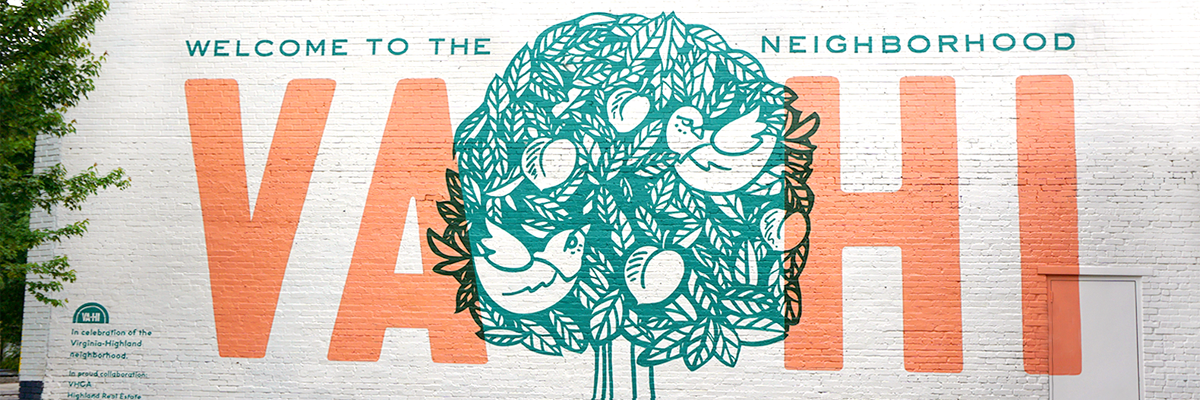
Following Alpharetta, we have our second Atlanta-based team, Virginia-Highland Civic SC. The team is based in the Virginia Highland neighborhood and is named after the Va-Hi Civic Association formed in 1971.
NOTES:
SpoilerThe crest is a vertical version of the VaHi sign, and includes the same font. The colors come from the Highlands flag of Scotland and the dark green on the neighborhood sign. The tartan pattern is the State of Georgia's in team colors.
The primary features a checkered pattern made of silhouettes of the team crest. The clash is based on the Va Hi mural and features a sublimated brick pattern.
-
3
-
1
-
-
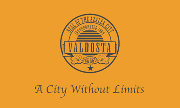
Next up we have State Line FC. This is the third carryover team from the GSL 1.0. The team name comes from the fact that Valdosta is the biggest town near the Florida-Georgia state line.
NOTES:
SpoilerThe team colors are based on the city flag, but with black instead of dark grey. The crest features an Azalea flower, as Valdosta is nicknamed "The Azalea City". The V, of course, stands for Valdosta where the team plays.
The primary kit is an exact replica of the 1.0 version. The clash kit is based on the colors of pink and purple azaleas, and the chest stripes emulate the ones found in the city seal.
-
4
-
-
4 hours ago, 8BW14 said:
Illinois is looking into a adopting a new state flag design and I had a few spare minutes at work yesterday and came up with this:
The sun/star has 21 points because Illinois was the 21st state to join the Union. The blue borders on the left, bottom, and right sides represent the Mississippi, Ohio, and Wabash rivers respectively and the upper right corner represents Lake Michigan. The green background is for Illinois’ forests and fields and the gold, not only represents the sun, but also the grain harvested from the fields in the fall. Illinois’ lifeblood is its lands and waters. They support pretty much all industry and commerce in the state. Out-of-staters and the majority of the population in the Chicago area tend to forget anything but Chicago exists in Illinois and I wanted to create a flag that represents the whole state, not just the NE corner.
My wife liked the symbolism but told me she thought it was an ugly flag. Any thoughts would be appreciated. love to submit a design if/when the state asks for input from its residents.
I think it's a good start. The green and blue definitely need more contrast though. I'd make the green darker since it's the main color. The sun could also spare to be a little smaller. As of right now, I think it takes up way too much space.
-
1
-
-
The next team is Olympiakos Alpharetta. The name comes from Greece's famous club and coincides with Alpharetta's Greek-inspired city name.
@tigers Here's the Greek design you've been waiting for.
NOTES:
SpoilerThe crest contains an olive branch and pillar inspired by ancient Greek buildings.
The primary kit is directly inspired by Olympiakos' red and white striped kits.
The clash is inspired by the white shoulder yokes on Greece's 2001-02 kit.
-
5
-
-
3 hours ago, TrueYankee26 said:
Links are broken

Should be working now. Not quite sure why my PNG uploads stopped showing up. Really don't wanna have to make all of the new teams JPEGs because of the lower image quality.
Next team will be posted this evening.
-
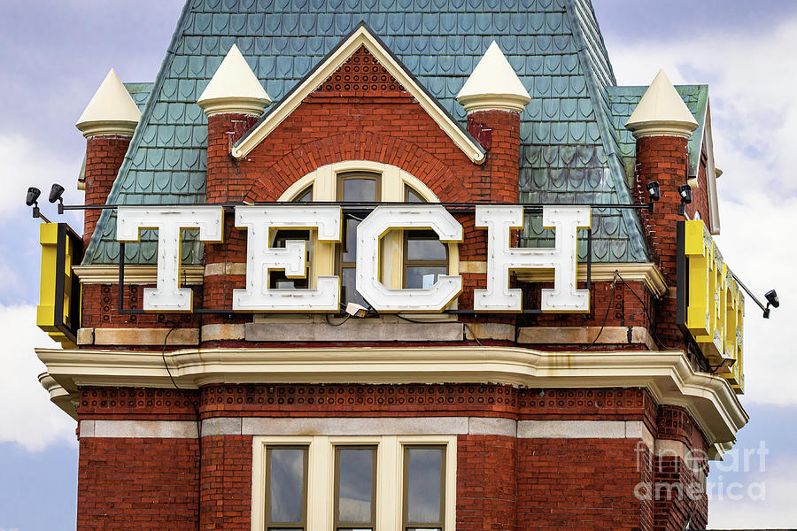
I decided to take Memorial Day Weekend off from posting on here, but now we're back with our first Atlanta-based team. Here we have Engineers FC. The namesake derives from Georgia Tech and its prowess as an engineering institution.
NOTES:
SpoilerThe crest is a hexagon due to Georgia Tech's mascot being a yellow jacket. The font is taken from the campus' most iconinc building, Tech Tower. The icons in the crest represent the three longest-offered engineering programs at Tech: mechanical, electrical, and chemical.
The primary kit features a sash made up of elongated hexagons. The clash has a stripe made up of each icon from the crest.
-
3
-
-
9 minutes ago, tBBP said:
Wait—there's a London Series now? How long has this been a thing?
And is Manfred trying to deebo the NFL now??
They did it once back in 2019 with the Red Sox and Yankees. It has been postponed the last 3 seasons due to COVID and other stuff. I'm not sure if it's meant to be a yearly thing though.
-
SpoilerOn 5/24/2023 at 3:25 PM, TheGiantsFan said:
Yay!!! Another state soccer league!
")
Some good stuff so far; you've got some fun color schemes in here!
My first critique is about your crest sizes. The Mannschaft crest is a good size (though it should be vertically centered with the Adidas logo), but the Athens crest is way too big, Going forward, just be sure to keep those crest sizes relatively consistent and centered with the manufacturer logo.
My second critique concerns the divisions. I think 10 divisions is a little excessive for a 40-team league, so maybe 4 divisions of 10 teams or 5 divisions of 8 teams would make more sense.
I think your original Georgia series happened during my several-year absence from the forums, so a lot of this is new to me (because most of the original images are gone
 ).Excited to see the rest!
I'll update the Athens crest later today. Regarding the divisions, I wanted to do 5 or 4 divisions, but my geography OCD got in the way. I think I will end up changing it to 5 divisions of 8 teams though, and then the top 2 in each make the group stage.
After going with two red-heavy teams to start things off, let's go to the opposite side of the color wheel with Augusta Green. This is the second team that featured in the original league. The namesake is derived from Augsusta's prevalence in the sport of golf.
NOTES:
SpoilerThe primary kit is directly inspired by the team crest. The crest contains the flag from the Masters logo and features the early 1900s styled soccer ball from Barcelona's crest.
The clash kit is inspired by an old-timey golf outfit.
PS: Please let me know if the images I post are blurry or not. They look crystal clear on my PC monitor, but then appear slightly blurry on my laptop.
-
1
-
1
-
-
8 hours ago, rainmaker17 said:
Unpopular opinion: The Rangers need to drop the whole powder blue faux retro thing altogether and bring back the red alt.
I don't think that's an unpopular opinion at all. A lot of people don't like the Rangers' powder blues because of the weird script and unnecessary hat.
-
2
-
2
-
-
50 minutes ago, Burmy said:
Say hello to the George Washington Revolutionaries.
Are six syllables the most for a mascot name in D1?
-
SpoilerOn 5/23/2023 at 5:30 PM, TrueYankee26 said:
Yesssssss another one, like the Alabama, California and Oregon ones I will follow this big time
Thank you!
On 5/23/2023 at 9:28 PM, tigers said:I'm not sure if this is based on a real team but i would have used Athens and went with the olive branch logo.
Other than that i like the clash better than the Home.There will be some other Greek-themed teams in the league. Like I said, it was a carryover from my previous concept series and there's more context in the spoilers in the post.
On 5/23/2023 at 10:46 PM, Bomba Tomba said:If the home is Athens Arsenal, would that make the clash Athens Villa?
Kind of happened that way unintentionally lol. I just really liked the look of the Georgia Theatre y'know?
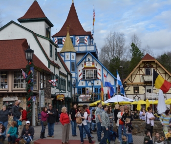
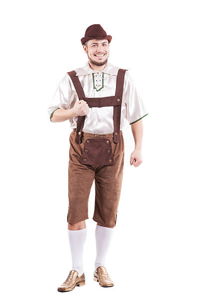
Next up we have Mannschaft Helen FC. This is one of my favorite team names and identities from the ones I've completed so far.
NOTES:
SpoilerHelen is a German-themed city nestled in the Blue Ridge mountains in North Georgia. In 1969, the town passed zoning laws for all buildings to be built around traditional Bavarian design. Since then, the town has been a major tourist spot and hosts a huge Oktoberfest each year. The crest colors are taken from the German flag and the design is inspired by Bavaria's most famous club, Bayern Munich. In the center of the crest is an H made out of a Bavarian checker pattern.
The clash kit is inspired by Leiderhosen. and the front design forms an H shape.
-
4
-
-
Looking at the whole lineup of caps, some of these could work within the current team identities.
- Twins could wear this with a powder blue uniform (which I assume their CC will be)
- Cardinals could wear that with their powder blue alternates
- Rays were already mentioned
- Rangers one looks better than the crappy cap they currently wear with the powder blues
- If the Jays wanted to make the secondary color of the powder alternates royal blue, this hat could work
-
2
-
-
I think the only thing I would dislike the Texans getting rid of is their number font. It's legitimately a perfect custom font.
Everything else in their brand I can take or leave despite the fact that I do like their current uniforms.
-
9
-
-
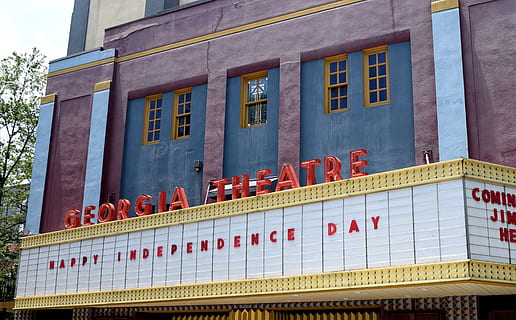
Without further ado, we have our first team, the Athens Arsenal. Athens is the home of the University of Georgia, which you'll see a big inspiration from here. This is also a carryover team from the GSL 1.0, so you can expect to see a few more updates to OG teams along the way.
NOTES:
SpoilerObviously, the name comes from the EPL's Arsenal FC, but the cannon shape is illustrated after an inoperable double-barrel militia cannon made by people ineligible to fight in the Civil War. The cannon has been preserved for over 100 years at this point.
The primary kit is inspired by Arsenal's of course but also features vertical striping that mimics that on UGA's football pants.
The clash kit is based on the facade of the Georgia Theatre, a landmark venue that is known throughout the state for hosting many famous musical acts over the years.
C&C is appreciated!
-
2
-
-
Hello all, and welcome to the Georgia Soccer League 2.0. Back in late 2016 and early 2017, I created a 12-team soccer league based in my home state of Georgia. After seeing @TheGiantsFan , @RevNet, and @jackkmart do some great work on their own state-specific soccer leagues recently, I was inspired to give this a second try with 40 teams this time. Now, let's take a look at the league map.
In this 40-team league, there are 5 divisions of 8 teams. The schedule is made up of 46 games (14 against division opponents, one game against every other team). The top two teams in each division go to the GSL Champions League Group Stage, where two groups of 5 play home-and-home matches. The winner of each group plays in the Grand Final at Mercedes Benz Stadium to decide the year's GSL Champion.
Lastly, I want to give a big thanks to @Jaffa for providing some excellent and up-to-date kit templates!
Completed Teams:
SpoilerAppalachian Division
Coastal Plain Division
Metro Division
Piedmont Division
Terminus Division
Logo Map
-
3
-
1
-


You Saw What Where??
in Sports Logo General Discussion
Posted
You sure you weren't in Birmingham, Alabama?