


GriffinM6
-
Posts
8,397 -
Joined
-
Last visited
-
Days Won
2
Posts posted by GriffinM6
-
-
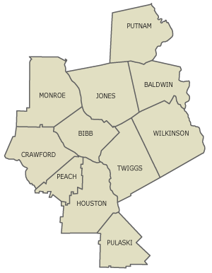
We're back for more as we reach our second team in the triad of clubs based in Middle Georgia. This is Middle Georgia United, based in Warner Robins, where you can find Robins AFB.

NOTES:
SpoilerCrest
- Based on the Air Force Roundel symbol
- United has a double meaning with the military theme and the entire area of Middle GA being united under this club
- Sublimated outline of the counties that make up Middle GA
- Three P51 Mustang plane silhouettes feature prominently on the crest (they flew at Robins AFB during WWII)
Primary
- Belly stripe based on the striping in the crest
- Blue/Blue/White a la Chelsea
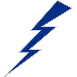
Clash
- Inspired by the USAF Acadamy's usage of lightning bolts in their athletic branding, as well as some Arsenal away kits from years past.
-
 1
1
-
-
Apologies for the nearly 2-week delay on this. Was out of town from the 29th-6th and then it was a hectic week until now.
We've reached our final coastal team in Golden Isles SC. The team name comes from the barrier islands that are found on the Southeast coast of the state in Glynn and McIntosh counties.
NOTES:
SpoilerCrest
- The font and floral-ish pattern are taken from the sign of the Ritz Theatre in Brunswick
- 8 pointed sun to represent the "golden" part of the team name
- Colors are based on both the flag of Brunswick and UNC-Wilmington athletics
Primary
- PSG-style vertical stripe down the center
- Sublimated suns from the logo running down the length of the stripe
Clash
- Gradient sun centered around the team crest
-
2
-
 1
1
-
-
It is a dark day in MLB history
-
8
-
-
Notre Dame did have some type of dazzle fabric for their Shamrock Series pants back in 2021 I believe. It's possible (from UA at least) to still make modern dazzle pants.
-
6
-
-
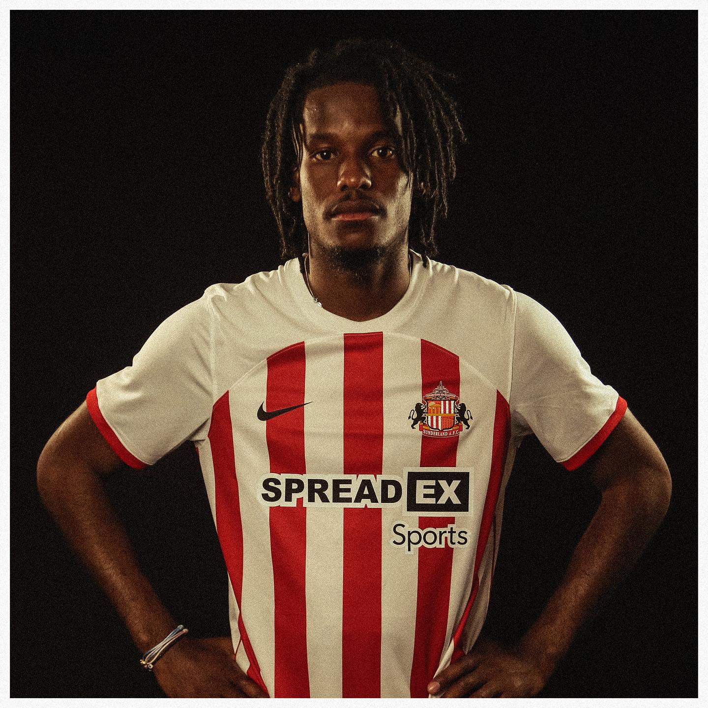
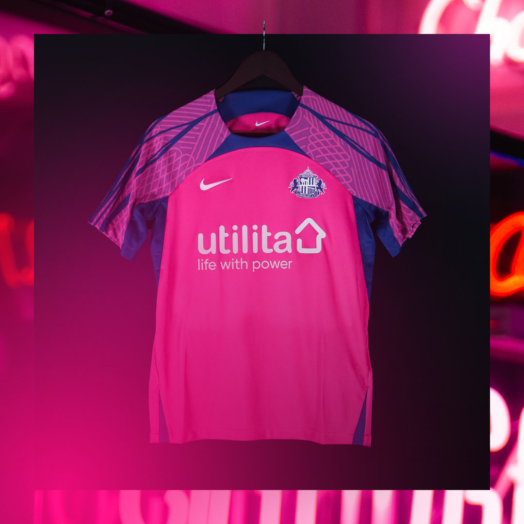
Sunderland unveiled their 23/24 kits on Nike's current template. Standard red and white striped shirt with black shorts and red socks. The away is pink and purple and features what I believe is a standard pattern for this Nike template on the sleeves.
They previously wore the color combo for a third shirt in 2016/17.
-
1 hour ago, cajunaggie08 said:
These wont see the field until 2025 but the University of Texas Rio Grande Valley (UTRGV) released 3 helmet options yesterday. UTRGV is starting up a football program that will play in the WAC/United Athletic Conference
https://goutrgv.com/galleries/football/football-helmets/2855
Gray with a black facemask, but their colors are navy, orange, and green?

-
3
-
-
Mexico is a 10/10. The lime green works so well with the tri colors. The road kit is fantastic as well. Good call to use gold rather than white on it.
-
8 minutes ago, solvetica said:
Here they are. I would have to imagine a red alternate, red helmet and maybe a light blue mock throwback will be introduced later in the year.
No stripes on pants make this a 7.5/10 instead of a 9/10.
-
6
-
-
Fantastic work on this entire series! Love the cute beaver for Corvallis. Can't wait to see the compilations.
-
1
-
-
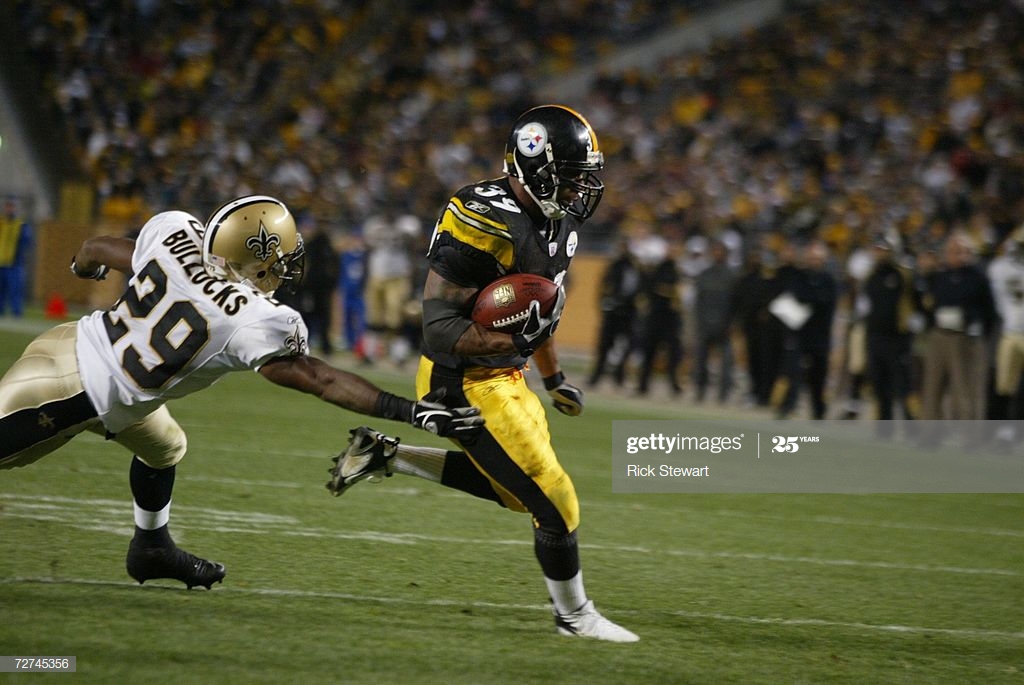
Shiny pants only look good for certain teams. The Steelers looked bad in shiny pants compared to when they wear matte.
The Saints looked way better with the shiny gold pants back then, but now they have a weaker look in the matte fabric.
-
14
-
 2
2
-
-
In other news, the Steelers have been posting some media day pics and players are still in the Vapor Untouchable template. Not sure if that'll be the case during the season, but TJ Watt, George Pickens, and Pat Freiermuth are still wearing it.
-
8 minutes ago, CitizenTino said:
Are the authentics for these ASG uniforms a preview of the next template for MLB teams? It’s long past time to replace the Majestic version with the awful side panels.
They are indeed. I think the template looks really nice and honestly seems less egregious with the paneling that the soon-to-be previous Majestic template. Nike's college teams need to start switching to the MLB template next year too.
-
1
-
-
10 minutes ago, Survival79 said:
The third one with the black inline stroke definitely looks the best.
-
9
-
-
7 hours ago, andregunts said:
So I was at the adidas store NYC 2 days ago and I saw the Mexico women’s away and I was tempted to buy it but I decided not to because the men will never wear and then tonight I turned on the Haiti vs Mexico game and lo and behold. I’m going back to the store asap, that jersey is fire
I feel the same way about the Germany women's away jersey. It's dope, but they aren't selling it in men's sizes at the moment.
-
1
-
-
We now have our 4th Terminus Division team in the Grant Park Troop. Zoo Atlanta is located in Grant Park, where the famous Willie B. gorilla was born in 1961. A group of gorillas is called a Troop, hence the name.
NOTES:
SpoilerCrest
- Side profile of a gorilla
- Zig-zag pattern is inspired by one of the Zoo Atlanta logos
Primary
- Utilizes a zig-zag pattern like the logo
Clash
- An ode to the team's namesake and the former Atlanta Silverbacks soccer club, a gradient representing a silverback gorilla is found on the back of the jersey
-
3
-
-
Wait...people actually think the Red Sox city connects look good?
-
10
-
2
-
-
-
21 minutes ago, DCarp1231 said:
Some Patriots uniform rumors
Interesting to see some fans in the replies to that tweet clamoring for white pants on the road. I'd like to see it, as it would allow the look to not be so bottom-heavy.
-
1
-
-
Apologies for the delay between teams, it was a hectic week.
Next up we have a carryover team in King and Queen FC. The club is named after the two famous buildings of the same name that can be found in Sandy Springs.
NOTES:
SpoilerA larger view of the crest...
Primary
- The horizontal stripes are based on the pattern on the outside of the K&Q buildings.
Clash
- This is similar to the design used on K&Q 1.0, where I used a 90s-inspired geometric pattern
-
5
-
-
27 minutes ago, MJWalker45 said:
It gives the appearance of being an inferior copy of the Chelsea badge in new colors, like when supporter groups make their own badges instead of just using the official club badge.
This is actually really cool. It's easily recognizable as a Man U supporter group and has localized iconography without taking away from the identity of the club it supports.
-
5
-
-
As a fan of the team, I'm pretty meh on it. It looks like a modern version of the late 70s uniforms, which is fine, but I'd rather them have just replaced the black road alt with a throwback and then done something completely different with the CC. Honestly, a steel/charcoal/gunmetal grey uniform with yellow as the main secondary color would've slapped. I do really like the font though, and wish they had used it on the hat as well.
-
The lack of gold on Washington's away uniforms just baffles me.
-
7
-
-
1 hour ago, Discogod said:
Doing my weekly shop at my local supermarket and I saw a mobility scooter parked in the entrance atrium totally decked out in Alabama gear, including a huge "Roll Tide" sign on the back. Didn't get a chance to see the person who owned it, but it certainly struck me as an unusual sight for this part of the world.
You sure you weren't in Birmingham, Alabama?

-
1
-
 1
1
-
-
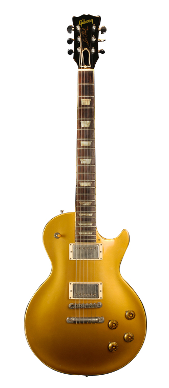
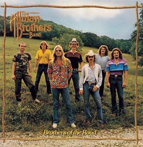
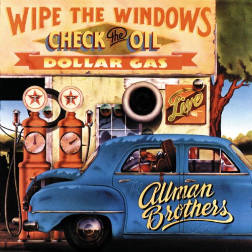
We now head to Middle Georgia for our first team in that region of the state, the Macon Ramblers. The Allman Brothers Band was based out of Macon, and what's arguably their most famous song is called Ramblin' Man.
NOTES:
SpoilerI have included a larger view of the crest, since it appears rather small on the presentation template.
Crest
- The MR monogram is based on the A and B on the Brothers of the Road album cover
- The guitar is a silhouette of the 1957 Gibson Les Paul used by Duane Allman
- The colors give off an early 70s vibe and are taken from the Nashville Sounds unused color scheme from their 2014 rebrand
http://ecx.images-amazon.com/images/I/61tuhsq0PoL._SL500_.jpg
Primary
- Features a sash representing the standard six strings of a guitar
- The number font comes from the Wipe the Windows, Check the Oil, Dollar Gas album cover
http://ecx.images-amazon.com/images/I/61fgwcnfUbL._SL500_.jpg
Clash
- The shirt is based on the album cover for The Road Goes on Forever
Oh, and I took @TheGiantsFan 's suggestion and made the league 5 divisions of 8 teams now.
-
3
-
1
-


![[Flag of Brunswick, Georgia]](https://www.crwflags.com/fotw/images/u/us-gabru.gif)


NFL 2023 Changes
in Sports Logo News
Posted
Alright Steelers, it's your turn to bring back a throwback.