


GriffinM6
-
Posts
8,382 -
Joined
-
Last visited
-
Days Won
2
Posts posted by GriffinM6
-
-
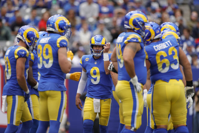
I think there is pants striping. Look at the reflection on the right side of the Cal McNair picture. You can see a horizontal red stripe and a thin white stripe. Seems similar to the Rams' yellow pants design.

-
 2
2
-
-
Is the yellow on the Scotland home the same as the yellow on the crest or is it more neon/volt? It's hard to tell in the picture above.
-
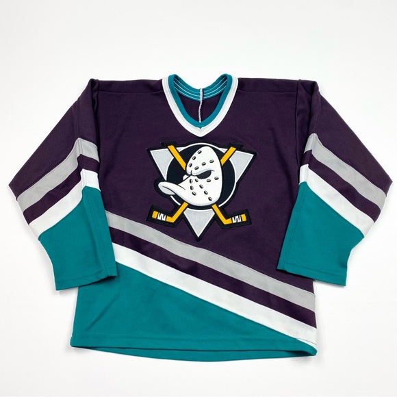
I've got quite a few hats that are from teams I'm not a fan of but they look nice; purple D-Backs throwback, Missoula PowderHeads seafoam green, teal Cuyahoga Community College Triceratops, pink Pensacola Blue Wahoos. The only jersey I own because it looks nice and is my favorite hockey jersey of all time is this bad boy right here...
-
2
-
 2
2
-
-
6 hours ago, spartacat_12 said:
A facemask in football is like the chin strap of a hockey helmet. Do you ever hear people complaining about teams like the Habs or Rangers having black chin straps on their helmets?
This is just a ridiculous statement. Football helmets have chinstraps too. The facemask is a focal point of the thing that fans identify most with a football team. Clearly there's a difference between these two helmets (You can come to your own conclusion on which one looks better):
-
3
-
-
2 hours ago, dont care said:
I’m just tired of the first day after a free agency move or trade a guy gets put on here when they only played a handful of seasons for one team. 28 is older for a running back but if he’s any good he’ll have atleast 4 more years, and who knows how much success he’ll have
He spent 7 years with the Chargers though. It's most definitely his right uniform.
-
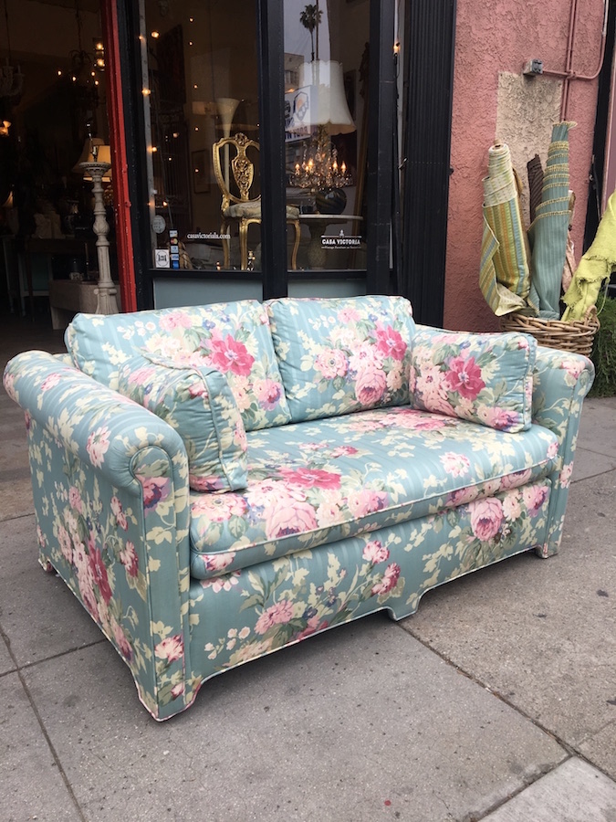
6 hours ago, TrueYankee26 said:
Looks like a grandma couch.
-
1
-
 1
1
-
 1
1
-
-
1 hour ago, DTConcepts said:
I think the Avs would be better off doing the opposite and darkening their shade of blue, similar to the Nuggets. Would certainly solve their contrast problem. Here are some examples I hastily Photoshopped in 10 mins to illustrate.
If you're going to darken the blue, you've gotta lighten the red slightly. Otherwise, you'd run into the same problem the Charlotte Knights did with their former brand.
-
1
-
-
When teams use the color fill spots sparingly or just use the main color, the template looks fine, but when they use the contrasting back it looks terrible. That Colombia shirt compared to the Spain home is a clear example of this.
-
3
-
-
1 hour ago, CaliforniaGlowin said:
NBA has a 5 year rule too? I thought that was just NFL.
AFAIK it does. The Hawks changed to their current look after 5 seasons in the neon diamond unis.
-
Not a thrift store, but I found this at Dick's on clearance today for $17. I *think* it's a replica, but I could be wrong. The wordmark is double knitted and heat applied, while the NOB and number are faux stitch heat applied. I assume it's a replica too because there's no swinging friar on the sleeve.
-
If the expectation is that this stuff is fixed by opening day, I wonder if they're just going to use the old template for on-field uniforms and sell the crappy one to fans for 2024 only. They have to still have plenty of that in the factory inventory I'd imagine.
-
19 minutes ago, Ark said:
Bruh I didn’t even realize “ballsack camel toe” existed until that pic
Thanks Nike
You've never heard of one of these?!
-
1
-
-
Picked up a Nike Michael Harris II Braves shirsey at Goodwill a few weeks ago for $3. Just imagine the pic below but with a Nike swoosh over the B.
-
5 minutes ago, CitizenTino said:
This is interesting. The backlash from the players over the new uniforms has gotten so loud that the union is now getting involved and demanding remedies. I doubt we are going to see wholesale changes, but I think things for MLB/Nike/Fanatics have gotten past the point of hoping this just blows over if they wait it out.
This is very promising. Hopefully fans can hold out for a year from buying new jerseys and they revert to the previous templates or a better version in 2025.
-
3 hours ago, PaleVermilion81 said:
This is the last I'm going to post on this kit. As a MNUFC fan it just depresses me and I'm letting it go and counting down to the 2026 replacement (and hoping we have a manager by then). But this is literally all I see when I see the new kit:
Plus
Equals
That would make this kit even cooler. Thank you for the visual.
-
1
-
1
-
-
39 minutes ago, Sec19Row53 said:
Too much stock on hand to change.
Exactly. Hopefully this is just a one season thing though. If they can make the right moves, hopefully better products come in 2025.
-
1
-
-
1 hour ago, Silver_Star said:
The original had more flare and it was more italicized. This one is the logo they use for the legacy helmets. I wish it was on a green background and white lettering instead of reverse, but I got this from The Wiki.
This should be named the new primary. No changes needed. I've said it before on here, and I'll say it again, this logo looks like it could've been released today. Just like the Bills and Miami Hurricanes logo, it's timeless despite being released over 40 years ago.
-
11
-
1
-
-
Disappointing honestly. I was hoping they'd do a pattern that looks like a nebula instead of just a solid purple shirt.
-
4
-
2
-
 1
1
-
-
This might be the most egregious example in showing the difference between the former and new version. Absolute dog$h!t.
-
 1
1
-
-
I still think the Jets would be better off making minor tweaks to the Sack Exchange uniforms. I'd like to see them keep the current unique block font rather than go back to a generic one. A small Jets wordmark at the base of the collar wouldn't be too shabby either.
-
1
-
-
I gotta say, I'm super excited for the 8 games in Atlanta. Hoping to catch one or two while the tournament is going on.
-
1
-
-
I literally squealed seeing the new Atlanta kit. This is fantastic. I'm buying it as soon as it releases and hopefully they sell a powder blue cap on the team store as well.
-
3
-
1
-
-
Dallas' new home kit has leaked. It's just the back, but it seems obvious it's trying to evoke the Texas flag. Not a big fan of the way they did it. It reminds me of those dumb mid-2000s Nike college football jerseys.
-
2
-
 2
2
-
-
15 minutes ago, Jezus_Ghoti said:
Maybe a weird question (and maybe I am missing an obvious answer) but has there been a major championship game in another sport featuring 2 logos that are as conceptually similar as these? Both based on 2 overlapping letters representing the city. Very similar font. Colors somewhat similar.
Both also include black, but there's no black to be found on the uniforms (sans helmet decal).
-
9
-


.jpg)


2024 NFL Changes
in Sports Logo News
Posted
Wait a second...