


GriffinM6
-
Posts
8,419 -
Joined
-
Last visited
-
Days Won
2
Posts posted by GriffinM6
-
-
The Citronaut looks great. Would love to see some full-body versions of him playing different sports.
The USF logo doesn't do it for me though. I understand that you went for a realistic look for the Brahma, but as it stands right now, it doesn't look very intimidating. I do love the negative space palm tree though.
-
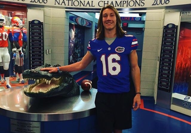
Came across these pics last night on College football twitter. Here's Trevor Lawrence on some recruiting visits to Tennessee and Florida.

I'm sure there are plenty of other guys who were elite CFB players you could add to this thread.
-
 7
7
-
-
27 minutes ago, Magic Dynasty said:
Seems a player's leaked the existence of orange and black alternate helmets for Tennessee.
I feel like those could just be for recruiting visit pics. Seems weird they wouldn't put stripes on either helmet.
Also, that Youngstown state helmet looks ridiculous. Might as well just put the use the whole beanie as a decal lol.
-
Really like the use of the axe handle grip! The number font looks great as well.
-
2
-
-
16 minutes ago, oldschoolvikings said:
We’re in a really weird place with design right now. Do you know that most people, when designing on a computer, work really hard to make it look as though it wasn’t made by a machine? If you told the average professional designer “hey, I like your work, it looks really computer generated” I doubt they’d take that as a compliment.C'mon OSV, you know what I mean...
No one wants to see this logo return in the way it's designed above because of how poorly hand-drawn the dolphin is. It needs to be somewhere in between the 1997-2012 dolphin and this one.
When I say "rendered on a computer", I mean making it look like it was made using graphic design software.
-
7
-
-
4 hours ago, Ridleylash said:
So basically the logo they had in the 2000's?

Something similar would look good, but not an exact copy of this (navy-excluded).
-
3
-
-
While I agree that the Dolphins need to go to the throwback uniforms, there still needs to be some tweaks.
1. Updated logo that looks like it was rendered on a computer
2. Less thick number outlines
3. Consistent helmet and pants striping
-
13
-
-
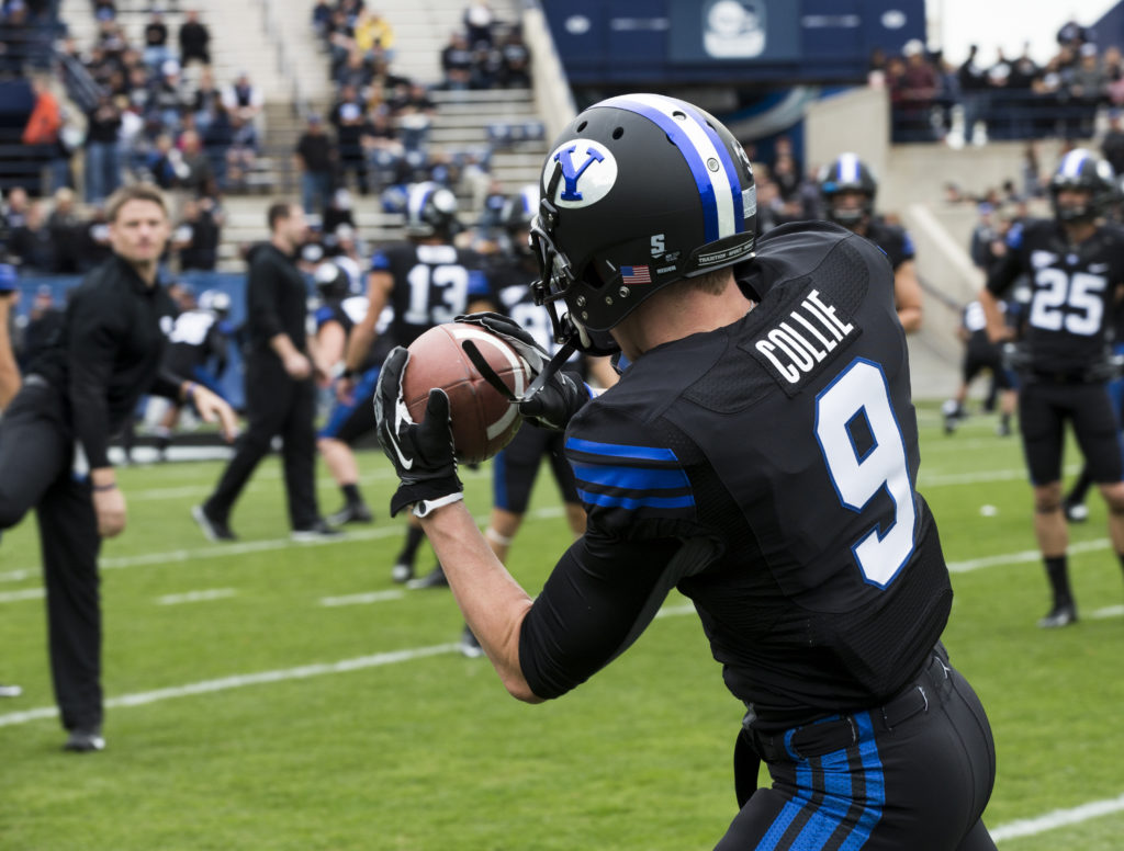
19 hours ago, Mingjai said:
BYU announced updated blackout uniforms for Shamrock Series game vs Notre Dame. I’m a fan of BYU’s traditional uniforms, so not a fan of the gradient helmet. But at least they’re not using the inverted colored logo (white oval, blue Y) they normally use with their blue helmets.
https://twitter.com/BYUfootball/status/1576934572448567298?s=20&t=Mn8vNFHQXQW7p7nkpmCyiQ
Here are BYU’s previous blackout uniforms:
That's a shame. This would've been a great looking game if BYU were wearing royal.
-
4
-
-
51 minutes ago, Cujo said:
Nah. These ain't it.
It's funny because I think they look great on tv and bad in this picture. Maybe it's because the pants stripes aren't visible here.
-
Those New Zealand hats are awesome.
-
4
-
-
27 minutes ago, nuordr said:
New scoreboard and uniforms for the Minnesota Twins next year.
Since you cannot see the whole article as it costs money, here it is:
Construction cranes are working behind Target Field for the North Loop Green building that will be completed by 2024.The three-game series with the White Sox starting Tuesday at Target Field will be the final time that fans will ever see Luis Arraez, Joe Ryan and Jhoan Duran in Twins uniforms.Oh, the players will probably be back next year. Those uniforms won't.The Twins' offseason will include some substantial and noticeable changes, and not just to a roster that fell well short of its goal of winning the AL Central. The ballpark, the team's logos and the winter calendar will be distinctly different in 2023 — starting with the clothing on the players' back."Our uniforms are going to evolve and take a step toward the future. There is always a sensitivity to paying respect to the history and the heritage of the franchise," team president Dave St. Peter said. "But there's also a desire to move it forward, much like we did in the mid-'80s."Will fans appreciate a new look? "Well, that reaction is always in the eye of the beholder," he said of a topic that always generates debate among fans of any sports team.The uniforms, which are complete but won't be revealed until after the season ends, are just the most obvious aspect of a general rebranding of the 62-year-old franchise, St. Peter said, one that will include "tweaks or in some cases, more than that" to the team's brand identification: the lettering, the logos, the look of the team. The colors won't change — "This franchise has embraced the base colors of red, white and blue since 1901," when it was the Washington Senators, St. Peter pointed out — but he believes a new look is well-timed."We're in a little bit of a different world today, and we've seen several brands go through a refresh. The Padres are a great example — they went with a refresh that actually reached back to their origins, but they did it in a really bold, dynamic way," St. Peter said of San Diego's re-embrace of its brown-and-gold, swinging-friar history. "It wasn't just a cookie-cutter of what Steve Garvey wore in 1984. And our goals are the same. How do you pay tribute to that history and heritage, but do it in a very modern way?"The team also will introduce a special City Connect uniform, a distinctive and nontraditional look that will emphasize some aspect of Minnesota culture, sometime next summer, but the team won't wear them until 2024. City Connects have been wildly popular with fans in other cities, and the Twins hoped to include theirs next year, but MLB is staggering their introduction with just a half-dozen or so each season.Minnie and Paul, their handshake across the Mississippi having symbolized the Twin Cities since 1961, will still be part of the franchise's icons and will continue to loom over center field in Target Field. But that logo, too, will be "tweaked," St. Peter said.Caravan returnsThe team's offseason schedule, disrupted by COVID-19, has been restored, he said, with the winter caravan across the upper Midwest planned for mid-January, the first in-person Diamond Awards banquet since 2020 set for Jan. 26, and TwinsFest to follow on Jan 27-28. The festival will be different, St. Peter said, and will only partly be staged at Target Field."We're working on some changes to what TwinsFest means, and how we can engage our players with the community," he said. "There will be changes to the scope and the lineup, doing some things a little differently to expose our brand to younger demographics. But we also understand that there is a core group of people who love to gather here and speak the gospel of Twins baseball every January."New scoreboardsWhile at TwinsFest, fans will notice a few big changes at Target Field. There will be cranes on the field from November to early March, installing new scoreboards, including a huge video board in left field that is 76 % larger than the current one. The $30 million project, with costs shared by the Twins and the Minnesota Ballpark Authority, will upgrade and in most cases expand every video board in the ballpark, with some new video hardware added.Have to admit, this article scared me at first until the paragraph referencing the Padres came up. I'm intrigued to see what they come up with.
-
5
-
 1
1
-
-
2 hours ago, Durden said:
That looks even worse than I imagined. Just f'ing awful!
My reaction to that information:
*Even as a Steelers fan, I like the look*
-
11
-
 2
2
-
 1
1
-
-
13 minutes ago, NH4 said:
Ole Miss going with hunting camo because of their partnership with Realtree…
Looks like they painted their powder blue shells white and the paint is chipping away.
-
8
-
1
-
-
5 minutes ago, SSmith48 said:
They've pulled out silver on black for the spring game, and I don't think it's a horrible look, but it is not as good as the standard home/away sets, and the all-black is certainly much better from an alternate standpoint.
Silver numbers on the black would really improve the look.
-
1
-
 1
1
-
-
1 hour ago, Ridleylash said:
Tempe wants a pro sports team in their city, they want a tenant to develop the compost yard into something that doesn't constantly set itself on fire, and the Coyotes not only provide both but also have ASU's backing, who basically run the city.
Idk man, seems like the Coyotes do their fair share of that already.
-
2
-
5
-
-
I like the font for CSU, but the sleeve striping gives off a wing vibe. I think you could probably utilize the swords instead and still give them a distinct look.
-
1
-
-
The heavy usage of white on the gold alternates really brings them down for me. There's no excuse for there to be any white on that jersey when they have 3 dark colors they could use in place of it.
-
6
-
-
When you thought the US kits were bad, at least we aren't Denmark...
-
1
-
-
1 hour ago, infrared41 said:
It won't. I don't like monochrome.
It isn't monochrome though.
-
7
-
1
-
-
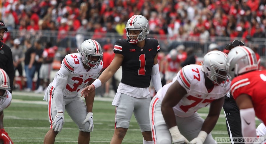
Really like the Purdue vs. Syracuse uni matchup.
-
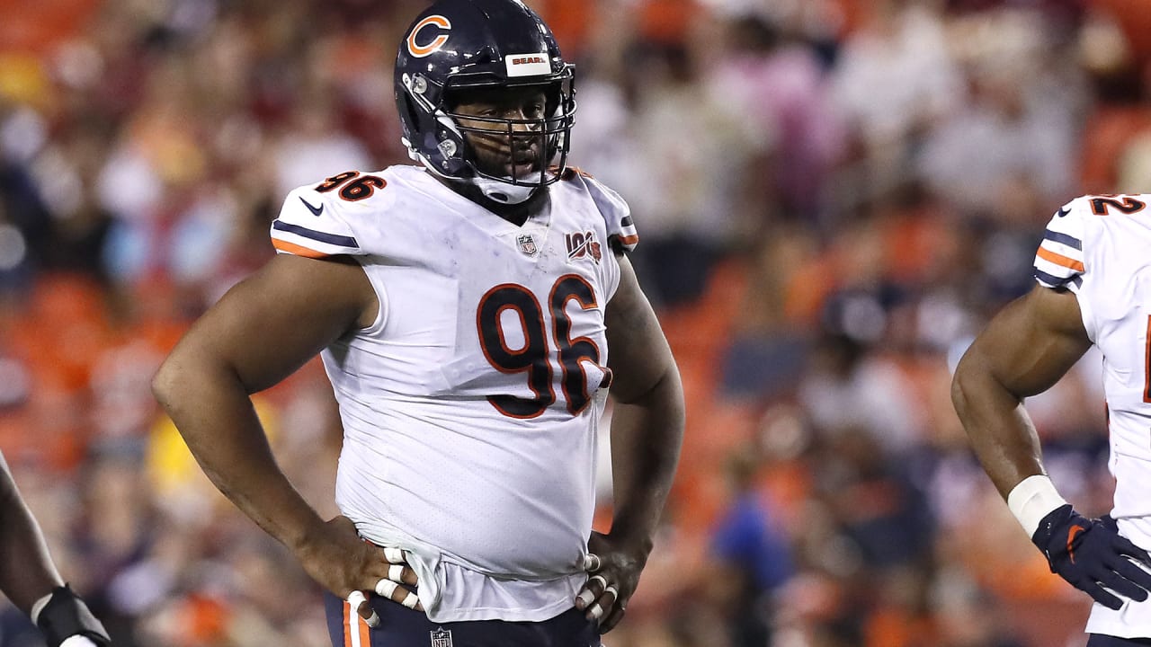
2 hours ago, BBTV said:
I guess by the dictionary definition of 'stripe' that you're correct, but I'd hardly consider this in the spirit of what a stripe is for.
I'm not sure how anyone who cares for stripes would be against the vertical idea since that's the only way you'll ever see a full stripe outside of a retail jersey.
Even the guy on the right side of the Bears picture looks bad to me because there's no logical termination of his stripes. They just disappear into the body of the jersey. That's now how they were ever intended to look.
The issue isn't really the stripes themselves. It's the Nike logo that pushes everything down a bunch. In college it looks fine.
-
6
-
-
6 minutes ago, Kg54mvp said:
These would look better if the number and shoulder area were filled in with their lighter shade of blue.
-
2
-
-
I really like the gradient on the collar and cuffs. Honestly think it would be better if the numbers and wordmark were solid white though.
-
Didn't see this other slate of unveilings get posted.
I already mentioned how much I like Wales' set for the World Cup, so I'll take the time to say I really like Chile's away kit with the sublimation. Their shade of blue is fantastic as well.


:format(jpeg)/cdn.vox-cdn.com/uploads/chorus_image/image/52030207/usa_today_9708288.0.jpeg)


2022-2023 NHL Jersey Changes
in Sports Logo News
Posted
Completely disagree. The orange sticks out like a sore thumb. The black and silver are neutral and work very well.