


GriffinM6
-
Posts
8,419 -
Joined
-
Last visited
-
Days Won
2
Posts posted by GriffinM6
-
-
21 minutes ago, colinturner95 said:
After watching game 2, I realized another thing that infuriates me about the Lightning besides the fact they keep winning:

The primary logo is contained within this Incredibles-esque oval shape,
But their shoulder logo bolt is contained within a perfect circle.
The amount of Lightning concepts I've seen on these boards where people extract the roundel bolt from the secondary logo is too many to count. They all seem to look better than what the team actually went with though.
-
44 minutes ago, DouglasQuaid said:
I'm still waiting for the return of the superior classics.
Needs the superior number font.
-
 10
10
-
 3
3
-
-
With all this discussion about teams going with non-grey away uniforms, I'm going to a shameless plug a few concepts for a series I did back in 2020.
-
4
-
 2
2
-
1
-
-
For me, the only full-time change I'd like to see to the Heat brand is to include the orange that used to be on their 90s uniforms. Either replace the yellow with orange, or use it along with the yellow. The orange could even be a lighter shade than it used to be too.
-
6
-
-
For the love of God, please just move this franchise already.
-
6
-
-
That update looks fantastic! The third uniform is definitely my favorite.
-
1
-
-
Absolutely love the updated EMU logo, but I'm not really feeling the uniforms. They look way took much like the Adidas stock template they wore in the mid-2010s. Also, grey looks great as a third color in their scheme. I think it would improve the look if you added it in some places.
-
1
-
-
UCF: Great job using the sword striping throughout the uniform. Any reason you decided to angle the striping on the jersey, rather than making it horizontal (like the current Jets uniforms)? Additionally, I'd love to see you do a gold jersey and Citronauts uniform for this set.
App State: Great idea going with the double stripe. My only suggestion would be to make the "A" logo filled in with white like it was back in the day.
-
2
-
-
4 minutes ago, spartacat_12 said:
Well they literally just swapped the gold & white portions of their away jersey.
And they made the wrong choice. Should've just swapped the grey and gold from their home jersey.
-
2
-
-
Golden Knights' gold jersey would look way better if there was no white on it. There's really no need to have any of the color on the jersey at all. It looks so out of place.
-
2
-
1
-
-
17 minutes ago, coco1997 said:
Another Astros City Connect tease:
Looks like orange numbers outlined in yellow. This should be pretty good looking. I'm hoping they include some quasars in the design like the LA Galaxy do.
-
On 4/2/2022 at 3:14 PM, upperV03 said:
Timbers 2 (which was supposed to be rebranded at some point) have new black primary shirts this year with Tillamook cheese as the front sponsor. I don’t want the first team to ever adopt black primaries, but I actually like how the black/green/gold combo looks for the second team. I LOVE the Tillamook sponsor logo, and I would not be opposed at all to seeing the first team have that if they ever lose the Alaska Airlines deal (though I’m hoping that deal keeps going for a long time).
I will say, it’s unfortunate that the names/numbers are white as well as the adidas logo & stripes on the socks:
As a huge fan of Tillamook ice cream, I'm very happy to see them sponsor a kit. Maybe they'll make their way onto the first team's sleeve in the future.
-
1
-
-
I'll be honest, this is probably the weakest one so far. Disregarding the colors, it's way too similar to Montana's current plate.
I'm not sure what other direction you could take this, since I don't know too much else about Idaho, but this could definitely use some improvement.
-
2
-
-
Wow, this is probably the best one yet. The idea to make a unique plate and emphasize each island on a flower is absolutely brilliant. It's gonna be hard to top this.
-
1
-
1
-
-
Yeah that's really nice. Good on them for not making the blossom pattern on the jersey too loud. It allows for the pink and cream(?) elements to shine.
-
As a Georgia resident, I'm loving this. I think it would go over very well if the change were to happen in real life.
-
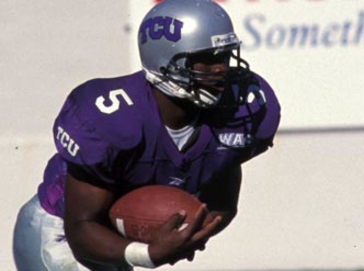
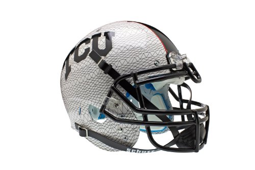
2 minutes ago, WSU151 said:
I wish TCU would bring back a silver helmet (as an alt if not the primary). I always thought these were a nice look (albeit simple) but if they added the frog skin helmet stripe to this, it could look pretty cool.
I feel like the frog skin pro combat helmets were good ways of using silver/grey. With them being in the Big XII along with Kansas State, the black used in these helmets helps differentiate the two teams.
If they were to bring these helmets back though, I'd like to see some purple in them, preferably in the thick stripe and wordmark.
-
2
-
-
-
Terrible
-
4
-
-
The entire English Premier League is missing from the site.
-
UCLA needs a Clarendon font. Other than that, not much you can do with either of the LA schools.
-
2
-
-
15 hours ago, dont care said:
Only one I’d say that isn’t an improvement is the Colorado one. Colorados current one is completely unique and immediately identifiable. Yours looks like any other blue license plate at a distance, only thing that makes it slightly different is the jagged line.
I agree with this as well. I think you could keep the same design, but use green, white, and grey instead of the flag colors. Colorado is the only Western state that uses green as far as I'm aware. The only other two state that use it are Vermont and New Hampshire AFAIK.
-
3
-
-
2 hours ago, officeglenn said:
We got new Ireland home kits today:
I like the sleeve cuffs design, but it reminds me more of a rugby jersey than a soccer one.
-
4 hours ago, sayahh said:
The new all-yellow/black jersey might be better in yellow and green and just rename them as the Utah Ducks and get it over with.
There it is! I couldn't figure out what it was about the new Jazz font that looked so familiar. It's just Baylor's but without the notches.
-
3
-
 2
2
-


Megaconference College Football by Hawkeye15 (Washington & Wazzu ... the end)
in Concepts
Posted
The most recent three look fantastic. I especially love how you included more red in GSU's look than what they currently use.