


GriffinM6
-
Posts
8,419 -
Joined
-
Last visited
-
Days Won
2
Posts posted by GriffinM6
-
-
1 hour ago, gosioux76 said:
I'll always defer to the native Floridians when it comes to whether wearing white vs. wearing a color makes a difference when it comes to the heat.
But for the Dolphins, I could very much see heat as being the origins of what is now a tradition of wearing white at home, especially considering how football jerseys in the early '70s were constructed. By comparisons to today's fabric technology, those jerseys were like wearing a weighted blanket.
The thing with the Dolphins and Jags though is that they already have a very bright color for their home jerseys. The Bucs, I guess, have a better excuse early in the year because they wear dark red. Hopefully they'll do less WAH next season when the creamsicles return.
-
 3
3
-
-
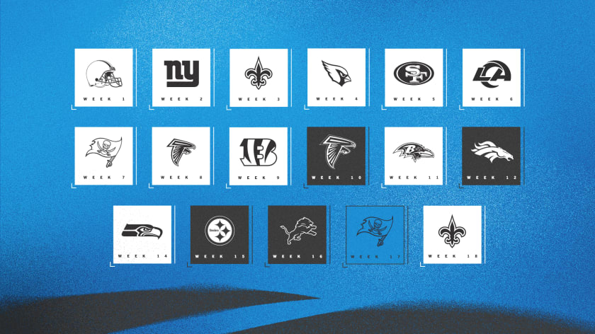
8 minutes ago, DCarp1231 said:
Panthers jersey schedule-

Not quite Cowboys level of white jersey absurdity, but damn near close to it.
Lol 12 games in white is absolutely terrible.
-
8
-
-
I like the design with the asymmetry, but I think the right side of the uniform feels pretty blank. Maybe put the sleeve stripe on the right side and leave the leg stripe on the left to offset this?
-
2
-
-
3 minutes ago, throwmesomepics said:
Teams can wear bfbs or all black but it’s so much better when there’s at least one contrasting element.
Panthers all black worked with blue socks.
Eagles bfbs would work with green helmets and either white or green pants, and black socks
Jaguars black t shirts with numbers look good with teal yoga pants
And black over purple is one of the ravens best combos
Steelers have been doing it for decades.

-
1
-
 1
1
-
 4
4
-
-
I like the Boise State look. The only thing that would make it better is increasing the size of the helmet logo. Maybe not make it as big as it currently is, but as it is right now, it appears very small.
Utah State looks nice, but that 9 is ROUGH. Maybe try a different number font.
-
2
-
-
That Mexico away is so nice. Love the purple for Argentina too. I'm wondering why Japan has a yellow front number though. Have they included yellow on the primary kits in the past?
-
Those ND uniforms are sweet. My only gripe is that there is very little blue on them. The shoulder stripes would probably look better with the white being filled in with navy.
Those Hawaii helmets though...those are sexy.
-
5 hours ago, pepis21 said:
Sides are nice but it will has Satx on front.
unconfirmed but Wolves were absent from that massive leak from Ferbuary
Was the screen messed up when they were making these?
-
2
-
-
I'm going to my first Cubs game on August 20th. Going with a friend who just moved to Chicago but has been there dozens of times. Would love some pointers on some fun pre-game and in-game stuff.
-
Love the changes to the striping on K-State. The alternates with lavender look fantastic too.
-
1
-
-
I like the return to traditional striping, but these suffer from the same syndrome as Miami's original Adidas uniforms. Traditional striping that's ruined by shiny chrome plastic numbers and stripes.
-
1
-
-
27 minutes ago, TruColor said:
Anyone else seen the Cardinals' alt helmet?
-
1
-
-
I can't seem to find any pics of games in Philips Arena with these uniforms, but I do remember watching Hawks home games on TV where they'd wear these.
-
1
-
-
Sunderland's home kit for this season dropped last week.
-
Definitely the best alternate helmet unveiled so far. Love the finish on it and I'm glad the facemask is blue.
If they wore this for a road game, I'd love to see it with blue pants and red socks.
-
8
-
-
That Washington plate has got to be top 5 in the series so far for me. The intricate details really do a great job of representing the state.
-
Albert coming back to St. Louis for one last season puts him in this category.
I searched for over 15 minutes for a picture of him in the cream "St. Louis" alt, but couldn't find any.
-
2
-
-
What helps with San Diego's look is that it's on a white base. The colors look nice together too. I'm intrigued to see the whole thing.
-
1
-
-
14 hours ago, Germanshepherd said:
ACC becomes first P5 to officially nix divisions
A lot of stupid yearly matchups were settled here. I'm pretty annoyed Miami isn't gonna be playing VT every year anymore.
-
1 hour ago, GFB said:
have these been posted yet?
they may just be knockoffs based on the early leaks
Terrible. I'll gladly be sticking with my navy 2010 WC jersey.
-
I am super excited to see Atlanta get selected as a host. I plan to be living abroad by 2026, but I will definitely make the trip home to watch the WC in my backyard. Started saving up my money as soon as the announcement was made.
-
Great job keeping the same general idea for SC while improving on what they already have. Love Puerto Rico as well. The bright blue looks great.
-
-
Love the simplicity and unique pattern used for WMU. CMU looks great except for the number font. I like what they use currently.
-
1
-


College athletics identity changes
in Sports Logo News
Posted
Did they completely get rid of gold?