


GriffinM6
-
Posts
8,419 -
Joined
-
Last visited
-
Days Won
2
Posts posted by GriffinM6
-
-
Some good looks so far, but I definitely agree that you need to use some more unique fonts. Regarding Xavier, I think it would look better if the X went directly across the shoulders like the old Texas A&M jerseys. Also, maybe try adding more grey to the jerseys and pants on that set.
-
I'm hoping that if they bring back the RR programs next year, the Penguins use blue. Seems a lot of fans, including myself, have wanted a blue alternate to come back ever since the disappointing yellow alt was introduced.
-
On 5/28/2021 at 9:37 PM, Crabcake said:
Double whammy on Yelich with the orange helmet.
You know that's Logan Morrison, right?
-
 1
1
-
-
This Italy vs. Austria match is absolutely beautiful. Amazing contrast and good on both team for wearing their primary looks.
-
2
-
-
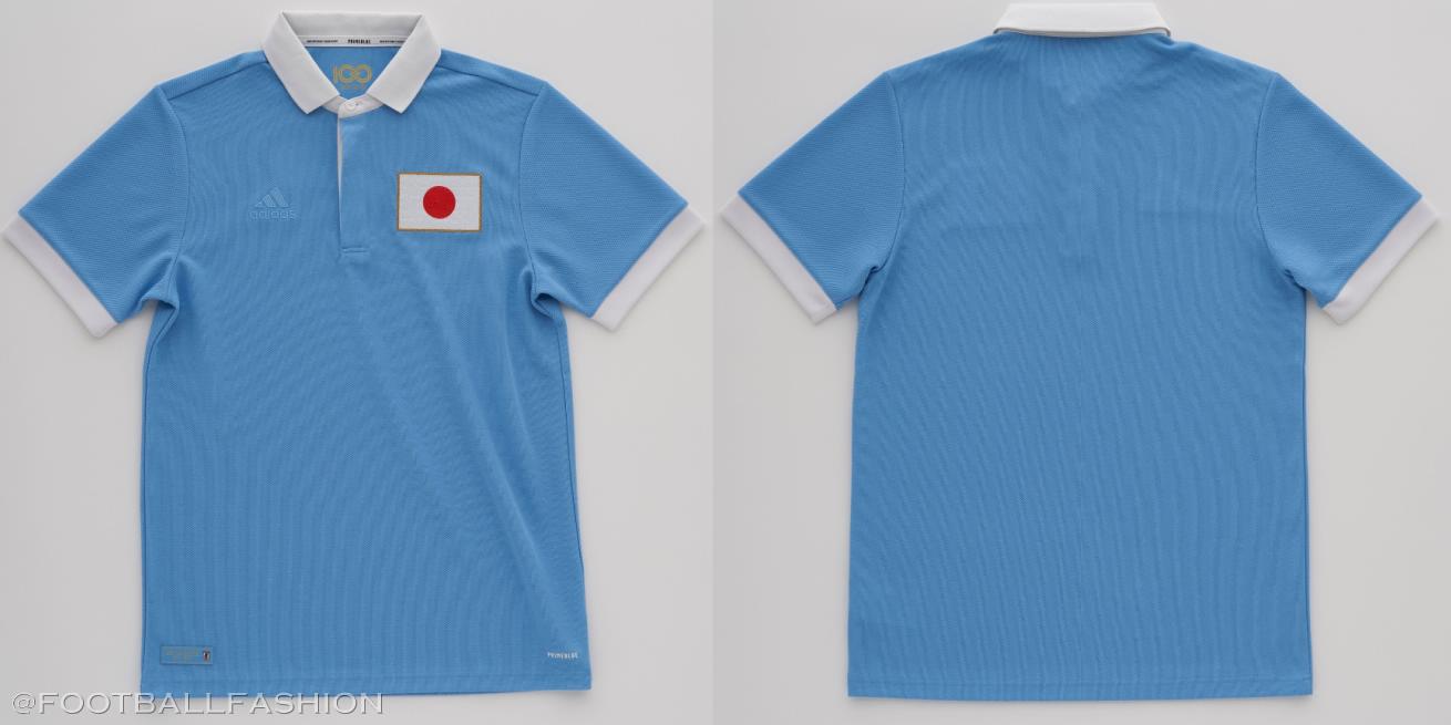
Japan unveiled a classy throwback kit to commemorate their 100th anniversary back on May 20th.
https://footballfashion.org/wordpress/2021/05/20/japan-fa-100th-anniversary-adidas-kit/

Peru is sporting an amazing Inca inspired set for this year's Copa America.
https://footballfashion.org/wordpress/2021/06/11/peru-2021-copa-america-home-and-away-kits/
-
4
-
-
Rockies vs. Athletics this year. Mentioned in the MLB thread how great the colors in this uni matchup looked.
-
3
-
-
Regardless of the notion of any people worrying about Islamic imagery similarities, 1 and 3 are the best looking of that bunch. The negative space "E" in number 1 is particularly clever.
-
6
-
-
18 hours ago, nash61 said:
If it comes down to diagonal-text Avs alternates, I still prefer this one.
Random: But every Av in this photo except Skoula is in the Hall of Fame

Okay...I'm really annoyed that I never noticed the sleeve stripes don't match the hem and socks. I'm never gonna be able to unsee this now.
-
1
-
-
51 minutes ago, guest23 said:
It's better but why the oval? If you want to evoke the jet imagery without a plane, the '78 logo is a perfect start as it really evokes era of jet-set era airline logos.
There's just something I've always loved about this logo. It looks like it could have came out today, but it's what? 35+ years old? It really feels timeless, and they should've brought it back in their most recent rebrand.
-
5
-
-
On 4/28/2021 at 4:35 PM, JayJaxon said:
I have a new template I have been working on for several months. I have completed some of the teams already but I wanted to get pretty far into the process before showing it off for the first time. I may also use this thread to show teams I have completed so errors can be pointed out. Take a look and let me know what you think:
I'm definitely late on seeing this thread, but great work as usual on this stuff. Quick question, would you mind posting a picture of these tan colored stirrups? I'm intrigued by these and would love to see what they look like on an actual player.
-
1
-
-
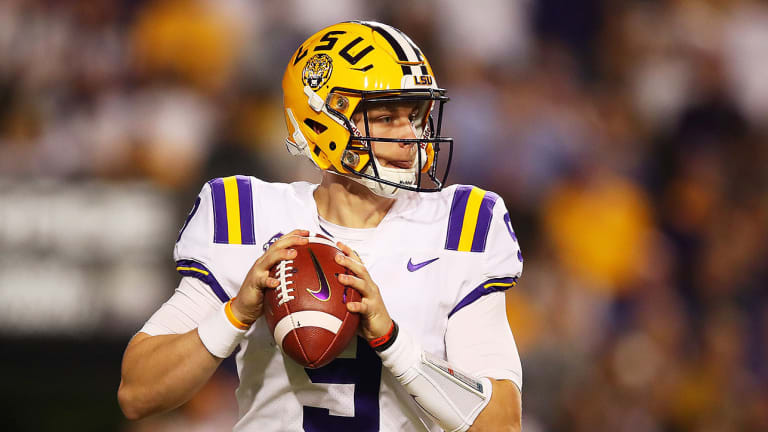
13 hours ago, WSU151 said:
They’re pretty consistent, IMO... red stripes with the middle stripe being the same as the number color (and the inverse of the jersey color)
They may be consistent, but they don't look as good as the other option. Let's look at LSU for example...
Their uniforms would be an eyesore if the purple and yellow were flipped. The current Pats would look better with the darker color on the outside. Miami suffers from this problem too on their white pants in contrast to their helmets. It's usually best to have the darker color outline the lighter color when it comes to striping on a white or grey jersey.
-
4
-
-
1 hour ago, TenaciousG said:
The Patriots’ current uniforms are almost perfect. They just need to go silver pants at home instead of monochrome:
But since they insist on COLOR RUSH
 , or maybe because Robert Kraft or someone in the organization has bad taste, they look incredibly dumb in their primary uniform.
So for now I will just sit back and enjoy the Patriots sucking at both football and aesthetics.
I think it would also look better if they flipped the red and blue stripes on the silver pants and white jerseys.
-
3
-
-
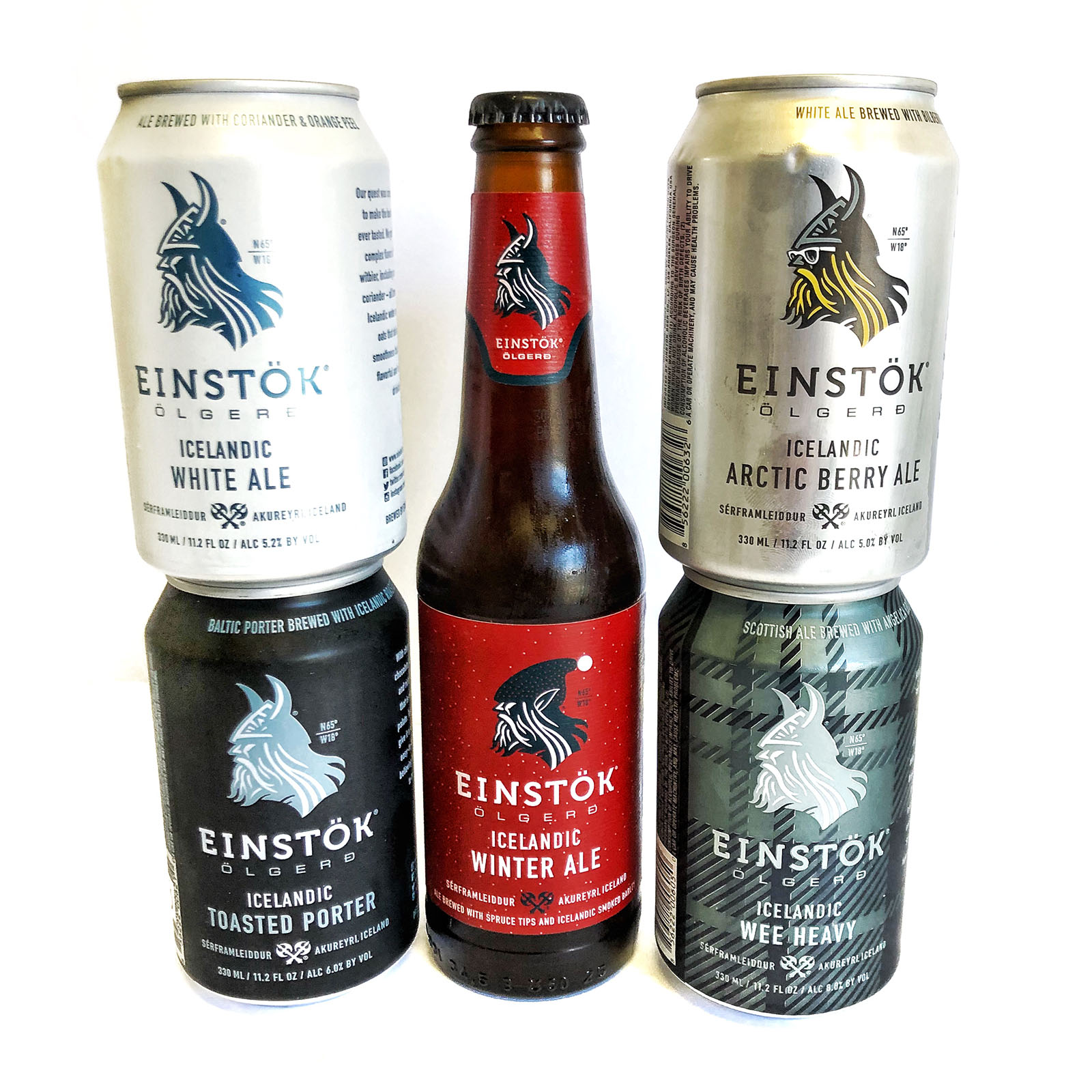
The beer is great, but Einstok Olgerd's can design is what made me notice it in the first place. I love how they change up the Viking's style for each flavor of beer.
-
1
-
-
35 minutes ago, BBTV said:
80s used to just mean "end", so TE, Split End, or Defensive End.
Again - there are plenty of numbers. This is unnecessary and chips away at what a professional football game should look like (not that all the immature show-off "look at me" dudes with their silly socks and to-the-knees undershirts haven't already done that.)
I'm far from a yell-at-clouds "gray facemasks and block fonts only!" guy, but some things are right and some are wrong. Number 12 being an iconic QB number is right. Some fat slob wearing it stretched over his untucked undershirt is wrong.
You strike me as the kind of guy to not watch college football, so I can see why this would look weird, but I've seen plenty of athletic DEs wear numbers in the teens and it doesn't bother me at all. I would imagine most NFL fans are also CFB fans, so for many people, this change really shouldn't take very long to get used to.
And besides the proposed rule doesn't include any "fat slob" type players to be eligible to wear numbers below 50 anyways, so you've got nothing to worry about there.
-
I don't really mind some of the number changes proposed. I will say though, it'll look weird if there is a TE wearing a single digit number. Numbers in the teens look fine on college TEs though.
One thing I wish they had proposed, however, is that defensive linemen can wear numbers in the 80s again. With more and more WRs moving away from the 80s, it would be nice to have more players in those numbers, as there is already a precedent of d-linemen wearing them. Also, I've noticed more college d-linemen wearing numbers in the 80s in recent years, so it's not anything out of the ordinary in that regard.
-
Algeria unveiled their away uniform today. It's on the basic Adidas Condivo template, but the first one to use green. Honestly, I think this pattern looks best on a green shirt compared to all the other color options.
https://www.footyheadlines.com/2021/01/algeria-2021-away-kit-leaked.html
-
Max Scherzer wore a Marlins inspired uniform in his time at Mizzou in the mid 2000s.
They also had Pirates inspired hats and vests.
-
2
-
-
Those Germany kits really should've used gold numbers. The white sticks out way too much. Also, most of those Euro kits are really plain, but I do enjoy the Scotland one. May even consider buying one.
-
4
-
-
38 minutes ago, MJWalker45 said:
Germany, Spain and Belgium. Belgium's is the Watford alternate with grey instead of light blue. Spain is pretty plain but compared to the home shirt it's better. Germany isn't a bad look though.
The Belgium and Spain ones suck, but I'm a fan of Germany's. I like when they use a true gold instead of athletic gold. It helps differentiate them from Belgium.
-
1
-
-
6 minutes ago, DiePerske said:
Mexico has a habit of releasing fantastic clash jerseys that are for some reason being used as a primary and, as such, suck.
Agreed. They do as good of a job as any country at using cultural iconography on their kits, but never seem to use it in the right context. This is reminiscent of those black primaries they had a few years back.
-
2
-
-
Anyone know if there's a vector version of this template compatible with Inkscape?
-
As a Stetson alum, it's interesting to me that they aren't joining the ASUN football league just yet. We have athletics scholarships for every sport except football (hence why we're in the Pioneer currently). Seeing the amount of money that was poured into improvements for our athletics facilities over my 4 years there, I find it hard to believe they don't have the money to offer the minimum number of scholarships to move out of the PFL. I could just be talking out of my ass though and they might have plans to join some time from 2022-24.
-
Biggest game in school history, and Iowa State is wearing all black smfh.
-
10
-
-
Not sure where to ask this, but is anyone else having issues with the mobile phone interface? On chrome I constantly am unable to click on the "Next Page" button, tap on the reply box, or even click the header with the website's logo. Anyone else having this problem?
-
1
-


/cdn.vox-cdn.com/uploads/chorus_image/image/49888199/MaxScherzer2004.0.0.0.jpg)

All City Sports Logos Combined - NFL MLB NBA NHL Mashup Design - Pro Teams Put Together
in Concepts
Posted
I'm pretty disappointed I didn't see this thread until nearly 3 months after it started, but great job on all of these.
I will say though that your Pittsburgh one is very similar to one that is already out. I actually have a sticker on the back of my car with a design that looks like yours, but I've had it for over two years. You may want to revise it somehow.