-
Posts
3,399 -
Joined
-
Last visited
-
Days Won
8
Posts posted by colinturner95
-
-
On 5/8/2020 at 1:53 PM, officeglenn said:
You don't need any special embed code. Just copy and paste the URL for the tweet into the reply box, but you don't the ? or anything after.
perfect. thank you
-
Am I doing something wrong when I try to embed a tweet? everytime I think I do it, I end up with this:
<blockquote class="twitter-tweet"><p lang="en" dir="ltr">We. Are. Done. <br>Thank you to everyone for their positive comments, follows, retweets and likes. Can’t wait to watch all of our favorite MLB teams live again. <a href="https://t.co/V9BN5srHmQ">pic.twitter.com/V9BN5srHmQ</a></p>— Ross Yoshida (@RYDesignLA) <a href="https://twitter.com/RYDesignLA/status/1258590507829063681?ref_src=twsrc%5Etfw">May 8, 2020</a></blockquote> <script async src="https://platform.twitter.com/widgets.js" charset="utf-8"></script>
-
-
2 minutes ago, j'villejags said:
The flag helmets definitely became more palatable to me when they dropped the MARYLAND from the back. looks a lot cleaner that way
-
 8
8
-
-
https://twitter.com/DTWillingham/status/1254772248671444993?s=20
Having serious issues I think trying to post a tweet but uh... this is hard to unsee
-
56 minutes ago, pscf3 said:
Yeah, I think that was definitely part of the idea behind it. Was very ill-timed though with Texas A&M joining the conference and giving them a uniform with such a similar concept.Ultimately it all worked out though. Definitely intrigued to see what A&M rolls out this year.
I've always wondered how those two super similar uniforms came out in the same year
Same here, I really hope they don't dump the racing stripes.
-
28 minutes ago, pscf3 said:
I wonder, is that possibly where they got some inspiration for the banner uniforms? Took the racing stripe idea and made it their own since Texas A&M got similar uniforms in the same year?
-
13 hours ago, WavePunter said:
Solid looking uniform, but if i recall correctly, Adidas came out with these around the same timeframe they came out with Miss State's "banner"-stripe uniforms.. MSU's single, wide, banner-style stripe looked very similar to what you created here, which is likely why they gave a&m the double-stripe
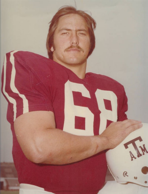
Both Miss. State and aTm got new Adidas uniforms for 2012-2013. That was the banner design for Miss. State and the racing stripe look for aTm. @MJWalker45 is correct in that aTm's design is basically a throwback, in this case to the 70's

Mississippi State unveiled their DWS-100 year anniversary uniforms 2 seasons later and by then those became the full time uniforms and the banner stripe was history. With that being the case, I don't think there would be any issue with adding a stripe to the Aggies' helmets. Maybe to aTm uniform purists maybe.
-
 2
2
-
-
14 hours ago, Midway said:
Simplify if you must but it would be a great waste to ditch the racing stripes instead of owning them.
14 hours ago, WavePunter said:The biggest issue with the entire set is the double stripes on the jerseys but single stripes on the pants
1 hour ago, jgiff17 said:If they keep the stripes then adidas needs to make different pants that work with every combo.
Shameless plug as it is, but why couldn't Adidas and aTm do something like this:

-Add stripe to helmet to match pant stripe
-remove all traces of the bevels from helmet logos, numbers, pant logos.
Now there's some level of harmony between all parts of the uniforms (ignore the socks and cleats, that's a holdover from my 72 project).
-
 6
6
-
-
5 hours ago, WSU151 said:
I don't think there are beveled fonts on the helmet logo and wordmark...

There aren't, just on the numbers. But to add to the problem of bevel vs no bevel, the pants logo features the beveled aTm on the state logo.
-
 7
7
-
-
On 4/6/2020 at 1:47 PM, monkeypower said:
I think Texas Tech's bevel is pretty good and I think is better than the old flat version.


I have a hat with the Tech logo on it and I don't really have any complaints with how it translated over.
The difference with A&M's logo is that 1) I don't believe Aggie fans really like the bevels, and 2) the beveling on the A&M logo is incorrect.
All these images are taken from a website called nobevel.com, hence my point about A&M fans not liking the logo.
they have a pretty good argument but they might get more traction if they didn't host it on a mid 90's website.
but honestly they could drop the bevel elements from their existing uniforms and call it a day. No reason to strip it down past the basics
-
 2
2
-
-
9 hours ago, Blindsay said:

 I’m not a Cavs Fan, but need I say more?
That jersey looks wrong on anyone
-
 8
8
-
-
46 minutes ago, See Red said:
Sadly, six or seven years ago, at the height of CFB uniform insanity, I might have believed this.
In other news, I just remembered that Fresno joined Adidas
-
 4
4
-
-
I don't hate it. I do think the (now-possibly) old logo is better, but I'll hold further judgement until something official comes out.
-
I'm not sure how to feel about this. Like I want to say it's an improvement, but I can't figure out if it actually is. I don't know if its the tiger or the font but it just doesn't quite feel right.
-
3 hours ago, CherryMX said:
This happens several times a day. I just wait a few minutes and check again. Beats me.
I noticed that every time I hit the link to the boards that I had bookmarked it would log me out. But when I navigated to the boards via the mothership home page, nothing changed. I deleted and remade the bookmark and knock on wood haven't had the log out issue in a while.
-
23 minutes ago, fizz said:
With the new head coach, Florida State will also be have a new look at home.
Dropping the pattern from the collar would go a long way on those jerseys IMO
-
 1
1
-
-
Is anybody else having an issue where they're signed in and then for instance, go to a post in Concepts and then back out and all of a sudden I'm logged out?
-

Anybody have any ideas on this one?
EDIT: NVM, figured out what the previous designer did.
-
On 7/12/2019 at 8:52 AM, ramsjetsthunder said:
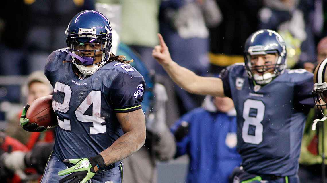
While I am a sucker for double blues and a pre-bandwagon Seahawks fan, I hate these uniforms. The previous set had life to it with the logo sleeve stripes and the current set has flair to it. But these suck and i'm not afraid to say it.
-
 5
5
-
-
7 hours ago, M4One said:
I'm not entirely sure about the Spitfire, but you might be thinking about the Lethbridge Hurricanes because not only did they use the same template, their wordmark logo was very similar to the Capitals wordmark logo.
A lot of junior teams use the same template as a NHL team without issue, but the combination of both the logo and template was a little too much for the Caps liking.
Throughout their history, Lethbridge has used the Capitals jerseys. they ran afoul of the Capitals when they basically carbon copied their logo.


-
 2
2
-
-

Anyone know what the font used for RODEO is?
-

anybody know the Final Score font? I'm seeing it more and more but can't identify it.
-


/cdn.vox-cdn.com/uploads/chorus_image/image/65605601/usa_today_11388861.0.jpg)


/cdn.vox-cdn.com/uploads/chorus_image/image/65140762/usa_today_13278010.0.jpg)


 I’m not a Cavs Fan, but need I say more?


College athletics identity changes
in Sports Logo News
Posted
I don't hate the new logo. I think it will work out better on uniform applications than the current logo.