


mcrosby
-
Posts
2,704 -
Joined
-
Last visited
-
Days Won
30
Posts posted by mcrosby
-
-
I like the board shorts stripe so much...but I can't help but want to see it on one of the pant legs like its inspiration. Any chance we see that?
-
 1
1
-
-
Other than geography, is there a reason to not have 5 conferences of 26 teams each instead of what you have at the moment?
Uniforms look great so far. -
I'm having one of those 'wish i had thought of that' moments. This is brilliant and beautifully executed.
-
 2
2
-
-
On 4/12/2022 at 11:30 PM, SSmith48 said:
Hummel has been doing some solid work in lower-level soccer, not just in the U.S., but internationally too (one of my favs is this glitched GK shirt for Maryland Bobcats FC). These uniforms are no exception. I might need to get my hands on that navy shirt.
I designed the glitch kit!
Seems to me that Hummel may not put out the best designs but simply allows clubs to submit their own stuff more freely.
-
6
-
-
13 hours ago, Sodboy13 said:
This whole Dockhounds launch has had a strong air of a municipality wondering what it's going to do with an empty ballpark about two years from now.
Mallards ownership was looking at the area a few years back, but they've been in the business of selling their non-Madison clubs, not adding more. I still wouldn't be surprised if the Dockhounds end up in Northwoods League after a season or two. Summer Collegiate seems to be more lucrative than Indy.
-
Sometimes lower league supporter groups release jerseys too. This happens to be one I designed.
-
8
-
2
-
 3
3
-
-
On 3/4/2022 at 12:27 PM, WideRight said:
And just a word about the designs. I often borrow heavily from a design I find online. When I do that I do all I can to reach out to the creator and get permission (like I did with Fraser Davidson on the Denver logo). In other cases it is not possible to find the creator and if that is the case I try to cite where I saw the original. In other cases several different logos may be blended together to create an amalgam. In those cases I am less likely to credit the original artists, but will if I feel a major portion of their design is the base for mine.
In this case, the image for the new logo comes from about 4 different designs, including elements of the original Federals IRL logo.
You've made your own logos in the past that are fantastic. Taking from others without crediting is lazy and disrespectful. Taking from other designers with crediting is just lazy. You do good work yourself, let's see that!-
1
-
 1
1
-
-
On 2/26/2022 at 3:40 PM, WideRight said:
The Washington Federals just cannot decide on a new logo. They don't want to look too much like the Eagles, but they have 15 seasons with a green & black color scheme. They are down to their Top 6 Finalists. One of these will be the new look of the Feds in 1998. But which one?
Anyone want to take a guess as to which one I am opting to go with in 1998? Of course understanding that they may change logos again in 2003, 2011, 2019, etc. At least I can guarantee they will never be called the Commanders.

And yes, two of these are based on real teams (upper left is SLC Screaming Eagles from indoor football and bottom left is a reworking of the UFL's Hartford Colonials), the rest take inspiration from a wide range of eagle-based logos around the web.
Little more than inspiration on some of those...
I'd say don't use that one.-
1
-
-
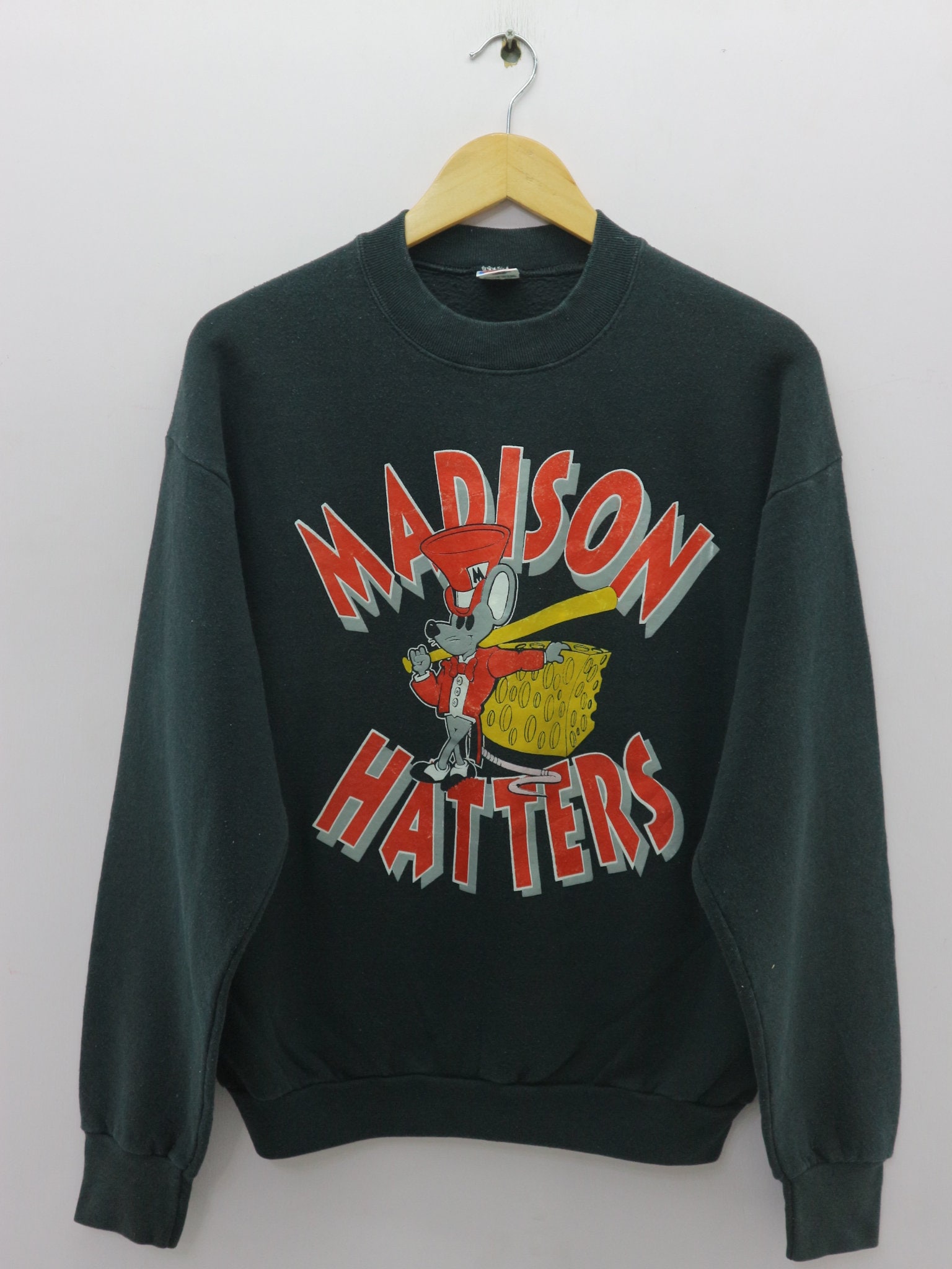
21 minutes ago, VampyrRabbitDesign said:
This is great. I would love to see the mouse keep his bow tie though - bow ties rule.
Just out of curiosity, was this team named after the phrase "Mad as a hatter"?I'm sure it was. Madison used to have a bar called MadHatters too.
-
1 minute ago, Sec19Row53 said:
I am pretty sure I have two unused tickets to their final game sitting in a box at home.
I love what you've done. BUT --- I don't know if it is just me or not. I'm getting a serious Mickey vibe from the shape of the M. I say that fulling admitting that I am NOT looking online to see if I am in any way correct, so shoot me down if needed
You are not wrong in the slightest. I honestly hadn't looked it up before going for it, was just going off of the original M logo. I'll try some new fonts.
-
1
-
1
-
-
These are still real rough - I'm just picking up Procreate and working on sketching my concepts there before vectorizing - so bear with me.
New pose and a wordmark treatment.
-
6
-
2
-
-
I haven't had much time to do any actual work on this in terms of vectorizing my sketch, but I did adjust some colors and sizes. I'm still not sold on the pose, especially after your comments, but I like it better with the smaller M. Since I've made the cheese holey I think it's probably best that I make it Swiss cheese colored instead of cheddar.
I'm considering a Babe Ruth calling his shot pose, which would mean flipping the head, uncrossing the legs, and changing the resting arm to a pointing arm. Y'all want to see that?-
1
-
-
The Hatters were in Madison for a single year as an affiliate to the St. Louis Cardinals, before moving on to Michigan where a stadium had been built. It's a crying shame, because the brand was brilliant.
I've tried a pretty standard update, but I'm not sure I love the pose so it's still in a rough sketch mode. You'll note the bat isn't finished, the tail is missing, and the cheese is...clip-arty. I'm pretty happy with the head and the concept behind the cheesy M. Let me know if this pose is something you all like, or if there's another classic mascot pose I should have a go at.-
17
-
-
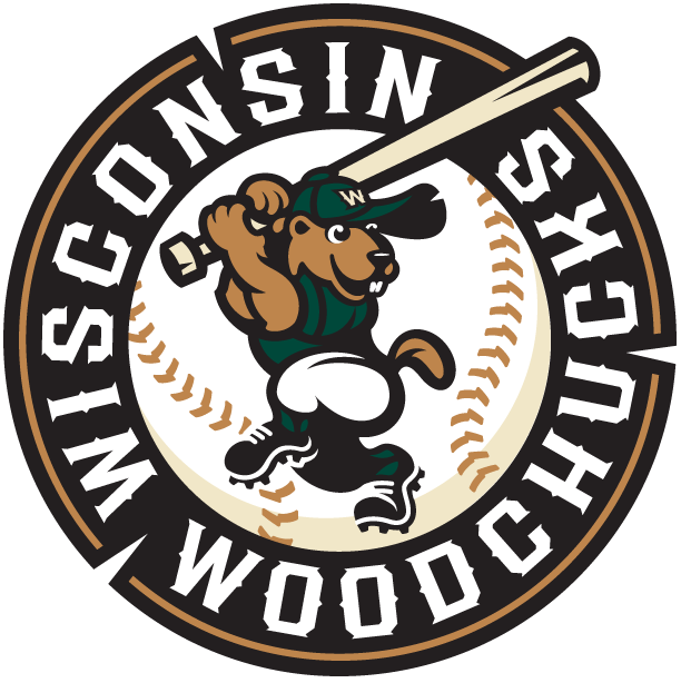
More Northwoods League rebranding: The Wisconsin Woodchucks are now (again) the Wausau Woodchucks. Great choice considering there are eight Wisconsin teams in the league, soon to be nine. Logos done by Studio Simon.
NEW
OLD
-
4
-
-
The Rochester Honkers of the Northwoods League (summer collegiate) have updated their logos.
One of our own has pointed out some similarities to his own work.-
2
-
-
2 hours ago, WideRight said:
Working on the 1998 new designs from Nike for the USFL, but decided to do something a bit odd, looking at the early 2000's. First I thought Tampa, but then decided that Houston needed to go a new direction.
Tell me what you think of this jersey for the Houston Gamblers, based on designs common to western shirt embroidery.
I love it. This could work very well as a black shoulder yoke for a white or red jersey as well as this western style shirt often has a different color for the shoulders. -
3 hours ago, lordsketor said:
The 'BUCKS IN 6' and the brick on each side are so perfect. Go Bucks!
-
2
-
-
I don't think Bucs fans would be happy looking so much like New Orleans.
-
1
-
-
On 9/18/2021 at 3:52 PM, johne9109 said:
Can I ask why?
I'd assume it's because of the national opinion of police as of late.
-
4 hours ago, Coiler said:
The Jets aircraft on the helmet looks like an F-117 Nighthawk. Was that deliberate?
It was when I made it.
-
3
-
-
On 4/19/2021 at 7:30 PM, mcrosby said:
Yeah, they paid me some money and Baccar has disappeared from just about all social media. Still working on getting him cut completely from Behance. Feel free to report him for being a thief.
Looks like Baccar got the boot from Behance. Stolen logo success story!
-
10
-
-
$50 they have a one-off game played as the Bozhos in the next 2 years.
-
14 minutes ago, DEAD! said:
That Mallard looks like it belongs in an episode of Arthur
An early episode.
-


College Football 2022
in Sports Logo News
Posted
At least they got all the Ns correctly oriented this time around.
https://madison.com/news/local/education/university/look-closely-letters-in-the-camp-randall-stadium-end-zones-are-upside-down/article_a8929fa1-8b8c-5e61-ad47-87b0ba4cf656.html